| THIS WEEK'S ARTICLES |
| Trading Places with Tom Bowley |
| Pre-Earnings Moves Are Underway And History Provides Us GREAT Clues To Find Them! |
| by Tom Bowley |
We're approaching Q2 earnings season, so I'm getting ready for all the short-term trading opportunities that await. But, in the meantime, there are plenty of other earnings opportunities right now - pre-earnings advances. Several of the large cap names (think Mag 7) are already starting powerful advances. Look no further than Tesla, Inc. (TSLA), which reports its results in just a little more than two weeks on July 23rd. TSLA has exploded higher, seemingly out of nowhere, but if you're a passionate historian, then you know better. TSLA is on our Top 16 list of stocks, where you MUST know seasonal trends. TSLA, throughout this secular bull market, has performed as follows:
- 24th through 7th: +70.08%
- 8th and 9th: -81.09%
- 10th through 17th: +79.17%
- 18th through 23rd: -26.14%
The latest 24th to 7th period (June 24th - July 7th) is now complete since the 6h and 7th fall on a weekend. Check out how this period just performed:
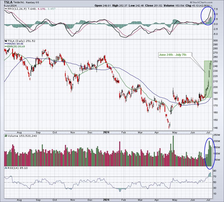
Does history work this well every time? Of course not. History only provides us tendencies, not guarantees. However, if you know TSLA's historical tendencies and you see a breakout above key resistance at 208 on massive volume on July 3rd, that seasonal knowledge can help you pull the trigger. Also, June 24th began this bullish period and TSLA was trading just above its 20-day EMA at the time. Further historical tendencies supported TSLA's advance as well. The first month of calendar quarters (Jan, Apr, Jul, Oct) has easily been TSLA's strongest, which makes perfect sense to me as TSLA reports quarterly results in the first month of each calendar quarter. Pre-earnings advances are common for TSLA and many other large cap stocks.
Want another? Check out Meta Platforms (META). On Friday, META soared and broke out to another all-time high. Historians weren't surprised. First, check out the chart:
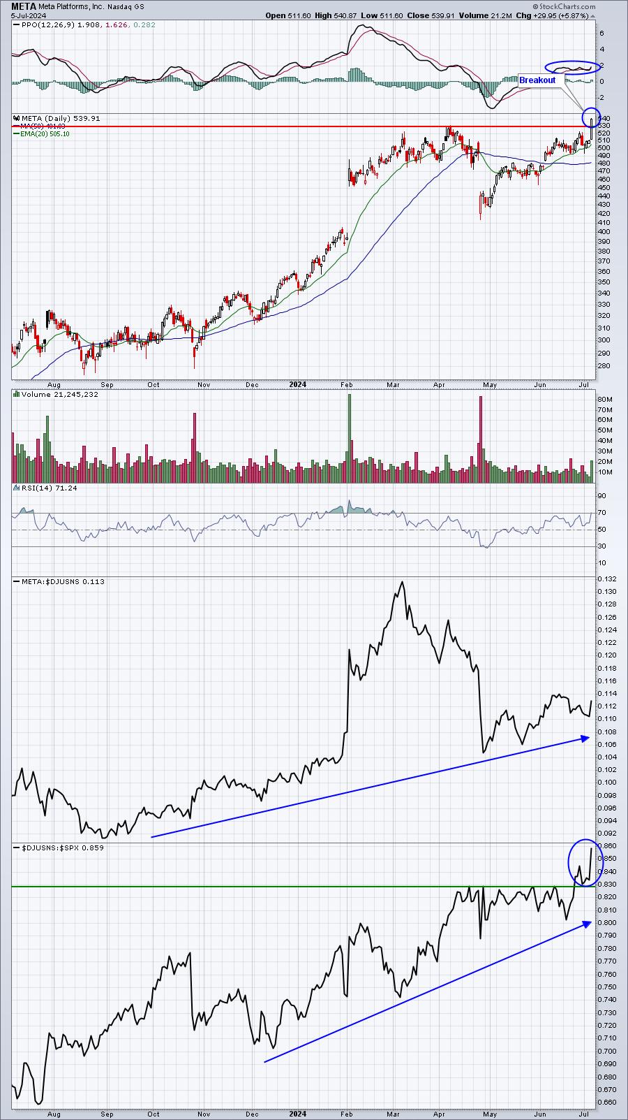
Technically, META's breakout and long-term relative strength are quite bullish. But knowing its seasonal tendencies provides even more confidence to trade META. For instance, check out how META performs during its pre-earnings months:
- Month 1 (Jan, Apr, Jul, Oct): +54.29%
- Month 2 (Feb, May, Aug, Nov): +16.21%
- Month 3 (Mar, Jun, Sep, Dec): +8.40%
These are annualized returns since 2013, when the secular bull market was confirmed. META typically reports its quarterly results late in the first month of each calendar quarter. Its next quarterly report is July 31st, as an example. This current breakout is likely the start of an upside move prior to reporting solid results on the 31st. That is NOT a guarantee, just simply an observation based on history. To further drive home this bullish period for META, consider how it's traded during the first half of calendar quarters (Jan 1-Feb 15, Apr 1-May 15, etc) vs. the second half (Feb 16-Mar 31, May 16-Jun 30, etc):
- First half calendar quarters: +43.11%
- Second half calendar quarters: +9.29%
I believe this historical knowledge is a critical component in becoming an excellent trader. Why not use all the advantages you can muster?
If you enjoy learning about historical tendencies, you need to first learn the tendencies of the S&P 500 in general. Do you know which 11-consecutive day period of the calendar month (roughly 35% of the calendar month) has produced more than 80% of the S&P 500 gains since 1950? You should. Doesn't it just make good common sense that you might trade more successfully with this information? This is just one example of what you'll learn after receiving our Bowley Trend Part 1 report. To claim your FREE copy right now, CLICK HERE. You will automatically be added as a FREE subscriber to our 2x per week (Monday-Wednesday) newsletter, EB Digest, and on Monday, I'll discuss yet another large cap name with likely upcoming strength that you MUST be aware of.
I've also just posted my latest EB Weekly Market Recap video on YouTube. Simply follow this link, "S&P 500 Hits Record High Despite Economic Challenges". If you enjoy our Weekly Market Recaps, please "Like" the video and be sure to "Subscribe" to our YouTube channel. Ring that bell to make sure you catch all of our YouTube videos.
Happy trading!
Tom
|
| READ ONLINE → |
|
|
|
| Martin Pring's Market Roundup |
| MEMBERS ONLY |
| They Say Three Steps and Stumble; This Market is Taking a Fourth |
| by Martin Pring |
|
The legendary technician Edson Gould had a rule that, after three discount rate hikes, the stock market would be likely to stumble. That doesn't apply to emerging markets, but it did make a catchy headline...
|
| READ ONLINE → |
|
|
|
| ChartWatchers |
| Stock Market Makes Spectacular Run, and It's Not From the Popular Magnificent Seven |
| by Jayanthi Gopalakrishnan |

What a strange trip it's been!
After breaking out of its June 20 to July 3 sideways movement, the S&P 500 ($SPX) index finally broke out to the upside--until it didn't. That was on Thursday.
Friday was a different story.
After Thursday's CPI report, the stock market reacted in a way that suggested investors were rotating out of tech stocks into other areas of the stock market. Could this have been a knee-jerk reaction to the cooler inflation data, combined with the market historically performing well during the first two weeks of July? Or was it something else? Whatever the case, it didn't last long, which seems to be the stock market's most typical behavior of late. Reactions tend to be big, but only last a day or two.
This type of environment makes it more difficult for retail traders since it's easy to get sucked into what others are thinking. That's why it's so important to look at the big picture before following the crowd. Remember, there are more algorithms making decisions. This is evident in how the stock market did a complete switcheroo on Friday.
The producer price index (PPI) number was slightly higher than estimates. This led to a 180-degree turn in market sentiment as onvestors returned to large-cap stocks. However, what was different about Friday's stock market price action was that it wasn't just the Mag 7 stocks that saw upside movement. The S&P 500 Equal Weighted Index ($SPXEW) broke out of its triangle pattern, piercing through the upper boundary. Small- and mid-cap stocks also rose. And the good ol' Dow Jones Industrial Average ($INDU) hit an intraday record high, but couldn't hang on to it high at the close. The same goes for the S&P 500 and Nasdaq Composite ($COMPQ).
Macro View Of the Stock Market
So, the rotation is still in play, and the trading week ends with participation broadening out to different areas of the market. That Thursday's selloff didn't continue into Friday shouldn't be too surprising, given the CBOE Volatility Index ($VIX) is still at relatively low levels.
The bullish sentiment is still intact, as seen by the expansion of market breadth. The daily chart of the S&P 500 below includes the NYSE new 52-week highs and lows in the lower panels.
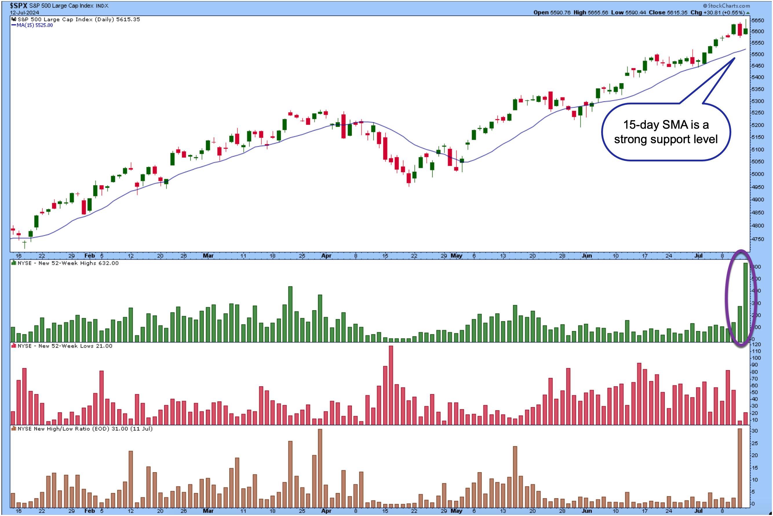
CHART 1. S&P 500 INDEX BREADTH. The new 52-week highs indicator has been expanding for the last three days.Chart source: StockCharts.com. For educational purposes.
Note that the number of new 52-week highs has expanded in the last three days. On Thursday, when equities went through a big selloff, the number of NYSE new 52-week highs increased, indicating money was still flowing into equities. It may not have been coming into tech stocks, but it was going somewhere.
The 15-day simple moving average (SMA), a reliable support level since June, indicates that the equities trend is still bullish.
If market breadth expands and the overall trend increases, there's no reason to panic sell. It's true that, historically, the stock market performs well during the first two trading weeks of July and slows down during the second two weeks of the month. But, at this point, it's best to go with the flow, which currently looks like the trend—despite short-term turbulence—is up.
Small Cap Stocks Are Taking Off
The action in small-cap stocks is particularly interesting. The S&P 600 Small Cap Index ($SML) has broken above a strong resistance level with expanding breadth (see chart below).
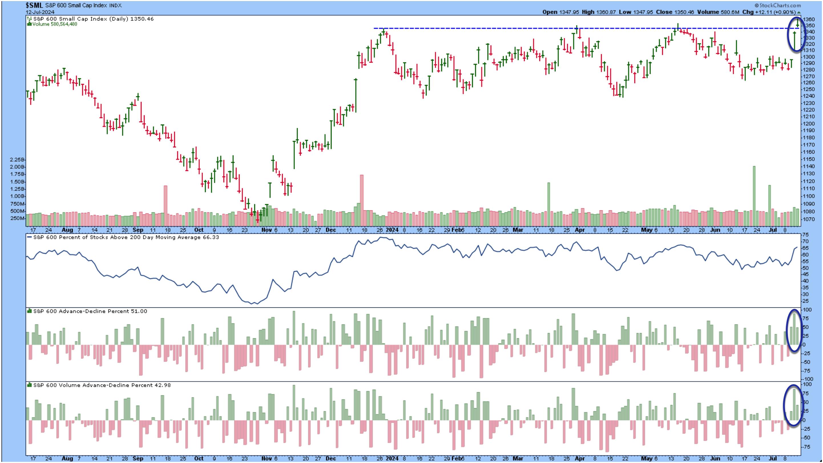
CHART 2. S&P 600 SMALL CAP STOCKS. Small-caps were in the spotlight in the last two days of the trading week. Market breadth expanded significantly. Will there be a follow-through next week?Chart source: StockCharts.com. For educational purposes.
The percentage of S&P 600 stocks trading above their 200 day moving average is above 66%, while the Advance-Decline Percent and Advance-Decline Volume Percent have been in positive territory for the last three trading days.
The bottom line: The broader stock market indexes are trading at or close to all-time highs, small-caps are breaking above a resistance level, and volatility is at relatively low levels. These are all positives for the financial market until signs show otherwise.
Earnings Season Kicks Off
Earnings season kicked off on Friday with JP Morgan Chase (JPM), Citigroup (C), and Wells Fargo (WFC) reporting. Investor reaction was mixed even though all three beat estimates. JPM's stock price closed lower by 1.21%, C declined by 1.80%, and WFC was the worst performer in the S&P 500, its stock price declining almost 6%.
Next week is thin on US economic data. The focus will be more on earnings, with mostly banks and energy companies reporting. The market seems to be shifting its behavior, so it's important to focus on the price action and act accordingly. It's difficult in the summer months when everyone likes to take vacations; we're trying to make it easier for you by sharing our charts. So make sure to click on the live charts and add them to your ChartLists!
End-of-Week Wrap-Up

- S&P 500 closed up 0.87% for the week, at 5615.35; Dow Jones Industrial Average up 1.59% for the week at 40,000.90; Nasdaq Composite closed up 0.25% for the week at 18,398.45
- $VIX down 3.56% for the week closing at 12.46
- Best performing sector for the week: Real Estate
- Worst performing sector for the week: Communication Services
- Top 5 Large Cap SCTR stocks: Insmed Inc. (INSM); Carvana Co. (CVNA); Super Micro Computer, Inc. (SMCI); NVIDIA (NVDA); MicroStrategy, Inc. (MSTR)
On the Radar Next Week
- June Retail Sales
- Earnings from BlackRock Inc. (BLK), Goldman Sachs (GS), Bank or America Corp (BAC), Charles Schwab Corp. (SCHW), Alcoa Corp. (AA), Haliburton Co. (HAL), and Schlumberger NV (SLB), among many other companies
- Fed speeches from Chairman Powell, Daly, Kugler, and others
- July MBA 30-year Mortgage rate
- June Housing Starts
- June Industrial Production
Disclaimer: This blog is for educational purposes only and should not be construed as financial advice. The ideas and strategies should never be used without first assessing your own personal and financial situation, or without consulting a financial professional.
|
| READ ONLINE → |
|
|
|
| DecisionPoint |
| NVDA & Mag 7 Breaking Down; Russell 2000 (IWM) and Retail (IYT) Get "Silver Cross" BUY Signals |
| by Erin Swenlin, Carl Swenlin |
This is a complimentary excerpt from the subscriber-only DecisionPoint Alert.
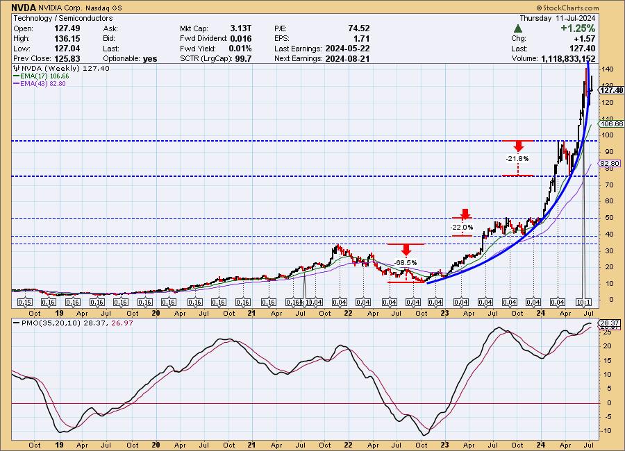
NVIDIA (NVDA) broke down today in what looks like an echo of last month's pullback. There is a short-term double top with price resting on the confirmation line. This could just be a one day event; however, if we assume that a correction has begun, we see first support at about 118.00, which marks a -17% decline. The next most obvious support is at about 97.00, a decline of about -32%.
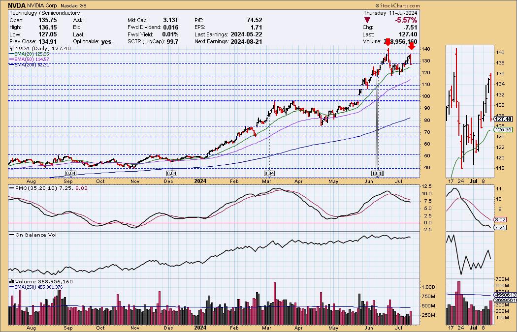
The primary problem with NVDA is the steep parabolic advance from the 2022 low. Such advances beg for correction, and we can see three previous corrections on this chart.
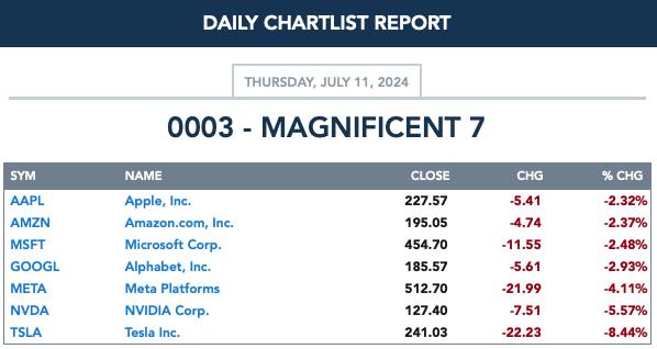
As the title noted, all the Magnificent 7 appear to entering corrections.
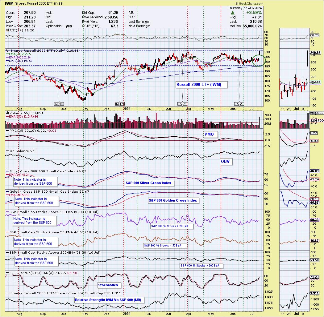
Today, the Russell 2000 ETF (IWM) 20-day EMA crossed up through the 50-day EMA (Silver Cross), generating an IT Trend Model BUY Signal. Like so many other indexes, IWM is in a narrow trading range that generates whipsaw signal changes, but the strength of today's move implies a probable upside breakout from that range.
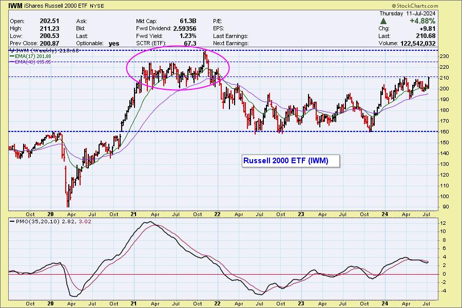
The weekly chart shows a PMO rising above the zero line, but we now see a lot of congestion in 2021 that will provide resistance to further advance. That is not to say further advance is not possible, but that it will possibly be more difficult.
Also today, the Retail ETF (XRT) 20-day EMA crossed up through the 50-day EMA (Silver Cross), generating an IT Trend Model BUY Signal. Again we have the narrow trading range and potential for whipsaw. In fact, XRT switched to NEUTRAL two days ago. Nevertheless, this seems to be an authentic change of direction, considering that it is a high-volume reversal on a day when part of the market was falling apart.
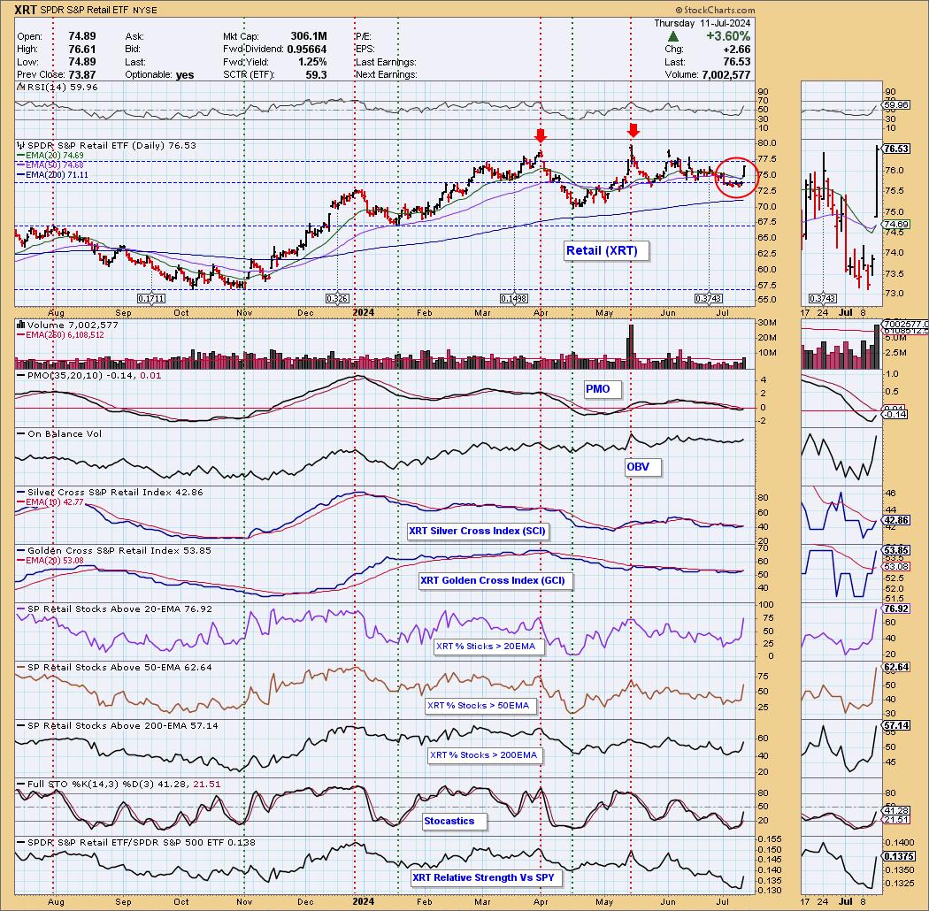
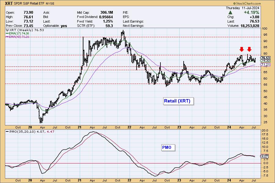
The weekly chart doesn't reflect much confirmation regarding this one-day change of direction, but the weekly PMO is flat above the zero line, which is encouraging.
Conclusion: Mega-cap stocks began to break down today, but other areas of the market have newfound strength. It is only one day of this 'bifurcation' between smaller-caps and mega-caps, but a broadening of the rally could preserve the integrity of this bull market.
Learn more about DecisionPoint.com:
Watch the latest episode of the DecisionPointTrading Room on DP's YouTube channel here!

Try us out for two weeks with a trial subscription!
Use coupon code: DPTRIAL2 at checkout!
Technical Analysis is a windsock, not a crystal ball. --Carl Swenlin
(c) Copyright 2024 DecisionPoint.com
Disclaimer: This blog is for educational purposes only and should not be construed as financial advice. The ideas and strategies should never be used without first assessing your own personal and financial situation, or without consulting a financial professional. Any opinions expressed herein are solely those of the author, and do not in any way represent the views or opinions of any other person or entity.
DecisionPoint is not a registered investment advisor. Investment and trading decisions are solely your responsibility. DecisionPoint newsletters, blogs or website materials should NOT be interpreted as a recommendation or solicitation to buy or sell any security or to take any specific action.
Helpful DecisionPoint Links:
Trend Models
Price Momentum Oscillator (PMO)
On Balance Volume
Swenlin Trading Oscillators (STO-B and STO-V)
ITBM and ITVM
SCTR Ranking
Bear Market Rules
|
| READ ONLINE → |
|
|
|
| ChartWatchers |
| Citi Predicts $3,000 Gold by 2025 — What You Need to Know |
| by Karl Montevirgen |
 Will Fed Chief Jay Powell rouse King Midas from his summer slumber? Gold investors are eager to have that question answered. The Fed's response will determine whether investors press pause or pull the trigger. Will Fed Chief Jay Powell rouse King Midas from his summer slumber? Gold investors are eager to have that question answered. The Fed's response will determine whether investors press pause or pull the trigger.
Thursday's CPI data seemed favorable enough. Consumer prices are easing, raising Wall Street's hopes for a Fed rate cut. Friday's PPI report, however, came out higher than expected. With inflation easing on the consumer end but rising stubbornly on the manufacturing end, how will the Fed respond in the coming months?
Central Banks Can Push Gold to Upwards of $3,000 by 2025
Gold price targets have been everywhere, largely depending on FOMC projections. But Citi's latest prediction is bold and bright for gold bulls. They see central bank gold demand driving prices to $3,000 by 2025, while Goldman Sachs revised its target for 2024 upward to $2,700.
The rationale? Analysts think central banks will snap up 1,100 tons of gold in 2024, with a bullish scenario hitting 1,250 tons. This demand has been steady at 28–30% of gold mine production since 2022, potentially climbing to 35% due to trade wars and worries about U.S. fiscal policies.
Gold: A 20-Year Lookback
Let's step back and take a wide-angle view ($GOLD monthly chart) of gold's position relative to its 20-year history.

CHART 1. 20-YEAR MONTHLY CHART OF GOLD. This chart might answer the raging debate about whether gold is a good investment. What do you think?
Gold see-sawed in a trading range from 2013 to 2019. After a breakout, it hit an all-time high and then saw three more years of wide sideways movement before 2024. In May, gold hit its highest price ever: $2,450.05 an ounce.mThe long-term trend? Net bullish. It's a reality check when you see that gold's price rise mirrors the drop in your money's purchasing power.
Momentum-wise, the Chaikin Money Flow (CMF) tells you that buying pressure is on an upswing which, in the past, coincided with every major rally. The big question now: will this anticipated rally keep going?
$GOLD vs GLD — Big Players vs. the Retail Crowd
For retail investors, SPDR Gold Shares (GLD) is the proxy for gold futures. Looking at StockCharts' correlation indicator, gold futures ($GOLD) and GLD are both moving in lockstep based on their 0.98 to 1.0 (meaning 98% to 100%) correlation, as you can see below:

CHART 2. CORRELATION BETWEEN GOLD FUTURES AND SPDR GOLD SHARES ETF. Note that the ETF is also gold-backed, making it a strong proxy for the metal itself.
But when you look at the buying and selling pressure as represented by the CMF, you get a different picture.

CHART 3. CHART OF GOLD FUTURES AND GLD WITH DIFFERING CMF READINGS. While gold futures show steady buying pressure, the ETF has shown outflows.
While gold futures and bullion are the domain of Institutional investors and commercial consumers (think manufacturers, hedgers, etc.), the retail crowd trades GLD. Are the pros gearing up for a move that retail investors might miss?
Add the Following Two Charts to Your StockCharts ChartLists
The $GOLD chart shows how gold futures prices stack up against the SPDR Gold ETF (GLD). The ETF is meant to track the futures, but look closely. If the thesis holds, you might be able to spot the difference between institutional vs. retail buying or selling—potentially signaling a market opportunity.
GLD's Daily Price Action
GLD gives a mixed picture.

CHART 4. DAILY CHART OF GLD. Bullish and bearish indications, but with clear support levels.
The CMF and the Ichimoku Cloud are both leaning bearish. The CMF shows dwindling momentum (dipping below the zero line) while GLD seemingly struggles to take out its record high of $225.66. The cloud turned red, giving the impression that once support is broken, it could transform into a thickening resistance range.
On the bullish side, the Moving Average Convergence/Divergence (MACD) shows both signal line and centerline crossovers, indicating a potential bullish scenario. Plus, the uptrend in both the 100-day and 200-day moving averages (SMAs) are intact and steadily rising. Both can provide support.
However, GLD could continue to drift downward, breaking below the 100-day SMA and the bottom cloud level—which it can do, given that gold tends to perform poorly in the summer months. If that happens, where else can you find strategic buying points (assuming that gold will rise to higher levels toward the end of the year)?
Plotting Fibonacci Retracement levels tells you that 38.2% ($209.60), and the range between 50% ($204.70) and 61.8% (199.75) might serve as strategic buy zones for accumulating GLD shares. After all, the context we're facing is a dreadful seasonal slump in August and September and a sharp rebound in the last quarter of the year, as StockCharts' five-year seasonality chart below illustrates.

CHART 5. FIVE-YEAR SEASONALITY CHART OF GOLD FUTURES. Why five years? Because the monetary and geopolitical scenario (e.g., inflation and global de-dollarization) of recent years changes the context of the dollar and gold.
But the real game-changer? The Fed's upcoming decisions on interest rates. That's the trigger you should be watching closely.
Closing Bell
Gold's prospects are a mixed bag of bullish and bearish signals, heavily influenced by the Fed's next moves on interest rates. While institutional players and central banks appear to be buying, retail investors are probably missing some cues. Seasonality-wise, gold's in a summer slump. However, things can change as early as the end of July, when the FOMC meets to deliver its rate decision. If not, things could also change very rapidly in the coming months. Plus, gold tends to perform well in the last quarter of the year.
Keep an eye on the strategic buy zones highlighted above. And remember: the real game-changer lies in the Fed's upcoming decisions.
Disclaimer: This blog is for educational purposes only and should not be construed as financial advice. The ideas and strategies should never be used without first assessing your own personal and financial situation, or without consulting a financial professional.
|
| READ ONLINE → |
|
|
|
| ChartWatchers |
| When Will the Stock Market's Bullish Momentum Snap? Charts You Need to Watch |
| by Jayanthi Gopalakrishnan |

With the S&P 500 ($SPX) and Nasdaq Composite ($COMPQ) hitting all-time highs and the Dow Jones Industrial Average ($INDU) trying hard to get there, are the broader indexes overstretched and ready to snap?
At the moment, all indications point to a bullish move. Investors are anxiously awaiting the June CPI data point that drops on Thursday. If it comes in much hotter than expected, there's a chance of a selloff. But that could change during the trading day; how the market closes is more important.
The Stock Market Big Picture
Overall, the macro picture is bullish. The S&P 500 and Nasdaq Composite are trading well above their 20-day simple moving average (SMA). This is predominantly driven by the price action in the Magnificent Seven stocks. Apple (AAPL) and Tesla (TSLA), two stocks hit hard earlier this year, have overcome their tailwinds and are trending higher.
The bullish outlook may not be as rosy outside of the large-cap AI-related world. Look at the daily chart of the S&P 500 Equal Weighted Index ($SPXEW) below.

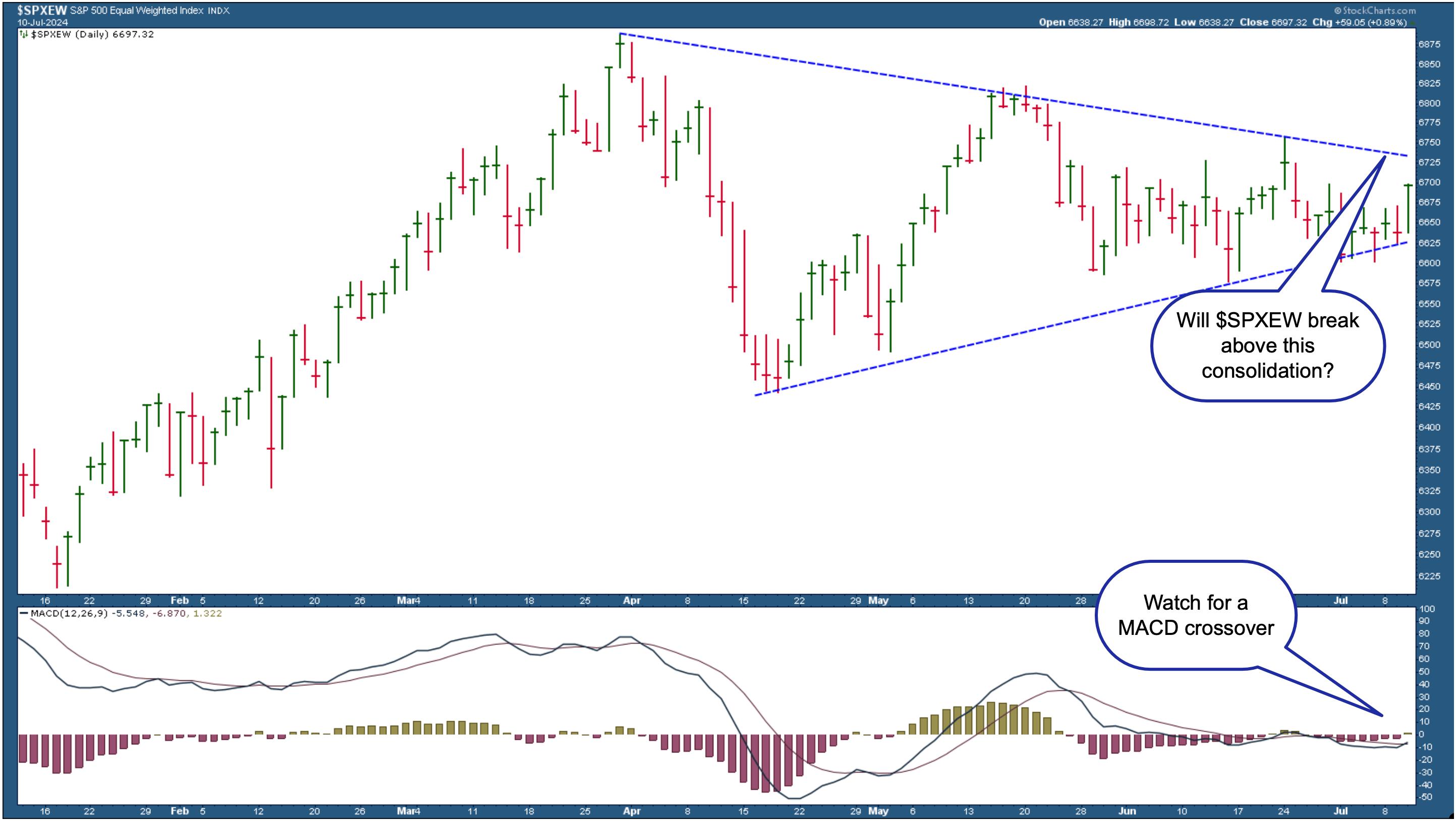
CHART 1. THE S&P 500 EQUAL-WEIGHTED INDEX ON THE VERGE OF BREAKING OUT? Look for the index to break above the triangle pattern and the bullish MACD crossover to confirm the market's bullish move.Chart source: StockCharts.com. For educational purposes.Though not hopeless, it's still got some room to cover before hitting new highs. $SPXEW is consolidating in a large triangle pattern and has avoided breaking below the lower side thus far. It's been closer to the lower line in the last few days, but Wednesday's 0.89% rise has brought it closer to the pattern's upper side. This is something to watch closely.
The Moving Average Convergence/Divergence (MACD) oscillator in the lower panel shows the lack of upside momentum at present. However, the histogram has moved just above the zero line, and it looks like the MACD line has just crossed above its signal line. If this crossover follows through, there's a chance $SPXEW could break through the upper triangle line and reach its all-time high. This would be a further optimistic indication of the overall bullishness of the equity market.
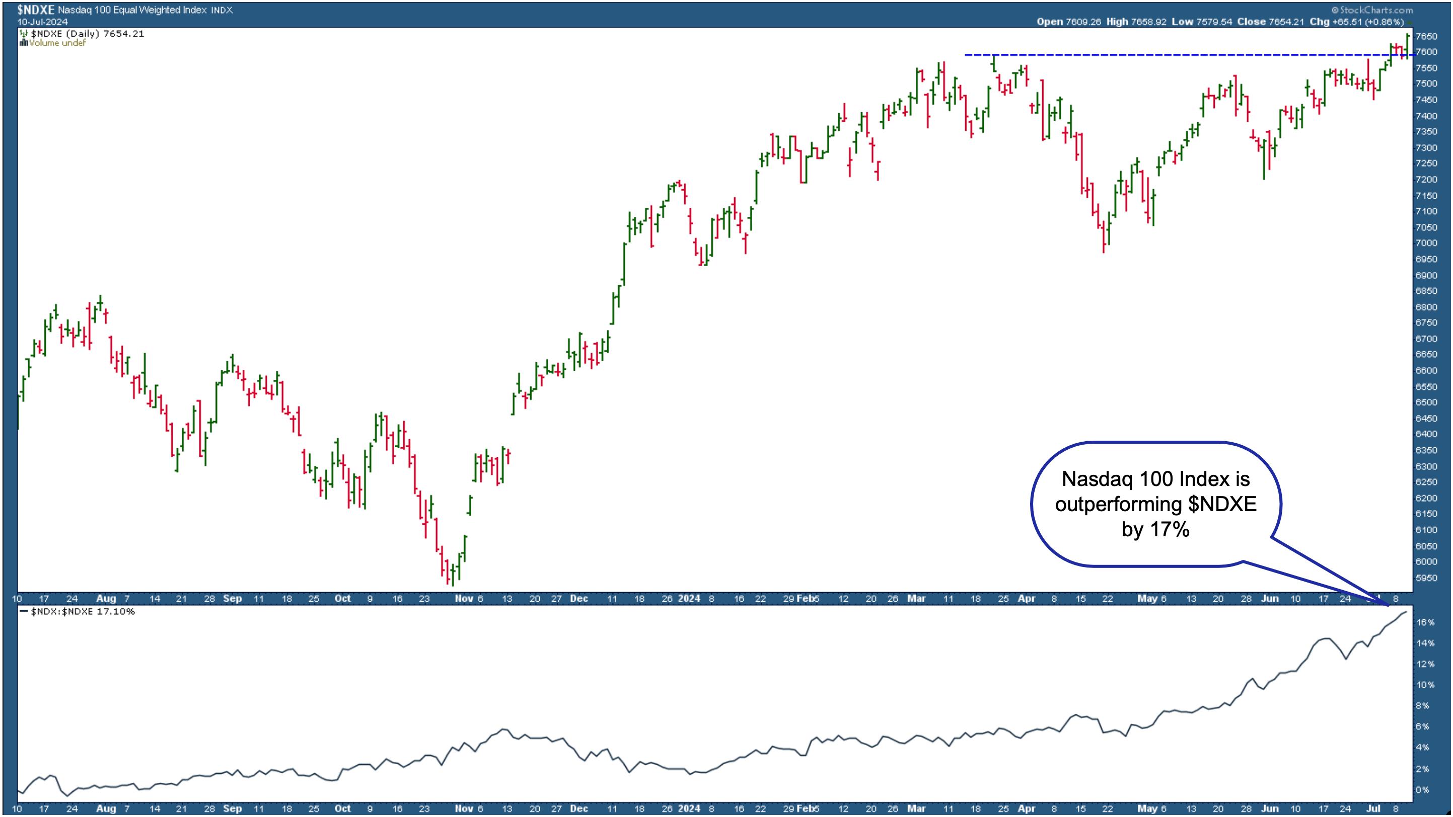
If you isolate the Technology sector and look at the Nasdaq 100 Equal-Weighted index ($NDXE) chart, you'll see that it's inching up towards hitting new closing highs. However, the Nasdaq 100 index ($NDX) is outperforming $NDXE by about 17%.

CHART 2. NASDAQ 100 EQUAL-WEIGHTED INDEX HITS NEW HIGHS. In spite of hitting new highs, the Nasdaq 100 index is outperforming the Nasdaq Equal Weighted index by about 17%.Chart source: StockCharts.com. For educational purposes.
It's all about tech stocks. Technology has been the best-performing sector for the last year. If you look at sector performance for the past year, all 11 S&P sectors are green—yes, even Real Estate.
The bullish outlook is still in play from a bird's eye perspective. Keep a close eye on the charts of the broader indexes. If they break below significant moving average support levels, objectively analyze your holdings to see if it makes sense to sell them.
It's All About Interest Rate Cuts
According to the CME FedWatch tool, the probability of a September rate cut continues to increase, as does one of a second rate cut in December. The stock market has priced in these cuts even though Fed Chair Powell, in his recent testimony, didn't indicate when rate cuts will start.
There's still more data before the September meeting, so have your ChartLists within easy reach. For as long as investors are speculating rate cuts, the market will probably keep moving the way it has been. But when those rate cuts arrive, things may change. Consider watching the bond market, which can often be a leading indicator of when interest rate cuts will start.
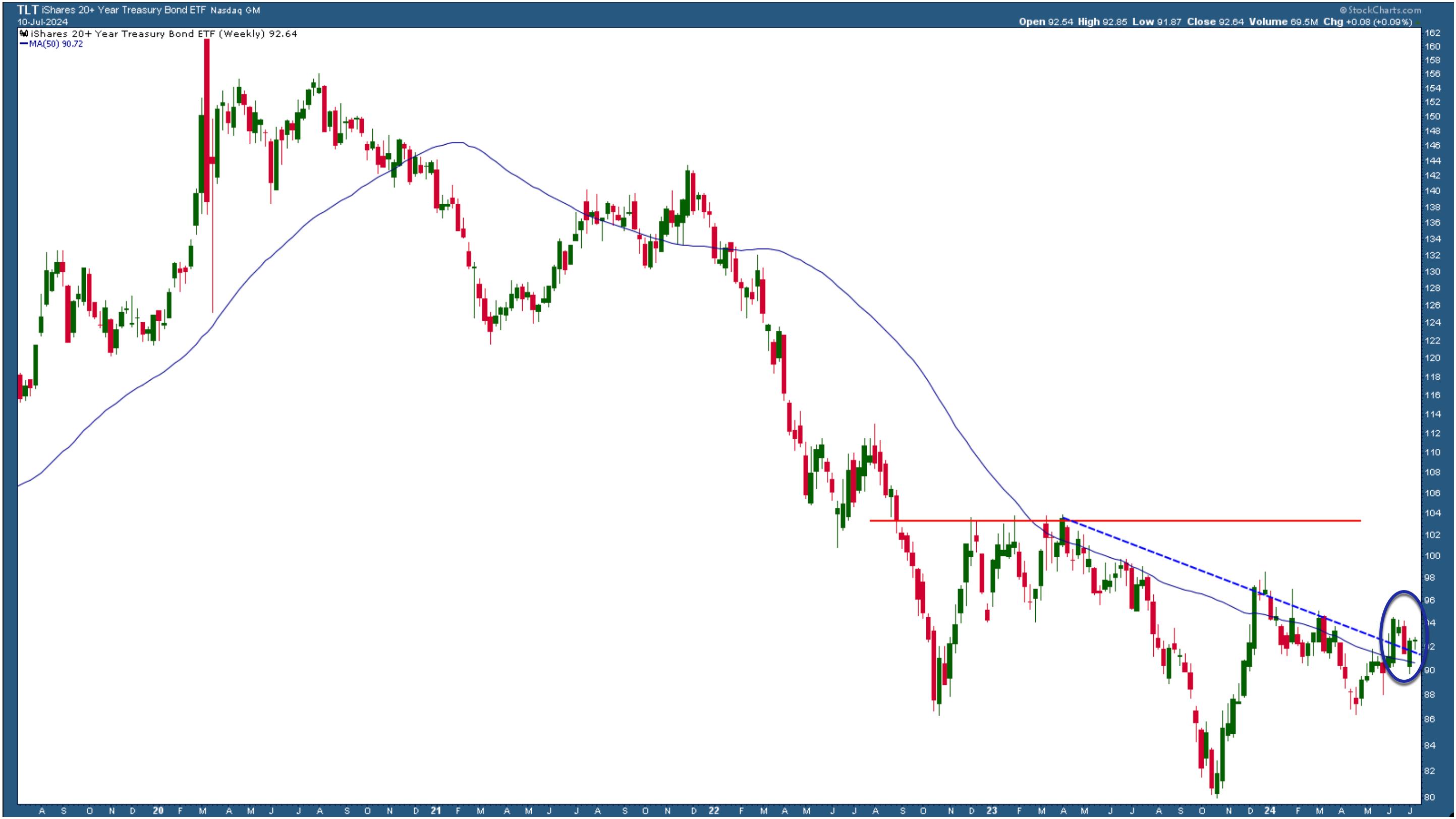
The weekly chart of the iShares 20+ Year Treasury Bond ETF (TLT) below shows that bond prices haven't made a decisive move yet. They will probably remain this way until the timing of rate cuts is crystal clear.

CHART 3. WEEKLY CHART OF TLT. Bond prices are still close to their five-year low. When the Fed cuts interest rates, TLT could see upside movement.Chart source: StockCharts.com. For educational purposes.
TLT is trading close to its five-year lows. If TLT remains above the blue-dashed trendline, investors speculate that interest rate hikes will probably happen. If TLT breaks below the trendline and declines, it would indicate that rate cuts aren't on the table yet.
Closing Position
Yes, the stock market is getting toppy. The extended bull run has been mainly driven by rate cut anticipation. Enjoy the bullish stock market ride, but know when to jump off.
Charts to add to your ChartLists:
S&P 500 Equal Weighted Index ($SPXEW)
iShares 20+ Year Treasury Bond ETF (TLT)

Disclaimer: This blog is for educational purposes only and should not be construed as financial advice. The ideas and strategies should never be used without first assessing your own personal and financial situation, or without consulting a financial professional.
|
| READ ONLINE → |
|
|
|
| Don't Ignore This Chart! |
| Silver's AI Boom: The Next Big Trade You Need to Know About |
| by Karl Montevirgen |

Over the last few years, the "AI trade" has shifted from the hottest trend to a portfolio centerpiece. The rationale for the shift is obvious: it's hard to imagine future technology without AI.
But while the AI trade revolves around the usual suspects—semiconductors and various big tech stocks—silver is a critical yet overlooked component supplying the entire AI industry.
Silver's Role in the AI Industry
Silver isn't the only metal in AI tech production; its role is critical. Without it, AI—and much of electronic tech—wouldn't exist. Its applications in thermal conductivity, semiconductor fabrication, sensors, connectors, and photovoltaic cells make silver indispensable in AI tech production.
The Silver Institute says global silver demand is set to hit around 1.2 billion ounces this year, the second-highest level ever recorded. Even with more silver being produced in response to industrial demand, analysts still believe the market will be in deficit for the fourth year in a row.
Silver's 5-Year Seasonality Chart
Take a look at silver's ($SILVER) five-year seasonality performance using StockCharts' Seasonality chart tool.

CHART 1. 5-YEAR SEASONALITY CHART OF SILVER. Note the volatile performance quarter by quarter.
First, why a five-year seasonality chart? The answer is that it gives more weight to silver's industrial demand and the AI trade starting in the year before the COVID lockdown. Still, if the market has been in a supply deficit for four years while demand keeps rising, you might wonder if the current price is somehow ‘repressed,' setting the stage for a big surge.
- Over the last four years, silver has returned, on average, 8.5% this month (average returns are at the bottom of the bar).
- August and September show the summer doldrums, with the latter's figure looking quite dismal.
- October through December, the best months, topped even that of March through May in terms of average returns and, to some extent, higher close rates (those are the numbers above the bar).
Silver's Macro View Shows Major Breakout
Looking back at silver's performance over the last 16 years, the white metal is breaking out of a wide (and very ugly) four-year trading range.

CHART 2. WEEKLY CHART OF SILVER. Silver just broke out of a four-year (and very volatile) trading range.
Looking at the Chaikin Money Flow (CMF) indicator, you can see how the rallies correspond to the increased buying pressure. The current reading may not be as dramatic as the levels seen in 2010 and 2011, but this is where you make an informed guess as to whether such a move is about to start.
Silver's price broke above the four-year resistance level at $30. However, it faces technical headwinds at approximately $36, $44, and right below $50 (the highest level reached was $49.45 in 1980 and $48.70 in 2011).
Are Big Players Scooping Up What Retail Investors Are Ditching?
Before looking at the daily chart from a tactical perspective for some potential entry points, let's first compare the silver futures market ($SILVER) to the iShares Silver Trust ETF (SLV) and focus specifically on the different readings from the CMF, which represents buying vs selling pressure.

CHART 3. DAILY CHART COMPARISON OF SILVER FUTURES VS ISHARES SILVER TRUST ETF. Notice the difference in money flow between the two.
The price correlation between the two markets is very tight, as SLV is a commodity-backed ETF. But look at the difference in money flow. The futures market shows a positive reading while the ETF dipped into negative territory.
Does this represent the sentiment of different types of market participants—namely, institutional investors (or commercial traders) versus retail investors? If so, might it indicate that the bigger players are buying what the retail traders are selling to them at a possible discount? It's something to think about.
Analyzing SLV's Near-Term Price Action
Take a look at the daily chart of SLV below. The StockCharts Technical Rank (SCTR) score is soaring above the 90 line, indicating technical bullishness across several indicators and timeframes.
The CMF is below the zero line, indicating retail investors may be liquidating positions. However, is quiet accumulation occurring among institutional players in the futures market amid retail selling?

CHART 4. DAILY CHART OF SLV. The CMF divergence is clear, but given how it almost contradicts the reading you get with silver futures, it almost changes the story the charts tell.
Take a look at the trendline (black) on the SLV chart. If silver's seasonal tendency materializes, then you would expect near-term weakness. SLV's price will likely test the trendline first (at whatever price point that will be at the moment) before testing the most recent swing low at $26.00. Should the price break below that level, you can expect support at the next major swing low at $24.00.
If price falls below that, there is further support at consecutive swing lows, but you will want to re-examine the macro situation before taking any further action.
Add the following two charts to your StockCharts ChartLists.
The $SILVER chart shows what the silver futures (continuous contracts) price action looks like in contrast to the iShares Silver Trust ETF (SLV). The ETF is designed to track the futures, but look closely—those little technical differences might lead you to hidden market opportunities.
Closing Bell
Not many retail traders see it, but silver shines in the AI world. AI's rise as a portfolio must-have puts a spotlight on silver's critical role in tech production. But there's a catch—silver supply may not be keeping up with soaring demand. While silver futures show strong buying, retail investors are ditching the SLV ETF. Big players might be scooping up what retail traders are selling, potentially setting the stage for a massive price surge later in the year.

Disclaimer: This blog is for educational purposes only and should not be construed as financial advice. The ideas and strategies should never be used without first assessing your own personal and financial situation, or without consulting a financial professional.
|
| READ ONLINE → |
|
|
|
| MORE ARTICLES → |
|




 Will Fed Chief Jay Powell rouse King Midas from his summer slumber? Gold investors are eager to have that question answered. The Fed's response will determine whether investors press pause or pull the trigger.


