UP NEXT: A STOCK MARKET SHOWDOWN!
by Chip Anderson | ChartWatchers
Hello Fellow ChartWatchers!
After an unexpectedly quick rise in stock prices this week, the markets are poised for a showdown. It's too bad we can't have the stock market be more like an athletic event...
In this corner, weighing in at 200-days in length, our long-term, bearish tag team champions - the masters of disaster - "Rounding Top Formation" and "200-day Moving Average!" (The crowd boos loudly. The champions don't care.)
And in the other corner, only 15-days old, the young upstarts - the great bullish hope - the uptrend that up-ends - "Four-Day Rally" and "MAC-Daddy Crossover!" (The crowd chants "Up-Trend! Up-Trend! Up-Trend!")
Let's take a closer look at the "boxing ring" for this week's fight:
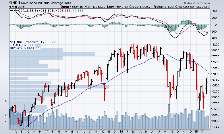 Unfortunately, I can only stretch the boxing/wrestling metaphor so far. But you get the idea. There is a HUGE collision about to happen in the market. It will actually be sort of fun watching it happen next week.
That blue line is the 40-week (aka 200-day) moving average for the Dow Industrials. The key question for next week is "Can the Dow move above that moving average?" Typically, as you can see in the past, the market slows down and changes direction whenever it approaches that average. It put the brakes on the big uptrend back in October. It also reversed numerous pull-backs during the long uptrend in 2014 and 2015. So the odds are things will slow down and reverse (at least temporarily) next week.
Other things working against our upstart uptrend include the 17,000 level, low volume for the past 3 weeks, and the resistance area between 17,000 and 17,250. (See the horizontal volume-by-price bar sticking out from the left side of the chart around that level?)
But - as they say in the sports world - "That's why they play the game" meaning that you can't take anything for granted. While the odds are against it, there's a change the sharp uptrend will continue. If it does continue, how high could it go?
First, the further above the 200-day MA it goes, the more likely it be that it will pull back to that average. Second, there is a huge overhead resistance zone just above 17,750. I'm having a hard time seeing things go that high anytime soon.
Again, the more likely scenario is what Clubber Lang called "Pain" - a reversal at the 200-day Moving Average followed by a new leg down.
Definitely "rocky" times ahead for the market. (Pun definitely intended.)
- Chip
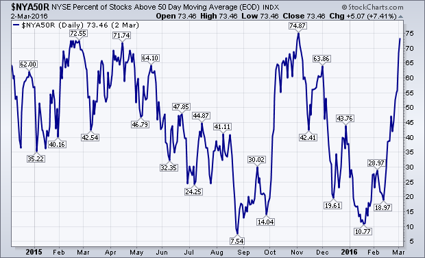
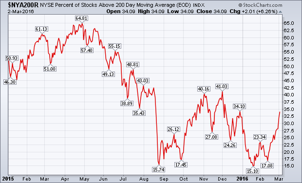
A lot of attention is now being paid to stocks testing or exceeding their moving average lines. My February 20 message had a headline suggesting that the percent of NYSE stocks trading above their 50- and 200-day moving averages might be bottoming. Let's take another look. The blue line in Chart 1 shows the % of NYSE stocks above their 50-day lines. Since February 20, that line has nearly doubled from 38% to 73%. That reflects the short-term improvement that's taken place over the last month in major stock indexes. That line, however, is nearing an important test of its early November peak at 74%. What it does near that resistance barrier will help determine if the short-term rally has more staying power. Chart 2 shows the % of NYSE stocks over their 200-day lines. It has risen from 23% to 34% since we last looked at it. That means that roughly a third of big board stocks are back in uptrends. While that's encouraging, it's not conclusive enough to signal a major bottom. For that to happen, the red line would have to clear its fourth quarter high at 41%. We'll be watching.
The McClellan Oscillators for the NYSE and Nasdaq surged over the last few weeks and hit multi-year highs. Medium-term, I would consider this breadth surge bullish. Short-term, however, it creates an overbought condition that could lead to a pullback or consolidation in stocks. Despite this double-edged sword, the medium and long term prognosis outweighs the short-term.
The NYSE McClellan Oscillator ($NYMO) is leading the charge with a surge above +100 and its highest reading since January 2009. In less than two months the indicator has moved from -89.2 to +105.77, which is a massive 205 point swing. This shows a sharp shift in breadth that I would consider as a bullish breadth thrust.
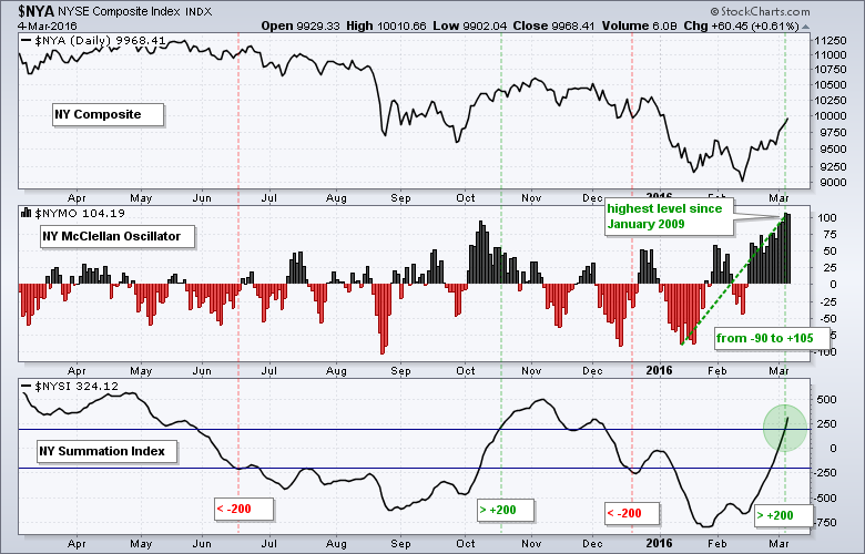
The bottom window shows the NYSE McClellan Summation Index ($NYSI) moving above +200 for the first time since early December. I am using +200 as my bullish threshold and -200 as my bearish threshold to reduce whipsaws. The NY Composite bulls have a medium-term edge as long as this indicator remains above -200.
The next chart shows the NYSE McClellan Oscillator over the last ten years. I added horizontal lines at -85 and +85 to identify swings from a negative extreme to a positive extreme. Some chartists use -80 and +80 so feel free to make adjustments. By my count, there have been at least ten such swings. Two occurred at the end of the 2007-2008 bear market, one marked a breadth thrust in March 2009 and the three of the next five preceded big advances. The other two were head fakes (bad signal) in July and August 2011. This was a period of extraordinary volatility and the oscillator surged above 90 October 2011. The bullish swing in October 2015 did not last long as the NY Composite peaked in November. The jury is still out on the current breadth swing, but I think it is bullish as long as the NYSE McClellan Summation Index ($NYSI) remains above -200 (red line).
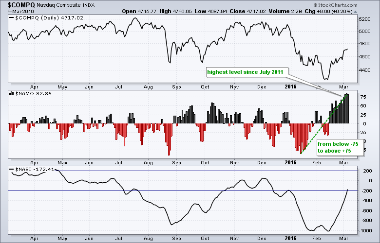
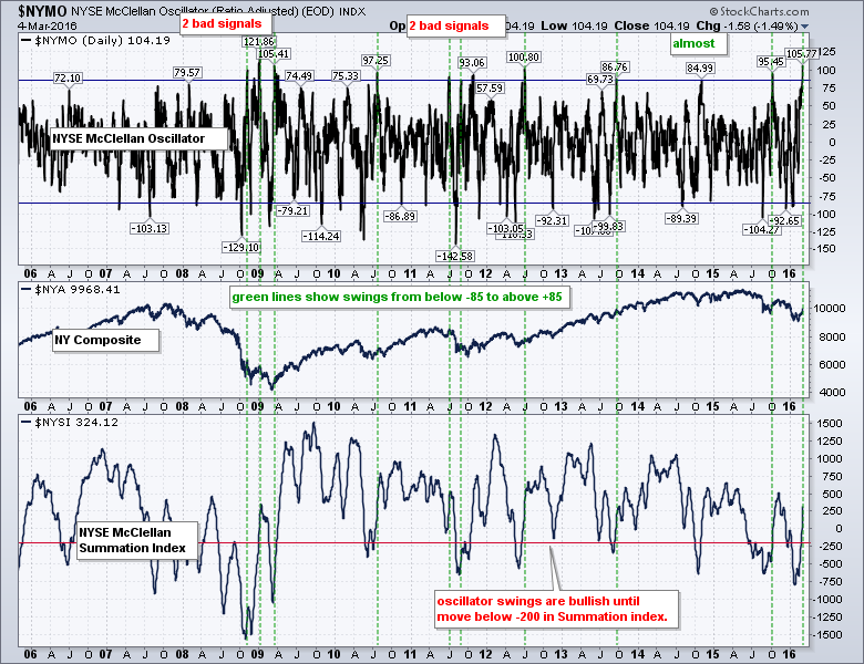 Note that I am showing the NY Composite with these NYSE breadth indicators. It does not make sense to show NYSE breadth with the S&P 500 because there are 114 Nasdaq stocks in the S&P 500, which is 22.8% of the index. The chart below shows the Nasdaq McClellan Oscillator ($NAMO) and Nasdaq McClellan Summation Index ($NASI) for reference. Those unfamiliar with these indicators can learn about them in our ChartSchool.
 ****************************************
Thanks for tuning in and have a good weekend!
--Arthur Hill CMT
Plan your Trade and Trade your Plan
*****************************************
This week did a lot to shake my resolve on the continuing bear market in the energy sector. Let's look at three charts and discuss why they are at critical levels. The OIH (US Oil Services ETF) has broken the downtrend for the first time since oil topped and started to break down. The Relative Strength closed just above the trend line on Friday. If nothing else, it indicates a change in trend for the XOP. The actual price of the XOP has now made a higher high but is still well below the trend line. The extreme volume shows a huge level of interest. We can also see the MACD gave a positive cross this week. This is easier to see by looking in the zoom box.
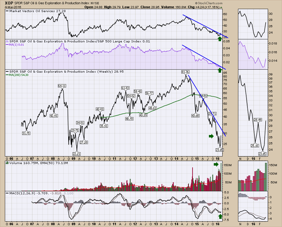
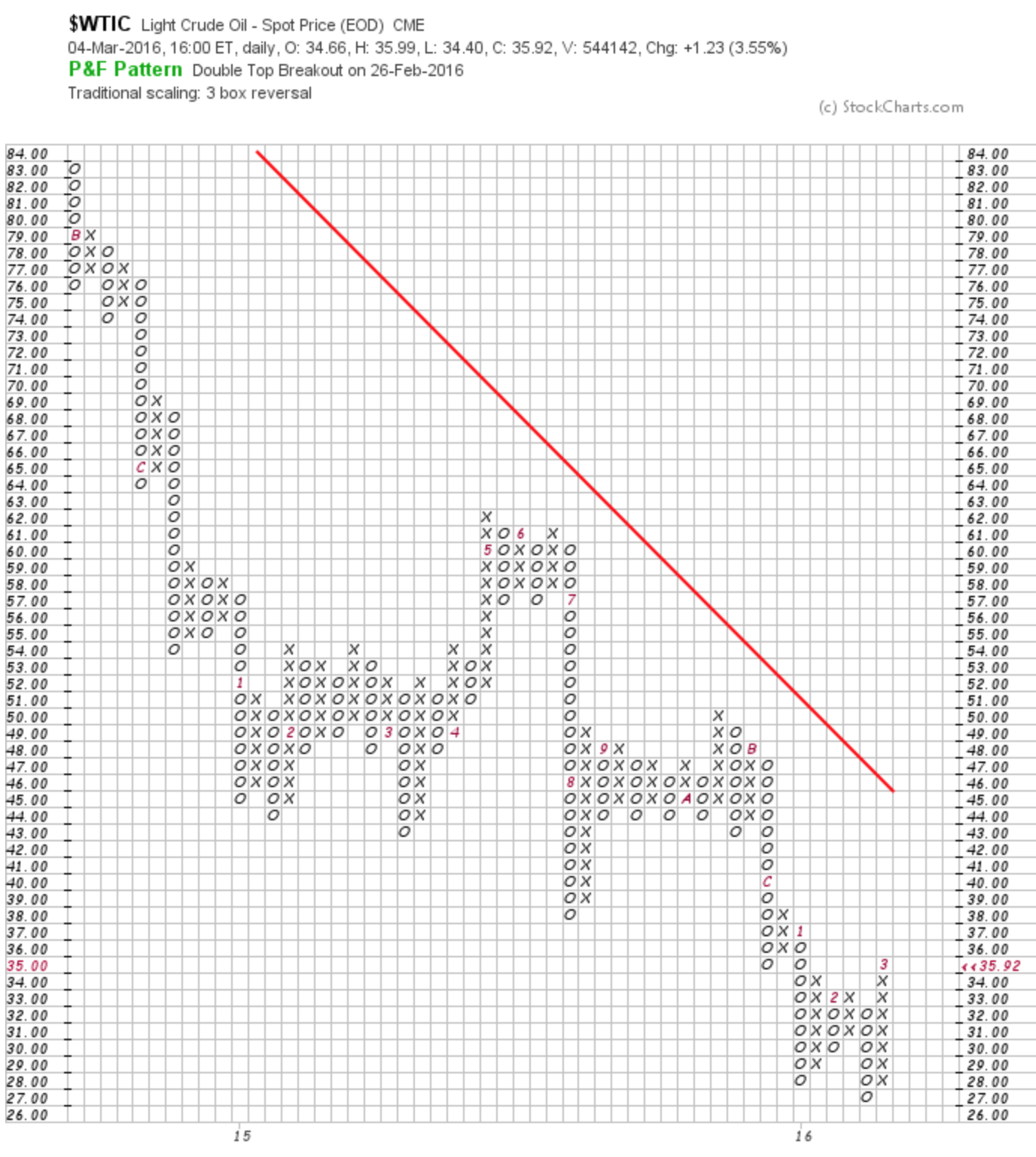
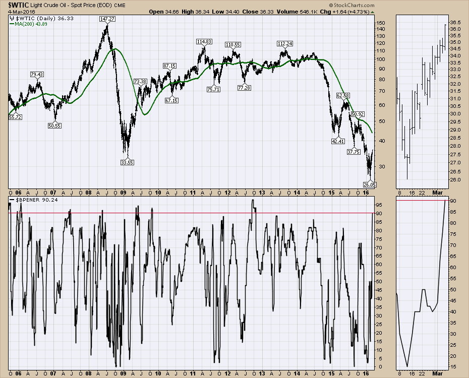
Secondly, the price of oil made a higher high. The question will be how crude traders will handle the resistance at $37-$38 level. We still don't have a higher low, so this should still be a basing pattern.
 Lastly, the Bullish Percent Index for Energy ($BPENER) broke out to the highest level since the price of oil topped. This level is extreme, which could indicate the start of a new bull market.
 The number of stocks that were starting to have high SCTR rankings is still not huge. But without question, the oil stocks should be on your radar. I did a webinar on Thursday, March 3rd, discussing how to get setup for a breakout in crude stocks. If you are looking for a method of technical analysis to buy into the oil sector, click on this link to see the webinar. Commodities Countdown 20160304.
Good trading,
Greg Schnell, CMT, MFTA.
GOLD BUGS ($HUI) SUPPORT LEVELS
by Erin Heim | DecisionPoint.com
I don't want to steal Carl's thunder as I happen to know he will be writing a follow-up article to his previous article on Gold. However, I did receive an email question to look at possible support levels on the Gold Bugs Index ($HUI). I'm going to start with the longer-term weekly chart and follow it up with daily and 10 minute bar charts.
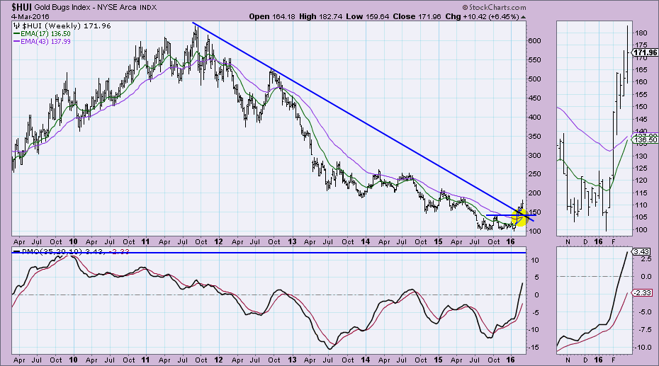
The breakout on the weekly chart for $HUI is impressive. Additionally the rising weekly Price Momentum Oscillator (PMO) has now reached readings not seen since 2011, yet it isn't overbought. The 17/43-week EMAs are preparing for a positive crossover, something also not seen since 2011. The long-term potential is enticing as we can see overhead resistance all the way up to 200 and 250. However, support levels are quite low at 140 and 100.
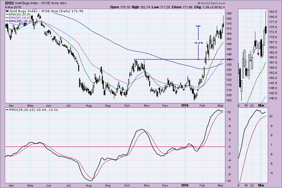
 It was pointed out to me that the candlestick tail on the daily chart is a problem. It shows that the bears wrestled control from the bulls and pulled price back even after a strong open. The PMO is very overbought but bottomed above its signal line which is generally bullish. Overbought conditions do need to be relieved and the easiest way for that to happen is a pullback. Based on the weekly chart and daily chart, we know that could be quite painful. Positives are a 50/200-EMA positive crossover that officially moved $HUI into a bull market.
 However, there are some areas of near-term support on the 10-minute bar chart. I've annotated the numerous "touches" to those lines.
 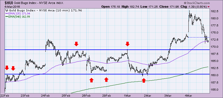 Conclusion: It isn't looking like the best short-term place to jump in as a pullback may be setting up. If you already are in, I would set stops accordingly based on your tolerance for various pullback levels. Overall, the long-term potential for Gold Bugs is high based on the the weekly PMO, breakouts and resistance levels, but it may need to correct for short-term PMO overbought conditions to clear on the daily chart.
IS NOW THE TIME TO SHORT?
by Tom Bowley | Trading Places
Yes.
Does that mean the stock market is guaranteed to roll over and play dead? Absolutely not. Trading success is not always dependent on being right, as crazy as that might sound. It's about planning your trades to minimize risk in the event your call is incorrect. Many times it "feels" good to short after the market has already fallen for several days in a row because that's when you feel most bearish. But truly the best time to short is when the market reverses in a counter trend rally for a period of time and approaches key price, gap, moving average, trendline, etc. resistance. Two weeks ago I posted an article here in this blog that suggested the rally in the NASDAQ could easily run into the 4600s, possibly even to test the declining 20 week EMA on the long-term chart above 4700. Below are two charts that show you can use a combination of short-term charts and long-term charts to identify key areas of resistance, from which to short.
Let's stick with the NASDAQ. First, I'll provide the daily chart and illustrate how the positive divergence played out to reset its MACD as it tested its 50 day SMA:
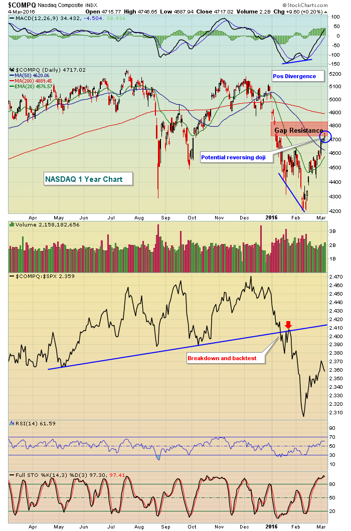 The daily MACD has stormed past centerline resistance and, on the surface, this would lead us to believe that price momentum is accelerating to the upside. Technically that is the case, but remember the MACD looks only at price, not volume. So can we truly rely on this centerline crossover without considering volume and the big picture? Volume on Friday was strong, but that occurred with a reversing candle (doji) and as we tested the bottom of gap resistance. That's only part of the problem, however. Here's the weekly chart - take a look at the close vs. the 20 week EMA that I mentioned could be tested a couple weeks ago:
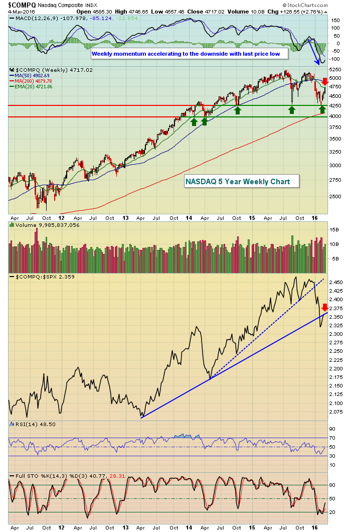 The relative strength of the NASDAQ has broken a two year uptrend line, as well as a three year uptrend line. The weekly MACD is absolutely horrid. Generally, when a weekly MACD is pointing straight down as it was when the last low printed, rebounds are contained the declining 20 period EMA. Currently, the 20 week EMA is at 4722. The NASDAQ hit 4747 intraday on Friday, but failed on the weekly close to pierce that 20 week EMA.
I'll be looking for a few signals next week to determine whether the next leg of a bear market begins.....or if the bulls resume command and look to extend the seven year bull market. On Friday, I posted a relative ratio chart to keep an eye on in my daily Trading Places blog. You can CLICK HERE to view the entire article.
Shorting seems like a high reward, low risk strategy at the current level. As always, I'd keep stops in play, however, as the best technical setups often times fail. Managing risk is critical.
Happy trading!
Tom
If the market this year has taught us one thing it's that it's as easy losing money when the market is going up as when it is going down. Consider this.
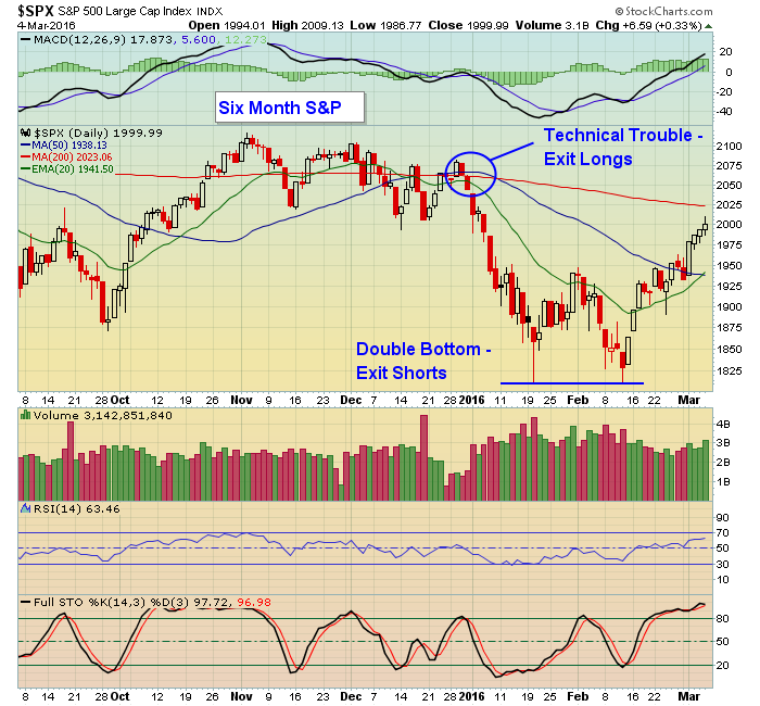
After the first trading day of the year was over, the S&P closed at 2012. This past Friday the S&P got as high as 2009 before closing just below 2000. So for a brief moment, the S&P had changed just 3 points from the first trading day of the year up until Friday.
Now, if someone had taken a long nap from December 31 up until Friday and looked at the S&P when they woke up, they would think that not much had gone on during their long sleep. Wrong! What they would not know is the S&P lost 12% from the close on December 31, 2015, to the low of 1810 on February 11, 2016, and then gained over 10% from that February 11 low toFriday's close. That's an awful lot of volatility over just a few months.
While all of this was going on the bulls learned painfully that holding stocks on the long side in a falling market can be hard on the pocket book. But then the bears who continued to hold short positions as the market climbed found their pockets had been emptied as well.
Anyone who has followed the market as long as I have knows that the masses often exit the market when the threshold of financial pain becomes unbearable. This goes for those who hold on stubbornly long when the market is falling as well as those who hold on short when the market is rising and who move to the sidelines only to watch in misery as the market reverses. By the time they are ready to jump back in it is likely after the bulk of the gains on the long or short side have already been made. Rinse and repeat.
So, what can one do?
You can start by looking closely at some tried and true technical indicators that provide critically important clues. For example, in the chart below look at what happened once the S&P closed below all key moving averages on December 31. It was straight down. So, holding on to long positions from that point and over the next three weeks would have caused undue financial pain. And those who were on the short side when the S&P hit its low of 1810 and who "felt" the market would continue lower yet held on to their positions are now left wondering how high the market might go if it clears yet another key level, the 200 day moving average, now at 2023. And with that worry comes an awful lot of worry and short covering and money down the drain.
 They say hindsight is 20/20; that it's always easier to see something after it has occurred. But if you are willing to keep an open, unbiased mind, there are always very visible clues on the charts as well as other possible strategies that can help to minimize the financial pain. Even then trading is a tricky business and one that requires discipline at all times.
For those interested, I will be joining Tom Bowley, Senior Technical Analyst at StockCharts.com during his Wednesday webinar this week where we will be discussing ways to profit on the long and short side, particularly from those companies beating or missing earnings expectations. If you are interested in attending this event just click here to register.

In the automotive industry, a car designer begins his or her career as a automotive stylist. Over time, as their knowledge and experience grows, the most talented of the bunch are offered the chance to become a car designer. It can take many years to earn that title, and few actually do. You see, style is all about how things look. Design is all about how things work...
Read More
 Unfortunately, I can only stretch the boxing/wrestling metaphor so far. But you get the idea. There is a HUGE collision about to happen in the market. It will actually be sort of fun watching it happen next week.


 Lastly, the Bullish Percent Index for Energy ($BPENER) broke out to the highest level since the price of oil topped. This level is extreme, which could indicate the start of a new bull market.


 In the automotive industry, a car designer begins his or her career as a automotive stylist. Over time, as their knowledge and experience grows, the most talented of the bunch are offered the chance to become a car designer. It can take many years to earn that title, and few actually do. You see, style is all about how things look. Design is all about how things work...