SCTR Drops for EW Consumer Discretionary // EW S&P 500 Fails to Keep Pace // S&P 500 Pulls back after Big Surge // Russell 2000 Remains a Problem Child // 2011 Redux // Watching High-Low Percent Before Flinching // Stocks Outperforming Other Assets // Retailers Cast a Dark Cloud // Friday Food for Thought /////
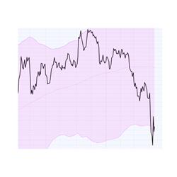
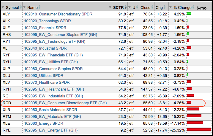
The broader market can weather weakness in the energy and materials sector, but I am not sure if it can weather weakness in the consumer discretionary sector. The EW Energy ETF (RYE) accounts for 7.85% of the EW S&P 500 ETF (RSP) and the EW Materials ETF (RTM) accounts for around 5.38%. RYE is down over 20% year-to-date and RTM is down almost 9%, but RSP has held up for the most part. The EW Consumer Discretionary ETF (RCD) accounts for 16.59% of RSP and it is down around 2.5% this year. By comparison, RSP is down around 3.2% year-to-date. The consumer discretionary sector includes housing stocks, auto manufacturers, retailers, media stocks and restaurants. In short, the sector represents discretionary spending in the US (well mostly US). A breakdown and relative weakness in this sector would cast a dark cloud on the broader market. The table below shows RCD sinking to the bottom end of the sector SCTR rankings. The SCTR is well below 50 and RCD is down over 4% in the last six months.
EW S&P 500 Fails to Keep Pace
The S&P 500 Equal-Weight Index ($SPXEW) looks quite shaky right now. In fact, the trend evidence turned bearish for the week ending August 21st and remains bearish. Before getting to the indicators, let's take a subjective look at the chart. While I try to be as objective as possible, charts are open to interpretation and this makes it a subjective exercise. The index broke below the March lows and December-January lows with the sharp decline in August. Lower lows are indicative of downtrends. There were then two bounces off the 2900-2950 area and then a break above the September high in the second half of October. A higher high is indicative of an uptrend. Concern comes into play with this week's sharp decline (currently 3.5%). Notice that the index is reversing near the 62% retracement and well below the May high (lower high). A decline back to the August-September lows would form a large head-and-shoulders reversal and a break below the September low would produce another lower low (big downtrend).

The trend indicators, which are less subjective, have been net negative since August 21st. For new readers, these indicators are explained in the paragraph below. Also note that I will publish a detailed commentary on these indicators with charts, SharpChart settings and a video on Monday. Returning to the S&P 500 EW Index, the 5-week Slope of the 52-week EMA turned positive last week, but the PPO(5,52,1) and Commodity Channel Index (CCI) remained negative. The trend evidence is bearish with two of the three remaining negative. The latter two dipped again as the index fell below 3150 this week.
In addition to some basic chart analysis, I am using three trend indicators to add an objective touch to the analysis process. They favor a downtrend when negative and an uptrend when positive. The trend bias is up when two of the three are positive and down when two of the three are negative. The first indicator is the five week Slope of the 52-week EMA, which is represented by the 5-week Slope of MACD(52,0,1). I was using a 3-week Slope, but have opted for a 5-week slope because I want to capture an entire month with the short-term EMA. MACD(52,0,1) is the 52-week EMA less Zero, which is just the 52-week EMA. Adding the Slope indicator simply measures the slope of the 52-week EMA. It is an indicator hack that is shown in the image below. The PPO(5,52,1) is positive when the 5-week EMA is above the 52-week EMA and negative otherwise. The 52-week CCI is positive or negative. The image below shows the SharpChart settings. Keep in mind that you can click any chart in this commentary to open it, see the settings and save it to a ChartList.

S&P 500 Pulls back after Big Surge
After surging around 10% in six weeks, the S&P 500 fell around 3.2% so far this week. It is indeed a sharp decline worthy of many media superlatives, but the index is entitled to a pullback after such a sharp advance. Three other sharp pullbacks are noted on the chart. The first two retraced 50-62% of the prior surge and the third retraced 38-50%. A 50-62% retracement of the Sep-Oct surge would carry the index back to the 1970-2000 area. Overall, I still think the trend is up for the large-cap dominated S&P 500 and my best guess for a bounce would be in the 2000 area.

The three trend indicators are still bullish (based on last week's close). We have to wait for today's close to see if the CCI ends below zero. By changing the 3-period Slope to the 5-period Slope, the trend signals moved forward a week because an increase in the parameter increases the lag. CCI(52) turned positive on October 23rd, but the other two did not follow until October 30th. Trend indicators lag and turn AFTER the actual trend reverses.
Russell 2000 Remains a Problem Child
The trend indicators turned net bearish on August 21st for the Russell 2000 and all three remain negative. The index was showing some lift with a breakout last week, but gave it all back with a sharp decline this week. Elsewhere, the trend indicators for the S&P MidCap 400 turned net bearish on August 28th and all three remain negative. All three trend indicators for the Nasdaq 100 turned positive on October 9th and remain positive. Thus, we have a clear split in the market as a whole. The S&P 500 and Nasdaq 100 are net bullish (large-caps), while the S&P 500 EW Index, S&P MidCap 400 and S&P Small-Cap 600 are net bearish (small and mid-caps). Even though the January effect is on the doorstep, large-caps are still the place to be and small-caps still show relative weakness on the weekly charts.

2011 Redux
Everybody's favorite analog seems to be from 2011 so let's take a look at this volatile year. The S&P 500 broke down in July-August, firmed in the 1100-1125 area with a very choppy range and then broke out in October with a 20% surge from low to high. The index then stalled for two weeks and then moved below the breakout with a sharp two week decline. This failed breakout was enough to scare the bulls, trigger stops, turn the trend indicators bearish, and mark the low. Yes, the low came right at the darkest moment. Funny how that happens (NOT). It is, however, all part of the game. The index reversed right at the 62% retracement and the trend indicators turned bullish four weeks later (in mid December). Keep this pattern in mind in the coming weeks.

Watching High-Low Percent Before Flinching
At what point to we start thinking that this week's pullback is something more? I am watching the High-Low Percent indicators for the four major stock indices: $SPX, $MID, $SML and $NDX. High-Low Percent is the number of new highs less the number of new lows divided by total issues. I will at least flinch if High-Low Percent dips below -5% for three of the four. The chart below shows these indicators with four signals in four months (1 in July, 2 in August and 1 in October). These signals do not usually trigger this often, but recent volatility has created more signals. The indicator turned bullish on October 12th when High-Low Percent for the S&P 500, S&P Small-Cap 600 and Nasdaq 100 exceeded +5%. We are seeing weakness in small-caps and mid-caps now because S&P 400 HiLo% ($MIDHLP) hit -5% and S&P 600 HiLo% ($SMLHLP) hit -4.83% on Wednesday. This indicator will turn bearish when three of the four break below -5%.

Stocks Outperforming Other Assets
The performance for US stocks is quite good when we compare the S&P 500 to other assets. The chart below shows the S&P 500 relative to the 10-yr Treasury Note ($UST), the CRB Index ($CRB), Spot Gold ($GOLD), the MS World ex-USA Index ($MSWORLD) and the DJ REIT Index ($DJR). Stocks outperformed bonds until 2014 and relative performance flattened in 2015, but he S&P 500 has outperformed since late August. The S&P 500 has steadily outperformed the CRB Index and gold since mid 2014. After a dip in the first four months of the year, the S&P 500 started outperforming the MS World ex-USA Index again and the price relative hit a new high. Relative to REITs, the relative performance in the S&P 500 has been up and down since 2014.

Retailers Cast a Dark Cloud
Even though stocks are still the preferred asset class, not all stocks are created equal and there are still quite a few no-go areas. These include energy, materials, steel, aluminum, mining, precious metals, railroads, cyber-security and retailers. Relative and absolute weakness in the Retail SPDR (XRT) is a concern because this ETF simply fell apart this week. It is not a big surprise, but XRT broke down with the broader market in August and never recovered in October. Notice that the three trend indicators turned negative at the end of August and did not even come close to turning positive again. On the price chart, XRT formed a triangle and broke triangle support with a massive decline this week. This is concerning because retail spending accounts for some 2/3 of GDP and a break down now bodes ill for the holiday season. There are only two positives here. The decline means a lot of the bad news is already priced into the ETF. A bad holiday season for retailers means big discounts for consumers.


Weakness in retailers is also affecting the EW Consumer Discretionary ETF (RCD), which reversed below its summer highs. As its name suggests, stocks in this sector are the most economically sensitive and a break down in RCD would be negative for the broader market. Weakness in this sector is probably why small-caps are underperforming because they are more domestically focused. Two of the three trend indicators for RCD are still positive. CCI(52) is negative and chartists should watch the PPO(5,52,1) in the coming weeks. Note that the August dip in CCI is skewed because of the August 24th spike low near 70. CCI uses the typical price [(H+L+C)/3] in its calculation and this ridiculous low skewed the typical price for that week. There will be more details in Monday's overview of the long-term trend indicators.
Friday Food for Thought
How hard is it to buy a barrel of crude and store it for future delivery? Hint: your garage would probably not be sufficient. This is part of the reason we see contango in the oil market.
Oxford Capital Strategies puts a gap trading strategy through the paces and it gets a rare "B" grade.
Self-driving cars may not be quite as we imagined. In fact, they may not even have wheels.
This is an oldie, but a goodie. Nick Radge, The Chartist, speaks to the Australian Technical Analysis Association on What it Takes to be a Successful Trader.
Feel free to leave comments or suggestions in the comments box below.
****************************************
Thanks for tuning in and have a good day!
--Arthur Hill CMT
Plan your Trade and Trade your Plan
*****************************************