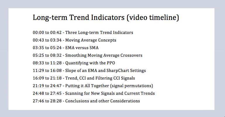
Introduction // Moving Averages and Trend // Creating a Smooth Operator // Slope of an EMA // Commodity Channel Index // Putting it All Together // Conclusions // Scan Code ////
Introduction
Trend is a very important aspect of technical analysis and investing. It is often pretty easy to identify the current trend, but it is much harder to identify trend reversals, especially meaningful reversals. There is no such thing as the perfect indicator or the ideal settings, but this article will profile a trend strategy using three indicators on the weekly charts. By default, weekly data filters out the day-to-day fluctuations and offers more perspective. The three trend indicators are the Percentage Price Oscillator (PPO), the Slope of an Exponential Moving Average and the Commodity Channel Index (CCI). Indicators are important for trend analysis because they add objectivity to the analysis process and they can be used in scans for a systematic approach. Before getting too excited about catching big trends, note that the success of a trend strategy depends on the persistence of the trend. A trend strategy will not be profitable if trends do not extend.
Moving Averages and Trend
Before diving into the indicators, let's review moving averages and how they work. Moving averages smooth price fluctuations by averaging price data for a certain period of time. A 52-week moving average, for example, condenses 52 price points into one average price point. A new price point is added each week and the oldest price point is dropped.
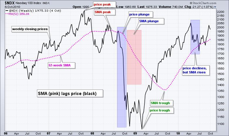
Moving averages are trend following indicators that lag price. This means they will turn down after prices have turned down and turn up after prices have turned up. The longer a moving average is, the more lag it will have. A 52-week moving average has 52 data points that extend back one year. This average, therefore, reflects past price action and inherently lags current price action.
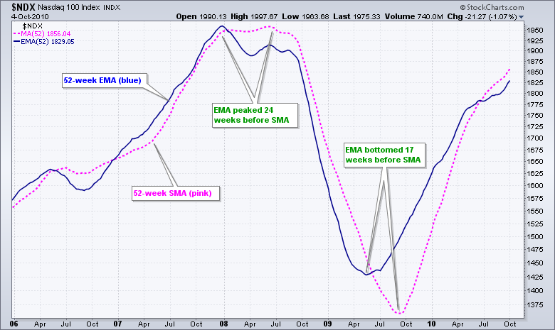
A moving average is a simple average of prices and each price input is weighted equally. Without going into the calculation details, an exponential moving average puts more weight to recent prices and has less lag than a simple moving average. EMAs, however, still have a lag factor.
There are many ways to use moving averages. First, chartists can compare the current price to a moving average. The trend is up when prices are above the moving average and down when below. Second, chartists can use two moving averages to create a crossover system. The trend is up when the shorter moving average moves above the longer and down otherwise. Third, chartists can measure the direction of a moving average. The trend is up as long as the moving average rises and down as long as the moving average falls.
Creating a Smooth Operator
The goal of a trend strategy is to capture the trend and filter out the noise. A basic moving average strategy identifies an uptrend when price closes above the moving average and a downtrend when price closes below the moving average. It sounds simple enough, but even weekly price data can be noisy with deep dips, sudden recoveries, failed surges and general volatility. Thus, even a strategy using weekly closes will be subject to whipsaws (bad signals).
There is no such thing as the perfect system, but chartists can reduce whipsaws by using a short moving average to smooth week-to-week volatility and maintain sensitivity. As always, there is a trade off. More sensitivity translates into early signals and more whipsaws. Less sensitivity translates into more lag and fewer whipsaws. Sorry, we cannot have our cake and eat it too.
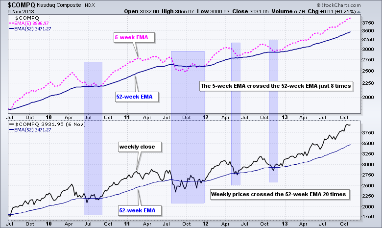
Instead of using closing prices and the 52-week EMA, I have opted to use the 5-week EMA and 52-week EMA for a crossover strategy. The trend is considered up when the 5-week EMA moves above the 52-week EMA and down when the 5-week EMA moves below the 52-week EMA. It may not be the "perfect" pairing, but I am not looking for the perfect pairing because there is no such thing as the perfect pairing (except maybe peas and carrots).
I like this pairing because 5 weeks is a little over a month and 52-weeks is a year. This EMA pairing will look great on some charts, but lousy on other charts. Truth be told, tweaking the settings will not make that much of a difference. The success of a trend strategy depends on trend persistence more than the settings. We are simply betting that there will be a few good trends and the money made from these trends will be more than the losses from the whipsaws.
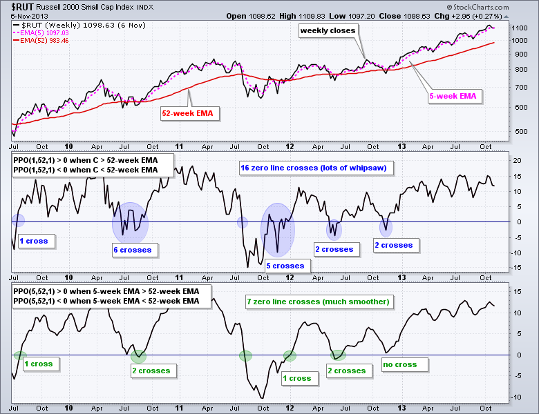
Chartists can use PPO(5,52,1) to capture the relationship between the 5-week EMA and the 52-week EMA. This indicator is positive when the 5-period EMA is above the 52-period EMA and negative otherwise. As the Russell 2000 example shows, the PPO(5,52,1) crossed the zero line 7 times from July 2009 until October 2013. This means the 5-week EMA crossed the 52-week EMA 7 time. Conversely, the PPO(1,52,1) crossed the zero line 16 times during this same timeframe. This means the weekly close crossed the 52-week EMA 16 times. This is a good example of how the 5-week EMA can reduce the number of signals and maintain sensitivity.
Slope of an EMA
The direction of the moving average can also be used to measure trend. The trend is considered down when the moving average is falling and up when the moving average is rising. This makes sense because the trend must be up when the average price is increasing and down when the average price is decreasing.
Chartists can hack the MACD settings in SharpCharts to produce the slope of an exponential moving average. MACD is the difference between two EMAs. MACD (12,26,9) is the 12-period EMA less the 26-period EMA. The "9" is for the signal line, which is a 9-period EMA of MACD. Setting MACD to (52,0,1) is the 52-week EMA minus zero, which is just the 52-week EMA. We then set the signal line to 1 to hide it. A 1-period EMA of MACD is just MACD so we will not see the signal line.
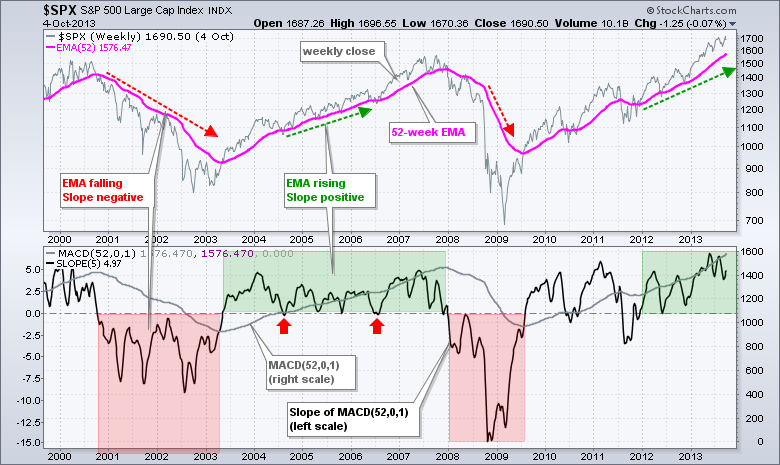
Once MACD (52,0,1) is set, chartists can use the advanced indicator options and add the Slope indicator. I chose a 5-week Slope because this represents a little over a month. It is sensitive enough to highlight directional changes, and stable enough to limit whipsaws. The EMA is pointing down when the slope is negative and pointing up when the slope is positive.
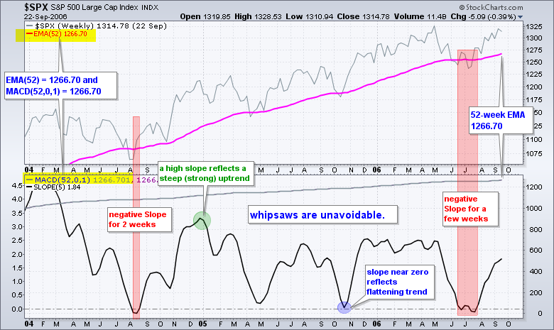
The example shows the S&P 500 weekly chart in the top window with the 52-week EMA in pink. The indicator window shows MACD(52,0,1) in gray and this line is just the 52-week EMA. The black line is the 5-period Slope of MACD(52,0,1). A move below the zero line means the 52-week EMA turned down over the last five weeks, and a move above zero means the 52-week EMA turned up. The scale for the Slope indicator is on the left and the scale for MACD is on the right. The red areas mark the last two bear markets, while the green areas mark extended uptrends. Note, however, that the Slope did turn negative for a few weeks in July 2004 and the June-July 2006 (red arrows).
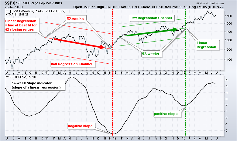
For purists, the slope indicator is actually measuring the slope of a 5-period linear regression of the 52-week EMA. I cannot draw a linear regression on a moving average, but I can draw it on closing prices using the Raff Regression Channel. This may help illustrate exactly what the slope is measuring. The middle line is a linear regression and the slope indicator is measuring the slope of this line. A linear regression is the "line of best fit" for a series of data points.
The steepness of the slope is reflected on the left scale. A higher slope value reflects a steeper and stronger uptrend. Slope readings near the zero line reflect a relatively flat trend. Deeply negative slope values reflect a steep and strong downtrend. Personally, I am not too interested in the steepness of the uptrend or downtrend. Instead, I just want to know the overall direction: up or down.
Commodity Channel Index
The Commodity Channel Index (CCI) is not thought of as a trend indicator because it is an oscillator with overbought and oversold levels (+100 and -100). A peek into the formula, however, reveals trend following elements that make it quite good as a trend indicator.
CCI(52) = (Typical Price - 52-period MA of Typical Price) / (.015 x Mean Deviation)
I chose 52-weeks for the CCI parameters to remain consistent with the other two indicators, which are also based on 52-weeks. The typical price is the sum of the high plus the low plus the close divided by three, which means CCI accounts for three price points. This means a spike low, such as that seen in many ETFs on 24-August-15, will result in a lower typical price because and negatively affect the CCI values.
From the formula, we can see that positive or negative values depend on the numerator, and only the numerator. CCI will be positive when the typical price is greater than the 52-week SMA of the typical price and negative otherwise. Simply using the zero line for CCI signals makes this a trend indicator. The trend is up when CCI is positive and down when CCI is negative.
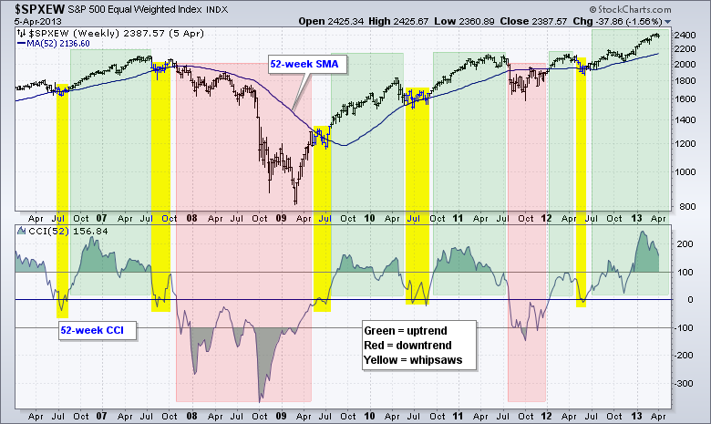
The chart above shows the S&P 500 Equal-Weight Index ($SPXEW) with the 52-week SMA and the 52-week Commodity Channel Index. The crosses above and below the zero line correspond pretty well with the moving average crossovers on the price chart. This makes sense because both are trend indicators and both moving averages are based on 52-weeks. CCI is based on the 52-week moving average of the typical price and the 52-week SMA is based on the close.
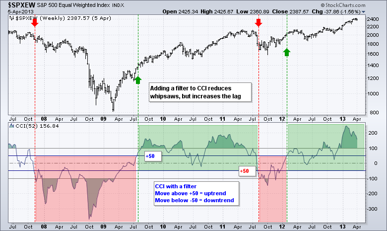
As the yellow areas highlight, there will be whipsaws or zero line crossovers that do not last long. This example shows CCI crossing the zero line around 20 times in seven years. Whipsaws are unavoidable, no matter what timeframe you choose. Chartists can consider adding another filter to reduce whipsaws, but this will add some lag and reduce the number of signals. For example, chartists could require a move above +50 for a bullish signal and a move below -50% for a bearish signal. Note that a bullish signal remains in force until countered with a bearish signal, and vice versa. Adding this filter reduced the number of trend signals to just 4, but these signals lagged a little more because of the filter.
Putting it All Together
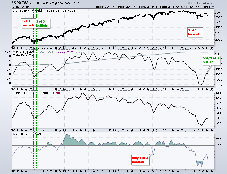
There is a certain redundancy in these indicators because they are all trend indicators. In statistics, this is known as multicollinearity, which means the indicators are highly correlated. These indicators will all be positive during strong uptrends and negative during strong downtrends. Small differences appear during transitional periods and using indicator combinations can help reduce whipsaws.
There are at least eight permutations possible to generate trend signals with these indicators:
Uptrend Signals
- 2 of 3 turn Positive (most sensitive)
- 3 of 3 turn Positive
- 2 of 3 cross above Bullish Threshold
- 3 of 3 cross above Bullish Threshold (most lag)
Downtrend Signals
- 2 of 3 turn Negative (most sensitive)
- 3 of 3 turn Negative
- 2 of 3 cross below Bearish Threshold
- 3 of 3 cross below Bearish Threshold (most lag)
The most sensitive of these combinations would be requiring two of the three to be positive or negative. This is perhaps the simplest and most straight forward, but it will be prone to whipsaws and false signals. Chartists could decrease sensitivity somewhat by requiring all three to be positive or negative. This will increase lag because the signals will come a little later.
Chartists looking to reduce whipsaws even more, and add more lag to the signals, can add bullish and bearish thresholds (filters). I showed an example with the CCI thresholds. Chartists could add another filter by requiring the PPO to exceed +1% for a bullish signals and -1% for bearish signals. A similar tactic could be applied to the slope of MACD(52,0,1).
Conclusions
This is a simple trend identification strategy based on three variations of a moving average crossover strategy. Signals in the PPO(5,52,1) are based on crosses of the 5-week and 52-week EMAs. The Slope of MACD(52,0,1) looks for the 5-week Slope of the 52-week EMA to turn up or down. Signals in CCI(52) are based on crosses of the typical price and the 52-week SMA of the typical price. Of these three, CCI has perhaps the least smoothing and could warrant a signal filter.
We can spend an eternity adjusting the settings and looking for the perfect filter and combination. Chartists should, however, be very careful with curve fitting because what works in the past does not always work in the future. It is best to base one's settings on a logical timeframe and stick with these settings. After all, indicators just indicate. We must also study the chart to determine the trend and confirm what we are seeing in the indicators.
Trend identification is only part of an overall strategy for trading or investing. Among other things, we also need to consider overall market conditions, relative performance, the exit strategy and position sizing. And finally, even though I used the major stock indices in my examples, the strategy can be applied to stocks and ETFs as well.
Feel free to send comments or suggestions using the form below.
Scan Code
Chartists can write scans on weekly data by preceding the indicator name with the term "weekly" (sans quotations). Scanning for Percentage Price Oscillator (PPO) and Commodity Channel Index (CCI) signals is straight forward, but we need to be inventive to scan for the Slope of MACD(52,0,1). Note that the scan engine ignores text after the two forward slashes // and these are used to add descriptions. The first scan looks for new uptrends emerging by using the crossover function (x). The PPO crossed above zero and CCI crossed above zero. For the Slope of the EMA, I am looking 52-week EMA to be greater than the 52-week EMA five week's ago (EMA rising) and for the prior week's 52-week EMA to be less than the 52-week EMA six week's ago (EMA falling). This will reflect a change in the direction of the EMA.
[group is SP500] or [group is SP600] or [group is SP400] or [group is NASDAQ100] and
[ [ [weekly PPO Line(5,52,0) x 0] and // PPO crosses above zero
[weekly CCI(52) x 0] ] or // CCI crosses above zero
[ [weekly PPO Line(5,52,0) x 0] and // PPO crosses above zero
[weekly EMA(52,close) > 5 weeks ago weekly EMA(52,close)] and // current slope positive
[1 weeks ago weekly EMA(52,close) < 6 weeks ago weekly EMA(52,close)] ] or // prior slope negative
[ [weekly CCI(52) x 0] and // CCI crosses above zero
[weekly EMA(52,close) > 5 weeks ago weekly EMA(52,close)] and // current slope positive
[1 weeks ago weekly EMA(52,close) < 6 weeks ago weekly EMA(52,close)] ] ] // prior slope negative
The second example looks for two of the three trend indicators to be positive. Notice that there are three possibilities for an uptrend. PPO and CCI are positive. PPO and Slope are positive. CCI and Slope are positive.
[group is SP500] or [group is SP600] or [group is SP400] or [group is NASDAQ100] and
[ [ [weekly PPO Line(5,52,0) > 0] and // PPO is positive
[weekly CCI(52) > 0] ] or // CCI is positive
[ [weekly PPO Line(5,52,0) > 0] and // CCI is positive
[weekly EMA(52,close) > 5 weeks ago weekly EMA(52,close)] ] or // Slope is positive
[ [weekly CCI(52) > 0] and // CCI is positive
[weekly EMA(52,close) > 5 weeks ago weekly EMA(52,close)] ] ] // Slope is positive
***************************************
Thanks for tuning in and have a good day!
--Arthur Hill CMT
Plan your Trade and Trade your Plan
*****************************************


