Holding Patterns for QQQ and SPY // XLY and XLK Remain the Leaders // Utilities Hit Make-or-break Level // 10-yr Yield is on the Verge // How Will Rising Yields Affect Other Groups? // Media Stocks Get Pummeled // Housing Stocks Still Trending Lower ////
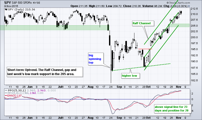
Holding Patterns for QQQ and SPY
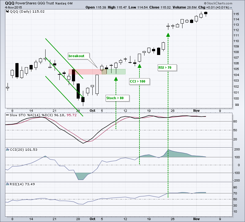
Keep in mind that overbought is long-term bullish and short-term neutral. I am guilty of using the terms overbought and oversold, but chartists should realize that overbought and oversold are difficult to quantify. What exactly is overbought? RSI above 70? Stochastic Oscillator above 80? CCI above 100? Looking at QQQ, the Stochastic Oscillator exceeded 80 on October 8th, the Commodity Channel Index (CCI) exceeded 100 on October 15th and RSI exceeded 70 on October 23rd. In addition, QQQ could have been considered overbought on October 15th after an 8% surge off the late September low. Despite these overbought conditions, the ETF just became more overbought because selling pressure never materialized. QQQ will eventually pull back and justify these overbought readings, but the short-term up trend overrides overbought readings because it is possible to become even more overbought.
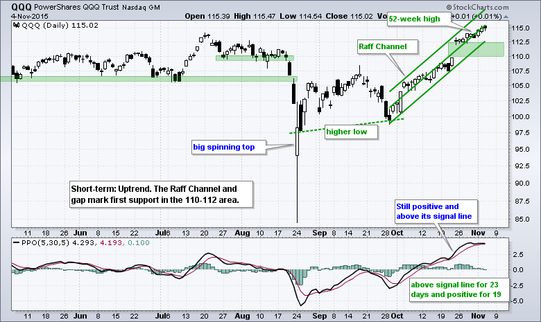
I am using Raff Regression Channels and the late October gaps to mark support zones that may hold during a short-term pullback. With the bigger trends up, short-term pullbacks are viewed as opportunities, not threats. QQQ support is set in the 110-112 area and SPY support is set in the 205 area.
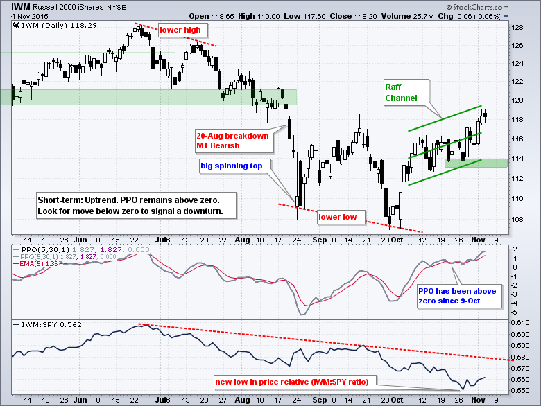
IWM is starting to show some relative strength because the price relative (IWM:SPY ratio) moved higher the last six days. It is still not enough to reverse the bigger downtrend in relative performance and much more is needed for IWM to start leading. The short-term trend is up and I am using a Raff Regression Channel to define this advance. The lower line and the late October lows combine to mark support in the 113-114 area. The PPO (5,30,1) turned positive on October 9th and remains positive to affirm the short-term uptrend. A positive PPO means the shorter EMA (5-day) is above the longer EMA (30-day).
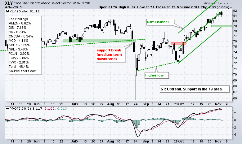
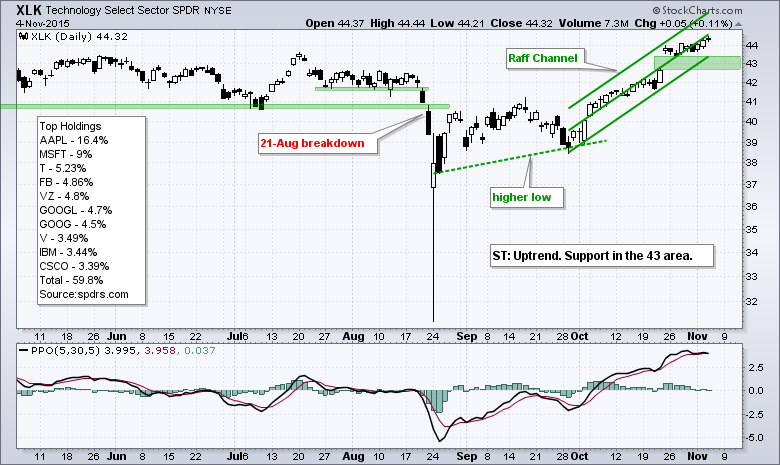
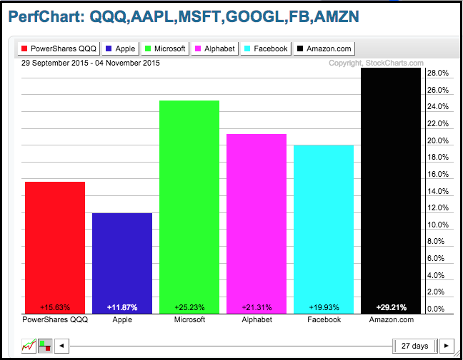
XLY and XLK Remain the Leaders
The Consumer Discretionary SPDR (XLY) and the Technology SPDR (XLK) are by far the two strongest sector SPDRs. In fact, they are the only two to hit new highs this week. This means large-cap technology and large-cap consumer discretionary are the big drivers of this advance. Note that Amazon (AMZN), Microsoft (MSFT), Facebook (FB) and Alphabet (GOOGL) hit new highs recently. This means XLK and QQQ hit new highs without Apple, which is severely lagging the other four. Elsewhere in tech land, the Internet ETF (FDN) hit another new high and continues to lead. The Software iShares (IGV) hit a new high and the Cloud Computing ETF (SKYY) is close to a new high. Upside leadership may change going forward, but trend-followers using a momentum strategy would still be long these groups. On the charts below, I am using Raff Regression Channels to define the five week advance and mark first supports for XLY and XLK.
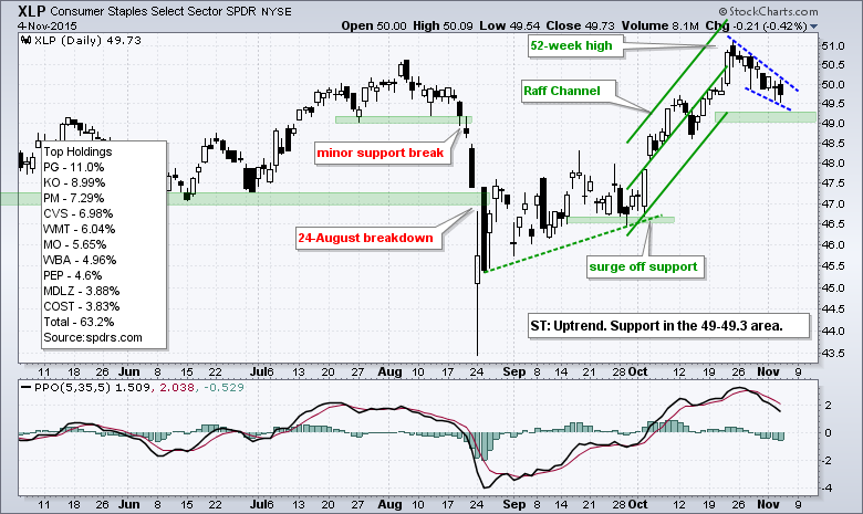
Utilities Hit Make-or-break Level
The Consumer Staples SPDR (XLP) and the Utilities SPDR (XLU) were leading the broader market in mid October, but came under selling pressure the last two weeks. Weakness in these two could be because of a stronger appetite for risk in the broader market and a sharp upturn in Treasury yields. These two sectors are typically defensive sectors that hold up well during periods of market turmoil. XLP hit a 52-week high in late October and pulled back with a falling wedge the last two weeks. The Raff Regression Channel marks support in the 49-49.2 area and a break here would reverse the short-term uptrend.
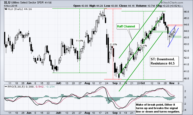
The swings in XLU over the last few months are quite amazing. The ETF surged 11.8% in July-August, fell 11.6% from mid August to early September and then surged 12.6% with above 45 in October. This is not your grandfather's utility index. It looks like XLU reversed the Sep-Oct upswing with a break below the lower line of the Raff Regression Channel and then formed a rising wedge the last five days. Another break below 43.5 would be bearish. The indicator window shows the PPO (5,30,5) at a make-or-break level. Either it turns up and breaks its signal line to stay bullish or it turns down and breaks into negative territory to turn bearish.
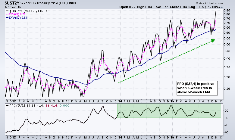
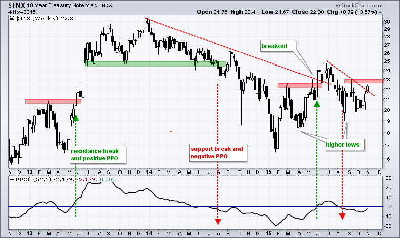
10-yr Yield is on the Verge
There is clearly something afoot in the bond market because the 2-year Treasury Yield ($UST2Y) surged to a new high over the last two weeks. It looked like the trend was turning down in early-mid October as the yield broke the August lows, but this was clearly just noise. The weekly chart shows the 5-week EMA moving above the 52-week EMA in December 2013 and holding above for almost two years now. Nothing but uptrend here.
I think we should also entertain the idea that long-term rates are moving higher. The 10-YR Treasury Yield ($TNX) has yet to fully reverse the downtrend from July to September, but it is getting close. A break above 23 (2.3%) and a move above zero in the PPO(5,52,1) would signal the start of a long-term uptrend. Remember, a positive turn in the PPO would means the 5-week EMA moved above the 52-week EMA. The red and green lines show prior reversals. Also notice that the 10-YR Treasury Yield ($TNX) formed higher lows in April and in August. A breakout at 23 would target a move to at least 30 (3%).
How Might Rising Yields Affect Other Groups?
Chartists can use the Correlation Coefficient to understand the relationship between Treasury yields and certain groups, such as banks, utilities and REITs. The chart below shows the 10-year Treasury Yield ($UST10Y) in the main window and seven correlations in the indicator windows. I am using weekly data, a 13-week Correlation Coefficient and a 26-week EMA for further smoothing. This extra smoothing is because I am simply trying to determine the general tendency. This is clearly not a trading vehicle, but rather an observation to be considered along with the price chart of each ETF. A positive correlation means the group tends to rise when the 10-yr yield rises. A negative correlation means the group tends to fall when the 10-yr Yield rises.
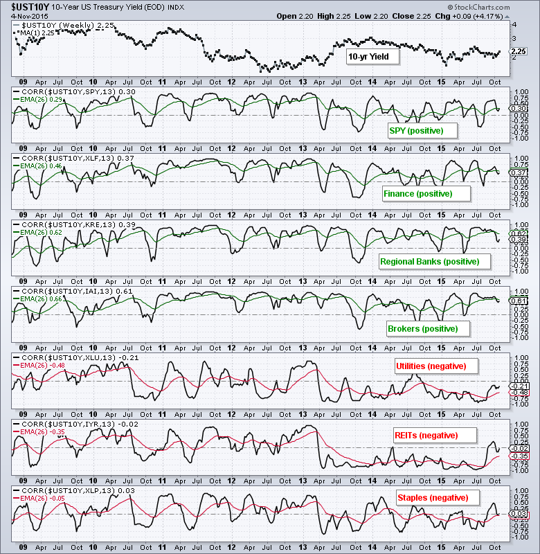
As the chart shows, the S&P 500 SPDR (SPY), Finance SPDR (XLF), Regional Bank SPDR (KRE) and Broker-Dealer iShares (IAI) are positively correlated to the 10-yr yield and the positive correlation is quite stable over the last six years. This means they tend to rise when the 10-yr Yield rises and fall when the 10-yr yield falls. An uptrend in the 10-yr Yield, therefore, would be positive for the broader market, banks and brokers. On the other side, utilities, REITs and consumer staples are negatively correlated with the 10-yr Yield. This means they tend to rise when the 10-yr yield falls and fall when the 10-yr yield rises. The correlation is not as stable because it was mostly positive from 2009 to 2012 and then turned negative in 2013. As the correlations now stand, a rising rate environment would be negative for utilities, REITs and consumer staples. I went through this same correlation exercise with the Dollar, Gold, Oil and other assets last week.
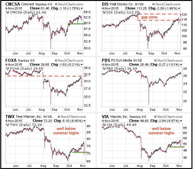
Media Stocks Get Pummeled
Media stocks took a tumble on Wednesday after Time Warner lower future guidance. I am not one to trade or react to earnings, but there may be a bigger story a work because the group was hit with selling pressure. In other words, the decline in Time Warner was not an isolated event. Also note that this is the second time media stocks have been hit hard in the last three months. The first hit occurred in early August when Disney led a broad decline by plunging 9%. Disney slashed its outlook for its cable business in early August and this reverberated throughout the group. The image below shows five media leaders and the Media ETF (PBS). Notice that DIS hit resistance in the August gap and FOXA hit resistance near broken support. TWX and VIA were hit the hardest this summer and both remain well below their prior highs (relative weakness).
Housing Stocks Still Trending Lower
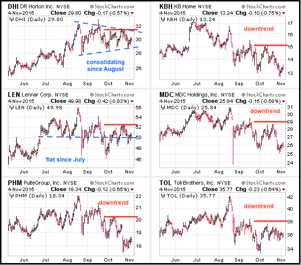
The Home Construction iShares (ITB) remains one of the big holdouts during the five week stock market surge and this is reflected in some of the top stocks. The CandleGlance chart below shows six stocks and four are in clear downtrends. The other two, DHI and LEN, are flat. Actually, LEN is in more of a downtrend than a sideways trend. The thick red lines mark resistance from the October highs and breakouts are needed to reverse these downtrends. DHI is holding up the best because of the triangle consolidation and a break of the October highs would revive the uptrend.
****************************************
Thanks for tuning in and have a good day!
--Arthur Hill CMT
Plan your Trade and Trade your Plan
*****************************************