The State of Stocks 2015 // Performance Metrics // $NDX has the Most Leaders // Choppy Upward Bias for SPX // Mid-caps Break Down into Thirds // Internal Divisions Weigh on Small-caps // A Sector, Industry Group and Stock Pickers Market // Friday Food for Thought ////
The State of Stocks in 2015
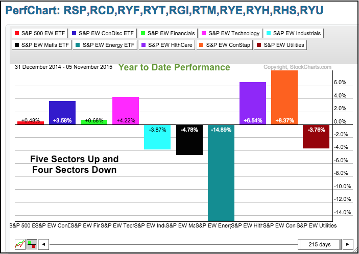
Today I am breaking down the big four stock indices to gauge the state of stocks within the stock market. These indices include the S&P 500, S&P MidCap 400, S&P Small-Cap 600 and Nasdaq 100. I will then put together the three S&P indices and look at the market overall (S&P 1500). Stocks in the Nasdaq 100 are the strongest as a whole and stocks in the S&P Small-Cap 600 are the weakest. We are also seeing a bifurcated market because a high percentage of stocks are still down year-to-date. The majority of stocks, however, are up and this supports an uptrend in the major indices. Nevertheless, we need to keep in mind that it is a market of stocks, not just a stock market. There are pockets of strength, pockets of weakness and pockets of ambiguity. Our job as traders and investors is to avoid the pockets of weakness and focus on the pockets of strength. As you can see from the PerfChart below, five sectors are up and four are down year-to-date.
Performance Metrics and Methodology
I ran some scans here at StockCharts to measure internal performance within four stock indices. The scan results were downloaded into a CSV format and I then crunched the numbers in Excel. The results are based on dividend-adjusted data, which means the dividends were added back to price and we are looking at total returns. Note that StockCharts data is dividend adjusted by default. Chartist can view unadjusted data by preceding the symbol with an underscore (_MSFT). I will detail the mechanics of the methodology more in today's video.
First up I am looking at the percentage of stocks that are up year-to-date and the percentage that are down. I then broke down the gains and losses into nine different categories (up greater than 30%, up 20 to 30%, up 10 to 20% and so on). These tables include the average return and the median return based on year-to-date data.
I also ran some scans to measure the percentage of stocks that are in short-term, medium-term and long-term uptrends. Of course, I used the Percentage Price Oscillator (PPO) for these with the PPO (5,30,1) defining the short-term trend, the PPO (10,60,1) defining the medium-term trend and the PPO (20,120,1) defining the long-term trend. The PPO is positive when the shorter EMA is above the longer EMA and negative otherwise. For example, the PPO (20,120,1) is positive when the 20-day EMA is above the 120-day EMA.
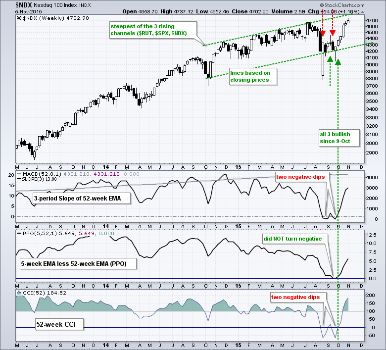
Nasdaq 100 has the Most Leaders
The table below summarizes the results for the Nasdaq 100 since January 1st. Notice that 42% of the stocks in the index are up 10% or more year-to-date. In contrast, 28% are down 10% or more. I think this is the most telling statistic for the major indices. Stocks up 10% or more show healthy gains, while stocks down 10% or more sport sizable losses. Netflix and Amazon are up more than 100% and are the biggest gainers. Micron and Keurig Green Mountain are the biggest losers and they are down just over 50%.
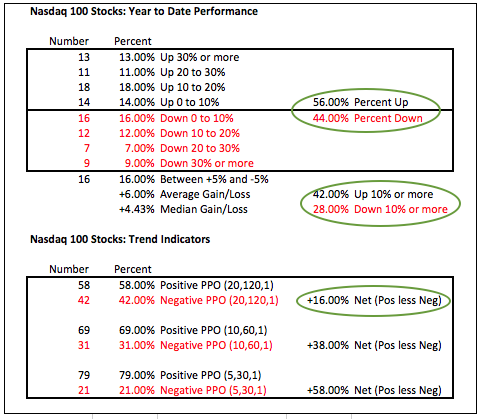
The average gain for all stocks is +6% and the median gain is +4.43%. Overall, these numbers indicate that more than just a handful of stocks are powering the Nasdaq 100 this year. Elsewhere, the trend indicators are all positive with 58% of stocks in a long-term uptrend, 69% in a medium-term uptrend and 79% in a short-term uptrend.
On the weekly chart, all three trend indicators for the Nasdaq 100 turned bullish on October 9th and remain bullish. The index also hit a new high this week and remains in a clear uptrend. We can argue about overbought conditions and pockets of weakness, but there is really no debate on the current trend. It is up. NDX is the strongest of the major indices and this is still the place to look for individual stock setups. It is also the place to be for a momentum strategy based on a portfolio of strong stocks.
Choppy Upward Bias for S&P 500
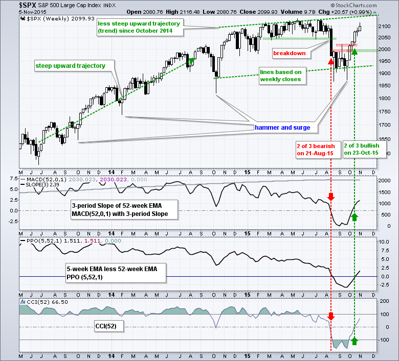
Trading gets more difficult when we broaden out to the S&P 500. Around 52% of SPX stocks are up year-to-date and 48% are down. Yes, a big chunk of the S&P 500 shows weakness still. Of these stocks, 32.4% are up more than 10% and 28.8% are down more than 10%. Thus, one-third of the S&P 500 produced some pretty good returns this year. Traders and investors need a strategy that will position them in top third and out of the bottom third. How can you do this? Look for stocks that show relative strength and are in uptrends. Avoid stocks that show relative weakness and are in downtrends. Get relative strength and trend right and your chances of outperforming increase significantly.
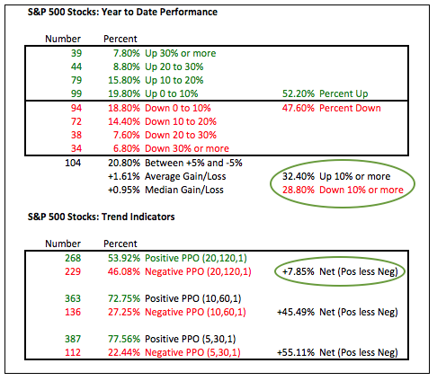
On the price chart, the S&P 500 broke through the 2000 level a year ago and then crossed this level at least eight times over the past year. On the daily chart, the S&P 500 has crossed the 50-day moving average more than 35 times this year. Strategas Research Partners notes that this is by far the most in over 80 years. Despite choppy trading, the trend indicators for the S&P 500 are pointing up and the index broke out with a surge the last four weeks. It may seem short-term overextended, but the bigger trend is pointing up and the cup is half full right now.
Mid-caps Break Down into Thirds
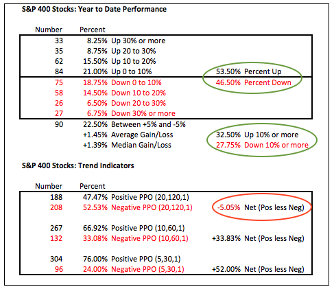
Turning to the stocks in the S&P MidCap 400, the year-to-date performance metrics are similar to the S&P 500. Of the 400 stocks, 53.4% are up year-to-date and 32.5% are up more than 10% year-to-date. Around 28% are down more than 10% year-to-date. As with the S&P 500, mid-caps are a market of thirds. Around one-third performed well, around one-third performed bad and the other third is somewhere in the middle. Notice that the year-to-date change for 22.5% of the stocks in the S&P 400 is between +5% and -5%. Over a fifth of its components have little to show for 10 months of trading. The trend situation is also mixed with more stocks in long-term downtrends than uptrends, but two-thirds of the stocks are in medium-term uptrends.
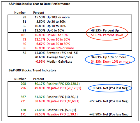
Internal Divisions Weigh on Small-caps
The stocks in the S&P Small-Cap 600 are the most mixed off all. Note that 51.67% are down year-to-date and the median gain is a loss (-.96%). It has been a rough year for small-caps so far. Furthermore, notice that the same percentage of stocks are up more than 10% and down more than 10% (34.83%). No wonder the index cannot make much headway.
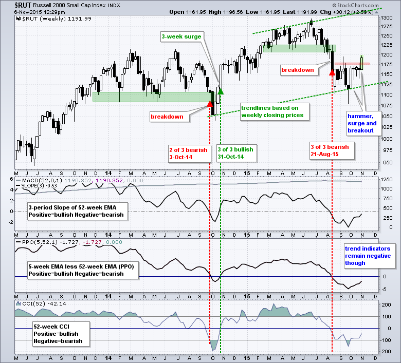
Even though small-caps are the weakest group, the Russell 2000 showed signs of life this week with a follow through breakout to the September hammer. It took a while, but the index looks set to close at its highest weekly close since early August. The three trend indicators turned up, but remain negative overall and have yet to confirm a long-term trend change. Stay tuned....
A Sector, Industry Group and Stock Picker's Market
The final table combines the results for the S&P 500, S&P MidCap 400 and S&P Small-Cap 600. There are more small and mid-caps than large-caps so these results are tilted towards the little guys (and gals). Overall, the winners hold a slight edge over the losers 51 to 49 percent. Also notice that 33.42% of stocks are up more than 10% and 31% are down more than 10%. There is a light edge for stocks with sizable gains, but the market has a whole is still split into thirds.
So what's the moral of the story? The broader market is indeed mixed with pockets of strength, pockets of weakness and pockets of ambiguity. The pockets of strength still outweigh the pockets of weakness. It is of utmost importance to find the pockets of strength and avoid the pockets of weakness. As noted above, we seem to be in a market of thirds: one-third strong, one-third weak and one-third muddling along.
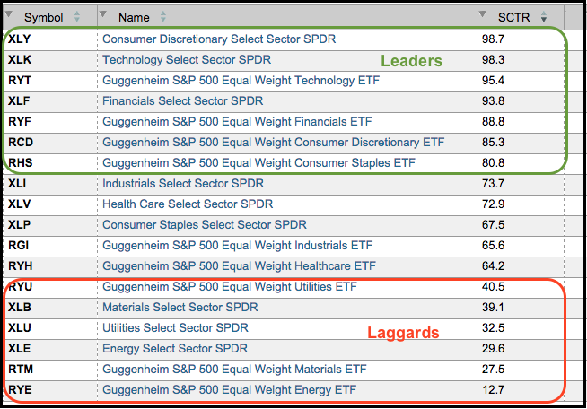
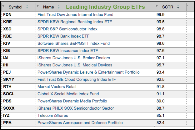
So....how do we find strong stocks? A list of strong stocks is available every day by looking at the list of new 52-week highs. Stocks hitting 52-week highs are in uptrends, no question about it. Chartists can also use the StockCharts Technical Rank (SCTR) to find stocks showing relative strength. Anything above 70 is in the top third of its group for relative performance. The tables below show the leading/lagging sectors and the leading industry group ETFs.
Friday Food for Thought
Ricardo Ronco of Aviate gave a presentation to the UK Chapter of the MTA and this is available on Youtube. Ronco talks about the behavioral aspects of trend and provides details on a simple trend following model. Great stuff. Then again, he is preaching to the choir when I am present.
Rob Hanna of Quantifiable Edges had a great blog post this week pointing out a rare occurrence when the S&P 500 Volatility Index ($VIX) rose sharply and the S&P 500 closed at a 50-day high.
Jon Boorman CMT wrote a great article (in June) entitled Finding a Trading Style that Suits Your Personality. The article starts with a quote from Colm O'Shea from Jack Schwager's latest book (The Little Book of Market Wizards).
Stig Brodersen of The Investors Podcast speaks with Jack Vogel of Alpha Architect. Vogel puts momentum investing through the wringer and produces some numbers to back it up as a systematic approach.
****************************************
Thanks for tuning in and have a good day!
--Arthur Hill CMT
Plan your Trade and Trade your Plan
*****************************************


