13 Days that Shook the Market // Bullish Breadth Thrust Nears // Checking the Signals in 2011 (again) // Still Hanging out in No Man's Land // All Nine Sector SPDRs in Short-term Uptrends // Bullish Continuation Patterns in Precious Metals // Nothing but Downtrend for Oil and NatGas ////
13 Days that Shook the Market
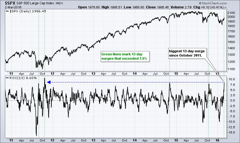
The bull-bear debate is reaching fever pitch as the S&P 500 surges to within 1% of the 2000 level. Is this a bear market rally or is this the start of a bigger advance? I am of the opinion that sustained advances often begin with a big upward thrust, kind of like a rocket lifting off. The thrust gets the rocket off the ground and provides enough power to escape gravity. After this acceleration, the rocket continues to climb at a slower, and more sustainable, pace. We saw similar surges in October 2011, October 2014 and October 2015. In fact, the current 13-day surge in the S&P 500 is the strongest since 2011. As the chart below shows, there were five surges that exceeded 7.5% in 13 days (since 2011).
Bullish Breadth Thrust Nears
We have yet to get a "Hill" bullish breadth thrust, but S&P 1500 AD Percent ($SUPADP) is getting very close. In my lexicon, a bullish breadth thrust occurs when the 10-day EMA for AD Percent surges above +30% and a bearish thrust occurs with a move below -30%. I focus on the S&P 1500 because it has large-caps, small-caps, mid-caps, NYSE stocks and Nasdaq stocks. NYSE breadth indicators leave out half the market. A breadth thrust shows strong buying or selling pressure that can foreshadow the start of an extended trend.
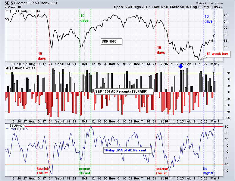
We have seen three signals since August because of recent volatility and are on the verge of a fourth. Notice that the 10-day EMA of AD Percent finished at 28.72%. Also notice that AD Percent has been positive ten of the last thirteen days. Since January 22nd (blue arrow), there were five surges above +75% and only two below -75%. There is some serious power behind this advance and a little more strength in the next two days would trigger a bullish signal. As usual, I will not anticipate and just wait to see if it happens.
Checking the Signals in 2011 (again)
I find myself going back to 2011 for comparisons to the current period. While I do not necessarily think we are in the same situation now, we are seeing a level of volatility that compares to 2011. Before looking at breadth in 2011, note that these breadth indicators are based on the current components of the S&P 1500, which will be different than the components in 2011. Personally, I do not think the difference is big enough to detract from the comparison.
The chart below shows the bullish breadth thrusts with green lines and the bearish thrusts with red lines. Notice that a bearish breadth thrust triggered right at the August support break. There were several more dips below -30% in August-September and the indicator did not exceed +30% until the October breakout. I was impressed that the indicator did not turn bullish during the volatile August-September period.
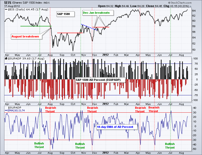
Just as the indicator was looking good, it triggered a bearish signal in late November and did not counter with a bullish signal during the subsequent rebound. After two more bearish signals in April-May, the indicator triggered a bullish breadth thrust on July 3rd (2012) and remained bullish until October 2014 (over two years). The indicator is not perfect, but it is one I think belongs in our toolbox.
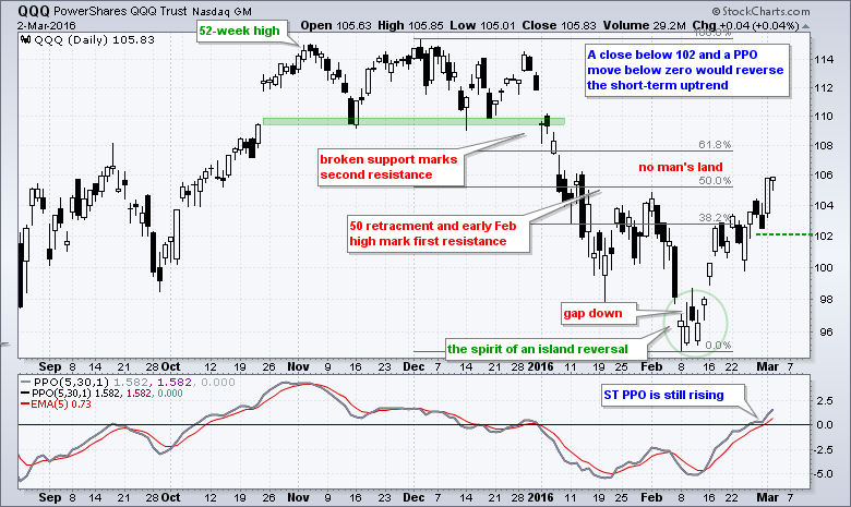
Still Hanging out in No Man's Land
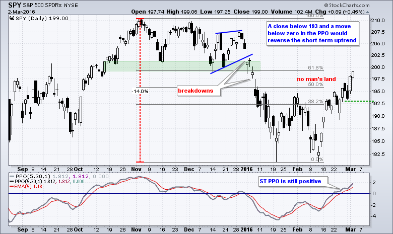
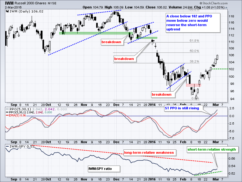
At this point, we have a big price surge in the S&P 500, Nasdaq 100 and Russell 2000. Note that the 13-day Rate-of-Change is the highest since October 2011 for the S&P 500 and Russell 2000. It is the highest since October 2014 for the Nasdaq 100, and the second highest since 2011. These are strong price moves, but I have yet to get a bullish signal from breadth so I remain in the bear market camp until such a signal. Thus, the short-term trend is up (and strong), while the long-term trend is still down.
I am quite concerned that consensus seems to be bearish and a CNBC analyst even used Fibonacci numbers to say the S&P 500 would not exceed 2000. This is anecdotal evidence though and I prefer to stick to price action. In my opinion, this rally should have failed already and the ability to continue higher is telling us something, especially with small-caps and mid-caps leading. SPY surged with three gaps and three big moves in mid February and then continued higher the following ten days. This short-term uptrend prevails as long as 193 holds and the short-term PPO (5,30,1) remains positive (gray line).
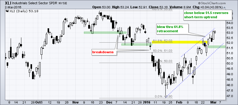
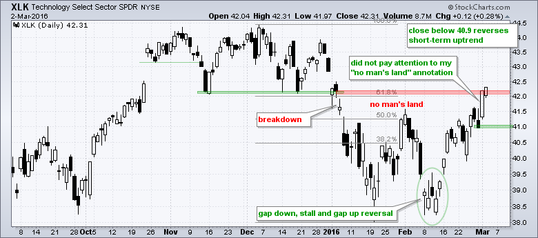
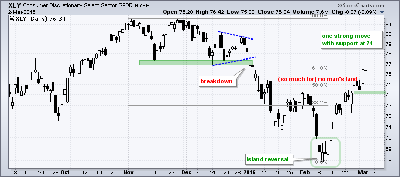
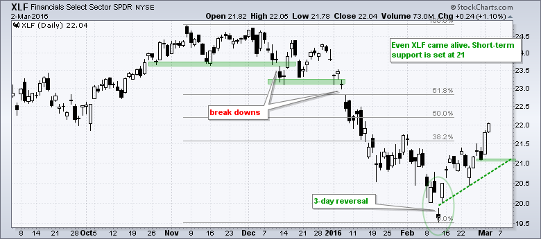
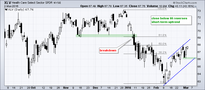
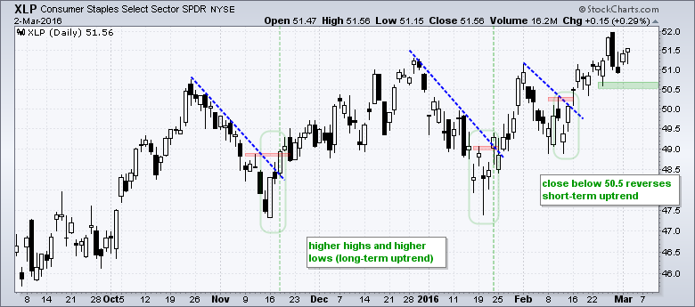
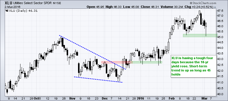
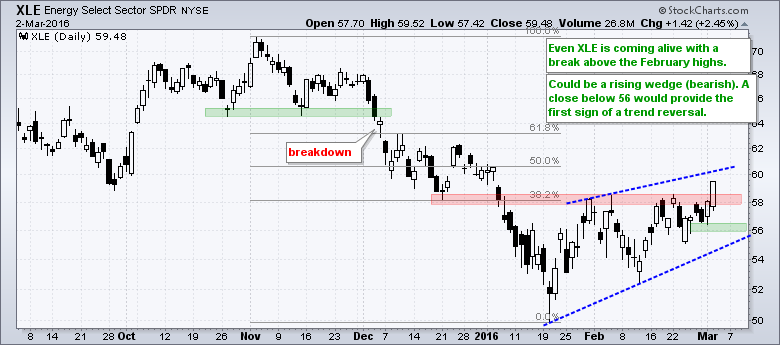
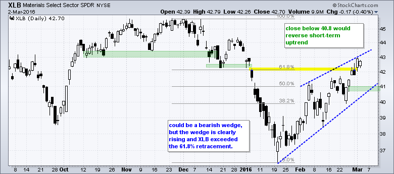
All Nine Sector SPDRs in Short-term Uptrends
All nine sector SPDRs are in short-term uptrends and above their 50-day moving averages. Four could be considered in long-term uptrends. Note that the Industrials SPDR (XLI), Technology SPDR (XLK), Consumer Staples SPDR (XLP) and Utilities SPDR (XLU) are above their 200-day moving averages. At this point, XLI and XLK are the new leaders in 2016. XLP and XLU were the leaders at the beginning of the year and are still in uptrends. I am just showing six month candlestick charts to define the short-term uptrends, which range from 3 to 6 weeks. I will be watching short-term support levels (marked in green) for signs of weakness in the broader market. Breakdowns in five of the nine sectors SPDRs would tilt the market evidence bearish.
Bullish Continuation Patterns in Precious Metals
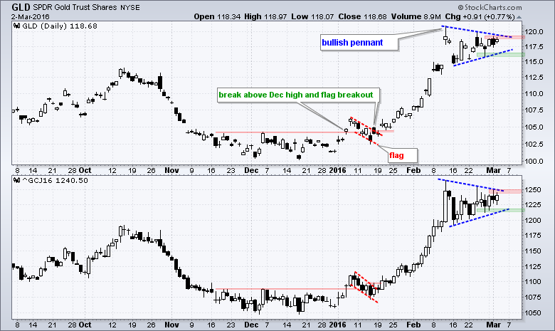
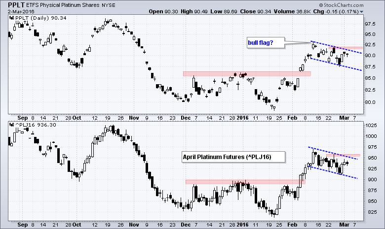
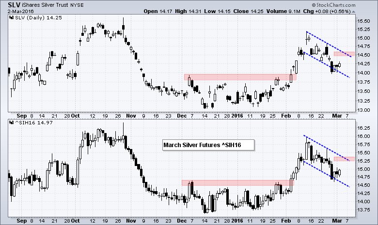
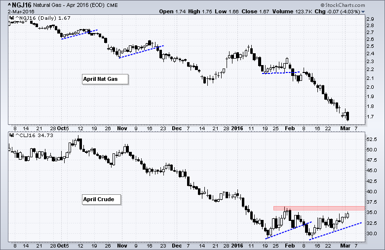
I am not seeing anything to suggest a trend reversal in oil and natural gaps, but I am seeing bullish continuation patterns in some precious metals. The next charts show the commodity ETF in the top window and the futures contract in the bottom window. When possible, I think we should use the futures contract for analysis because it is the real benchmark. This is especially true for oil and natural gas. The commodity ETFs are hybrids made from a basket of futures contracts. Also note the "spot" prices and continuous futures are usually hybrids.
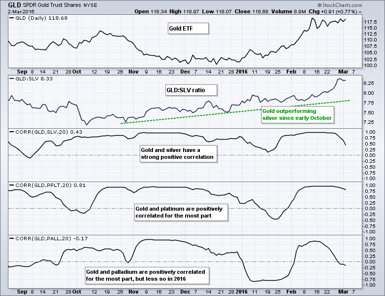
The Gold SPDR (GLD) formed a small triangle or pennant after the surge. This is a bullish continuation pattern and an upside breakout would be, well, bullish. A downside break would be negative and argue for a retracement of the prior advance.
Next up we have the Platinum ETF (PPLT) with a breakout in early February and a bull flag over the last few weeks. An upside breakout would be bullish.
The Silver ETF (SLV) surged along with platinum and gold, and then corrected with a rather sharp pullback. Nevertheless, the pullback looks like a bull flag as well and an upside breakout would be bullish.
Even though silver experienced the deepest pullback, it still has a strong positive correlation with gold. Gold, however, has been outperforming silver since October. The second window on the chart below shows the GLD:SLV ratio moving higher the last five months. The third window shows the correlation between The Gold SPDR (GLD) and the Silver ETF (SLV). It has been positive for most of the last six months. Gold is also positively correlated to platinum, and less so to palladium.
April Natural Gas (^NGJ16) broke down again in early February and hit new lows the last three weeks. April Crude (^CLJ16) may be firming, but there is clearly no breakout and no uptrend on this chart.
Other Commentary Links
Bear Market Bounces - Understanding Bear Market Patterns, Signals and Retracements.
Measuring Risk On-Risk Off - Using charts to quantify stock, economic and credit risk.
PPO Trading Strategy - How to use 3 PPOs to develop a trend-reversion trading strategy.
Long-term Trend Indicators - Using the PPO, EMA Slope and CCI to determine the trend.
ETF Master ChartPack - 300+ ETFs organized in a Master ChartList and in individual groups.
Follow me on Twitter @arthurhill - Keep up with my 140 character commentaries.
****************************************
Thanks for tuning in and have a good day!
--Arthur Hill CMT
Plan your Trade and Trade your Plan
*****************************************


