Stock Market Environment Takes a Turn // Just a Big Correction after an even Bigger Advance? // October 2015 versus February 2016 // 10-YR Treasury Yield Surges // S&P 1500 Breadth Thrust Triggers // High-Low Percent Indicators have Work to Do // McClellan Oscillators Hit Multi-year Highs // Friday Food for Thought ////
Stock Market Environment Takes a Turn
Even though the current advance is just three weeks old, we saw some strong numbers from the Russell 2000, the S&P 500 and breadth indicators. The 14-day Rate-of-Change for the S&P 500 and Russell 2000 was the highest since October 2011. As far as breadth is concerned, the NYSE and Nasdaq McClellan Oscillators moved to their highest levels in years. We also got a bullish breadth thrust from the 10-day EMA of S&P 1500 AD Percent. Throw in a surge in the 10-YR Treasury Yield and relative strength in small-caps and we have the recipe for a position change. In short, I am not in the bear market camp anymore and now consider the market cup to be half full. Not all of my indicators have turned bullish so I am waiting a bit before turning fully bullish again. Namely, I would like to see bullish signals from the High-Low Percent indicators.
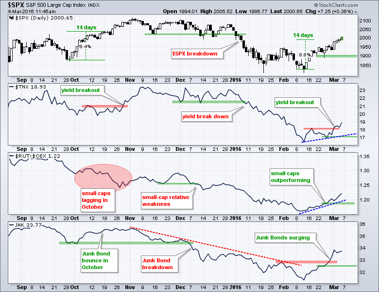
The chart above captures the three week change quite well. The S&P 500 exceeded its early February high with a ~9 percent advance. The 10-YR Treasury Yield broke out and is moved sharply higher. The Russell 2000 is outperforming the S&P LargeCap 100 and the High Yield Bond SPDR (surged as credit conditions eased. There seem to be significant low points around February 23rd and I have marked these low points with the green shading on each window. Moves below these levels would call for a reassessment. Before leaving this first chart, notice the October surge and subsequent breakdown. The $RUT:$OEX ratio and JNK broke down in December to foreshadow the breakdown in the S&P 500. The 10-YR Treasury Yield broke down in early January.
Just a Big Correction after an even Bigger Advance?
Let's start with some perspective by looking at the last five years. The S&P 500 advanced around 90% from the 2011 lows to the 2015 highs and then fell around 15%. The S&P 500 EW Index, S&P MidCap 400 and S&P Small-Cap 600 were up over 100% during the same timeframe and subsequently fell around 20%. The declines over the past six to nine months look rather paltry when compared to the gains of the prior four years. The blue trend lines mark falling channels over the last six to nine months and these define the current downtrend. Within these channels, notice that the indices broke above a prior high to forge a higher high (red lines). Similar breakouts occurred in October, but lower highs ultimately formed in November-December and the indices moved to new lows in 2016. There is, however, a big difference between the current breakout and the October breakout.
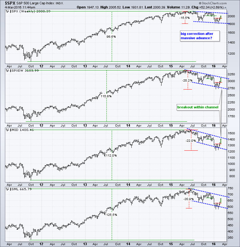 Before getting to the difference between October and now, note that there are two things to watch for bullish breakouts on these weekly charts. First, we need to see a move above the upper trend line of the falling channel. Second, we need to see a break above the November-December highs. Until the indices break above the 2015 highs, there will always be another level to watch for the ultimate breakout. We can either act now or wait for one more confirmation, and then another, and then another.... There is no such thing as certainty in the markets so we have to take a stand at some point. It is not as if certainty will increase as time passes.
October 2015 versus February 2016
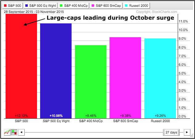
The stock market surged in October and there was a bullish breadth thrust, but this breakout and thrust ultimately failed. Despite the bullish breadth thrust, note that equal-weights, small-caps and mid-caps lagged large-caps from September 28th to November 2nd, which covers most of the big move. The S&P 500 was up 12%, the S&P 500 EW Index was up 11% and the rest were up less than 10%. This means the S&P Small-Cap 600, Russell 2000 and S&P MidCap 400 were lagging in October. These indices represent the high-beta end of the market and relative weakness showed risk aversion during the October surge.
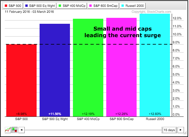
The tables have turned over the last three weeks. The S&P 500 is up around 9%, the S&P 500 EW Index is up around 11.5% and the other three are up over 12%. Small-caps and mid-caps are leading this advance and this shows a strong appetite for risk. Relative strength in small-caps and mid-caps could peter out, but that is neither here nor there. In other words, it is not an issue right now so let's not make it an issue until it is.
10-YR Treasury Yield Surges
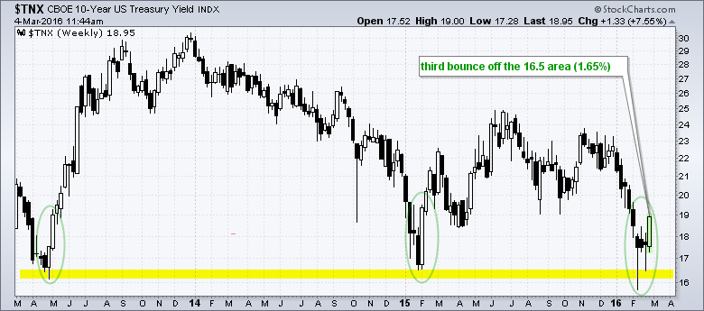
The 10-YR Treasury Yield ($TNX) surged this week and the 20+ YR T-Bond ETF (TLT) moved sharply lower. This move is bullish for stocks, especially financials. Stocks benefit because money moving out of safe-haven bonds can now be put to work in riskier assets. Financials benefit because there is a strong positive correlation between the 10-yr yield and banking stocks. They rise and fall together. The chart below shows the 10-YR Treasury Yield bouncing off the 16.5 (1.65%) area for the third time in three years. The yield firmed for three weeks in the 17.5 area and surged above 18.5 this week. Note that most of this surge occurred on Tuesday, well before today's non-farm payroll number.
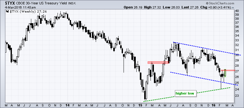
The 30-YR Treasury Yield ($TYX) is even stronger than the 10-YR Treasury Yield. Notice that $TYX held above its January 2015 low and could be forming a higher low. The February high marks the first peak to watch for any kind of short-term breakout. A close above 27.12 would clear that high and argue for at least a short-term trend reversal.
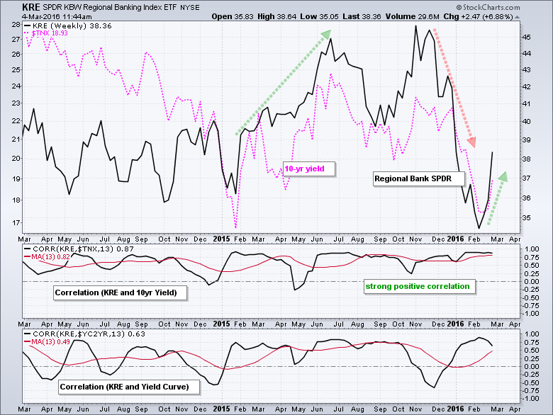
The Regional Bank SPDR (KRE) is up over 6% this week and clearly benefitting from its positive correlation with the 10-YR Treasury Yield.
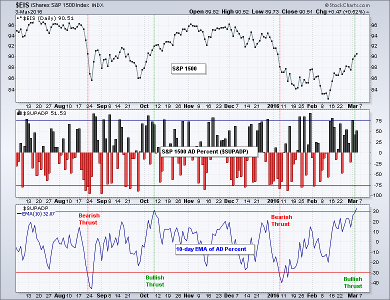
S&P 1500 Breadth Thrust Triggers
I took a page from Marty Zweig by using the 10-day EMA of S&P 1500 AD Percent ($SUPADP) to define bullish and bearish breadth thrusts. I also took a page from Gerald Appel by simply requiring the indicator to reach a certain threshold to trigger a bullish signal (> +30%). I view a bullish breadth thrust as a medium to long term signal (two months or longer). It shows an extraordinary amount of buying pressure and this signals the start of an uptrend in the stock market. The chart below shows the signal triggering on Thursday and this negates the bearish signal on January 7th. The last three signals were not good (August 21st, October 8th and January 7th). Prior to this period, the bullish signal on July 3rd 2012 was a dandy because it lasted until October 2014 and the subsequent bullish signal in October 2014 lasted until August 2015. I have no way of knowing how long this signal will last or if it will be profitable. All I know is that I have a signal and the market cup is half full until proven otherwise. Even if this signal fails, I would not expect it to fail immediately because strong buying pressure does not usually dissipate over night.
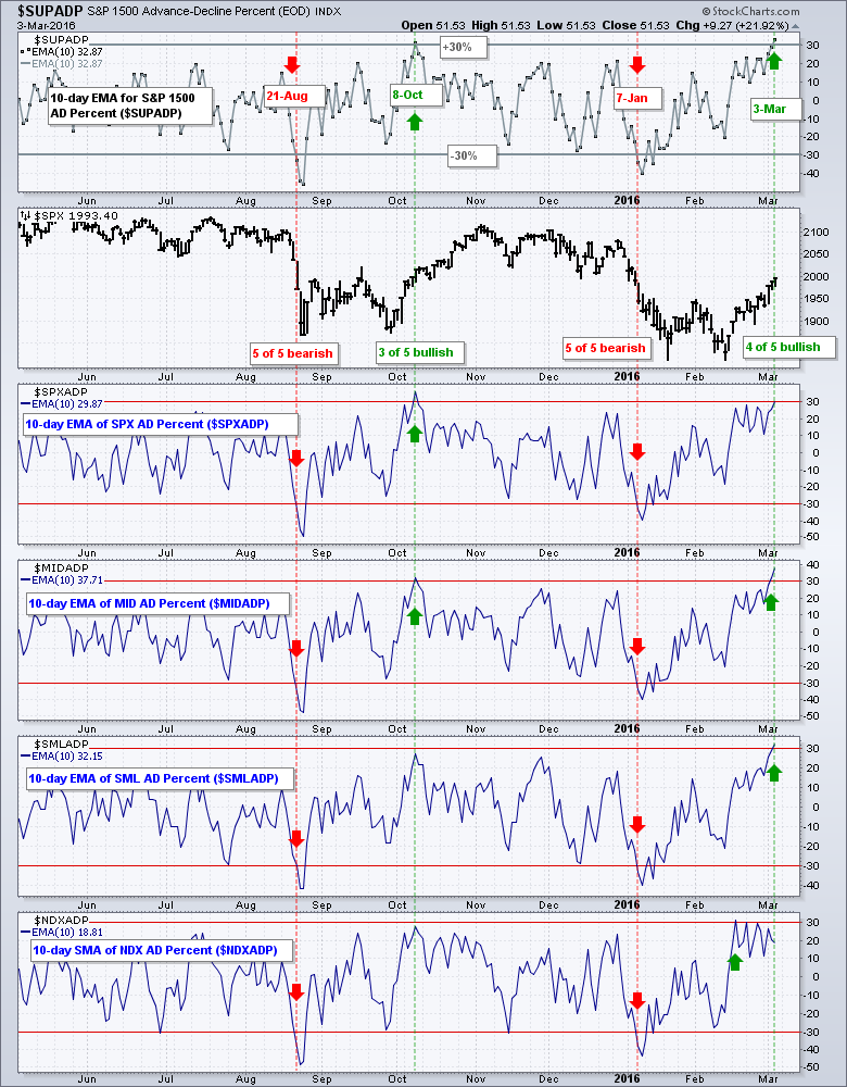
The next chart shows the 10-day EMA for AD Percent for the S&P 1500, S&P 500, S&P MidCap 400, S&P Small-Cap 600 and Nasdaq 100. The Nasdaq 100 trigged bullish on February 17th. The S&P 1500, S&P MidCap 400 and S&P Small-Cap 600 triggered bullish on March 3rd. This means four of the five have triggered bullish. The S&P 500 remains the hold out, but the 10-day EMA of S&P 500 AD Percent ($SPXADP) hit 29.87% and it is pretty darn close. Note that the 10-day EMAs for AD Volume Percent also triggered bullish signals this week.
High-Low Percent Indicators have Work to Do
The High-Low Percent indicators have yet to turn bullish, which would require a move above +10%. High-Low Percent equals new highs less new lows divided by total issues. These indicators often lag because it takes more time to forge a 52-week high or low. Also note that around 55% of the stocks in the S&P 1500 hit new lows at some point this year (January-February) so quite a bit more upside is needed before we see new highs in these stocks.
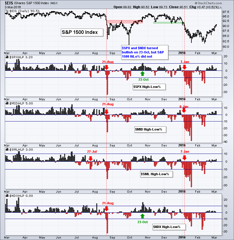
After running some scans, I noticed that it would not take much to push the High-Low Percent indicators above 10%. 17 stocks in the S&P 500 hit new highs on Thursday and there are another 80 stocks within 5% of a new high. 22 stocks in the S&P MidCap 400 hit new highs and there are another 50 stocks within 5% of a new high. 20 stocks in the S&P Small-Cap 600 hit new highs and there are another 55 stocks within 5% of a new high. The S&P 500 needs 51 net new highs to turn High-Low Percent bullish, the S&P MidCap 400 needs 41 net new highs to turn High-Low Percent bullish and the S&P Small-Cap 600 needs 61 net new highs to turn High-Low Percent bullish. I will show how to run these scans in today's video.

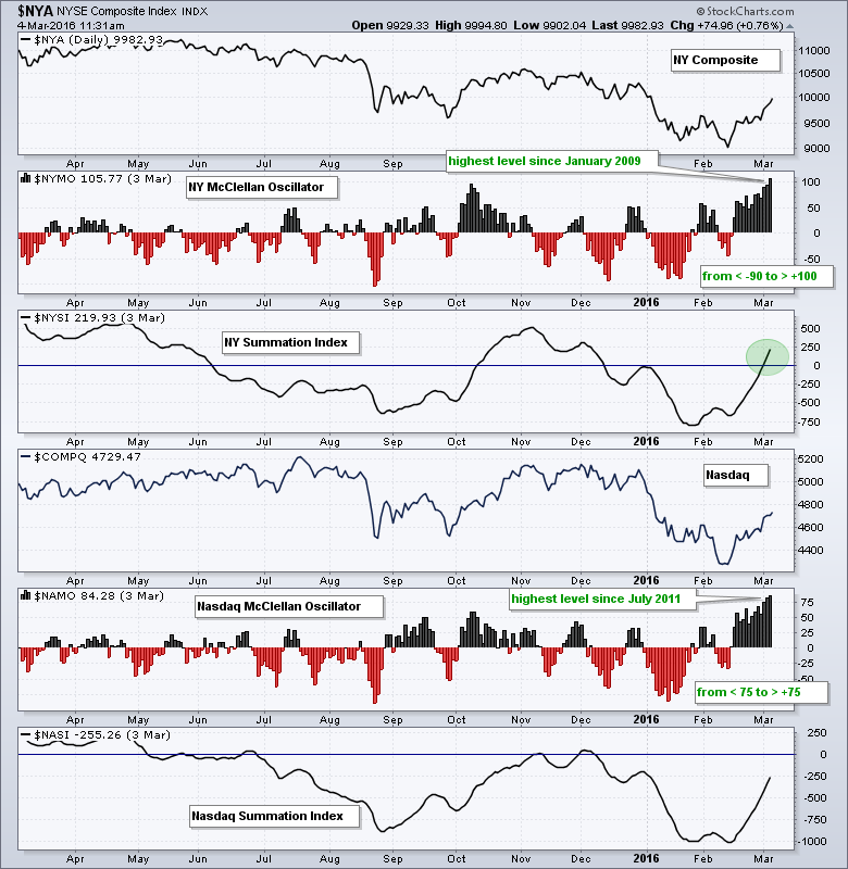
McClellan Oscillators Hit Multi-year Highs
Many of us have already seen the high readings in the NYSE McClellan Oscillator ($NYMO) and the Nasdaq McClellan Oscillator ($NAMO), which surged to their highest levels in years. $NYMO is above 100 and at its highest level since January 2009. $NAMO is above 80 and at hits highest level since July 2011. Even though these indicators are "overbought", the surge over the last few weeks shows incredibly strong breadth in both the Nasdaq and the NYSE. Also notice that the NYSE McClellan Summation Index ($NYSI) turned positive for the first time since December.
Friday Food for Thought
Cheatsheet for the Beginners in Technical Analysis (Rajandran, MarketCalls.in)
10 Things to Avoid and 8 Things to Do.
Getting out When Moving Averages Cross (Jason Goepfert, SentimenTrader.com)
We often discuss how various behavioral biases impact sentiment, and recency bias, or fighting the last battle, is among the most nefarious. Most of those managing investments today lived through at least the last bear market, and usually the last two. That’s what has imprinted, and that’s what they measure patterns against. Those time periods are also historical outliers that are unlikely to repeat in a similar fashion in the near future.
What I've Been Reading... (Backtestwizard.com)
Simply put, imagine that you had a crystal ball and at the beginning of each year you knew which assets would appreciate the most in the following 12 months. Surely a license to print money…You simply buy whichever assets produce the highest return 12 months later.
Check Your Narrative at the Door (gestaltu.com)
A historical case study will help put the past year’s dearth of returns in context. Imagine that on January 1st of each year, we knew in advance which major global asset classes would deliver returns above the group’s average, as well as positive returns, in the coming year. Of course, knowing the future in this way is impossible, but it helps to illustrate the available opportunity set for an active long-only global asset allocation strategy. Perhaps unsurprisingly, an investor with this type of perfect foresight – who allocated capital equally among the top half of positively performing assets each year – would have produced average annual returns of 22% since 1995.

Other Commentary Links
Bear Market Bounces - Understanding Bear Market Patterns, Signals and Retracements.
Measuring Risk On-Risk Off - Using charts to quantify stock, economic and credit risk.
PPO Trading Strategy - How to use 3 PPOs to develop a trend-reversion trading strategy.
Long-term Trend Indicators - Using the PPO, EMA Slope and CCI to determine the trend.
ETF Master ChartPack - 300+ ETFs organized in a Master ChartList and in individual groups.
Follow me on Twitter @arthurhill - Keep up with my 140 character commentaries.
****************************************
Thanks for tuning in and have a good day!
--Arthur Hill CMT
Plan your Trade and Trade your Plan
*****************************************


