$SPX Leads on the Charts // Vacation // $MID Leads the Surge // Long-term EMA Slope Turns Positive for $SML // It is All about Timeframe // New Lows Perk Up in Small-caps // Bullish Until Proven Otherwise // Watch Treasury Yields for Clues // Oil Stalls at Key Retracement // Friday Food for Thought ////
S&P 500 Leads on the Charts
Is the advance from mid February to mid March the start of a bigger advance or just a bear market rally? This, of course, is the million Dollar question. I know you are going to hate this answer, but I must say: it depends which index you are looking at. According to my indicator set, the S&P 500 is in a bull market right now and this index represents about 80% of the total US stock market capitalization. I have yet to get confirmation from the S&P MidCap 400 and S&P Small-Cap 600. Once again, large-caps are leading. We can see this on the price charts and in the breadth data. I will first cover the price charts and then look at the breadth indicators.
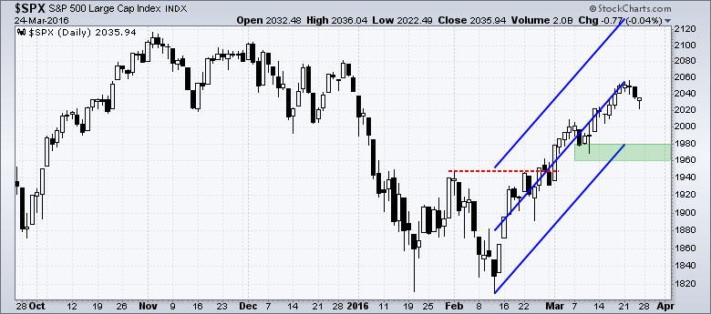
The million Dollar question is clear on the S&P 500 price chart. First, we can see a falling channel extending back to July 2015 (blue trend lines). These lower lows and lower highs suggest a long-term downtrend. Note that I am not using these trend lines to mark support or resistance. Trend lines just measure the slope of an advance or decline: the steeper the trend line, the bigger the slope and the sharper the move.
Within the channel, we can see four swings: down, up, down and up. The last upswing triggered with the breakout at 1950. One could certainly make the argument for resistance in the 2100 area, but I am not going there because we saw a breadth thrust in early March and High-Low Percent confirmed with a surge above +10% on March 17th. In other words, resistance in a bull market environment is not an issue. We need to watch support levels because a break below support would warrant a reassessment. More on support a little later.
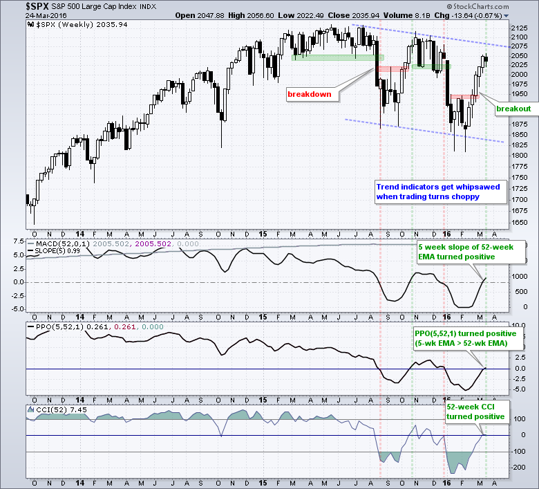
The indicator windows show the three long-term trend indicators turning net positive and negating the bearish signals in late December. Here is the thing about trend indicators, and I mean all trend indicators: they lag. Trend indicators, such as moving averages, will always be late to the trend and there will always be whipsaws. Chartists need to watch the price chart to get timely signals. Trend indicators are not useless, but it is just important that we understand how they work. Here is an article describing the long-term trend indicators.
Vacation Notice
Before hitting the rest of the charts, note that I will be taking a family vacation from March 28th (Monday) to April 8th (Friday). Family vacations are sacred cows and we will be visiting some sacred cenotes (ole!). I will not publish commentaries during this period and will return to action on Monday, April 11th. Happy Easter!
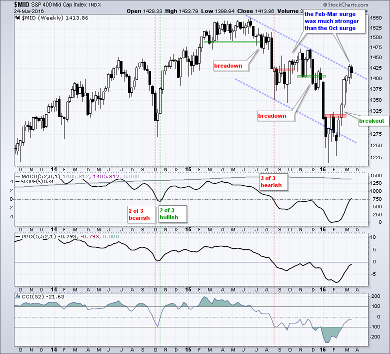
Mid-caps Lead the Surge
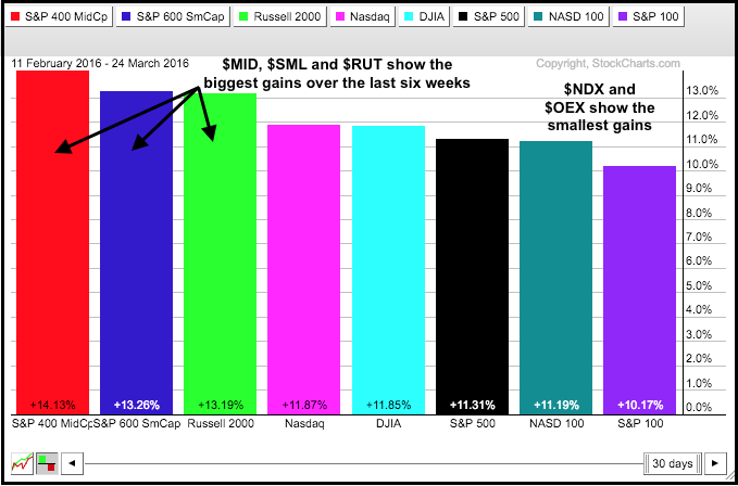
Now let's look at the small and mid caps, which account for the other 20% of the stock market. The S&P MidCap 400 surged over 13% in five weeks and then pulled back with a small loss last week. As with $SPX, one could make the case for a long-term downtrend with the falling channel. Note, however, that the Feb-Mar surge was much stronger than the October 2015 surge. Even though $MID (~8%) is further from its all time high than $SPX (~5), it led the market higher over the last six weeks. $MID is weaker based on the price chart, but stronger based on six week performance. I think a pullback would be an opportunity and would consider the 1375-1380 area as a potential reversal zone.
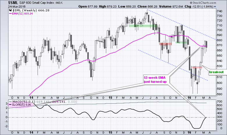
Long-term EMA Slope Turns Positive for $SML
Note that the trend indicators for $MID and $SML are net negative. The 5-week Slope of the 52-week EMA turned positive for both, but the PPO(5,52,1) and CCI(52) remain negative. The $SML chart looks the same as the $MID chart so there is not much more to add. The indicator window shows MACD (52,0,1), which is an indicator hack for the 52-week EMA. MACD(52,0,1) equals the 52-week EMA minus zero. I added the 5-week Slope as an indicator of an indicator and it turned positive this week. You can also see the EMA turning up on the price chart (pink).
It is All about Timeframe
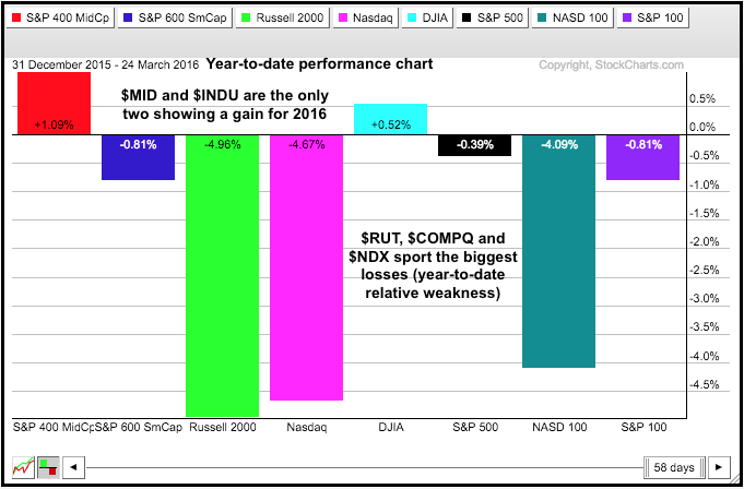
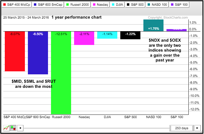
One's view on a particular market often depends on the timeframe. I can show small-caps and mid-caps leading over the last six weeks, and I can show them lagging over the last twelve months. The three PerfCharts show different perspectives with some notes on each chart. The one takeaway: mid-caps show leadership year-to-date and over the last six weeks.
New Lows Perk Up in Small-caps
High-Low Percent remains the lagging indicator right now. S&P 500 HiLo% ($SPXHLP) moved above +10% on March 17th to turn bullish, but we have yet to see confirming signals from the S&P Small-Cap 600 and the S&P MidCap 400 (or the S&P 1500). At the very least, S&P 1500 High-Low Percent ($SUPHLP) needs to break +10% to affirm a bull market. High-Low Percent fell back this week and S&P 600 HiLo% ($SMLHLP) actually turned negative on Friday as new lows out paced new highs.
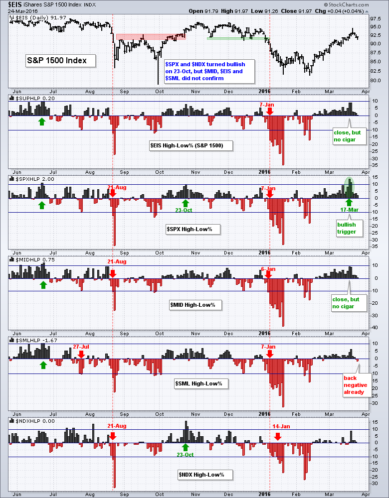
Despite this non-confirmation, there were plenty of new highs throughout the week. At some point over the last four trading days, 72 stocks in $SPX (14.4%) recorded a new high, 45 in $MID (11.25%) and 50 in $SML (8.33%). The numbers are even stronger when we look at six month highs. At some point this week, 114 stocks in $SPX (22.8%) recorded a six month high, 84 in $MID (21%) and 87 in $SML (14.5%). Despite relative weakness in small-caps, I think there is more bullish evidence than bearish evidence right now.
Bullish Until Proven Otherwise
Instead of asking if we are in a bull market or bear market, it is sometimes easier to simply assess the weight of the evidence and base a market stance on this assessment. I covered the trend evidence above. Despite, the falling channels, I think the February-March surge showed extraordinary strength and this is more indicative of a bull market than a bear market. Yes, I realize bear market rallies can be sharp, as in 2001 and 2002, but the current rally has yet to reverse or be proven otherwise. Check this article on Understanding Bear Market Bounces for clues on a reversal.
What would it take to switch back to a bearish stance on stocks? First, the 10-day EMA of S&P 1500 AD Percent ($SUPADP) would have to move below -30% to trigger a bearish breadth thrust. Second, the S&P 500 would have to close below 1960. Third, S&P 500 HiLo% ($SPXHLP) would have to break below -10% to negate its bullish signal. Stocks are quite extended right now and ripe for a pullback, but I would not become concerned until the S&P 500 closes below 1960.
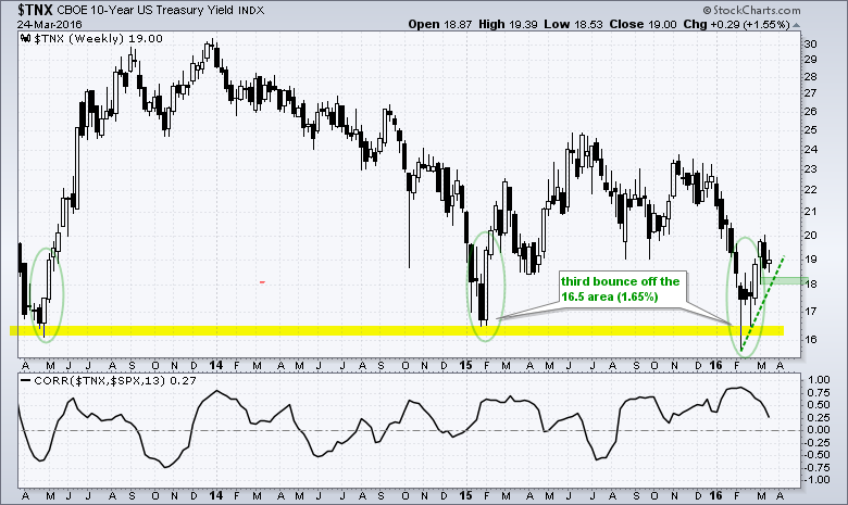
Watch Treasury Yields for Clues
The S&P 500 and 10-YR Treasury Yield ($TNX) are positively correlated for the most part and this means they tend to move in the same direction. $TNX bounced off the 16.5 (1.65%) zone for the third time and this bounce is positive for stocks as long as it holds. A close below 18 (1.8%) would reverse the current upswing. A breakdown in Treasury yields would imply a breakout in Treasury bonds and this would point to risk aversion in the market.
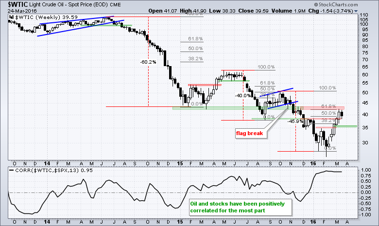
Oil Stalls at Key Retracement
For better or for worse, the stock market seems to be fixated on the price of oil. This may not last, but there is a positive correlation between oil and the S&P 500 right now. Personally, I think we just need stability in the oil market and a trading range around $40 would be fine. Further gains would likely help, but another breakdown would not. The long-term trend for Spot Crude ($WTIC) is down with a new low in February. The subsequent bounce broke resistance in the $35 area and it is important that this breakout holds. A close below $35 would negate this breakout and likely weigh on the stock market.
Friday Food for Thought
Chasing Momentum (Charlie Bilello, Pension Partners)
Momentum is one of the most powerful and persistent market anomalies. The evidence supporting this assertion is overwhelming. The idea that buying past winners and selling past losers (from 1-12 months) can lead to outperformance, though, is still bewildering to many. It’s not intuitive, especially for value investors, to believe that past performance in security prices can actually be indicative of future results.
How Pioneer of Smart Beta Started to See a Lot of It as Dumb
(Tom Redmond, BloombergBusiness)
You can use smart beta smartly or you can use smart beta stupidly,” Arnott, chairman and chief executive officer of Pimco subadviser Research Affiliates LLC, said in a phone interview during a visit to Tokyo. “Strategies become so popular that the only way for them to succeed is to go from very expensive to more expensive. That’s a dangerous game to play.
How GE Exorcised the Ghost of Jack Welch to Become a 124-Year-Old Startup
(Devin Leonard and Rick Clough, Bloomberg Business Week)
Now it’s focused on electric power generators, jet engines, locomotives, and oil-refining gear. And it’s made a significant bet on developing software to connect these devices to the Internet. There’s a term for this trend of adding network connections to hardware not usually considered computers: the Internet of Things. GE believes its opportunity lies in what it calls the Internet of Really Big Things. (GE hit a 52-week high this week).
Ulcer Index: An Alternative Approach to the Measurement of
Investment Risk & Risk-Adjusted Performance (Peter G. Martin)
Ulcer Index (UI) is a method for measuring investment risk that addresses the real concerns of investors, unlike the widely used standard deviation of return (SD). UI is a measure of the depth and duration of drawdowns in prices from earlier highs. (and it is available as an indicator at StockCharts).
Principles of Building a Discretionary System That Works (Wayne Montierth, CMT)
I am not much for Elliott Wave or Cycles, but I do like flags, wedges and pennants to catch moves within a trend. Wayne Montierth explains his process in a one hour video. For me, the meat of the presentation starts around the 24 minute mark.
When Is Overbought Really Another Word For Bullish? Maybe Right Now.
(LPL Financial Research)
As we noted on Tuesday, the S&P 500 was down 10% at one point this quarter and has a shot at closing the quarter green. You have to go back to the Great Depression for the last time equities saw a reversal like that.
Other Commentary Links
Bear Market Bounces - Understanding Bear Market Patterns, Signals and Retracements.
Measuring Risk On-Risk Off - Using charts to quantify stock, economic and credit risk.
PPO Trading Strategy - How to use 3 PPOs to develop a trend-reversion trading strategy.
Long-term Trend Indicators - Using the PPO, EMA Slope and CCI to determine the trend.
ETF Master ChartPack - 300+ ETFs organized in a Master ChartList and in individual groups.
Follow me on Twitter @arthurhill - Keep up with my 140 character commentaries.
****************************************
Thanks for tuning in and have a good day!
--Arthur Hill CMT
Plan your Trade and Trade your Plan
*****************************************


