The Great Rotation of 2016 // Finance Sector Correlations to Watch // Wedge Continues to Rise for 10-yr Yield // Big Banks Make-or-break XLF // REITs and Insurance Power RYF // Breakouts and Uptrends for 6 Big Banks ////
The Great Rotation of 2016
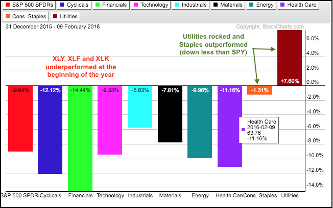
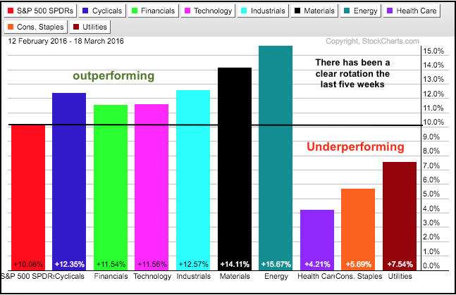
It has been a tale of two markets in 2016. The first PerfChart shows stocks falling sharply at the beginning of the year with finance, consumer discretionary and technology leading the way lower. The stock market then bottomed in mid February and surged the last five weeks. As the second PerfChart shows, six of the nine sectors are outperforming SPY during this five week surge - even finance. Utilities, consumer staples and healthcare are underperforming as money rotated out of staples and utilities. Relative strength in the four offensive sectors and energy-materials reflects a strong risk appetite in the stock market. Will it continue?
Finance Sector Correlations to Watch
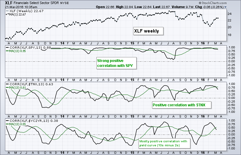
The finance sector had a strong run the last five weeks and could be the one to make or break the broader market. Before looking at individual charts, let's analyze some key correlations for the finance sector. The chart below shows weekly prices with 13-week Correlation Coefficients and these have 13-week SMAs in green. I am just looking for some general relationships. First, XLF has a strong positive correlation to SPY, which is not surprising. Thus, an uptrend in SPY is positive for XLF. Second, XLF has a positive correlation with the 10-YR Treasury Yield ($TNX). Thus, an uptrend in yields is also positive for the finance sector, as is a downtrend in Treasury bonds. There is also a positive correlation with the Yield Curve (10YR - 2YR), although it is not as strong as the positive correlation with the 10-yr yield.
Wedge Continues to Rise for 10-yr Yield
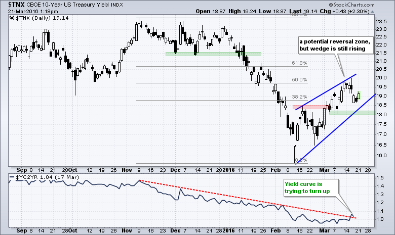
The next chart shows the 10-YR T-Yield within a rising wedge and the Yield Curve (10YR - 2YR) trying to turn up. $TNX is in a potential reversal zone and the rising wedge may turn out bearish, but it is rising right now and that is the most important consideration right now. The trend is up and this is bullish until proven otherwise. A move below 18 (1.8%) would reverse this immediate uptrend and signal a continuation of the prior decline. A bearish break in the 10-yr yield would also be negative for XLF.
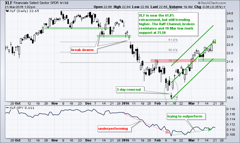
Big Banks Make-or-break XLF
Big banks drive the Finance SPDR (XLF). Note that WFC, JPM, C, BAC, USB, and GS account for around 30% of the ETF. Chartists interested in XLF would be wise to watch these stocks closely. On the price chart, XLF is in a rather strong uptrend the last five weeks. The ETF may be in a potential reversal zone, but the trend is the dominant force at work right now. The Raff Regression Channel defines this uptrend and I am marking support in the 21.5-21.7 area. A close below 21.5 would reverse this uptrend.
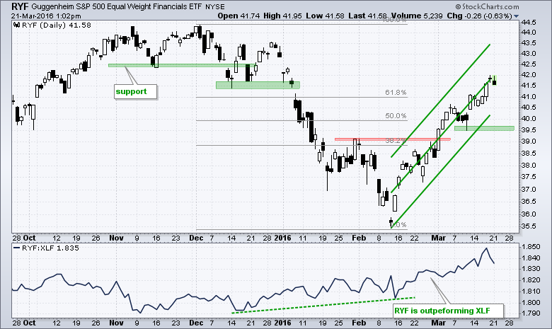
REITs and Insurance Power RYF
The EW Finance ETF (RYF) is outperforming the Finance SPDR (XLF) because of REITs and insurance. Note that REITs account for around 30% of RYF and insurance accounts for 22%. It is very important to understand what is driving a particular ETF. Both groups have been very strong of late. The price chart shows RYF exceeding its 61.8% retracement with a ~15% advance the last five weeks. The indicator window shows the RYF:XLF ratio rising as the equal-weight finance ETF outperforms the cap-weight finance SPDR.
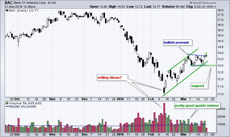
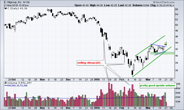
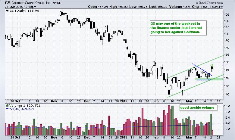
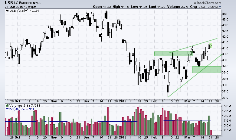
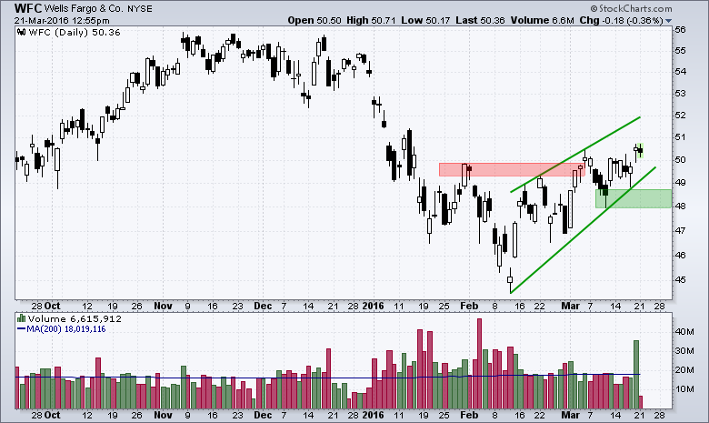
Breakouts and Uptrends for 6 Big Banks
The finance sector attracted my attention because some of the big banks popped on Thursday-Friday and broke out of small consolidations. Overall, it looks like we had some sort of high-volume selling climax in mid January and mid February. The subsequent bounces over the last few weeks show pretty good upside volume. The short-term consolidation breakouts are positive and could help the market continue its advance.
Admittedly, the advance since mid February could be a counter-trend move or corrective bounce after the December-February decline. Right now, which is what matters most, the trends are still up. The next six charts mark the short-term consolidations with blue dotted lines and the overall uptrends with green trend lines. Horizontal support is shaded green and closes below support would reverse the immediate uptrends.

Other Commentary Links
Bear Market Bounces - Understanding Bear Market Patterns, Signals and Retracements.
Measuring Risk On-Risk Off - Using charts to quantify stock, economic and credit risk.
PPO Trading Strategy - How to use 3 PPOs to develop a trend-reversion trading strategy.
Long-term Trend Indicators - Using the PPO, EMA Slope and CCI to determine the trend.
ETF Master ChartPack - 300+ ETFs organized in a Master ChartList and in individual groups.
Follow me on Twitter @arthurhill - Keep up with my 140 character commentaries.
****************************************
Thanks for tuning in and have a good day!
--Arthur Hill CMT
Plan your Trade and Trade your Plan
*****************************************


