A Weight of the Evidence Approach // Consumer Discretionary Remains the Weakest Link // Finance Sector Struggles // Technology Does the Splits // Staples and Utilities Lead with New Highs // Ranking the Nine Sectors // Evaluating Price Action with the Stochastic Oscillator // Webinar Preview //// .....
A Weight of the Evidence Approach
I will break down the broader market by looking at breadth indicators for SPY and the nine sectors. Stocks have fallen rather sharply the last two days, but the majority of charts and indicators for the sectors remain bullish. The next charts show a cap-weighted ETF, the corresponding equal-weight ETF and three breadth indicators. These are used for a weight of the evidence approach to market analysis. I would view these as medium-term indicators that cover a two to six month timeframe. I am bullish when the majority of price charts and indicators are bullish. I am bearish when the majority is bearish. I will first show the S&P 500 and the break it down by sectors.
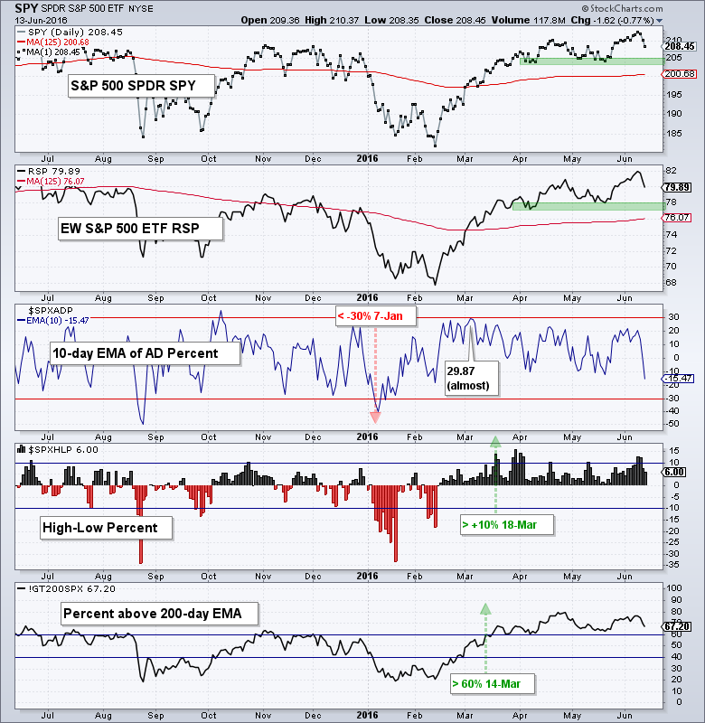
 First, here is a brief summary of the indicators. The S&P 500 SPDR (SPY) and the EW S&P 500 ETF (RSP) are shown with the 125-day SMA. I chose this moving average as a compromise between the 50-day and 200-day ((50+200)/2 = 125). I am not using this moving average as support or resistance. It is rather a benchmark level chartists can use to compare performance. Next, there is the 10-day EMA of AD Percent, which is a breadth indicator that triggers bullish with a move above +30% and bearish with a move below -30%. AD Percent = (Advances + Declines)/Total Issues. This is usually the first of the breadth indicators to trigger. High-Low Percent triggers bullish with a move above +10% and bearish with a move below -10%. High-Low Percent = (New Highs - New Lows)/Total Issues. I do not use the zero line for signals because there are too many whipsaws. The last breadth indicator is the percent of stocks above the 200-day EMA.
The broad market price charts and indicators remain bullish. SPY is the benchmark for the broader market and RSP is the equal-weight version. Both fell sharply the last two days, but remain well above their April-May lows and support zones (uptrends). The trouble starts when/if these support zones are broken. The 10-day EMA of AD Percent did not trigger bullish in early March because it fell short by a mere .14 (29.87). Technical analysis is a little "art" and a little "science" so this makes it a judgment call. High-Low Percent triggered bullish on 18-Mar and the %Above 200-day triggered bullish on 14-Mar. Thus, the price charts and at least two of three indicators are bullish.
Consumer Discretionary Remains the Weakest Link
The stocks in the S&P 500 break down into nine sectors and we can apply the same analysis to all nine. Consumer discretionary is the weakest of the nine sectors. Even though XLY and RCD are above their 125-day SMAs, XLY did not exceed its May high this month and RCD formed lower highs the last two months. Buying pressure is weak in XLY and selling pressure is dominant in RCD.
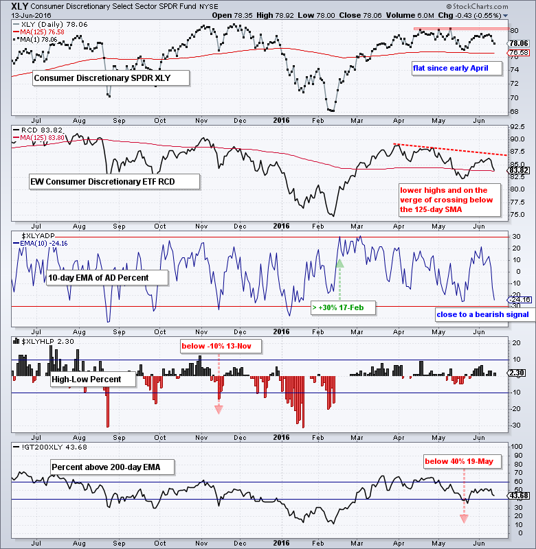
High-Low Percent triggered bearish back on 13-Nov and the Percent above 200-day indicator triggered bearish on 19-May. The 10-day EMA of AD Percent fell sharply the last two days and is close to triggering a bearish signal. It would not take much for the weight of the evidence to shift bearish for the consumer discretionary sector.
Finance Sector Struggles
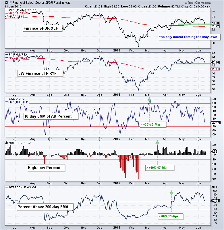
The finance sector weakened this month, but the weight of the evidence remains bullish. This sector, however, is a concern for the broader market. XLF and RYF remain well above their 125-day SMAs, but they are the only sector ETFs that are testing their May lows. All three breadth indicators remain bullish for now though.
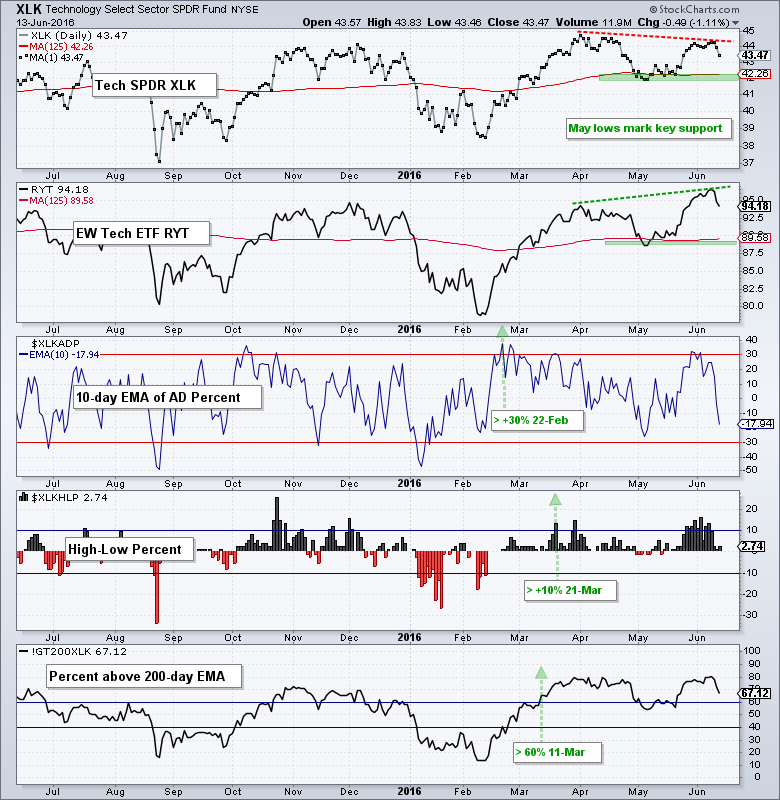
Technology Does the Splits
The technology sector has done the splits because the Technology SPDR (XLK) formed a lower high from May to June and the EW Technology ETF (RYT) formed a higher high. Large-cap techs are clearly lagging small-mid cap techs on the price chart. Both ETFs remain above the May lows and these levels mark key support. Also notice that all three breadth indicators are in bull mode.
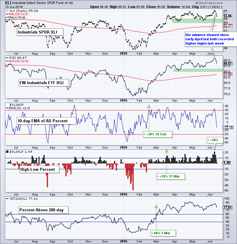
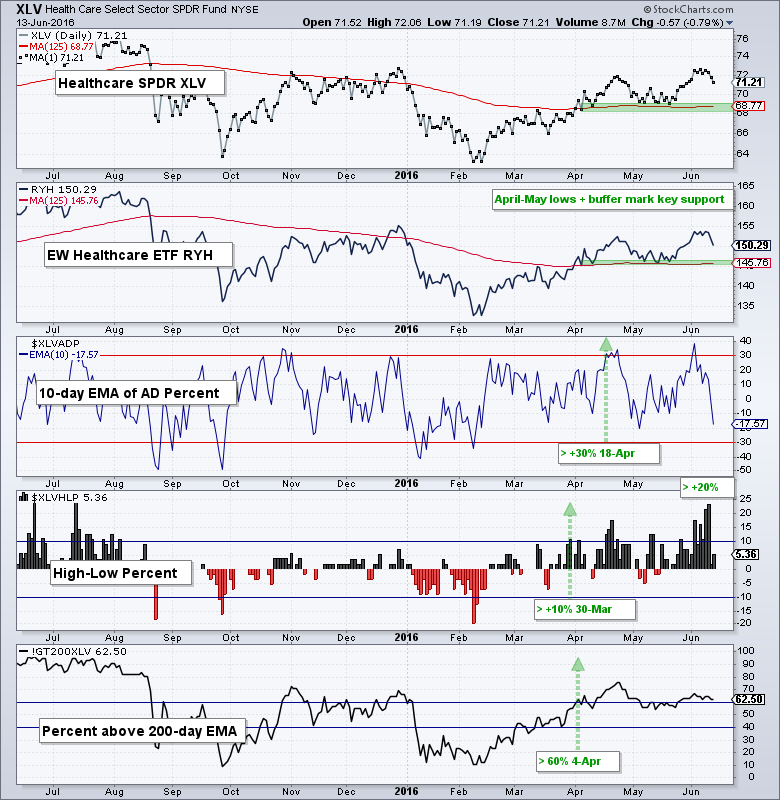
Industrials and Healthcare Lead New High List
The industrials sector remains strong overall. The advance in the Industrials SPDR (XLI) and EW Industrials ETF (RGI) slowed over the last two months, but price is still edging higher as both formed higher highs just last week. The April-May lows mark key support for both. All three breadth indicators are in bull mode. Notice that High-Low Percent exceeded +20% and this sector is churning out new highs.
Despite troubles with biotech, the healthcare sector is bullish overall. Both the HealthCare SPDR (XLV) and EW Healthcare ETF (RYH) exceeded their April highs last week. The April-May lows mark key support zones. All three indicators are in bull mode with High-Low Percent exceeding +20% twice last week.
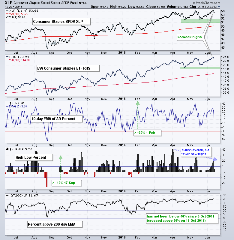
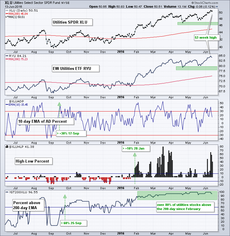
Staples and Utilities Lead with New Highs
The death of the two defensive sectors has been greatly exaggerated. The Consumer Staples SPDR (XLP) and EW Consumer Staples ETF (RHS) hit new highs last week and all three indicators remain in bull mode. Notice that the percent above 200-day EMA indicator has not been below 40% since October 2011.
The Utilities SPDR (XLU) and EW Utilities ETF (RYU) also hit new highs last week. Thus, staples and utilities were the only sector ETFs to hit new highs last week. The percent above 200-day EMA indicator has been above 80% since February.
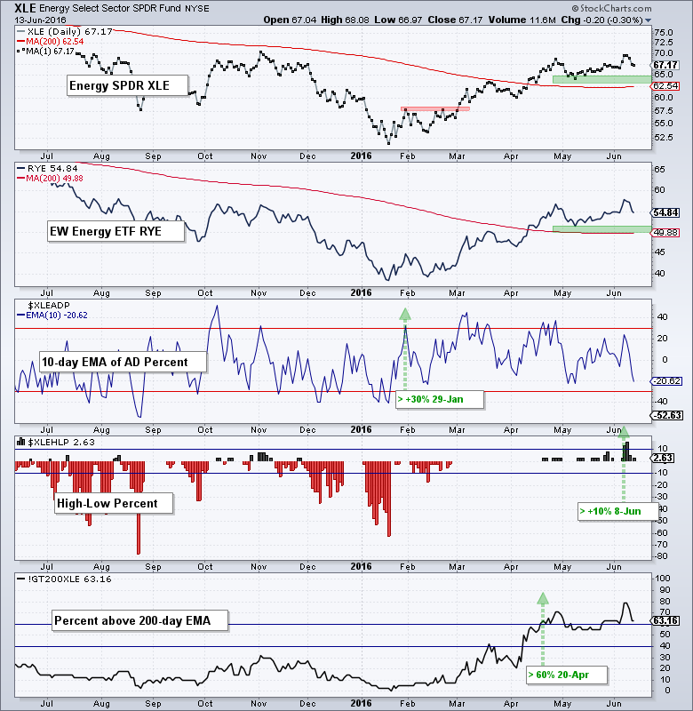
The energy ETFs remain in uptrends overall with the May lows and a buffer marking the support zones. Notice that the 10-day EMA of AD Percent triggered bullish way back in January and this proved a timely signal. It took almost three months of uptrend for the percent above 200-day EMA to exceed 60% and High-Low Percent did not trigger until June.
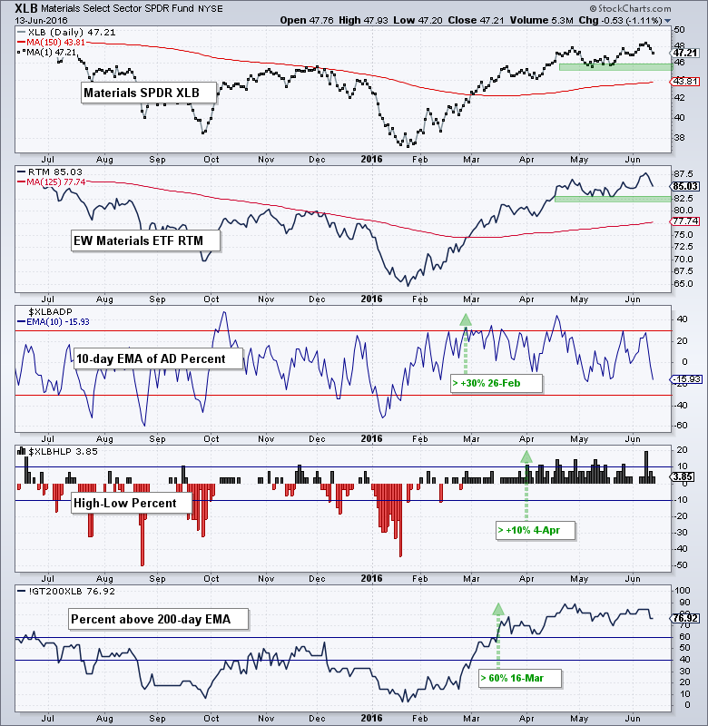
The materials sector remains bullish overall. The Materials SPDR (XLB) and EW Materials ETF (RTM) both exceeded their April highs last week and remain above first support. All three breadth indicators are in bull mode.
Ranking the Sectors
The table below puts all the sectors and indicator ratings in one place. To simplify and quantify objectively, I favor an uptrend when above the 125-day SMA and a downtrend when below. The other indicators are also quantified objectively and the table is very green. As shown in the charts above, only two breadth indicators are red (bearish) and they are in consumer discretionary. I would not become concerned with the overall uptrend in the S&P 500 until we see at least a third of this table turn red.
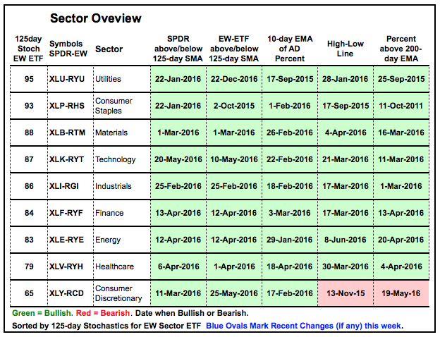
The table is sorted by the value of the 125-day Stochastic Oscillator. 125 days is around six months and this value tells us how close (far) the current price is from the six month high. Readings above 90 indicate that prices are very close to a six month high (utilities and staples). This reflects strong price action on the price charts. Seven of nine are above 80 and performing well. Healthcare is at 79 and performing well, as well. Consumer discretionary is the weakest on the price chart because it is the furthest below its six month high.
Evaluating Price Action with the Stochastic Oscillator
The chart below shows an example with the EW S&P 500 ETF (RSP), EW Consumer Staples ETF (RHS) and EW Consumer Discretionary ETF (RCD). The Stochastic values are as follows: RSP (black 86), RHS (blue 93) and RCD (red 65). Sounds like a bingo game! The top window shows the three price plots for reference. Notice that RHS and RSP exceeded their April highs, but RCD did not. Even though RCD is lagging on the price chart, it is not near a six month low because its Stochastic Oscillator is still well above 50. Readings below 10 would suggest that prices are near a six month low.
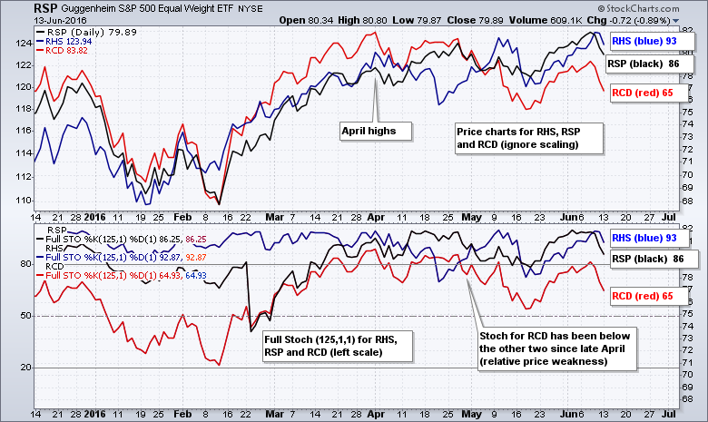
The lower window shows the plot for the 125-day Stochastic Oscillator. RCD (red) is clearly the weakest of the three because its Stochastic plot is under the other two. In other words, it is further from its six month high on the price chart.
******************************************************
Measuring Risk On-Risk Off - Using charts to quantify stock, economic and credit risk.
PPO Trading Strategy - How to use 3 PPOs to develop a trend-reversion trading strategy.
Long-term Trend Indicators - Using the PPO, EMA Slope and CCI to determine the trend.
ETF Master ChartPack - 300+ ETFs organized in a Master ChartList and in individual groups.
Follow me on Twitter @arthurhill - Keep up with my 140 character commentaries.
****************************************
Thanks for tuning in and have a good day!
--Arthur Hill CMT
Plan your Trade and Trade your Plan
*****************************************


