SystemTrader // Introduction - Measuring Trend Participation // 200-day EMA versus 200-day SMA // Backtesting the Moving Averages // Percent above 200-day Breadth Indicator // Smoothing and Reducing Whipsaws // Capturing Broad Market Participation // Conclusions on Trend Participation // Stocks Above EMA Symbols at StockCharts //// . . . . .
Introduction - Measuring Trend Participation
The humble moving average remains one of the most popular methods for trend identification and the 200-day moving average is perhaps the most common timeframe. Even though not all indexes, ETFs and stocks test well against the 200-day moving average, we can still use this moving average as a benchmark level to measure trend participation. This article will start by explaining the differences between a simple moving average and exponential moving average. I will then show how to use the Stocks Above 200-EMA indicator to measure trend participation. This indicator is part of a breadth trio I use to define the market environment and keep me on the right side of the trend. The first two articles covered Advance-Decline Percent and High-Low Percent.
200-day EMA versus 200-day SMA
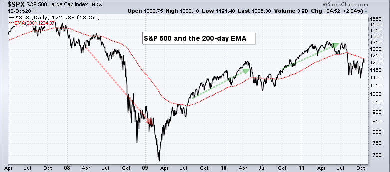
Before getting into this breadth indicator, it will help to clarify the difference between an exponential moving average and a simple moving average. A 200-day simple moving average is simply an average of closing prices for the last 200 days. The first price point, which is 200 days ago, counts just as much as the most recent price point. This is why moving averages lag. Moreover, the lag increases along with the length of the moving average.
An exponential moving average (EMA) puts more weight on recent prices and less weight on older prices. This reduces the lag, but does not completely remove the lag. EMAs react quicker to price moves and are often closer to the current price after a strong directional move.
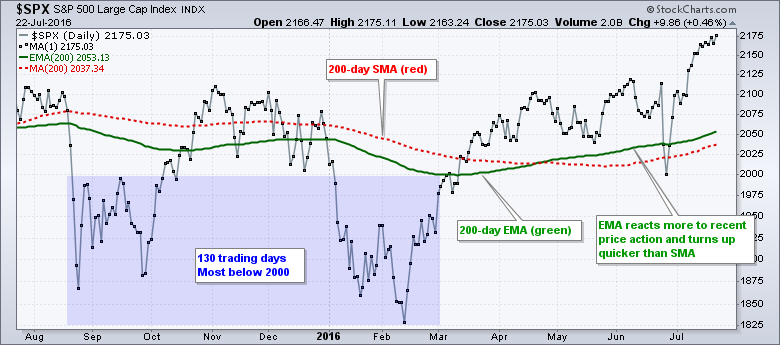 The chart above shows the 200-day EMA in green and the 200-day SMA in red. Notice how the 200-day EMA is below the 200-day SMA from August to February. This is because of two sharp declines below 2000 and more emphasis on recent prices (blue area). The S&P 500 turned up sharply in mid February and then surged to a new high in July. Notice that the 200-day EMA turned up in late March and reacted much quicker to recent price action.
The 200-day EMA and 200-day SMA often converge during long and steady trends. The chart below shows both moving averages from June-August 2013 until August 2014. The EMA was closer to the actual price in July and August, but the SMA closed this gap as the trend extended. These two moving averages were virtually identical from October 2013 to August 2014.

Backtesting the Moving Averages
Which is better? It appears that the 200-day EMA is slightly better than the 200-day SMA for the S&P 500. The table below shows results when testing these moving averages since 1950. Buy-and-hold for the S&P 500 returned 6.63% per annum with a 56.77% drawdown. Buying on a close above the 200-day SMA and selling on a close above the 200-day SMA returned slightly less than buy-and-hold, but the MDD was much less and the Risk-adjusted Return was higher.
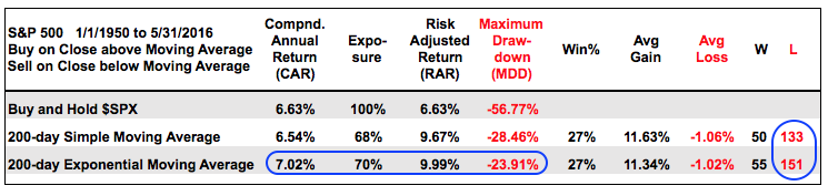 The 200-day EMA performed the best with a 7.02% annual return, a better Risk-adjusted Return and a better Maximum Drawdown. Before leaving this table, notice that losing trades outnumbered winning trades by three to one. There 151 losing trades because of whipsaws around the 200-day moving averages (EMA and SMA). This underscores the significance of the 200-day moving average as an important level for the S&P 500. It is where trends start and it is also a battle zone.
Even though the 200-day EMA performs better than the 200-day SMA when applied to the S&P 500 ($SPX), do not assume that EMAs perform better for all indexes, ETFs and stocks. If fact, you would be quite surprised at the differences in performance. The 200-day SMA works much better than the 200-day EMA for the S&P MidCap 400 (MID). The 200-day SMA works slightly better than the 200-day EMA for the S&P Small-Cap 600 ($SML). The performance numbers for the Nasdaq 100 ($NDX) were virtually identical.
Stocks Above 200-EMA Breadth Indicator
Despite mixed performance for the major stock indexes, there is still some value in the 200-day EMA and I use it has a breadth indicator. The 200-day EMA serves as benchmark level that we can use for comparative purposes. First, stocks trading above the 200-day EMA are stronger than stocks trading below their 200-day EMA. Second, an uptrend is more likely when above the 200-day EMA and a downtrend is more likely when below.
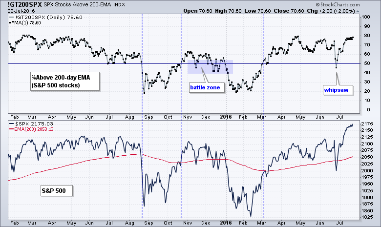 The chart above shows S&P 500 Stocks Above 200-EMA (!GT200SPX) with a horizontal line at 50%. This indicator tells use the percentage of stocks in the S&P 500 that are above their 200-day EMA (the rest are below). The S&P 500 is shown in the lower window with the 200-day EMA in red. In general, we can see that crosses above/below the 50% level coincide with crosses of the 200-day EMA. There was a battle around the 50% level in November-December as the index battled the 200-day EMA with several crosses. There was also a whipsaw in late June with the reaction to the Brexit vote.
Smoothing and Reducing Whipsaws
There is always a trade-off when looking for the perfect signal. Sensitive indicators will trigger quicker signals and this will result in more whipsaws (bad signals). Smoothing the indicators will add some lag to the signals and reduce the whipsaws. This means the entries and exits will not be as good.
Chartists must first decide how they wish to use the indicator. I am using the Stocks Above 200-EMA to help define the environment for the stock market as a whole. Is it bullish or bearish? The definition of long-term is also open for debate. For me, it is anything longer than two months. I basically have a short-term outlook (1-8 weeks) and a long-term outlook (2+ months). Anything more just gets too complicated for me simple brain.
Chartists should expect signals to lag because the Stocks Above 200-EMA is a trend following indicator by nature. My goal is not to reduce lag, but to reduce the whipsaws by ignoring insignificant moves in the indicator. The chart below shows the 10-day EMA of S&P 500 Stocks Above 200-EMA with a bullish threshold at 60% and a bearish threshold at 40%. This is like a double smoothing. First, I am smoothing the indicator itself by adding a 10-day EMA. Second, I am setting the signal thresholds above and below 50%.
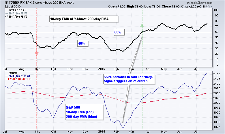 As seen from the number of losing trades in the backtests and the first chart, the 200-day EMA can be quite the battle zone. This is why I am looking for significant signals instead of mere crosses above/below 50%. It is of bullish significance when more than 60% of stocks trade above the 200-day EMA. Conversely, it is of bearish significance when fewer than 40% trade below their 200-day EMA. What happens between 41% and 59% is anybody's guess. Basically, I am avoiding the 50% area on purpose because this is a big battle zone subject to whipsaws. I am looking for a signal that the battle is over and a clear winner has emerged.
Capturing Broad Market Participation
Breadth indicators are designed to capture the degree of participation and the percentage of stocks above the 200-day tells us how many stocks are partaking in an uptrend. Chartists can measure broad market participation with the S&P 500 Stocks Above 200-EMA (!GT200SPX), Mid-Cap Stocks Above 200-EMA (!GT200MID) and Small-Cap Stocks Above 200-EMA (!GT200SML). The chart below shows the S&P 1500 with the 10-day EMA for these three indicators.
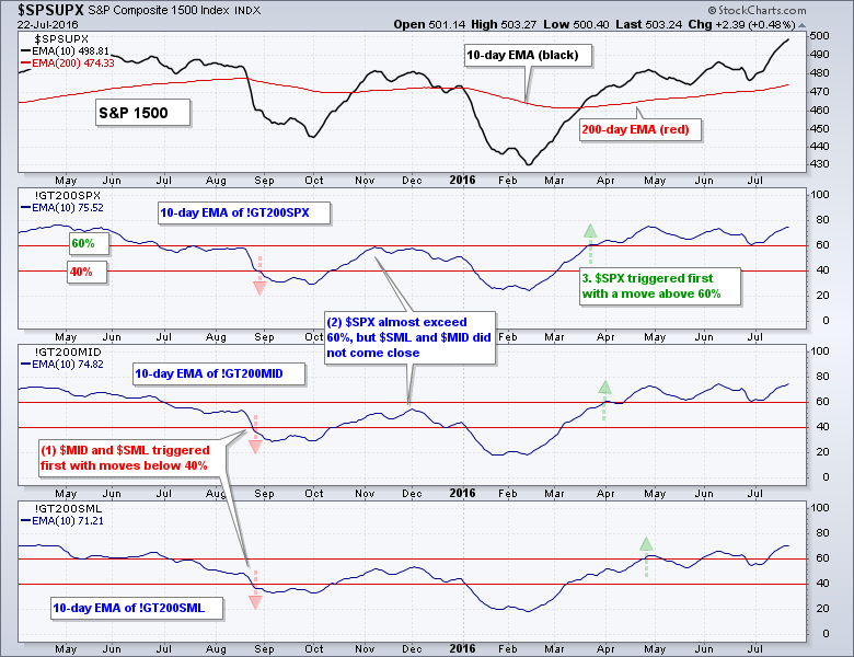 There are three takeaways on this chart. First, notice that mid-caps ($MID) and small-caps ($SML) weakened before large-caps in August. Second, large-caps ($SPX) came close to a bullish signal in November, but mid-caps and small-caps did not. Third, large-caps and mid-caps turned bullish with a move above 60% in late March. Small-caps lagged, but eventually confirmed with a move above 60% in late April.
Conclusions on Trend Participation
The Stocks Above 200-EMA is a breadth indicator we can use to determine participation levels in a trend. As with High-Low Percent, its signals will lag and trigger after the market has turned. As a trend-following indicator, it is designed to keep me on the right side of the market. The bulls have a clear edge when the 10-day EMA of Stocks Above 200-EMA exceeds 60% for two of the three indexes. This edge remains until there is enough selling pressure to push two of the three indicators below 40%. Moves below 50% can still be part of a correction and this is why I am looking for more selling pressure before turning bearish.
%Above Moving Average Symbols at StockCharts
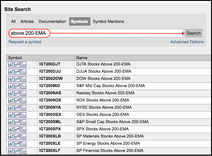
StockCharts calculates and publishes the Stocks Above EMA data for dozens of (several indexes and the nine sectors). These include the Dow Industrials, Nasdaq 100, Gold Miners ETF and the nine sector SPDRs. Chartists can find this list by searching the symbol catalog for "above 200-EMA". We also calculate for the 20-day EMA and 50-day EMA. Just substitute 20-EMA or 50-EMA for 200-EMA in your symbol search.
 The charts shown in this article can serve as templates for creating other breadth indicators. Users can click on these charts to open them in the SharpCharts workbench. The indicators settings will then be visible below the charts. Simply replace the existing symbols with other Stock Above EMA symbols to create different charts. Users can then click "save as" and place them in a ChartList for future reference.

****************************************
Thanks for tuning in and have a great day!
--Arthur Hill CMT
Plan your Trade and Trade your Plan
*****************************************


