SystemTrader // Introduction - the Bias is Obvious // High-Low Percent Calculation // Massaging the Data with Different Indicators // Setting Bullish and Bearish Thresholds // Breaking Down the S&P 1500 for more Clues // Conclusions on this Trend Following Indicator // High-Low Percent Symbols at StockCharts //// . . . . .
Introduction - the Bias is Obvious
52-week highs and 52-week lows are chart milestones that occur during strong trends. At the risk of stating the obvious, stocks forge 52-week highs in strong uptrends and 52-week lows in strong downtrends. The difference between the two tells us if more stocks are in strong uptrends or strong downtrends. This is valuable information on the market environment. The market environment is bullish when 52-week highs outnumber 52-week lows and bearish when 52-week lows hold the upper hand. This article will show how chartists can use High-Low Percent to define the broad market environment.
Note that this is the second article in a series on the breadth indicators I use to determine the broad market environment. The first article explained why I use the S&P 1500 as the base index for breadth and showed how to use the 10-day EMA of Advance-Decline Percent to identify significant shifts in market participation. This indicator usually triggers before High-Low Percent and these shifts mark significant reversals.
High-Low Percent signals act more like a trend-following indicator. High-Low Percent is less sensitive than AD Percent because we do not see big positive-negative shifts from day-to-day. New highs can dry up when the market falls, but we rarely see a sharp surge in new lows with a one-day decline. This makes sense because daily changes in new highs and new lows are less variable than daily changes advances and declines.
High-Low Percent Calculation
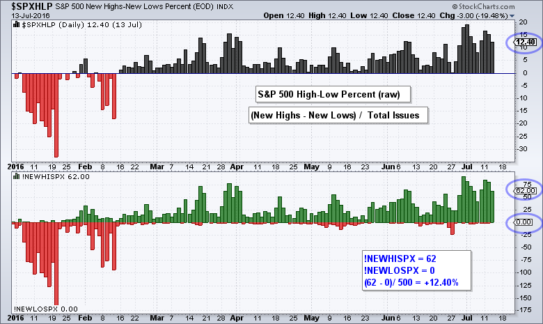
High-Low Percent is the percentage of net new highs, which is new 52-week highs less new 52-week lows. High-Low Percent is positive when new highs outnumber new lows and negative when new lows outnumber new highs. If there were 62 new highs, 0 new lows and 500 total stocks, High-Low Percent would be +12.40% ((62 - 0)/500 = .1240).
High-Low Percent = (New Highs - New Lows)/Total Issues
Massaging the Data with Different Indicators
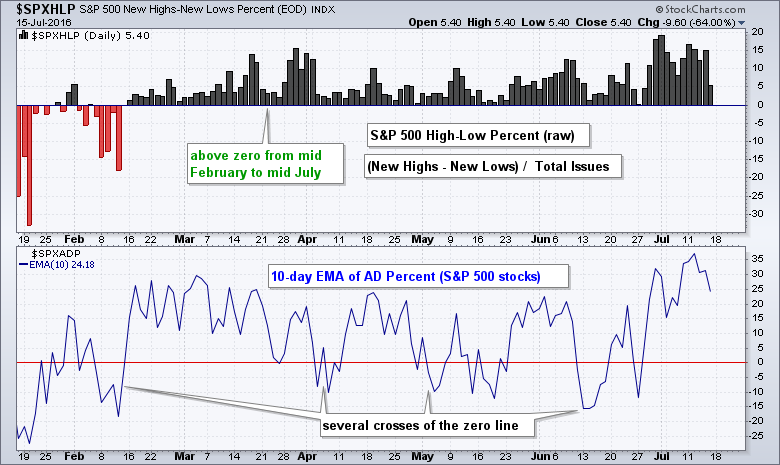
The chart below shows High-Low Percent (raw) as a histogram in the top window, the High-Low Line and the 10-day EMA of High-Low Percent, which acts as a slow oscillator. I am calling it an oscillator simply because it moves above and below the zero line (blue). Like an AD Line, the High-Low Line plots the cumulative readings of daily High-Low Percent. Thus, the High-Low Line rises when High-Low Percent is positive and falls when High-Low Percent is negative.
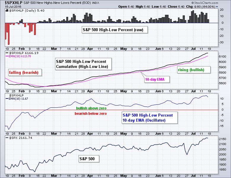 Even though the raw data is relatively tame, Chartists can consider "massaging" the data for smoothing purposes and further insights. A 10-day EMA can be added to the cumulative High-Low Line for signals. The indicator is bullish when above the EMA (rising) and bearish when below (falling). The 10-day EMA of High-Low Percent smooths the daily readings into an exponential moving average. Chartists can then use crosses above and below the zero line for signals. I am showing these just to give chartists ideas on working with this indicator.
Setting Bullish and Bearish Thresholds
There is no such thing as the perfect indicator with the perfect setting. EMA crossovers of the High-Low Line produce plenty of signals, but this means more whipsaws and bad signals. Even though the 10-day EMA of High-Low Percent is quite smooth, it too is prone to whipsaws because it can turn negative during corrections and not all corrections evolve into full-blown downtrends. The challenge is to trigger trend signals and avoid whipsaws during a corrective period.
After some trial and error, I opted for raw High-Low Percent with +10% and -10% as my bullish and bearish thresholds. Notice that I am setting my bullish and bearish thresholds well above/below the zero line. There are too many signals if we just look for crosses above/below the zero line. I tried using +5% and -5%, but these levels also produced a fair number of whipsaws. In addition, these levels are not high enough to denote a significant expansion of new highs or new lows. There is probably a "perfect" number between 5% and 10%, but I am not searching for perfection in an imperfect market.
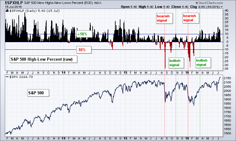 The chart above shows S&P 500 HiLo% ($SPXHLP) with lines at +10% and -10% for signals. A reading above +10% implies that more than 10% of stocks in the index hit new highs. Notice how the indicator stayed bullish throughout 2013-2014 and then turned bearish with a move below -10% in August. The indicator then triggered three more signals because of the bullish whipsaw (bad signal) in October.
Again, there is no such thing as the perfect indicator. I am using this indicator to simply determine a broad market bias. The bulls clearly have an upper hand when new highs outpace new lows and a move above +10% strengthens this bias. I remain with a bullish bias until a move below -10%, which shows a significant increase in downside participation. This means I do not turn bearish as the first sign of weakness and I do not turn bearish on modest weakness. Basically, I am looking for evidence of significant weakness by requiring the indicator to move below -10% for a bearish signal.
Breaking Down the S&P 1500 for more Clues
The examples above used the S&P 500 as the base index, but chartists can also use the S&P 1500, S&P MidCap 400 and S&P Small-Cap 600 for more insight. The S&P 1500 is an excellent index for measuring broad market breadth. The S&P MidCap 400 and S&P Small-Cap 600 can be used for insights into smaller stocks in the S&P 1500.
The next chart shows the S&P 1500 and the High-Low Percent indicators for each index. S&P 1500 High-Low Percent triggered two new signals from June 2015 to July 2016. There was an initial bearish signal with a move below -10% on August 21st and an initial bullish signal with a move above +10% on March 30th. The initial bearish signal was affirmed with subsequent moves below -10% in late September, January and February. The initial bullish signal was affirmed with subsequent moves above +10% in June and July. Notice that using +5% and -5% for signals would have resulted in more signals and more whipsaws.
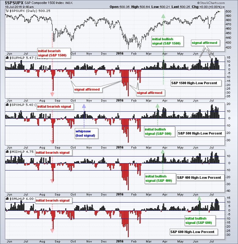 The index breakdown shows all three triggering bearish signals on August 21st. Note that the indicators came close to bearish signals in late July, but did not cross below -10%. S&P 500 HiLo% ($SPXHLP) turned bullish in October, but this signal turned out to be a whipsaw that was not confirmed by S&P 400 HiLo% ($MIDHLP) or S&P 600 HiLo% ($SMLHLP). At least two index signals are needed to trigger a broad market signal in S&P 1500 Hi-Lo Percent ($SUPHLP). Further along, notice that the S&P 500 was the first to turn bullish in mid March and the S&P MidCap 400 confirmed with a signal in late March. The S&P Small-Cap 600 did not reverse the August signal until a bullish signal triggered in early June.
Conclusions on this Trend Following Indicator
High-Low Percent is like a trend following indicator because the signals lag. In other words, a bullish signal will trigger AFTER the market has turned up and moved higher. Similarly, a bearish signal will trigger AFTER the market has turned down and moved higher. As with trend following indicators, High-Low Percent is designed to keep me on the right side of the market. Frankly speaking, simply being on the right side of the market is more than half the battle.
I set the bullish and bearish thresholds at +10% and -10% to filter out the weak signals and focus on the strong signals. Even though these thresholds will not prevent whipsaws completely, they ensure a certain amount of participation before triggering. For example, a move above +10% indicates that more than 10% of the stocks in the index are trading at new highs. This is clearly more bullish than bearish and this tells us a lot about the market environment.
High-Low Percent Symbols at StockCharts
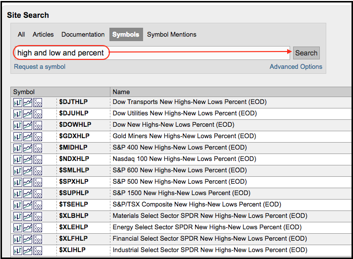
StockCharts calculates and publishes High-Low Percent data for dozens of symbols (indexes and ETFs). These include the Dow Industrials, Nasdaq 100, Gold Miners ETF and the nine sector SPDRs. Chartists can find this list by searching the symbol catalog for "high and low and percent".
 The charts shown in this article can serve as templates for creating other breadth indicators. Users can click on these charts to open them in the SharpCharts workbench. The indicators settings will then be visible below the charts. Simply replace the existing symbols with other High-Low Percent symbols to create different charts. Users can then click "save as" and place them in a ChartList for future reference.
****************************************
Thanks for tuning in and have a great day!
--Arthur Hill CMT
Plan your Trade and Trade your Plan
*****************************************