Still Watching the Swing within Trading Range // Mid-caps Outperform Large-caps // Small-caps Hold Support Zone // Breadth Indicators Hit New Milestones // Bonds Extend Surge as Yields Fall // Falling Yields Weigh on Finance-related Groups // Break Down Holds for Finance SPDR // Webinar Preview //// .....
Still Watching the Swing within the Range
The S&P 500 dipped below 2000 last Monday and then recovered to post its biggest weekly gain (3.22%) since November. Overall, chartists can make the case for a large trading range the last two years (1825 to 2125). This trading range is providing fodder for both bulls and bears so I think we need to look at price action within the range. As such, I remain focused on the swings within this range and the current swing is up as the index broke out in late February and broad market breadth turned bullish in early March. I expect a range breakout and new highs as long as the weight of the evidence remains bullish.
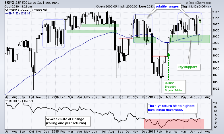
There is only one key level and this is the support zone in the 2000-2030 area. I am not marking resistance because I expect resistance levels to be broken when the evidence favors the bulls. Support is key because a support break reflects a notable increase selling pressure. A weekly close below 2000 would break support and call for a reassessment.
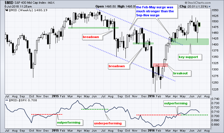
Mid-caps Outperform Large-caps
The S&P MidCap 400 also dipped into its support zone early last week and then recovered to close strong. The lows of the last three months and a buffer mark support in the 1400-1425 area. A weekly close below 1400 would break support and call for a reassessment. The indicator window shows the $MID:$SPX ratio rising since early January as mid-caps outperform large-caps.
Small-caps Hold Support Zone
Small-caps are also holding up well as the S&P Small-Cap 600 bounced off the support zone. The lows of the last three weeks and a buffer mark support in the 660-670 area. The indicator window shows the $SML:$SPX ratio rising since early February as small-caps outperform large-caps. This ratio stalled in June, but small-caps would not show relative weakness unless this ratio breaks the May low.
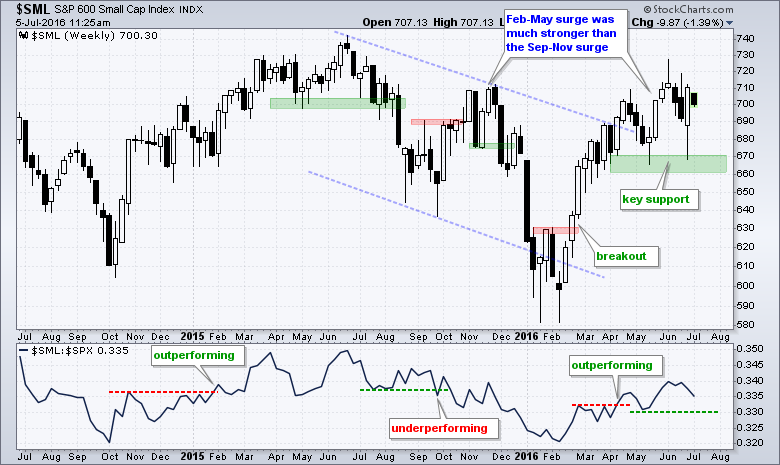
The support levels marked on the last three charts can be used to define broad market direction. Even though volatility increased over the last few months, these support levels held and the trends remain up. I am especially impressed with the strength in small and mid caps since mid February. Note that the advances from February to May were much stronger than the advances from September to November.
Breadth Indicators Hit New Milestones
The next chart shows the S&P 1500 with two key breadth indicators: the 10-day EMA of S&P 1500 AD Percent ($SUPADP) and S&P 1500 High-Low Percent ($SUPHLP). The S&P 1500 is an excellent barometer for the broader market because it includes the S&P Large-cap 500, S&P MidCap 400 and S&P Small-Cap 600. The 10-day EMA of AD Percent triggered bullish with a surge above +30% on March 3rd. Notice that the indicator dipped below -10% several times from early April to late June, but did not even breach the -20% level. My bearish threshold is -30% and I will remain bullish until selling pressure is broad enough to push this indicator below -30%.
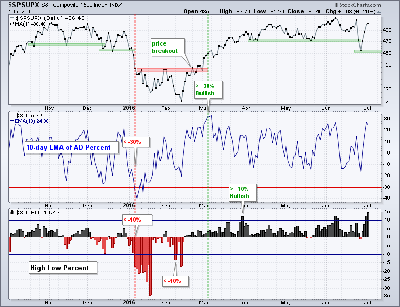
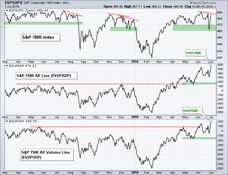
High-Low Percent triggered bullish with a move above +10% in late March. There were confirming signals in June as the index exceeded +10% four days in June. The indicator hit 14.5% on Friday and this is the highest level since March 2015. This suggests that participation is broadening and this is bullish overall. At the very least, it does not take a rocket scientist to figure out that the bulls have the edge when new highs outpace new lows. In a separate, but related note, the AD Line and AD Volume Line for the S&P 1500 hit new highs last week.
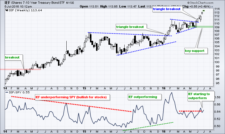
Bonds Extend Surge as Yields Fall
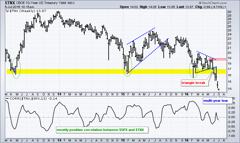
Even though the evidence remains bullish for stocks, there is some concern the bond market. For example, the 7-10 YR T-Bond ETF (IEF) is starting to outperform the S&P 500 SPDR (SPY). This shows a preference for safety over risk. The chart below shows IEF breaking triangle resistance in late May and surging above 113 this week. The indicator window shows the IEF:SPY ratio turning up in June and breaking above the April-May highs. This means IEF is starting to outperform SPY. The second chart shows the 10-YR Treasury Yield ($TNX) moving below 14 (1.4%) for the first time since July 2012.
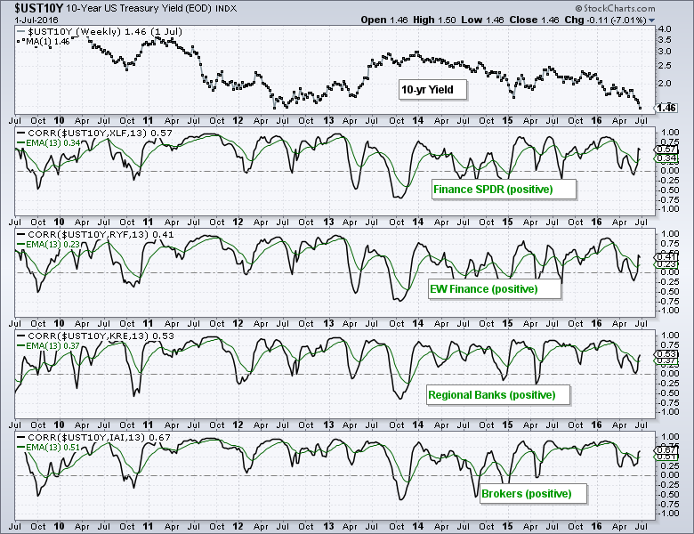
Falling Yields Weigh on Finance-related Groups
The Finance SPDR (XLF) remains one of the weakest of the nine sector SPDRs and falling Treasury yields are partly to blame. Note that the finance sector has a strong positive correlation to the 10-YR T-yield. This means they tend to move in the same direction. The chart below shows Correlation Coefficients between the 10-yr Yield and four finance-related ETFs. This is a weekly chart and the green lines show the 13-week EMA of the 13-week Correlation Coefficient. This EMA serves as a smoothing mechanism. Notice that the green lines are all positive and confirms that they tend to move in the same direction as the 10-yr yield.
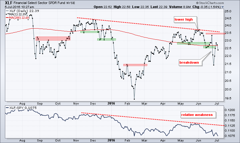
Break Down Holds for Finance SPDR
June was an exceptionally volatile month for the Finance SPDR (XLF), but the ETF broke prior lows twice and should be considered bearish. Notice that XLF popped with the rest of the market last week, but did not even challenge the late June high and moved back below its 200-day moving average today. The indicator window shows the price relative (XLK:SPY ratio) near its 2016 lows as the finance sector underperforms the broader market. Note that I will feature charts for five big banks in today's webinar.
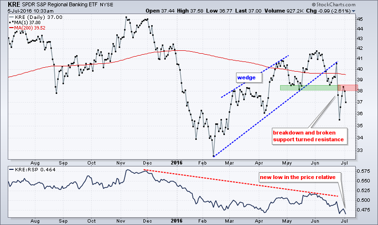
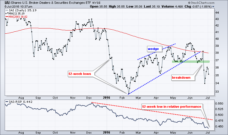
Elsewhere in the finance sector, the Regional Bank SPDR (KRE) broke wedge support with a sharp decline below 38 and broken support turned into resistance. The indicator window shows the price relative hitting a new low as KRE underperforms the broader market. The Broker-Dealer iShares (IAI) also broke down.
******************************************************
Measuring Risk On-Risk Off - Using charts to quantify stock, economic and credit risk.
PPO Trading Strategy - How to use 3 PPOs to develop a trend-reversion trading strategy.
Long-term Trend Indicators - Using the PPO, EMA Slope and CCI to determine the trend.
ETF Master ChartPack - 300+ ETFs organized in a Master ChartList and in individual groups.
Follow me on Twitter @arthurhill - Keep up with my 140 character commentaries.
****************************************
Thanks for tuning in and have a good day!
--Arthur Hill CMT
Plan your Trade and Trade your Plan
*****************************************


