Broad Market Strength affirms Bull Market // Short-term Yields Edge Higher - Will Long-term Yields Follow? // Extrapolating from the June Swoon in Treasury Yields // Finance Sector Remains Strong // Regional Bank SPDR Holds Breakout - JPM, C, BAC, USB // Setting first Supports for the Fab Five - FB, GOOGL, AMZN, AAPL, MSFT // Chart Potpourri - XBI, JJU, AA, UNP, PFE //// .....
Broad Market Strength affirms Bull Market
The major stock indexes continue to stall in the short-term, but this does not detract from the long-term trends and the bull market environment. The chart below shows the S&P 500, S&P MidCap 400, S&P Small-Cap 600 and Nasdaq 100 with their 50-day EMAs (green) and 200-day EMAs (red). All four are well above their 200-day EMAs and the 50-day EMAs are above the 200-day EMAs. This sets the bullish tone for the "stock market" because all four indexes are on board.
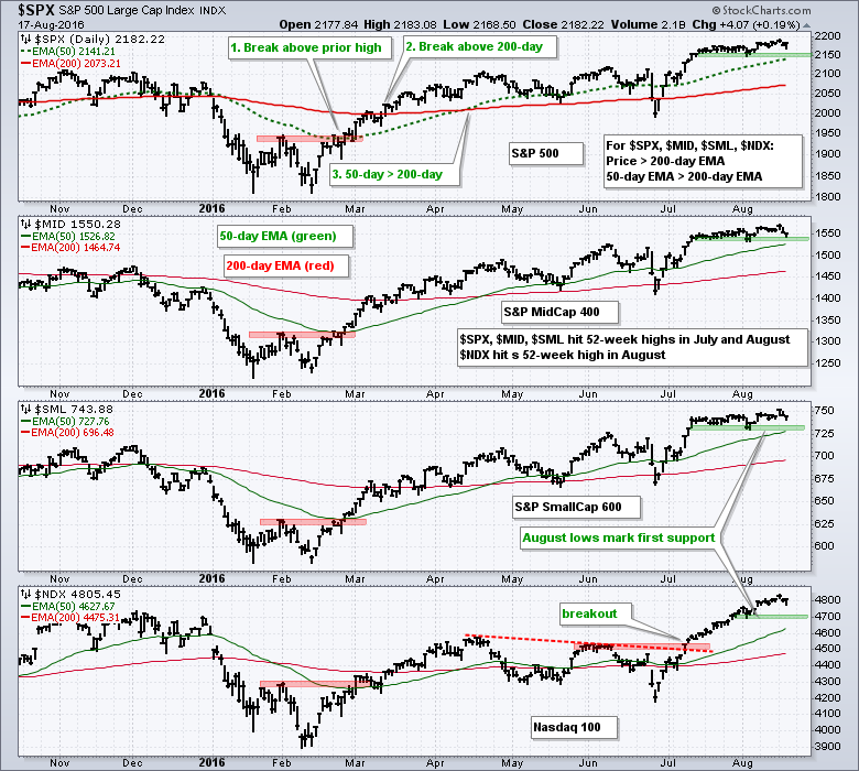
In addition to clear uptrends since, note the $SPX, $MID and $SML hit 52-week highs in July and August. $NDX joined with a 52-week high in August as well. Short-term, the three S&P indexes stalled over the last five weeks, but this stall has an upward drift because all three hit fresh 52-week highs on Monday. The green shading marks the first support zones to watch, but I would not turn that bearish on a break because the bigger trend remains the dominant force. More likely, a 2-3 percent decline would create an opportunity for a mean reversion trade.
Short-term Yields Edge Higher - Will Long-term Yields Follow?
The next chart shows four Treasury yields with the 50-day EMA and 200-day EMA. I am not using these EMAs to mark support or resistance. Instead, they serve as benchmark levels to help identify the trend and compare the different yields. Each window shows the yield and relationships with the two EMAs. The 10-year Treasury Yield ($UST10Y) remains in a long-term downtrend and 50-day EMA has been below the 200-day EMA since mid January. The close is well below the 200-day and just below the 50-day EMA. All indications are red and indicative of a downtrend. Despite this downtrend, we are starting to see some green at the shorter end of the yield curve and I am watching the 10-yr yield for a short-term breakout at 1.6%.
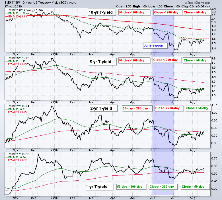
Moving to the short end of the curve, the 2-year Treasury Yield ($UST2Y) is above its 50-day EMA and very close to exceeding its 200-day EMA. The 1-year Treasury Yield ($UST1Y) is the strongest of the four because the 50-day is above the 200-day, and the yield is above both. The 1-yr and 2-yr yields show the most short-term strength and I am watching to see if this transfers to the 5-yr and 10-yr yield. Don't listen to the Fed or the pundits. Watch the bond market first and foremost.
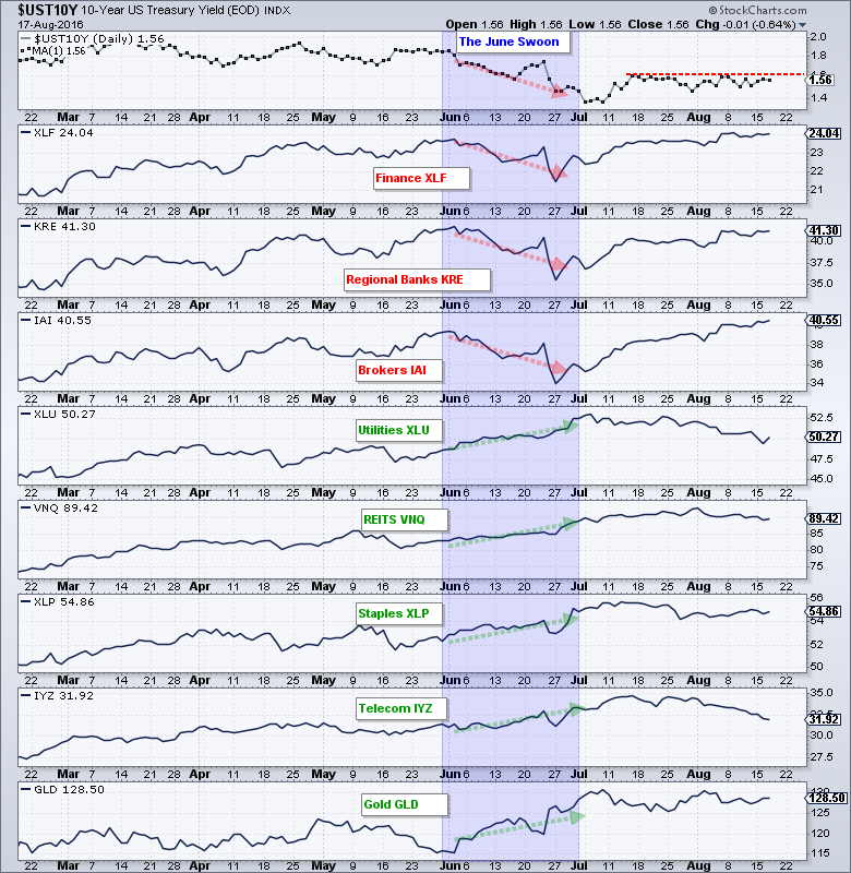
Extrapolating from the June Swoon in Treasury Yields
I am interested in these yield charts because a breakout in the 10-yr would have a negative affect on gold, utilities, staples, REITs and telecoms. In contrast, a breakout would be bullish for the finance sector, banks and brokers. I draw this conclusion based on the reactions to the June swoon in the 10-yr yield. The chart below shows the 10-Yr Yield plunging in June. The Finance SPDR (XLF), Regional Bank SPDR (KRE) and Broker-Dealer iShares (IAI) also moved lower and were positively correlated. The Utilities SPDR (XLU), REIT ETF (VNQ), Consumer Staples SPDR (XLP), Telecom iShares (IYZ) and Gold SPDR (GLD) all moved higher and were negatively correlated. We can expect the opposite to happen should the 10-yr yield break out and move higher, even just to 1.8%.
Finance Sector Remains Strong
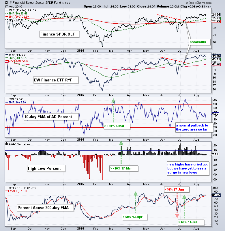
The finance sector continues to trend higher with the EW Finance ETF (RYF) hitting a 52-week high in early August and the Finance SPDR (XLF) breaking its June high. The 50-day EMAs are above the 200-day EMAs for both. Two of the three breadth indicators have been bullish since mid March and all three have been bullish since 11-July. The 10-day EMA of AD Percent and High-Low Percent softened over the last two weeks, but neither is close to a bearish signal (move below -30% for AD Percent and -10% for High-Low Percent). The %Above 200-day EMA remains very strong at 81.52%. You can read more about these breadth indicators here.
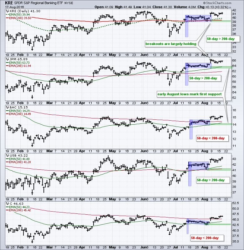
Regional Bank SPDR Holds Breakout - Plus Four big Banks
The next chart shows the Regional Bank SPDR (KRE) and four big banks, which are not part of KRE. First, all are trading above their 200-day EMAs and the 50-day EMA is above the 200-day EMA for four of the five. All broke flag resistance with surges on August 5th and these breakouts are holding for the most part. The green zones mark the August lows and these are the first support levels to watch. I will not become concerned with the finance sector until these stocks start breaking their early August lows.
Setting first Supports for the Fab Five - FB, GOOGL, AMZN, AAPL, MSFT
The Fab Five led the Nasdaq 100 ETF (QQQ) higher with big moves from late June to mid August. Overall, four of the five can be considered in long-term uptrends. Apple is the only one where the 50-day EMA remains below its 200-day EMA and the only one that did NOT record a 52-week high recently. Nevertheless, it was one of four that surged over 20% the last 7-8 weeks. AMZN only advanced 14%.
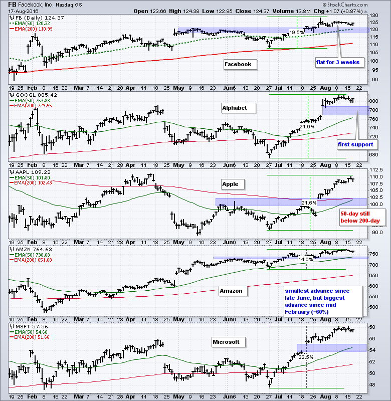
At this point, the only potential negative is they are extended and ripe for a pullback or consolidation. FB has already consolidated with a narrow range around 125 the last three weeks. AMZN has also flattened above 750. At this point, I am most interested in where these stocks may find short-term support should we see a pullback and the blue shaded areas mark potential support zones. In other words, I am not interesting in timing a pullback within an uptrend. Instead, I want to try and time a bounce within an uptrend.
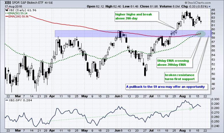
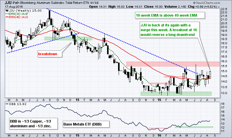
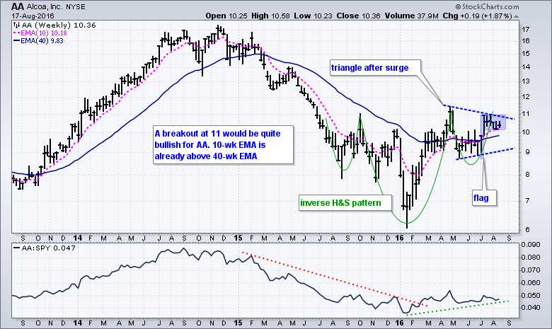
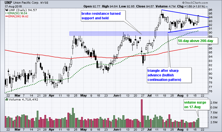
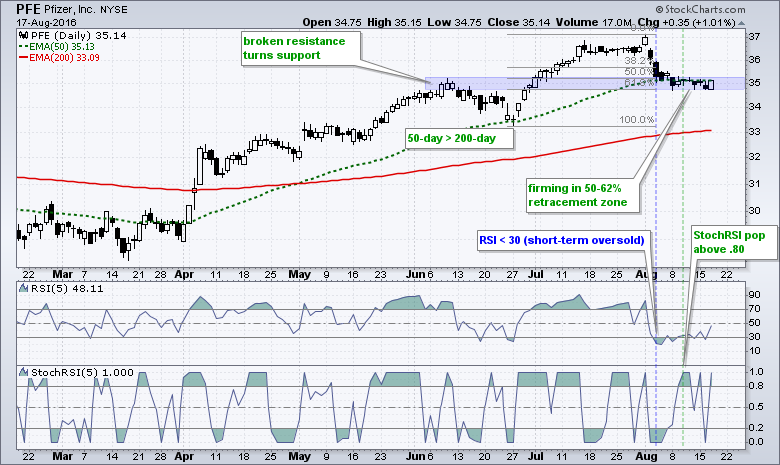
Chart Potpourri - XBI, JJU, AA, UNP, PFE
The next charts have annotations and explanations right on the chart.
******************************************************
Measuring Risk On-Risk Off - Using charts to quantify stock, economic and credit risk.
PPO Trading Strategy - How to use 3 PPOs to develop a trend-reversion trading strategy.
Long-term Trend Indicators - Using the PPO, EMA Slope and CCI to determine the trend.
ETF Master ChartPack - 300+ ETFs organized in a Master ChartList and in individual groups.
Follow me on Twitter @arthurhill - Keep up with my 140 character commentaries.
****************************************
Thanks for tuning in and have a good day!
--Arthur Hill CMT
Plan your Trade and Trade your Plan
*****************************************


