Taking the Emotion out of Jobless Claims and Non-Farm Payrolls .... No Issues with Weekly SPY Chart .... Backtest Review for Key EMA Crossover .... ChartCon Strategy Preview .... QQQ Stalls with Very Tight Range .... Small-caps and Large-caps Continue to Outperform .... AD Percent Stalls along with Indexes .... New Highs Wane, but New Lows Remain Scarce .... Percent above 200-day Indicator Remain Firmly Bullish //// .....
Taking the Emotion out of Jobless Claims and Non-Farm Payrolls
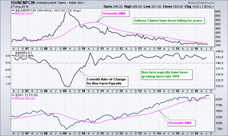
Hold on to your hats because the most important employment report of the year will be released today. Wait a minute! I thought the May report was the most important. No, I was wrong, it was the February report. You get the picture. The upcoming report is always "the most important" report. It is a never-ending cycle and most of the time we are better off ignoring the report and focusing on the price charts. However, if you must see some employment data, let's look at a chart and remove some of the emotion. The chart below shows Initial Jobless Claims ($$UNCMPIN), the 3-month Rate-of-Change for Non-Farm Payrolls and the S&P 500. Jobless claims remain in a steady downtrend and the 3-month Rate-of-Change for non-farm payrolls remains clearly positive. There is a clear negative correlation between Jobless Claims and the S&P 500 because they are moving in opposite directions.
No Issues with Weekly SPY Chart
The S&P 500 is the single most important index when assessing the US stock market and I will start with here. The chart below shows the S&P 500 SPDR (SPY) with weekly bars, the 10-week EMA and 40-week EMA. There are three bullish steps to the current uptrend and we have yet to see any bearish steps. First, the index broke its prior high (peak) the third week of February. Second, the index closed above the 40-week EMA the following week. Third, the 10-week EMA closed above the 40-week EMA in late March.

The Brexit shenanigans pushed SPY below the mid May low and 40-week EMA in late June, but we did not see a weekly close below these two levels because the ETF rebounded immediately. This is why I prefer weekly charts for my long-term analysis. SPY went on to break another resistance level in early June and hit multi-year highs. There is nothing bearish on this chart and I will mark first support in the 209-211 area. A pullback into this zone could provide an opportunity.
Backtest Review for Key EMA Crossover
The next table shows backtest results for EMA crossovers using the S&P 500 Total Return Index ($SPXTR). In contrast to the normal S&P 500, the total return version includes dividends and provides a more realistic picture for returns. Note that SPY is also dividend adjusted and the chart reflects the total return. Chartists can precede the symbol with an underscore (_SPY) to see the unadjusted data.
Returning to the backests, I first tested the 10-week/40-week EMA crossover and the 50-day/200-day EMA crossover with long positions only. There is not much different between the two, but I think the 10-week/40-week EMA crossover has a slight edge. The Compound Annual Return is slightly higher, the Maximum Drawdown is slightly lower and the average gain is higher (because fewer whipsaws). Notice that both are better than buy-and-hold because the Maximum Drawdowns are much smaller and tolerable.

The second half of the table shows these same EMA crossovers with long and short positions. Notice that short positions DO NOT add any value. The Compound Annual Returns are lower, the exposure is higher, the Risk-adjusted Returns are lower, the Maximum Drawdowns are higher and the Win% is much lower. We are better off playing the long side of the stock market and staying out of the short side.
ChartCon Strategy
At this year's ChartCon I will show how to create and execute a momentum trading strategy for stocks using the tools at StockCharts. Backtest results were promising with a Compound Annual Return of 13% over the last fifteen years. Moreover, this strategy lost less than 7% in 2011, which was a year to forget for many traders. Past performance does not guaranty future returns, but you will surely learn a great deal about trading system development in this presentation.

QQQ Stalls with Very Tight Range
The Nasdaq 100 ETF (QQQ) sports a volatile uptrend since October 2014 with a series of higher highs and higher low (green channel). I am ignoring the spike low on 24-August-2015 because it was just one day and the recovery was immediate (kind of like Brexit). Most recently, QQQ stalled the last four weeks with a rather tight trading range. This range is so tight that I fear a whipsaw if playing the break (either way). Overall, I would mark the first support zone around 111-112 and view a pullback to this area as a potential opportunity.

Small-caps and Large-caps Continue to Outperform
Note that QQQ and IWM are outperforming SPY. QQQ represents large-cap tech stocks and the growth end of the market. IWM represents small-caps and the high-risk end of the stock market. Relative strength in both groups points to a healthy risk appetite within the stock market. On the price chart, I am using a Raff Regression Channel to define the uptrend in IWM. The lower line ends around 112.5 and a break below 112 would call for a reassessment of the overall uptrend. Further up the chart, broken resistance marks first support in the 118 area. A pullback to this area would provide a potential opportunity.

AD Percent Stalls along with Indexes
I will now turn to the breadth indicators for the S&P 1500, S&P 500, S&P MidCap 400 and S&P Small-Cap 600. The 10-week/40-week EMA cross provides great long-term trend signals for the S&P 500, but breadth indicators can be used for early warnings and confirmations. You can read about my trend identification strategy and how I use these breadth indicators in this article. The links to the individual breadth articles can be found in the first paragraph.
The 10-day EMA of AD Percent is the first breadth indicator and the S&P 1500 is used for broad market signals. A move above +30% is bullish and a move below -30% is bearish. I then break down the S&P 1500 into the three market cap indexes for further insights. The 10-day EMA for S&P 1500 AD Percent ($SUPADP) turned bullish with a surge above +30% in early March and this signal was affirmed with a subsequent move above +30% in early July. The indicator has since fallen back to the 0-10% area the last few weeks, but this is normal during a flat consolidation. I would not become concerned unless we see enough selling pressure to push this indicator below -30%. So far, the indicator is not even close to a bearish signal. The green shading shows the other index indicators hovering in the zero to ten percent area.

New Highs Wane, but New Lows Remain Scarce
The next chart shows High-Low Percent for the same indexes with the S&P 1500 High-Low Percent ($SUPHLP) in the second window. A move above +10% shows enough participation to turn bullish and a move below -10% shows enough participation to turn bearish. S&P 1500 High-Low Percent turned bullish with a move above +10% in late March and has yet to turn bearish. Even though there are fewer new highs than in early July, new highs still outnumber new lows and this is really all that matters. The trouble starts when new lows seriously expand and a bearish signal triggers with a move below -10%.

Percent above 200-day Indicator Remain Firmly Bullish
The next chart shows the percentage of stocks above the 200-day EMA for the S&P 500, S&P MidCap 400 and S&P Small-Cap 600. A rally reaches critical mass when this indicator exceeds 60% for two of the three indexes. Conversely, a move below 40% in two of the three indexes means downside participation has reached bearish proportions. The S&P 500 was the first to trigger bullish in mid March and the S&P MidCap 400 followed a week later. Small-caps did not trigger until mid April. All three have been hovering in the 70% area since mid July and remain bullish.

No matter what happens with today's employment report, the bulk of the evidence is bullish for stocks and will remain bullish after today's close. Well, ok, we could get a crash. Barring a crash today, I remain bullish for the foreseeable future and will remain so until the indicators suggest otherwise. This means I still favor long positions over short positions, stocks with relative strength and stocks with good upside momentum.
******************************************************
Measuring Risk On-Risk Off - Using charts to quantify stock, economic and credit risk.
PPO Trading Strategy - How to use 3 PPOs to develop a trend-reversion trading strategy.
Long-term Trend Indicators - Using the PPO, EMA Slope and CCI to determine the trend.
ETF Master ChartPack - 300+ ETFs organized in a Master ChartList and in individual groups.
Follow me on Twitter @arthurhill - Keep up with my 140 character commentaries.
****************************************
Thanks for tuning in and have a good day!
--Arthur Hill CMT
Plan your Trade and Trade your Plan
*****************************************


