Aroon Indicators Crash on SPY Chart .... IWM and QQQ Continue to Outperform .... Financials, Utilities and the 10-yr Yield .... Short-term Yields Rising Faster than Long-term Yields .... Plotting, Analyzing and Scanning with Bollinger Bands .... ChartList Update .... //// ....
The S&P 500 SPDR (SPY) moved back above 215 on Wednesday, but remains range bound since mid July, which is when it first crossed above 510. We could add some lines to draw a diamond and point to the early September gap as bearish, but I think the long-term trend is up because the ETF hit a new high in August and the 50-day EMA is well above the 200-day EMA. Long-term support is set in the 208-210 area. Short-term, SPY bounced over the last 3-4 weeks and the short-term trend is up with support marked at 213.50, a break of which could target a test of long-term support.
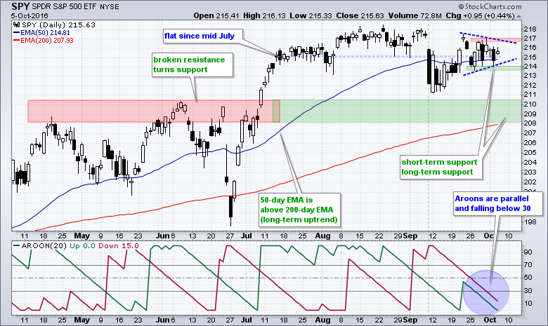
The consolidation of the last few weeks is also reflected in the Aroon indicators (Aroon-Up and Aroon-Down). As their names imply, one measures upside directional movement and the other downside directional movement. Both are below 30 and falling in parallel fashion. This means there is little up movement and little down movement right now. In short, it means there is a consolidation and we should prepare for break. The first Aroon to surge above 50 will trigger the next directional signal: bullish should Aroon-Up surge above 50 or bearish should Aroon-Down surge above 50.
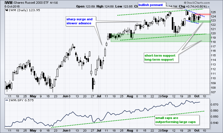
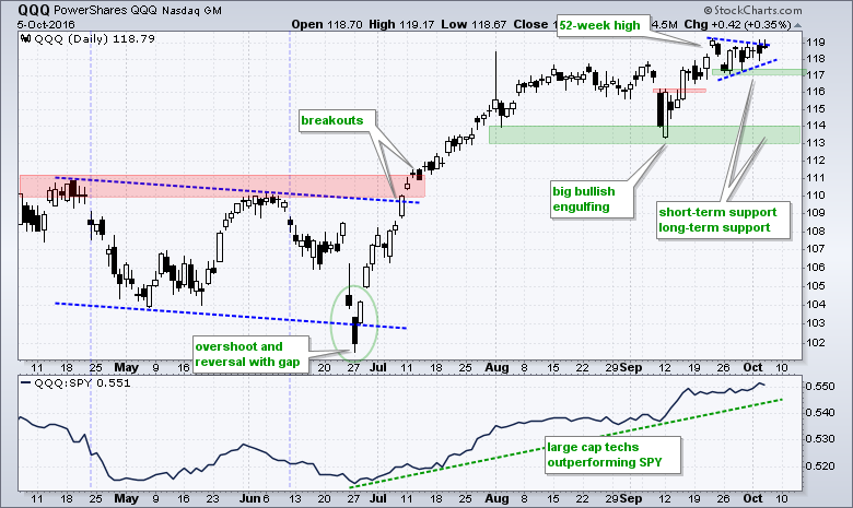
IWM and QQQ Continue to Outperform
IWM remains with an upward drift since July (green trend lines) and a falling wedge/pennant over the last two weeks. This is a bullish continuation pattern and a breakout at 124.5 would signal a continuation of the bigger uptrend. While a short-term support break at 122.5 would be negative, I would not read too much into it because the bigger uptrend carries more weight. Long-term support is set in the 118-120 area.
QQQ is consolidating near 52-week highs with a small triangle or pennant. A break below 117 would be short-term negative, but you know the assumptions. I assume that short-term bearish signals will result in whipsaws when the bigger trend is up. In other words, I am only interested in short-term bullish signals and bullish setups when the bigger trend is up. Moreover, I also prefer short-term bullish setups that result from a pullback or short-term oversold reading. A break below 117, while negative, would likely lead to the next short-term bullish setup.
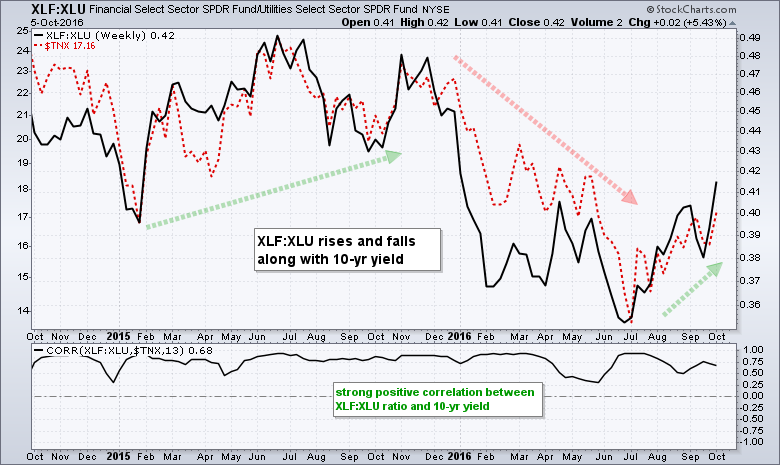
Financials, Utilities and the 10-yr Yield
John Murphy pointed out the XLF:XLU ratio on Wednesday because financials are starting to outperform utilities. John noted the significance of this ratio because financials "benefit from higher rates" and utilities are "hurt by higher rates". Later in the day, I was watching an excellent MTA webinar from Will Geisdorf of Ned Davis and he showed this chart overlaid with the 10-yr T-Yield ($TNX). Remarkable! The chart below shows the XLF:XLU ratio in black and $TNX as the red dashed line. They are clearly moving in the same direction and this is confirmed with the Correlation Coefficient. Thus, chartists can expect financials to outperform utilities when the 10-yr T-Yield rises.
Short-term Yields Rising Faster than Long-term Yields
The next chart shows the 10-yr T-Yield ($UST10Y), the 5-yr T-Yield ($UST5Y), the 2-yr T-Yield ($UST2Y), 1-yr T-Yield ($UST1Y) and the Yield Curve 10yr Less 2yr ($YC2YR). Each plot is with the 50-day EMA and 200-day EMA. Chartists can use these emails to compare the trends. First, notice that the 10-yr yield is below the 200-day EMA and above the 50-day EMA. The 50-day EMA is also below the 200-day EMA. The trend since July is up, but more work is needed to reverse the long-term downtrend.
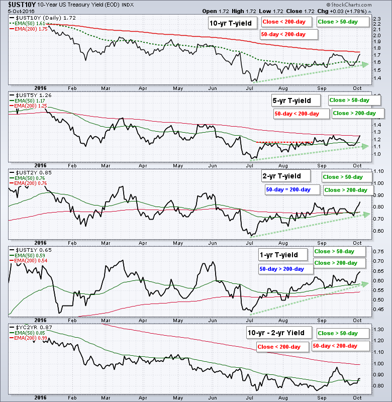 Moving to the short end of the yield curve, the next to the last window shows the 1-yr Yield above its 200-day EMA and above its 50-day EMA. Also notice that the 50-day EMA is above the 200-day EMA and the 1-yr Yield exceeded its September high. By comparing the relationships with the EMAs, we can see that there is more strength at the short-end of the curve right now and this favors a Fed tightening, perhaps in December. The bottom window shows the yield curve stabilizing over the last three months.
Plotting, Analyzing and Scanning with Bollinger Bands
The GM chart below shows a classic Bollinger Band squeeze, head fake down and upside breakout. First and foremost, notice that the long-term trend is up because the 50-day EMA is above the 200-day EMA and the stock hit a 2016 high on Wednesday. Second, notice how the stock stalled in August and the Bollinger Bands narrowed in early September. This set up the classic squeeze play. GM broke below the lower band when the market plunged in early September, but quickly recovered and broke above the upper band on September 22nd. This downside break is referred to as a "head fake" by John Bollinger in his book, Bollinger on Bollinger Bands.
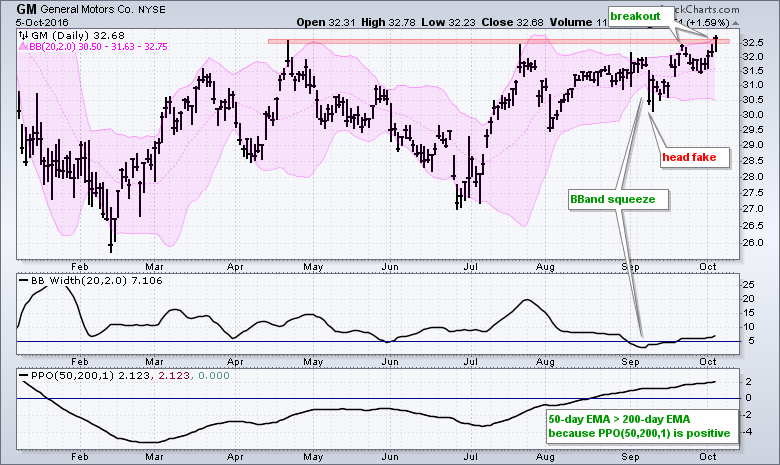 The first indicator window shows BandWidth, which measures the difference between the two Bollinger Bands. The second window shows the PPO(50,200,1), which measures the difference between the 50-day EMA and 200-day EMA.
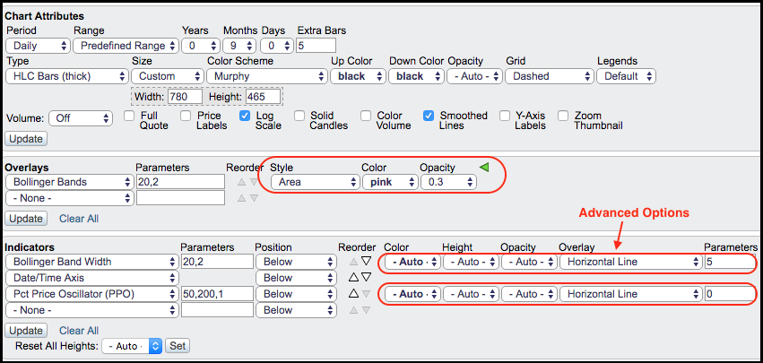
I set the Bollinger Bands in pink by choosing Area as the indicator Style, pink as the Color and 0.3 for Opacity. Adjusting the transparency makes it easy to see the bands on the chart and identify signals. I used the Advanced indicator settings to add Horizontal Lines to the BandWidth and the PPO. See image below for details.
 Chartists can also scan for low BandWidth using the code below. This code shows stocks in the S&P 500 where the lowest level of BandWidth over the last 10 days is below the lowest level of the prior 79 days (90 - 11). It is basically looking for stocks where BandWidth is at a 90 day low.
[group is SP500] and
[Min(10,BB Width(20,2)) < 11 days ago Min(90,BB Width(20,2))]
ChartList Update
The Art's Chart ChartList has been updated with some individual stocks. The ChartList is sorted by date and I left the industry group ETFs, which were added on Monday (3-Oct). 16stocks were added today (6-Oct) and they are in the second half of the list. Highlights include:
- Monsanto forms big bullish engulfing near support
- Boeing goes for a breakout
- UPS forms bull flag
- Amazon surges on big volume
- Intel leads semis with a new high
- Auto parts stocks start outperforming (AXL, BWA, DLPH, MGA, TEN)
Click here to see the ChartList.
******************************************************
Measuring Risk On-Risk Off - Using charts to quantify stock, economic and credit risk.
PPO Trading Strategy - How to use 3 PPOs to develop a trend-reversion trading strategy.
Long-term Trend Indicators - Using the PPO, EMA Slope and CCI to determine the trend.
ETF Master ChartPack - 300+ ETFs organized in a Master ChartList and in individual groups.
Follow me on Twitter @arthurhill - Keep up with my 140 character commentaries.
****************************************
Thanks for tuning in and have a good day!
--Arthur Hill CMT
Plan your Trade and Trade your Plan
*****************************************


