Vanguard Financials ETF Hits Channel Trend Line .... Spotting Pullbacks within an Uptrend .... Trading with MACD-Histogram and RSI .... Scan Code for Pullbacks .... Microsoft and Apple Trigger Signals.... //// ....
Vanguard Financials ETF Hits Channel Trend Line
Many stocks and ETFs surged over the last two weeks and became short-term overbought. Keep in mind that overbought is a double-edged sword. First, short-term overbought is actually long-term bullish because overbought conditions stem from exceptionally strong buying pressure. Second, short-term overbought conditions indicate that price has advanced sharply in a short period of time and this means we could see a pullback. Overbought conditions do not, however, guarantee a pullback. Even if a pullback unfolds, nobody knows how long it will last or how far it will extend.
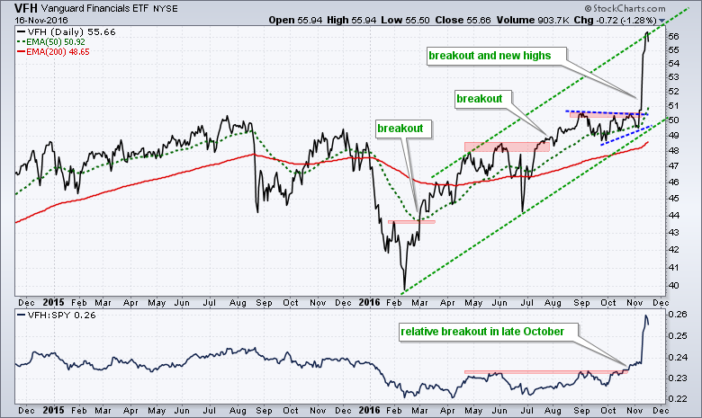
The chart above shows the Vanguard Financials ETF (VFH) with three breakouts in 2016 and a 52-week high with a 10+ percent surge November. The ETF touched the upper trend line of a rising channel and is clearly short-term overbought. I would not consider the upper trend line as a "hard" resistance level. It is just telling us to be on guard for a pullback or consolidation. The indicator window shows the price relative (VFH:SPY ratio) breaking out in late October. Note that this breakout preceded the price breakout.
Spotting Pullbacks within an Uptrend
How can we find short-term opportunities on a pullback? The chart below was first posted on October 18th (green vertical line). VFH just broke flag resistance and the PPO (5,30,5) just turned up. There was another downturn in the PPO in early November and then an upturn just before the election. The signals were there for the taking. For the next setup, I would look for the PPO to dip back below 1 and/or RSI(5) to dip below 30. Note that the long-term trend is clearly up and this means I am IGNORING bearish crosses in the PPO. Short-term bearish signals are just noise when the bigger trend is up.
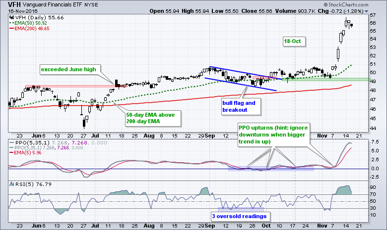
The lower indicator window shows RSI(5) dipping below 30 seven times over the last six months. Sometimes one dip works (early August). Sometimes two dips work (June). Sometimes we may see more than two dips (September). It is just the nature of the beast. One strategy might be to wait for RSI(5) to dip below 30 and then look for an upturn in the PPO. This will result in a later entry, but it will ensure that prices have started to turn up. This does not, however, guarantee that the upturn will extend.
Trading with MACD-Histogram and RSI
The Industrials SPDR (XLI) is another sector that surged and became short-term overbought. Instead of the PPO, I am showing this chart with the MACD Histogram (5,30,5) and RSI(5). The overall trend is up because the 50-day EMA has been above the 200-day EMA since late March and XLI started hitting 52-week highs in April. This bigger uptrend meant that the decline from mid August to early November was a correction within an uptrend. Defining the bigger trend is very important because it sets my trading bias (bullish).
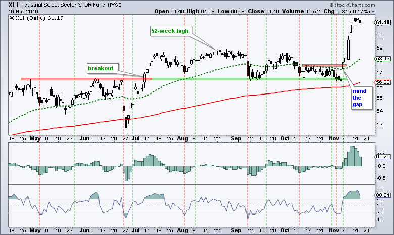
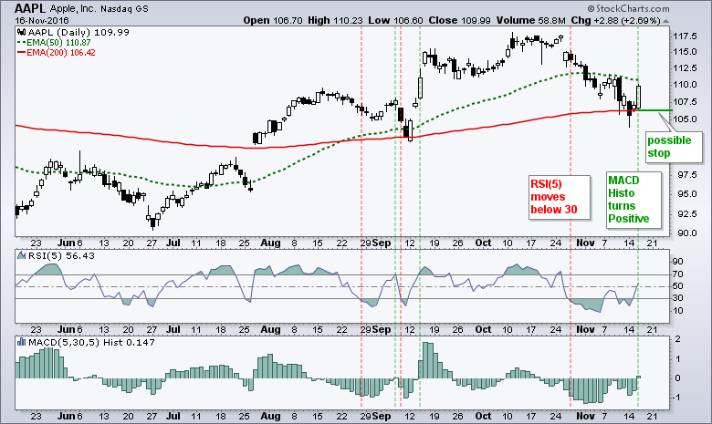
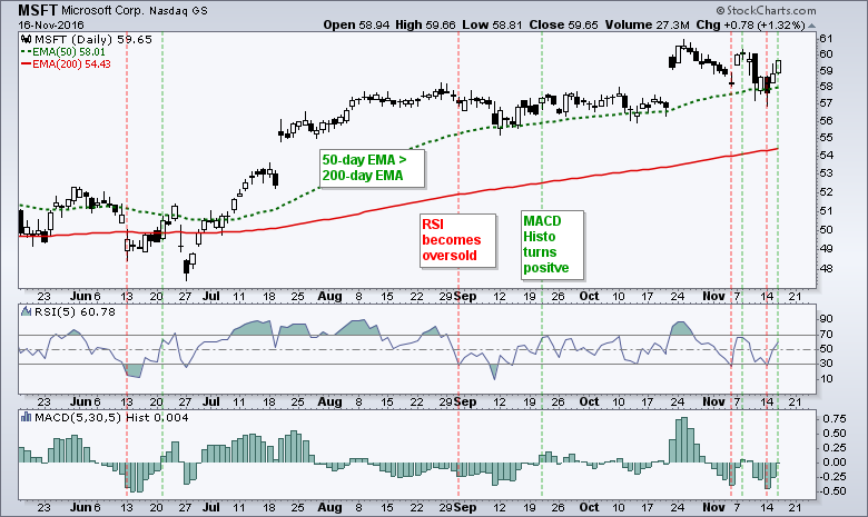
The MACD Histogram (5,30,5) measures the difference between MACD (5,30,5) and its signal line. Thus, the histogram turns positive when MACD moves above its signal line and negative when MACD moves below its signal line. This makes it easy to spot signal line crossovers. The red lines show when RSI(5) becomes oversold and the green lines mark a subsequent move into positive territory for the MACD Histogram. The signals are not perfect, but it is a strategy chartists can use to filter their trading universe. Note that the PPO and MACD are basically the same indicators. MACD measures the absolute difference between two EMAs and PPO measures the percentage difference between two EMAs.
Scan Code for Pullbacks
The scan code below can be used to find S&P 500 stocks meeting the criteria in the XLI chart. The 50-day EMA is above the 200-day EMA, RSI(5) dipped below 30 and the MACD Histogram (5,30,5) crossed above the zero line.
[group is SP500] and // stocks in S&P 500
[EMA(50,close) > EMA(200,close)] and // stock is in long-term uptrend
[Min(10,RSI(5)) < 30] and // short-term RSI became oversold
[MACD Hist(5,30,5) x 0] // MACD(5,30,5) moved above signal line
Microsoft and Apple Trigger Signals
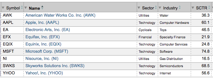
The table below shows the results from today's scan. Notice that Apple and Microsoft made the cut as both turned up over the last two days.
The charts below show when RSI becomes oversold (red lines) and the MACD Histogram subsequently turns positive (green lines).
******************************************************
Measuring Risk On-Risk Off - Using charts to quantify stock, economic and credit risk.
PPO Trading Strategy - How to use 3 PPOs to develop a trend-reversion trading strategy.
Long-term Trend Indicators - Using the PPO, EMA Slope and CCI to determine the trend.
ETF Master ChartPack - 300+ ETFs organized in a Master ChartList and in individual groups.
Follow me on Twitter @arthurhill - Keep up with my 140 character commentaries.
****************************************
Thanks for tuning in and have a good day!
--Arthur Hill CMT
Plan your Trade and Trade your Plan
*****************************************


