Charting 52-week Highs on SPY .... QQQ Lags, but Chart Remains Bullish .... Downloading Data and Creating User-Defined Indexes .... Small-caps Ripe for Rest, but Still Bullish .... Top Ten Large-caps are Greater than All Small-caps .... The Case for a Grind Higher .... Scanning for Percent Above/Below EMA .... //// ....
Charting 52-week Highs on SPY
The S&P 500 is the most important benchmark for the stock market and the long-term trend is clearly up. This means we are in a bull market. This weekly candlestick chart shows the 40-week EMA in red, 52-week price channels in gray and the PPO(10,40,1) in the indicator window. SPY turned bullish in March with the breakout, close above the 40-week EMA and positive PPO (green dashed lines). The ETF also recorded a 52-week high with a move above the 52-week Price Channel in mid April. The upper line marks a 52-week high, the lower line marks a 52-week low and the middle line (dashed) is the average of the two. A move above the upper line denotes a 52-week high, while a move below the lower line marks a 52-week low.
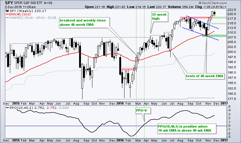
We can debate overbought readings and the validity of the breakout, but I do not think we can debate the overall trend (up). I will remain long-term bullish on the broader market as long as 208 holds on a closing basis and the PPO remains positive. At this point, I am looking to identify levels where SPY could reverse after a pullback, which everyone seems to be waiting for. Broken resistance marks the first area around 218 and the channel breakout marks the second area around 215. Perhaps a reversal will materialize between 215 and 218 if we see a pullback.
QQQ Lags, but Chart Remains Bullish
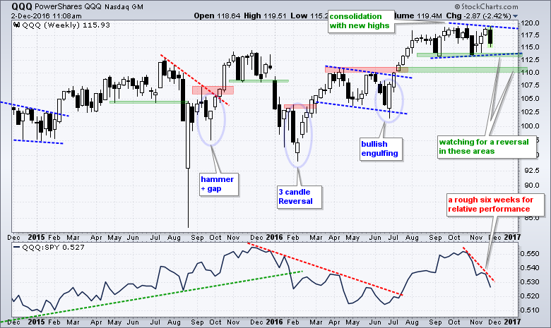
QQQ underperformed SPY over the last six weeks, but remains in a trading range on the price chart. Even though QQQ traded flat since August, it did hit a new high just six weeks ago and this chart is still more bullish than bearish. A consolidation after a sharp advance is perfectly normal and a breakout at 120 would signal a continuation higher. While it may seem logical to turn bearish on a support break at 113, I would hesitate as long as the broad market environment remains bullish. I am still more inclined to look for potential reversal levels on a pullback. This means the areas around 113 and 110 may offer opportunities. Note that RSI(5) on the daily chart moved below 30 on Friday.
Downloading Data and Creating User-Defined Indexes
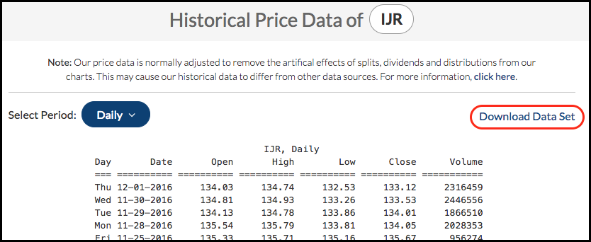
Before looking at small-caps, I would like to point out that I will be using a User-Defined Index for the S&P SmallCap iShares (IJR) because of the spike low to 76.13 on 25-August-2015. As you can see from the image below, this distorts the chart so I decided to make a manual adjustment. While I don't recommend adjusting data, this spike lasted just a few minutes and totally distorted the chart. Perhaps most importantly, note that this spike did not occur in the S&P Small-Cap Index ($SML). It really was an aberration.
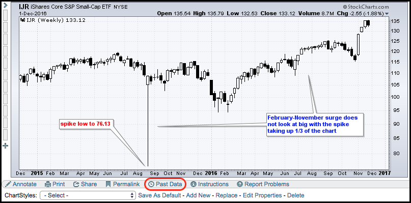
StockCharts users can download a data set by clicking the "Past Data" link under the chart. A new page will open up and there is a link to "Download Data Set". I saved this data set and then manually changed the low for August 25th.
Note that only PRO Members can create a User-Defined Index. This can be used for any data set or for a custom indicator. For example, chartists could download the IJR dataset, create a custom indicator in Excel and then upload this custom indicator as a User-Defined Index. Here is an article explaining how.
Small-caps Ripe for Rest, but Still Bullish
The chart below shows IJR without the spike and this puts the February-November surge into perspective (it is huge). IJR surged over 15% in three weeks in November and became quite extended. This makes it ripe for a pullback or consolidation, but it does not make the chart bearish. As with QQQ above, I would view pullbacks as opportunities to partake in the bigger uptrend. The green areas mark potential reversal zones based on the 38.2% retracement and broken-resistance turning support.
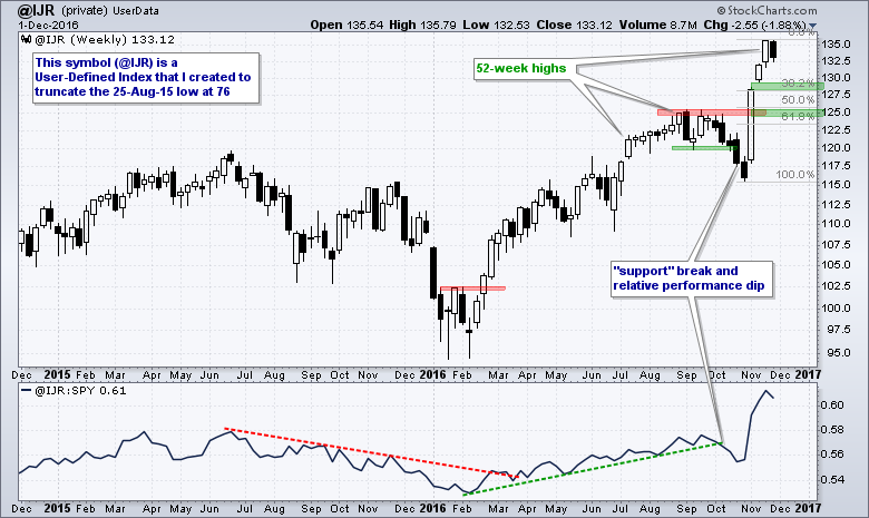
Before leaving this chart, notice that the "support" break and relative breakdown in late October did not amount to much. Both were quickly reversed as IJR and the price relative surged to new highs. There are three things to note. First, this was a minor support break or pullback after a surge from 110 to 125. Two, the broad market environment was still bullish and this means we should not focus on minor bearish developments. Three, pullbacks within a bigger uptrend are corrections and these represent opportunities.
Top Ten Large-caps are Greater than All Small-caps
The average market cap in the S&P Small-Cap 600 is around $1.2 billion and this means the total market cap is around $720 billion. Here are the market caps for some large-cap stocks to put this into perspective: Apple (AAPL) $583 billion, Alphabet (GOOGL) $520 billion, Microsoft (MSFT) $460 billion, ExxonMobil (XOM) $361 billion, Johnson & Johnson (JNJ) $303 billion and JP Morgan (JPM) $292 billion. It does not take much to move small-caps because the S&P Small-Cap 600 and Russell 2000 represent a small percentage of the total US stock market (less than 8%).
The Case for a Grind Higher
The S&P 500 (aka the broader market) could be in for a grind higher because of the group rotations within the market. Mathematically, the S&P 500 will move higher as long as 51 percent of its sector weightings are moving higher. It does not matter which sectors are leading and which are lagging. Looking at the broad trends, I see the Consumer Staples SPDR (XLP), Utilities SPDR (XLU) and HealthCare SPDR (XLV) in downtrends because these three are below their 200-day EMAs. The chart below shows SPY and the nine sector SPDRs. The sector charts are sorted by the percentage above the 200-day EMA with the highest at the top (XLF) and the lowest at the bottom (XLP). I also included the percentage weighting for each sector.
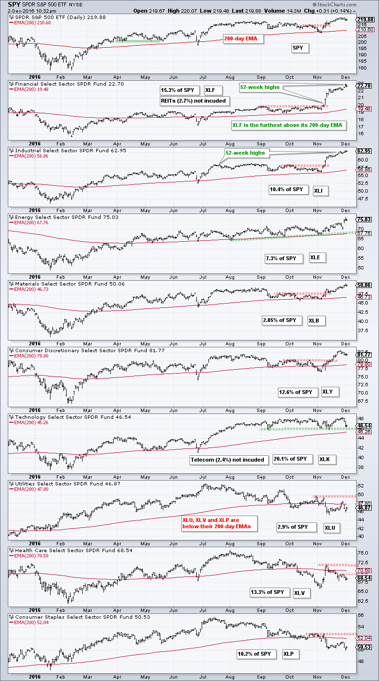
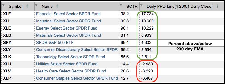
Six of the nine sector SPDRs are above their 200-day EMAs and the 200-day EMA is rising for all six. These six sectors account for 68% of the S&P 500 and this is enough to keep the market in an uptrend overall. Of these six, the Technology SPDR (XLK) is the closest to its 200-day EMA and the one to watch closely. Three of the nine sector SPDRs are below their 200-day EMAs, but not by much. These three represent around 26% of the S&P 500 and they are weighing on the market. Note that REITs 2.7% and Telecom 2.4% were excluded from these calculations. REITs were part of the finance sector and most telecom stocks are part of the technology sector. The table below shows the scan results ranked by the PPO.
Scanning for Percent Above/Below EMA
Chartists can scan for the percent above/below the 200-day EMA by using the Percentage Price Oscillator (PPO) and the "Rank by" function. The first four lines of the scan code below show a cheeky way to isolate the sector SPDRs. The results will include the REIT SPDR (XLRE).
[symbol starts with 'XL'] // write your comments after the two forward slashes
and [country is US] //
and [group is ETFNOUI] // ETFs no inverse of leverage
and [SMA(50,volume) > 500000] // average volume greater than 500KRank by PPO Line(1,200,1)
Notice that the ranking here corresponds with the StockCharts Technical Rank (SCTR). This is because the SCTR uses the percentage of the 200-day moving average in its calculations. The further above, the higher the SCTR.
******************************************************
Spotting Pullbacks and Upturns within an Uptrend using RSI and MACD Histogram.
Defining Bull and Bear Market Environments with Breadth Indicators (plus video).
Backtesting Different Moving Average Pairs with SPY, QQQ and IWM.
ETF Master ChartPack - 300+ ETFs organized in a Master ChartList and in individual groups.
Follow me on Twitter @arthurhill - Keep up with my 140 character commentaries.
****************************************
Thanks for tuning in and have a good day!
--Arthur Hill CMT
Plan your Trade and Trade your Plan
*****************************************