Rethinking Healthcare .... Breadth Indicators for Healthcare Remain Net Bearish .... Biotech ETFs Extend the Long Stall .... HealthCare Providers ETF Holds Bull Flag .... Medical Devices ETF Firms in Potential Reversal Zone .... Telecoms Surge along with Treasury Yields .... Yield Curve Turns Up .... 2007 Comparison Suggests Room-to-Run for XLF .... Do Dividends Matter? .... Regional Banks Lead Finance Sector .... //// ....
Rethinking Healthcare
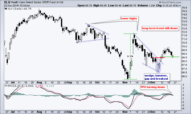
The HealthCare SPDR (XLV) attempted a reversal over the prior two weeks, but failed to follow through this week and remains in a downtrend since last summer. I pointed out the hammer, gap and wedge breakout in mid December, but this breakout is clearly within a bigger downtrend and this means I am flouting one of my main principles (trade in the direction of the bigger trend). Even though XLV held above its early November low, this is an attempt at bottom picking and bottom picking is tricky business. The wedge breakout is currently being tested and a close below 68.5 would negate this breakout. Note that the PPO (5,30,5) just moved below its signal line and is close to turning negative. This is looking more like a short-term bearish signal within a bigger downtrend. Personally, I am not interested in playing the short side of anything when the broad market environment is bullish.
Breadth Indicators for Healthcare Remain Net Bearish
The next chart shows XLV with the EW Technology ETF (RYT) and three breadth indicators. First, notice that the 5-day EMAs are below the 200-day EMAs for both XLV and RYH. This is a basic way to establish a trend bias and the trend bias is down. Second, two of the three breadth indicators triggered bearish signals in late October and remain in bear mode. Healthcare High-Low% ($XLVHLP) moved below -10% and Healthcare %Above 200-day EMA (!GT200XLV) moved below 40%. The 10-day EMA of AD Percent has yet to trigger a bearish signal, but clearly the bulk of the evidence is bearish for healthcare right now. While there may be individual stocks and groups that buck the sector trend, the outlook for the sector as a whole is bearish.
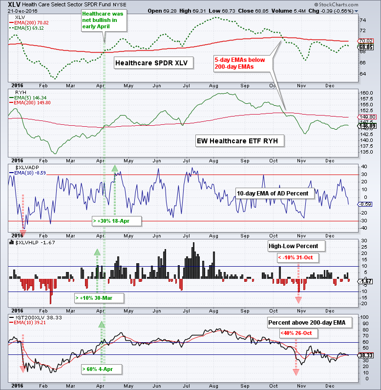
The breadth indicators above are available for all nine sector SPDRs and several major indexes. Simply change out the sector SPDR symbol for the other symbols ($XLVHLP to $XLKHLP). Here are links to three articles detailing these breadth indicators and how they work: AD Percent, High-Low Percent and Percent Above 200-day.
Biotech ETFs Extend the Long Stall
The Biotech iShares (IBB) plunged to a new 52-week low in February and then embarked on a long stall. Notice that the ETF crossed the 270 level a dozen times since March and could be forming a triangle since summer. This would be a bearish continuation pattern and a break below 250 would open the door to new lows. The green outline marks the surge and pullback within the triangle. A weekly close above 276 is needed for a short-term breakout. Such a move would provide the first sign that this long stall is actually a base.
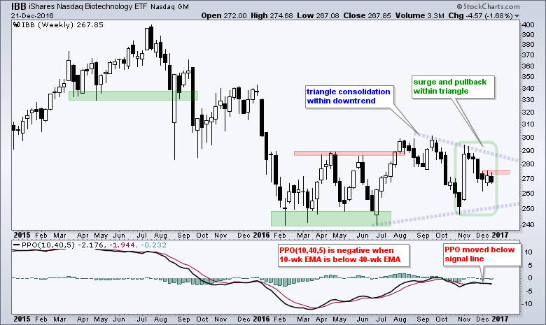
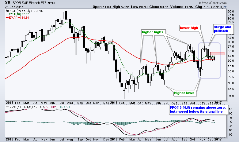
The indicator window shows the PPO(10,40,5) in negative territory since October. This means the 10-week EMA is below the 40-week EMA. I am using this version of the PPO because it replaces the EMAs on the chart (cleaner chart). Basically, chartists can show their favorite EMA pair through the PPO and add a signal line for momentum turns. The PPO moved below its signal line four weeks ago and this means long-term momentum is pointing back down. The next chart shows XBI with a lower high in November and downturn in the PPO.
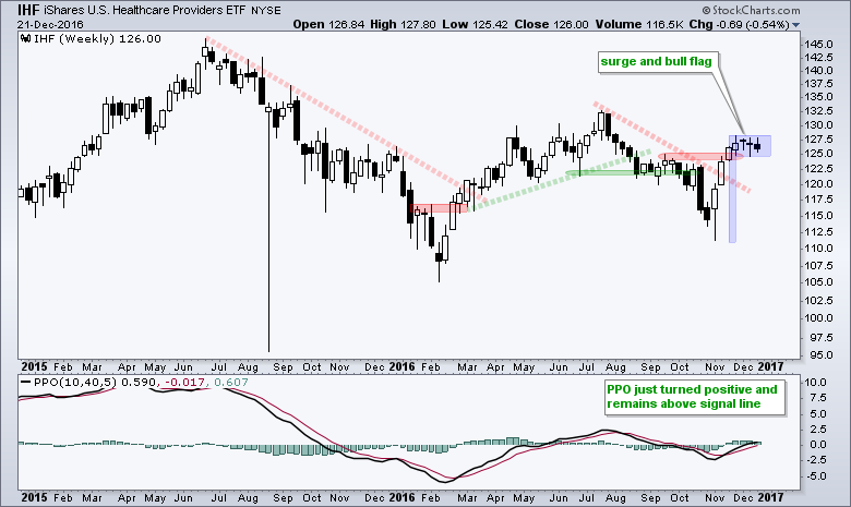
HealthCare Providers ETF Holds Bull Flag
The HealthCare Providers ETF (IHF) is the best looking group within the healthcare sector. Notice that the PPO(10,40,5) just moved above the zero line and remains above the signal line. On the price chart, the ETF surged and formed a flat flag. A breakout at 128 would be bullish.
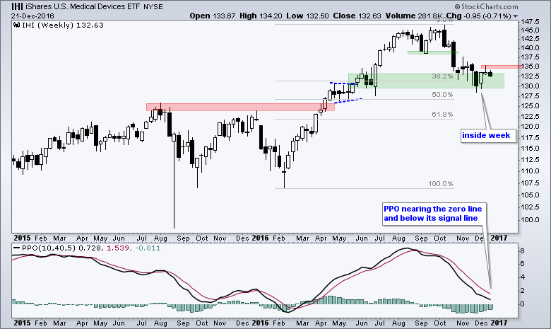
Medical Devices ETF Firms in Potential Reversal Zone
The Medical Devices ETF (IHI) remains at an interesting juncture. First, the PPO(10,40,5) is still positive. Second, the October-November decline started from a 52-week high and retraced 38-50% of the prior advance. This percentage is pretty normal for a pullback within a bigger uptrend because it fits with a two steps up and one step backward scenario. Third, there is support in the 130-133 area from the summer lows. Fourth, IHI formed an inside week three week's ago and shows signs of firming. A breakout at 136 would reverse the ten week slide and put the bigger uptrend back on track.
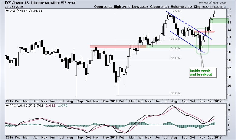
Telecoms Surge along with Treasury Yields
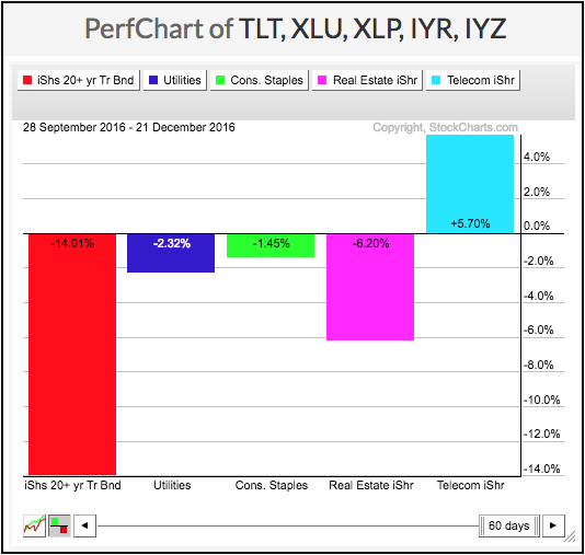
The surge in the 10-yr T-Yield ($TNX) is one of the biggest events of the fourth quarter. The yield moved from 1.6% to 2.6% and the 20+ YR T-Bond ETF (TLT) fell over 13% in the process. This move lifted the finance sector and weighed on other groups, such as utilities and REITs. The PerfChart below shows the Utilities SPDR (XLU) and Consumer Staples SPDR (XLP) struggling since October and the REIT iShares (IYR) falling over 4%. I used to think the Telecom iShares (IYZ) was sensitive to interest rates, but it is up over 7% so far this quarter. Telecoms are marching to the beat of a different drummer.
The chart below shows IYZ firming near the 50% retracement with an inside week in early November and then breaking out with a surge above 32. I missed this move, but I think IYZ should be on our radar in 2017 because the big trend is up and it is a leader this quarter. This means pullbacks and short-term oversold conditions are opportunities. I am marking the first potential reversal zone (on a pullback) in the 33-33.5 area.
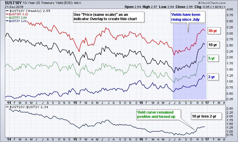
Yield Curve Turns Up
In addition to a surge in Treasury yields, the yield curve is turning up and yield spreads are widening. The chart below shows the 30-yr, 10-yr, 5-yr and 2-yr yields using the same scale. The yield curve (10-yr less 2-yr) is shown in the lower window. First, notice that yields bottomed in July-August and moved sharply higher the last five months. Second, notice that the yield curve steepened over the last three months. This means the difference between the 10-yr yield and 2-yr yield is growing. Rising rates and a steepening yield curve are positive for stocks in general and bullish for banks. This is a theme we should keep in mind heading into 2017.
2007 Comparison Suggests Room-to-Run for XLF
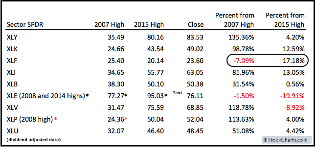
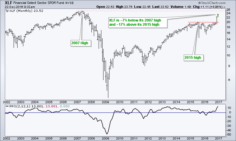
The Finance SPDR (XLF) is the only sector SPDR that has yet to exceed its 2007 high, but it is the furthest above its 2015 high. The table below shows some data points for the nine sector SPDRs. Note that I am using dividend-adjusted data. I am measuring the distance between Wednesday's close and the 2007 and 2015 highs. Note that I am using the 2008 highs for XLE and XLP, and the 2014 high for XLE because they peaked at different times. Of the four offensive sectors, XLF is the only one still below its 2007 high. The other three (XLI, XLY and XLK) are an average of 105% above this high right now. I am not predicting the same for XLF, but this shows there is room to run in 2017. It is also worth noting that XLF is the furthest above its 2015 high (+17.18%). This means it is leading and making up for lost ground.
Regional Banks Lead Finance Sector
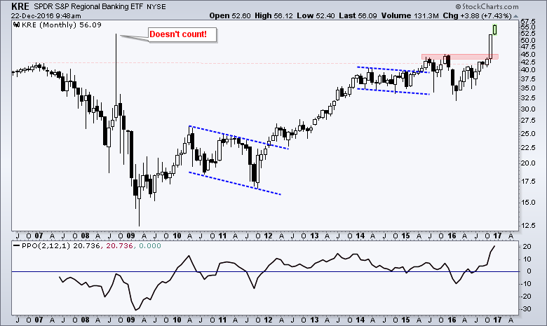
The next chart shows dividend-adjusted XLF with the breakout and surge over the last few months. I am not using the 2007 high to mark resistance because I do not think this is a valid resistance level. First, the make up of XLF was completely different in 2007. Second, there are a couple dozen moving parts in XLF and these stocks have their own support and resistance levels. XLF is driven by the price of its components and this makes it difficult to set hard support or resistance levels on the ETF. Third, the dividend adjustments skew support and resistance levels. The longer the look-back, the more the skew. A move above the 2007 high, however, would be significant because it would represent an all time high. The next chart shows KRE exceeding its 2007 high and leading XLF.
Happy Holidays!!
I am off between Christmas and New Year so this is my last commentary for 2016. Have a very Merry Christmas and a happy New Year. See you in 2017!

******************************************************
Spotting Pullbacks and Upturns within an Uptrend using RSI and MACD Histogram.
Defining Bull and Bear Market Environments with Breadth Indicators (plus video).
Backtesting Different Moving Average Pairs with SPY, QQQ and IWM.
ETF Master ChartPack - 300+ ETFs organized in a Master ChartList and in individual groups.
Follow me on Twitter @arthurhill - Keep up with my 140 character commentaries.
****************************************
Thanks for tuning in and have a good day!
--Arthur Hill CMT
Plan your Trade and Trade your Plan
*****************************************
