SystemTrader .... Testing the January Barometer .... Long-term Bullish Bias for Stocks is Clear .... Setting Up the Backtest .... 1950 to 2016 - The Big Test .... 1950 to 1999 - The Gravy Train .... 2000 to 2016 - The Lean Years .... Conclusions.... .... //// ........
Testing the January Barometer
Greg Morris' yearend blog post (New Year Nonsense) inspired me to test the January Barometer. I highly recommend Greg's commentaries because he challenges us to think and advocates a rules-based approach. Today I will start with two PerfCharts and then run some tests to see if the January Barometer adds any real value to the investing process. In particular, I will test the S&P 500 from 1950 to 2016 and from 2000 to 2016. I will test annual returns, eleven month returns (February to December), the January Barometer and the golden cross. We can then compare these results to see if the January Barometer is truly an anomaly. To recap, the January barometer suggests a bullish bias the rest of the year when the month of January closes higher. Note that I am not testing full year results to measure the value of the January Barometer, but rather the period after the January Barometer triggers (February-December).
Three Year Dry Spell
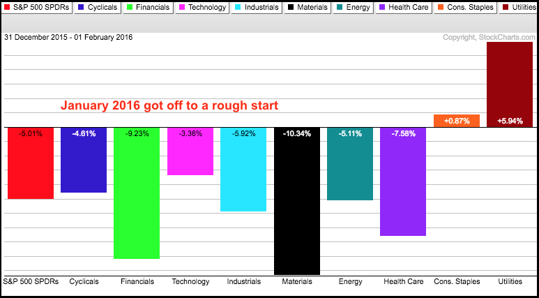
Before backtesting, let's look at how 2016 performance stacked up to the January barometer. The first PerfChart shows the performance for SPY and the nine sectors in January 2016. SPY fell around 5% with the Finance and Materials leading the way lower. The Consumer Staples and Utilities bucked January selling pressure with gains and led the market. Chartists using January to set their strategy would have been bullish on staples and utilities, and bearish on the finance and materials sectors.
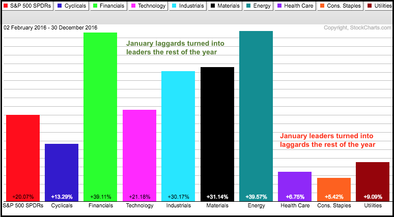
The rest of 2016 looked completely different. The next PerfChart shows the performance from February to December, the other eleven months. SPY gained 20% with Finance and Energy leading the way. The Materials SPDR was the third best performing sector. The Consumer Staples SPDR and Utilities SPDR also gained, but they lagged the broader market and six other sectors. A lot can change in just a few months and we would have been better off paying attention to price action and trend developments. Note that the S&P 500 was down in January 2014 and 2015, but finished higher from February to December in both years. Thus, the January barometer has not worked the last three years in a row. It did work in 2012 and 2013.
Long-term Bullish Bias for Stocks is Clear
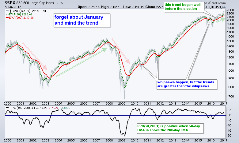
Before looking at the big backtest, let's review the long-term performance for the S&P 500. Over the last 67 years (since 1950), the S&P 500 finished the year higher 49 times and lower 18 times. This means the index closed higher 73% of the time. In a separate, but related stat, the index closed lower three years in a row just once (2000-2002) and lower two years in a row just once (1973-1974). Investors would be better off buying after a down year than selling. More importantly, the stock market clearly has a long-term bullish bias, regardless of how January finishes.
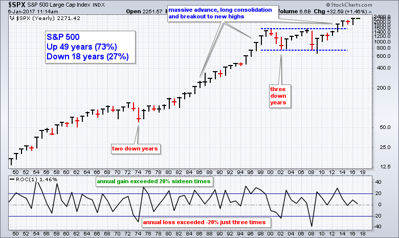
Since we have the chart up, I cannot help but point out some clearly bullish technical patterns. There was a massive advance from the 1974 low to the 2000 high and then a long consolidation. This lost decade included the bursting of the dot-com bubble and the financial crisis. Pattern-wise, the index formed a long consolidation and broke out in 2013. This is a massively bullish breakout and we are clearly in a secular bull market. Separately, the indicator window shows the annual Rate-of-Change. Notice that the annual gain exceeded 20% sixteen times and fell below -20% just three times. Again, there is a long-term bullish bias in stocks.
Setting Up the Back Test
The backtests are pretty straightforward. The S&P 500 is used because it has data going back to 1950. Unlike the S&P 500 SPDR, this data does not include dividends so the S&P 500 returns will be slightly lower than SPY. There are no commissions and a $100,000 portfolio was used. Keep in mind that we are only trying to determine if the January barometer adds any value to our investing process. Commissions and dividends, therefore, are really irrelevant for this exercise.
1950 to 2016 - The Big Backtest
The table below shows the first four backtests over the last 67 years. Test 1 captures the annual return for the S&P 500. Simply buy on the open the first trading day of the year and sell the close of the last trading day. There were positive 73% of the time, the Compound Annual Return was 7.55% and the Maximum Drawdown was a whopping 52.53% (blue oval). Buy-and-hold had the highest return and the biggest drawdown. Long-term, it is very hard to beat buy-and-hold, but the drawdowns are tough to sit through. Test 2 shows results when buying the open on the first trading day of February and selling the close of the last trading day of December - for all 67 years. This generic February to December test is needed as a direct comparison to the January barometer.
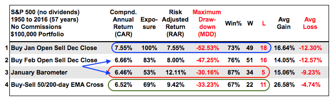
Test 3 shows results for the January Barometer. If January closes higher, buy the first trading day of February and sell the last trading day of December. This indicator only triggered 39 times over the last 67 years (58% of the time). In general, the results are better than test 2 because of the higher Risk-adjusted Return, the lower Maximum Drawdown and higher Win% (red oval). Also notice that the Win% was a whopping 87%, which appears to validate the January barometer.
The final test (4) is the basic golden cross. Buy when the 50-day EMA crosses above the 200-day and sell when the 50-day crosses below the 200-day. Even though the Win% is lower (67%) and the Compound Annual Return barely beats the January barometer, this strategy would have generated more total return because it's exposure (invested time) higher than the January barometer. The golden cross was invested 69% of the time and the January barometer only 53% of the time (green oval). Also notice that the Average Gain was much higher for the golden cross and the Average Loss was much lower.
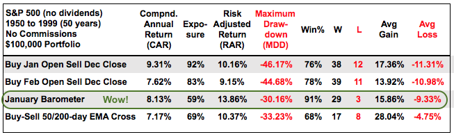
1950 to 1999 - The Gravy Train
The 67 year test period included two roaring bull markets from 1950 to 1967 and from 1975 until 1999. In fact, the January Barometer performed quite well from 1950 to 1999 and even outperformed the golden cross. However, the buy-and-hold returns were higher. The table below shows why the January Barometer became some popular. The strategy returned over 8% per annum with the lowest Maximum Drawdown and the highest Win%. Even so, the Average Gain was still much lower than the golden cross and the Average Loss was much higher.
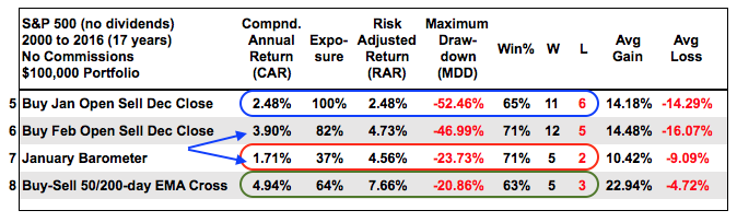
2000 to 2016 - The Famine
The next 17 years were different - much different. As we all know, the market went through some rough times after the dot-com bubble and during the financial crisis. These rough times are reflected in the Compound Annual Return for test 1 (buy and hold) and the lower Win% (11 up years and 6 down years).
Over the last 17 years, the January Barometer was the worst performing strategy with a Compound Annual Return below 2% and exposure was very low (37%)(red oval). The basic golden cross strategy was the best with the highest Compound Annual Return, the lowest Maximum Drawdown and highest Risk-adjusted Return (green oval). A 5% Compound Annual Return is not much to brag about, but it was double the return of buy-and-hold and the Maximum Drawdown was less than half.
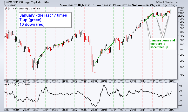
For reference: The chart below shows the January closes marked in red (down) and green (up) over the last 17 years. Seven were up and ten were down.
Conclusions
As Greg Morris pointed out in his blog post, there is a lot of noise out there and we must do out best to filter out unnecessary information. The January Barometer performed great from 1950 to 1999, but performed poorly from 2000 to 2016. Seventeen years is a long time for a strategy to stop working and I would consider it broken. At the end of the day, I think we would be better off using the golden cross for broad market guidance (S&P 500). The trend really is the single most important item on the chart. The golden cross is a consistent indicator that shows fairly stable returns and reduced drawdowns for the S&P 500.
I am one with the trend and the trend is with me
- Charles Dow chanelling Chirrut Îmwe (Rogue One)
******************************************************
Thanks for tuning in and have a good day!
--Arthur Hill CMT
Plan your Trade and Trade your Plan
******************************************************
Other Articles in the SystemTrader Series:
- Introduction to Key Performance Metrics - Quantifying the Golden Cross for the S&P 500
- Golden Cross and 5 Major Indexes - EMAs versus SMAs - Do Short Positions Add Value?
- Short-term Moving Average Crosses - Differences in Major Indexes - Do Trend Filters Work?
- MACD Crosses - Rules to Reduce Drawdowns and Increase Gains - Testing PPO Strategy
Follow me on Twitter @arthurhill - Keep up with my 140 character commentaries.
