 |
.... Breadth Indicators Plunge to Extremes .... Finance, Industrials and Tech Get Hit Hard .... SPY has not Done This since October .... Small-cap Correlation Turns Down .... RSI Breaks Key Level for QQQ .... The Bottom Line .... |
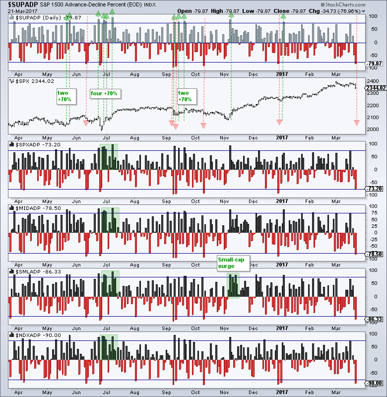
What a difference a day makes - 24 little hours. There is selling pressure and then there is SELLING PRESSURE. Tuesday's decline represents the latter because AD Percent for the major indexes plunged to its lowest level of the year. AD Percent equals advances less declines divided by total issues. Thus, AD Percent for the Nasdaq 100 equals -90% when 5 stocks advance and 95 stocks decline ((5 - 95) / 100). This is a measure of downside participation.
The chart below shows AD Percent for the S&P 1500, S&P 500, S&P MidCap 400, S&P Small-Cap 600 and Nasdaq 100. The horizontal lines are set at +75% and -75% for reference. S&P 1500 AD Percent ($SUPADP) hit -79.87%, which is the lowest level since late December. The green and red arrows show when S&P 1500 AD Percent exceeded +75% or -75%. Sometimes a single extreme is enough to signal the start of an extended move. More often than not, two or more extremes signal the start of an extended move. AD Percent for the other four indexes also hit the lowest level since late December. This reflects widespread selling pressure in the stock market and clearly increases the likelihood of a corrective period.
Finance, Industrials and Tech Get Hit Hard
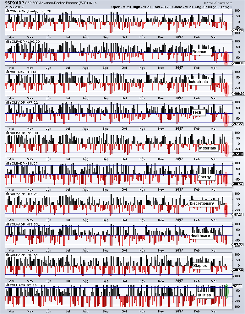
We can also use this indicator for the nine sectors to see which sectors led the decline. The chart below shows S&P 500 AD Percent ($SPXADP) in the top window and the sector AD Percent indicators below. The sectors leading the decline are the top. Note that all stocks in the finance and industrials sectors decline. That means XLF AD Percent ($XLFADP) and XLI AD Percent ($XLIADP) finished at -100%. Technology AD Percent ($XLKADP) finished at -97.22%. This shows widespread selling pressure in three top sectors and this is negative for the market. Utilities AD Percent ($XLUADP) was the only positive at -92.86%.
SPY has not Done This since October
The S&P 500 SPDR (SPY) did something it hasn't done since October 11th, over 100 days ago. The ETF fell over 1%. We have been hearing a lot about this 1% thing so let's see what happened in the past. The chart below shows 7 declines greater than 1% since April, which is when the 50-day EMA crossed above the 200-day EMA. I marked five with red lines. The early April decline foreshadowed a flat correction for the next three months. The late June decline was a reaction to Brexit and marked a bottom. After hitting a new high in August, the index declined 1+ percent in early September. A two month correction then followed and there was another 1+ percent decline in early October. This brings us to the present 1+ percent decline.
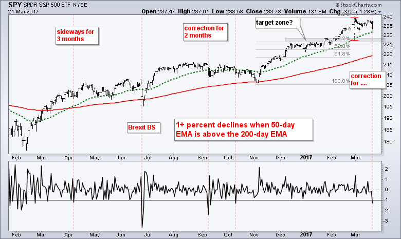
On the face of it, Tuesday's decline reflects the most selling pressure in five months, which is significant. It also suggests that the long awaited correction could finally be here. We never know how far or how long a correction will extend. We also do not know the path that price will take (sharp decline, trading range or zigzag decline). A garden variety 5% correction would extend to the 227 area. This area also marks broken resistance and a 38% retracement of the prior advance (November to March). A deeper correction could extend to the 61.8% retracement and the 200-day EMA.
Small-cap Correlation Turns Down
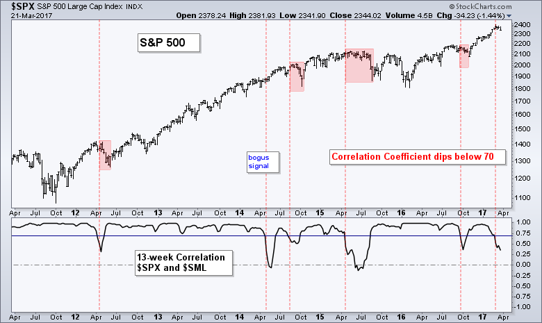
The next chart shows the S&P 500 in the top window and the 13-week Correlation Coefficient ($SPX,$SML) in the lower window. Large-caps and small-caps are moving in the same direction when this indicator is above .70, which is most of the time. There are, however, times when small-caps diverge from large-caps. The red lines show when this Correlation Coefficient dipped below .70 (six times). Notice that the S&P 500 corrected four of the previous five times. The sixth occurrence triggered the first week of March and points to a correction in the coming weeks.
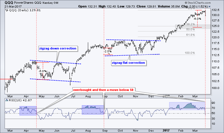
RSI Breaks Key Level for QQQ
Tuesday's decline did not take any prisoners as even the leaders were taken out to the shed for a whupping. Even QQQ was hit with its biggest decline since December 2nd. I have been watching RSI for a break below 50 that would signal a downturn in momentum and this occurred on Tuesday. At its most basic, the momentum cup is half full when RSI is above 50 and half empty when RSI is below 50 (the centerline). The blue areas show when RSI was overbought for an extended period and the red lines show when RSI moved below 50. The late April dip foreshadowed a two-month correction and the late August move foreshadowed a two-to-three month correction. A 38.2% retracement would extend to the 125 area and a deeper 61.8% retracement would extend to the 121 area.
The Bottom Line
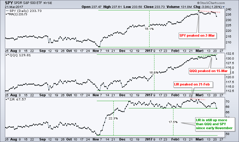
The peak parade started in late February with IJR peaking on 21-Feb (closing prices). SPY peaked on 2-Mar and formed a lower high last week. QQQ peaked on 15-Mar and turned down sharply on Tuesday. Even with a one-month decline, IJR is still up more than SPY and QQQ since early November. That is a moot point because I am more concerned with Tuesday's broad selling pressure, small-cap correlation, the RSI signal in QQQ and the 1+ percent decline in SPY. These suggest that a correction will unfold over the coming months. Should a broad market correction take shape, chartists can expect the majority of stocks to decline along with the broader market. This means there will be few places to hide. At this point, I still think it is a correction within a bigger uptrend. It could last one to three months so traders should prepare for choppy markets as we head into spring.
******************************************************
What a Difference a Day Makes - Dinah Washington on Youtube
******************************************************
Spotting Pullbacks and Upturns within an Uptrend using RSI and MACD Histogram.
Difference between EMA and SMA - Using %Above 200-day EMA for Breadth Analysis.
Backtesting Different Moving Average Pairs with SPY, QQQ and IWM.
ETF Master ChartPack - 300+ ETFs organized in a Master ChartList and in individual groups.
Follow me on Twitter @arthurhill - Keep up with my 140 character commentaries.
****************************************
Thanks for tuning in and have a good day!
--Arthur Hill CMT
Plan your Trade and Trade your Plan
*****************************************


