.... High-Beta/Low-Vol Ratio Reflects Risk Environment
.... Risk Ratios Stabilize within Downtrends
.... Stock:Bond Ratio Turns Down
.... High Yield Bond SPDR Could be Vulnerable
.... Internet, Software and Cloud-Computing Hold Up
.... Gold Miners ETF Underperforms Gold ....
High-Beta/Low-Vol Ratio Reflects Risk Environment
There are a number of ways to measure the risk appetite in the stock market. In particular, chartists can use ratio charts to compare the performance of a riskier asset to a less risky asset. This could be small-caps relative to large-caps or stocks relative to bonds. Today I am going to look at the S&P 500 High Beta ETF (SPHB) and the S&P 500 Low Volatility ETF (SPLV). I like these two because they are based on technical data, not fundamental data. In addition, they are equal-weight ETFs and there was no overlap when I checked the components. The chart below shows the High-beta ETF just below the flat 50-day SMA and Low-Vol ETF just above the rising 50-day. The sector weightings say it all. Over 50% of high-beta comes from finance and energy. 38% of Low-Vol comes from utilities and consumer staples.
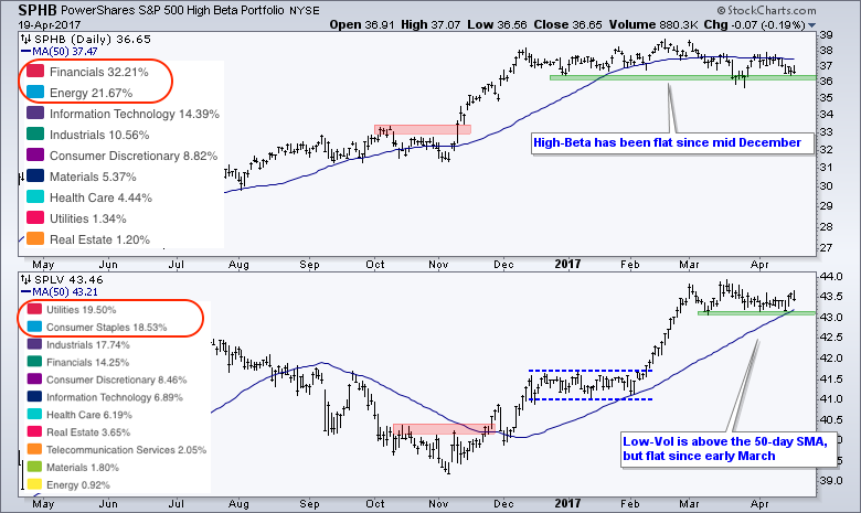
According to the PowerShares provider (Invesco.com), beta is a price-based assessment that measures a stock's sensitivity to market movements and volatility measures the magnitude of price fluctuations over a period of time. Each ETF consists of 100 stocks (20% of S&P 500), which means SPHB has the 100 stocks with the highest betas and SPLV has the 100 stocks with the lowest volatility. The portfolios are rebalanced quarterly in February, May, August and November.
Risk Ratios Stabilize within Downtrends
Chartists can use a ratio chart to directly compare the performance of one symbol against another. The chart below shows High-Beta relative to Low-Volatility using the SPHB:SPLV ratio. I am also showing the Russell 2000 relative to the S&P 500 ($RUT:$SPX) for reference. Notice that you can plot these ratios as bar charts, candlestick charts or line charts. I am not sure, however, how valid candlestick patterns are for ratio charts. In any case, you can see that the ratios surged in November as the market embraced risk (high-beta) and fell over the last four months as the market shunned risk (in favor of low-volatility). Both ratios flattened over the last few weeks and this suggests a short-term stalemate, but still a downtrend since December. The red areas mark the early April highs and a break above these levels would signal a return to risk-on.

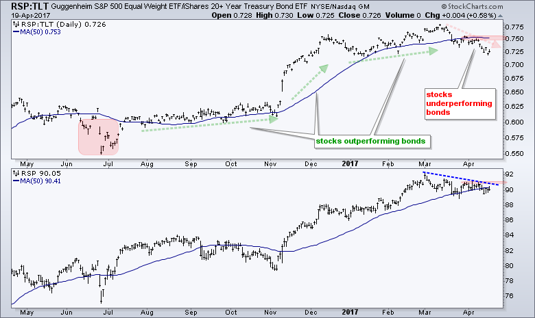
Stock:Bond Ratio Turns Down
The next chart shows the Equal-weight S&P 500 ETF (RSP) relative to the 20+ YR T-Bond ETF (TLT), which charts the performance of stocks relative to bonds. I am using RSP to filter out the large-cap dominance in SPY. RSP represents the "average" stock in the S&P 500. This ratio hit a new high in mid March and then turned lower the last four weeks. The ratio is now the furthest below its 50-day SMA since June. The RSP:TLT ratio needs to get back above the 50-day and above the mid March high to signal a return to risk-on. The bottom window shows RSP with resistance marked at 91.
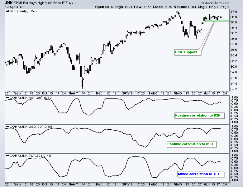
High Yield Bond SPDR Could be Vulnerable
The High Yield Bond SPDR (JNK) remains near its 2017 highs, but may be vulnerable to weakness in stocks and oil. The chart below shows JNK with three Correlation Coefficients. JNK is positively correlated to the RSP (stocks) and oil (USO). This means they tend to move in the same direction. Further weakness in stocks and oil could weigh on JNK. The correlation between TLT and JNK is currently positive, but shows a tendency to be mixed over the last eight months. On the JNK price chart, I am watching support in the 36.6-36.7 area for the first signs of a breakdown.
Internet, Software and Cloud-Computing Hold Up
The Technology SPDR (XLK) and the Nasdaq 100 ETF (QQQ) are holding up because of software, internet and cloud-computing. Chartists can break down a sector ETF into industry group ETFs. In the case of XLK, I broke it down into six tech-related ETFs: FDN (internet), IGV (software), SKYY (cloud-computing), XSD (semis), HACK (cyber-security) and IGN (networking). There is some overlap because some stocks are in more than one ETF, but these ETFs provide a pretty good break down of the technology sector. I am using the March lows and 50-day SMA as benchmark levels to measure relative performance. Note that the internet, software and cloud-computing ETFs are leading because they are above their 50-day SMA and March lows.
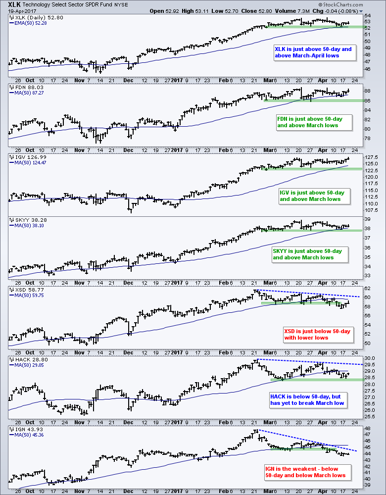
Semiconductors and networking are the two weakest sector groups because they are below the 50-day SMAs and below their March lows. Cyber-security is somewhere in the middle because it is below the 50-day SMA, but has yet to break the March low. Overall, I would watch the top three for clues on XLK. The tech sector is holding up now, but would weaken when and if the Internet ETF (FDN), Cloud Computing ETF (SKYY) and Software iShares (IGV) break below their March lows.
Gold Miners ETF Underperforms Gold
The Gold Miners ETF (GDX) broke a wedge line on Wednesday and is underperforming GLD. The chart below shows GDX with resistance in the 25-26 area. The ETF fell short of this resistance level last week and turned down this week with a wedge break. Also notice that price is below the 200-day SMA and the SMA turned lower the last few weeks. The top indicator window shows the price relative (GDX:GLD ratio) to compare the miners to the metal. This ratio did not come close to the February high and turned down the last few days.
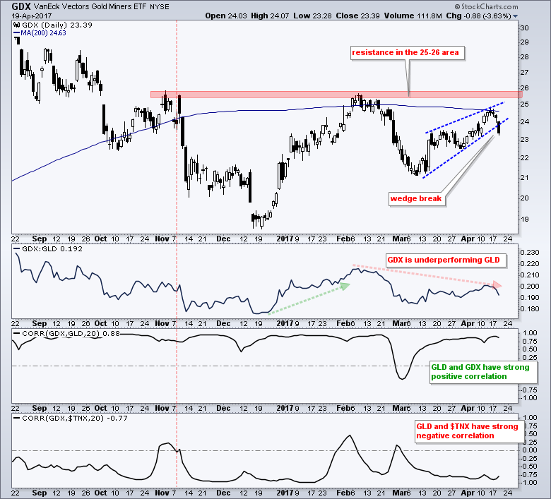
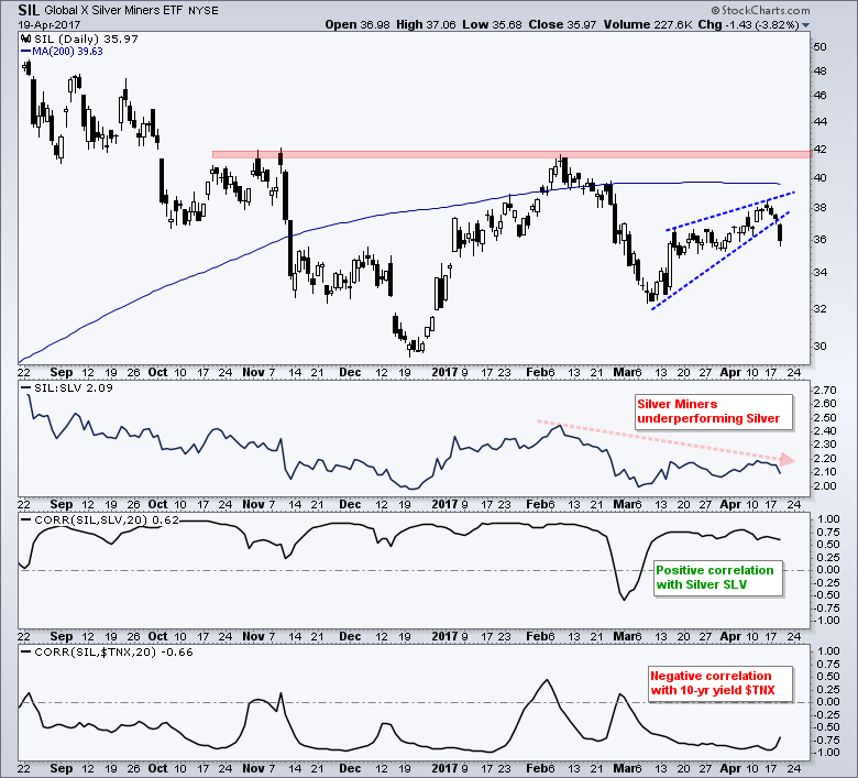
In general, I think that the price of gold will drive the Gold Miners ETF (GDX) and the 10-yr T-Yield ($TNX) will drive gold. Furthermore, note that GDX has a strong positive correlation to GLD and a strong negative correlation to $TNX. The lower indicator windows confirm this with the two Correlation Coefficients. Traders and investors in GDX, therefore, should keep a close eye on the 10-yr T-Yield. The next chart shows the Silver Miners ETF (SIL) with similar characteristics.
******************************************************
Spotting Pullbacks and Upturns within an Uptrend using RSI and MACD Histogram.
Difference between EMA and SMA - Using %Above 200-day EMA for Breadth Analysis.
Backtesting Different Moving Average Pairs with SPY, QQQ and IWM.
ETF Master ChartPack - 300+ ETFs organized in a Master ChartList and in individual groups.
Follow me on Twitter @arthurhill - Keep up with my 140 character commentaries.
****************************************
Thanks for tuning in and have a good day!
--Arthur Hill CMT
Plan your Trade and Trade your Plan
*****************************************


