.... Applying Standard Deviation and BandWidth to the VIX
.... Trade XIV Instead of SPY
.... Combining Technicals and Fundamentals
.... Monthly MACD for Long-term Trend
.... Charting the Fear & Greed Index
.... Machines Dominate the Bond Market ....
I will post the Weekly Market Review & Outlook on Friday with a video. Instead of the System Trader article, today I would like to share some notes and charts from the MTA Symposium in New York. Greg Schnell, Julius de Kempenaer and I attended this great event to expand our knowledge of technical analysis and network with industry professionals.
Applying Standard Deviation and BandWidth to the VIX
The S&P 500 Volatility Index ($VIX) was a hot topic for two reasons. First, Andrew Thrasher won the Charles Dow award for his paper, Forecasting a Volatility Tsunami. Second, Russell Rhoads showed how implied volatility can be used as a market indicator. Thrasher used a chart from StockCharts showing $VIX with the 20-day Standard Deviation and also suggested applying Bollinger Bands to measure contractions in the VIX. The chart below shows the VIX with the Standard Deviation, the S&P 500 and BandWidth. Notice how the two indicators serve to normalize the VIX. They are flat as the VIX trends lower from 2009 to 2016. This normalization makes it easy to identify big volatility spikes.
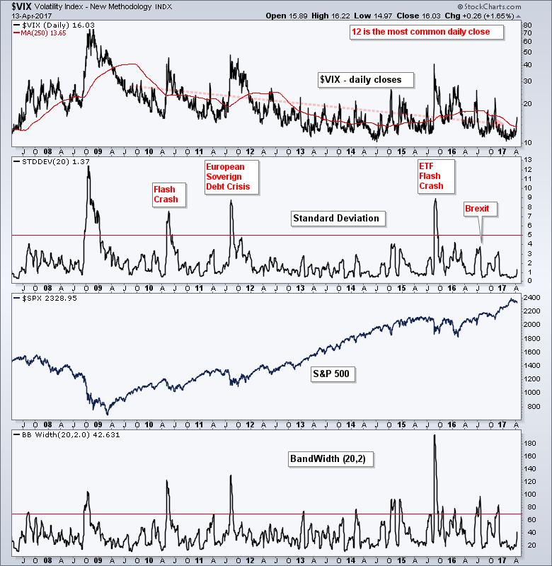 Rhoads noted that the quarterly high-low range for the VIX was the tightest ever, which suggest a serious contraction in volatility. This is also confirmed by BandWidth, which hit its lowest level since November 2013. I do not think there is much to be made of the current low BandWidth reading because we know the VIX can stay low for extended periods. Note that the S&P 500 advanced around 18% from November 2013 to May 2015.
Trade XIV Instead of SPY
Rhoads noted that traders should stay away from the iPath S&P 500 VIX ETN (VXX). It should only be used to hedge event risk for a few days - at most. It is dangerous to hold for more than a week and has a long-term downward bias because of the contract rollovers (VIX futures).
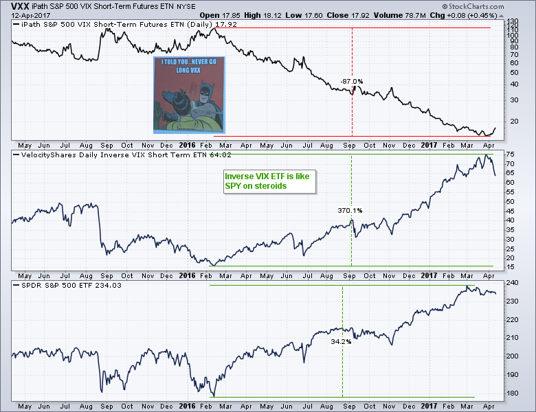
Rhoads also highlighted the Inverse VIX ETF as an alternative to trading SPY. It is certainly more volatile and risky, but it has a strong positive correlation to SPY, which makes sense because $VIX has a strong negative correlation to SPY. Notice that XIV is up 370% from its February 2016 low to March 2017 high and SPY is up 34%. For those looking for more, note that Rhoads has a blog devoted to the volatility at the CBOE.
Combining Technicals and Fundamentals
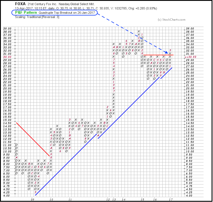
Erez Katz and Tucker Balch of Lucena Research showed how to improve a technical strategy by adding some fundamental filters. For technicals, they used Point & Figure buy signals and P&F change days, which is the number of days since a change on the chart. Sorry, I do not know the exact number of days used in their test. We, however, can find P&F buy signals on the Predefined Scan page and we can scan for double top breakouts using this code: [PnF Double Top Breakout is true]. The chart below shows FOXA with a quadruple top breakout.
 The fundamental criteria were based on Joel Greenblatt's book (The Little Book that Beats the Market) and the ratio of net income to assets. I am not showing this to offer a complete turnkey trading system. Instead, I am just showing how Lucena combined technicals and fundamentals to create a more robust trading strategy. We do not have a fundamental screener here at StockCharts, but I am sure you can find one with a Google search.
Monthly MACD for Long-term Trend
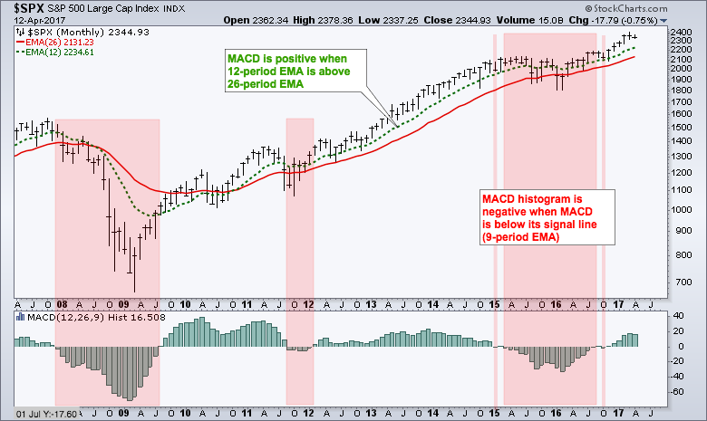
Katie Stockton of BTIG showed a monthly chart of the S&P 500 using MACD to determine the long-term trend. I modified her chart a bit by showing the 12-month EMA and 26-month EMA along with the MACD Histogram. Note that MACD is positive when the 12-month EMA is above the 26-month EMA, which has been the case since November 2010. Yes, the EMA crossover and positive/negative MACD are lagging indicators. The MACD Histogram is more sensitive because it turns positive/negative with MACD signal line crossovers. Notice that the histogram first turned positive in August 2009. The red zones show when the histogram was negative. Most recently, the histogram has been positive since November and this favors and uptrend in the broader market.
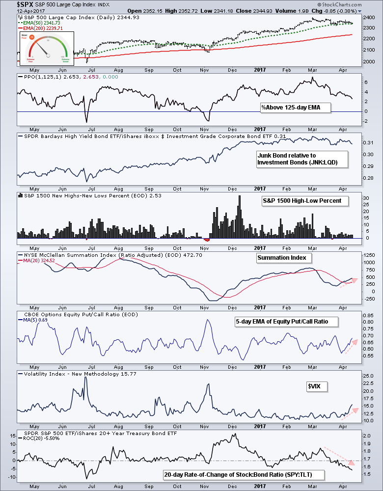
Charting the Fear & Greed Index
Stockton also uses the CNN Fear & Greed Index to measure sentiment. Instead of survey results, this index is based on seven indicators. The current reading is 26, which shows modest fear. The indicators make up the index include the S&P 500 percentage above the 125-day SMA, 52-week Highs less 52-week Lows on the NYSE, advancing volume versus declining volume, the put/call ratio, the spread between junk bonds and treasuries, the VIX and the difference in returns for stocks and Treasuries. The chart below shows my rendition of these indicators using the tools available at StockCharts. I am using the PPO(1,125,1) to measure the percentage above the 125-day EMA and the McClellan Summation Index instead of the McClellan Volume Summation Index.
Machines Dominate the Bond Market
Jim Bianco of Bianco Research, a firm specializing in fixed income analysis, notes that 10 firms account for 90% of the trading volume in US Treasury bonds. JPM Morgan and Citigroup are in the bottom half of this group. The top five are high-frequency trading firms using computer-generated algorithms to react to the market. These firms are generating hundreds of trades per minute and dominate the market. As Bianco noted in a 2015 Bloomberg interview: The Trader is the Computer.
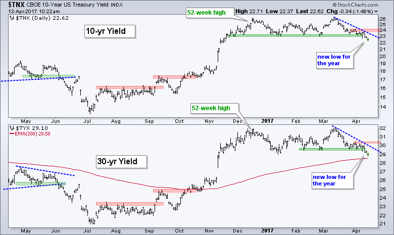 The chart above shows the 10-yr T-Yield ($TNX) and 30-yr T-Yield ($TYX) moving below their prior lows and hitting new lows for the year. I view this has mirror images of the spot market for Treasury bonds. The break below the prior lows points to lower yields ahead and this could weigh on the broader market (and banks). The late March highs now mark resistance and a move above these highs is needed to reverse the five week slide.
******************************************************
Spotting Pullbacks and Upturns within an Uptrend using RSI and MACD Histogram.
Difference between EMA and SMA - Using %Above 200-day EMA for Breadth Analysis.
Backtesting Different Moving Average Pairs with SPY, QQQ and IWM.
ETF Master ChartPack - 300+ ETFs organized in a Master ChartList and in individual groups.
Follow me on Twitter @arthurhill - Keep up with my 140 character commentaries.
****************************************
Thanks for tuning in and have a good day!
--Arthur Hill CMT
Plan your Trade and Trade your Plan
*****************************************


