.... Passive versus Too Active
.... Using the Inspect Feature on SharpCharts
.... The Good, the Bad and the Neutral
.... Scan Code to Measure Performance
.... Building a Correction ChartList
.... S&P 500 Breadth, Momentum and Correction Target ....
The active versus passive debate has been raging for some time now. On one side you have the Bogleheads advocating low-cost index funds and passive investing. On the other side you have active managers picking stocks and charging higher fees. Time and time again, we read articles showing that the majority of fund managers underperform the S&P 500. A report from S&P SPIVA notes that, over the last five years, 88.3% of large-cap managers, 89.95% of mid- cap managers, and 96.57% of small-cap managers underperformed their respective benchmarks. Picking small-caps is clearly the toughest job of all.
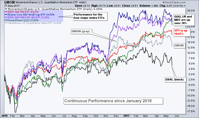
Frankly speaking, most actively managed funds with more than 30 stocks are going to have a very difficult time outperforming the S&P 500 because the benefits of diversification decrease dramatically once a fund exceeds 20 stocks. Let's call it the "too active" syndrome. Add in fees and it is virtually impossible to outperform a low-cost passive index fund. The SharpChart above shows the performance for SPY, MDY, IJR, QQQ, the US Quantitative Momentum ETF (QMOM) and the US Quantitative Value ETF (QVAL). Note that QMOM has 41 stocks and QVAL has 51 stocks. QMOM (gray) was performing admirably in December 2016, but still underperforming MDY and IJR at the time. QVAL has never stood out because value has not been working very well the last two years.
Using the Inspect Feature on SharpCharts
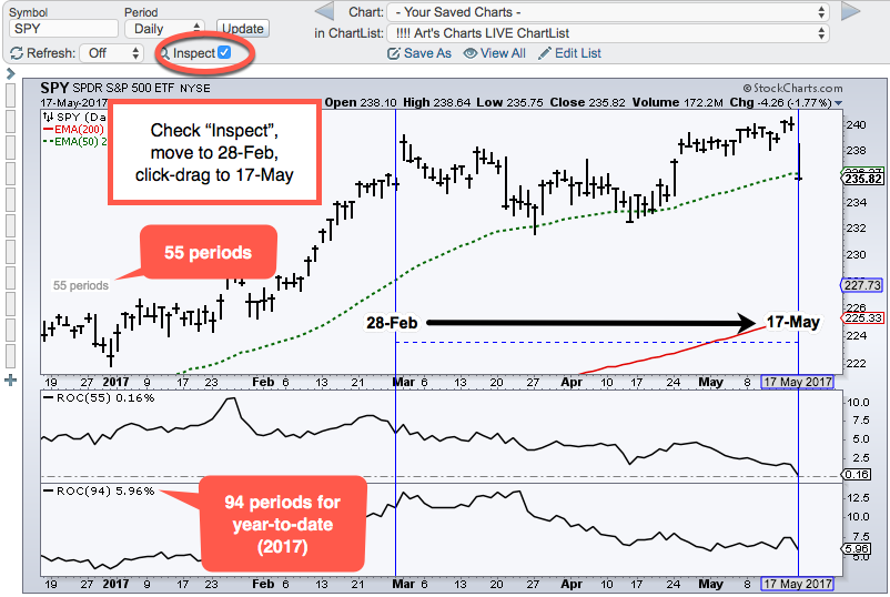
Before looking at individual stock performance, I would like to highlight the "Inspect" box on SharpCharts. The image below shows how to use the "Inspect" feature to count the number of days. Check the "Inspect" box, move to the starting date, left click and drag horizontally to the right. There are 55 trading days from March 1st to May 17th and 94 from January 3rd to May 17th. Note that I started a day earlier to measure from the close of February 28th and December 30th. Chartists can also use this feature to measure the percentage gain or loss by clicking and dragging vertically.
The Good, the Bad and the Neutral
Even though passive is all the rage right now, I think there is an argument to be made in favor of actively managed portfolios with around 20 stocks. By the way, there is a performance metric making the rounds from Larry McDonald of the Bear Traps Report. McDonald notes that the FANG stocks gained $270 billion in market cap since March 1st and the rest of the S&P 500 lost $260 billion (based on the 15-May close). Using this date range, I decided to measure individual stock performance since March 1st. There is good news (lots of stocks with big gains), bad news (lots of stocks with big losses) and neutral news (flat market). From March 1st to May 17th (55 trading days), SPY is up .16%, MDY is down 1.81%, IJR is down 2.44% and QQQ is up 4.87%. The table below shows some performance metrics for the stocks in these indexes.
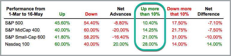
It is clear why the broad market index ETFs (SPY, MDY, IJR) are basically flat since March 1st. The majority of stocks in these indexes are down and more stocks are down in excess of 10% than up over 10%. Nevertheless, note that 10.4% of stocks (52) in the S&P 500 are up more than 10%, 14.25% of stocks (57) of stocks in the S&P 400 are up more than 10% and 21% of stocks (126) in the S&P Small-Cap 600 are up more than 10%. This means over 200 stocks in the S&P 1500 are currently up more than 10% since March 1st. Even though more stocks are down than up, there are clearly some winners out there and it is a stock pickers market right now.
Scan Code to Measure Performance
The code below is very simple and can be used to measure and rank performance over a give period. Code lines or phrases preceded by two forward slashes are ignored by the scan engine (//). The code below ignores SP400 and SP600.
[group is SP500] // add notes after forward slashes
//[group is SP400] // precede code with forward slashes to ignore
//[group is SP600] // SP600 is ignored by scan engineAND [ROC(55) > 10] // 55-day Rate-of-Change is greater than 10%
Rank by ROC(55) // Rank results by 55-day Rate-of-Change
Building a Correction ChartList
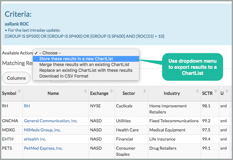
The stock market could be embarking on a corrective process that could push the S&P 500 6-7% lower, the S&P Mid-Cap 400 7-10% lower and the S&P Small-Cap 600 10-12% lower. These are just guesstimates. For active stock pickers, now is a good time to build a watch list for when a possible correction ends. Full disclosure: I do not know how far or how long a correction will extend. However, I will take a stab in the next chart. For now, the scan code and image below 235 stocks to put in a ChartList and watch in the coming weeks and months. These are the current leaders (up 10+ percent since March 1st) and they could be interesting candidates after a pullback.
[group is SP500]
or [group is SP400]
or [group is SP600] // these 3 equal the S&P 1500AND [ROC(55) > 10] // 55-day ROC is greater than 10%
Rank by ROC(55) // Rank results by 55-day Rate-of-Change
S&P 500 Breadth, Momentum and Correction Target
The S&P 500 could be starting a correction after the gap down, largest 1-day decline since September 9th and break below the 50-day EMA. In fact, it looks eerily similar to what we saw on September 9th. The S&P 500 was less than .50% from a new high on September 8th, gapped down on September 9th and fell 2.5% on the day. There was a rebound in mid September, but the corrective period extended into early November. Should something similar occur now, the S&P 500 could correct to the 2250 area. The December-January consolidation, rising 200-day SMA and a 50% retracement mark this zone. Note that this would imply a 6-7% decline from the recent highs.
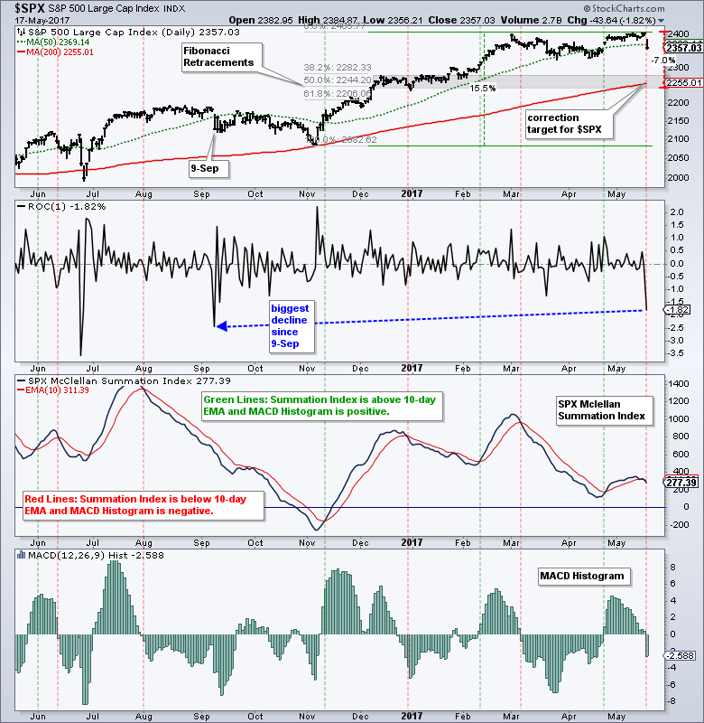
The chart above also shows the McClellan Summation Index and the MACD Histogram with some red and green signal lines. A bearish signal triggers when the McClellan Summation Index is below its 10-day EMA and the MACD Histogram is negative. A bullish signal triggers when the McClellan Summation Index is above its 10-day EMA and the MACD Histogram is positive. Some signals were pretty good and some were not-so-good. The system is currently on a bearish signal. I did manage to backtest this system over the last 20 years and Compound Annual Return (CAR) was just 2% when using SPY for long-short trades. The CAR is not very good, but at least there is a slight positive expectancy.
And finally, Carter Worth elloquently outlines his thoughts on the 10-yr T-Yield ($TNX), the US Dollar ETF (UUP) and the S&P 500 in this CNBC video.
******************************************************
Spotting Pullbacks and Upturns within an Uptrend using RSI and MACD Histogram.
Difference between EMA and SMA - Using %Above 200-day EMA for Breadth Analysis.
Backtesting Different Moving Average Pairs with SPY, QQQ and IWM.
ETF Master ChartPack - 300+ ETFs organized in a Master ChartList and in individual groups.
Follow me on Twitter @arthurhill - Keep up with my 140 character commentaries.
****************************************
Thanks for tuning in and have a good day!
--Arthur Hill CMT
Plan your Trade and Trade your Plan
*****************************************


