 |
Weekly Market Review & Outlook .... On a Road to Nowhere ($VIX and $SPX) |
On a Road to Nowhere
The Talking Heads come to mind after watching the S&P 500 SPDR (SPY) over the last thirteen trading days (We're on a Road to Nowhere). I consider SPY the best broad-market benchmark and the best representative for the broad market trend. SPY surged on April 24th and 25th, and then moved into a tight trading range. The ETF has closed between 238 and 240 since April 25th, which is a very narrow range (less than 1%). This narrow range shows some serious indecision that pushed the S&P 500 Volatility Index ($VIX) to its lowest close in over 10-years. The chart below shows the VIX closing below 10 for the first time since February 2007.
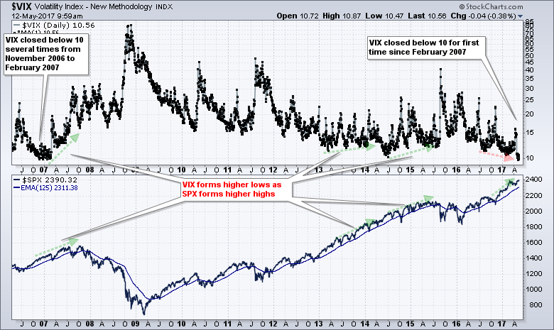 Note that I do NOT view low VIX readings as bearish. As we have seen before, the VIX can remain at low levels for extended periods and this usually coincides with an uptrend in the S&P 500. In addition, I do not think the VIX is a very reliable indicator for market tops. It is better at forecasting market bottoms after a panic. Surges above 25 are more likely to foreshadow a bottom than a top. Sometimes the VIX will form higher lows as the S&P 500 forms higher highs and this can foreshadow a market top, but this setup is not present right now. This setup occurred in 2007 and from July 2014 to July 2015. Note that these "divergences" lasted six to twelve months it took a long time for a meaningful top to form. The divergence in 2013 did not foreshadow a reversal.
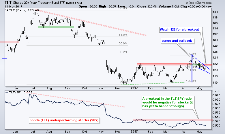
The bulk of the evidence remains bullish for stocks, but small-caps and mid-caps continue to drag their feet. Nevertheless, large-caps continue to hold up and SPY is holding its latest breakout. In particular, I am watching the gaps created on April 24th and 25th because these triggered breakouts in SPY, MDY, IJR and several other ETFs. A close below the April 21st close would fill these gaps and negate the breakouts. I am also watching bonds for clues because the 20+ YR T-Bond ETF (TLT) fell over the last three weeks. This key bond benchmark is at a potential reversal zone and an upside breakout could have negative ramifications for stocks and the finance sector, and positive ramifications for the utilities sector and gold.
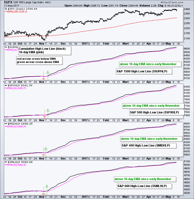
High-Low Lines Continue to Rise
The next chart shows the High-Low Lines for the S&P 1500, S&P 500, S&P MidCap 400 and S&P Small-Cap 600. Like the AD Line, the High-Low Line is a cumulative measure of High-Low Percent. It rises as long as High-Low Percent is positive (new highs outpace new lows) and falls when High-Low Percent turns negative for a period of time. I am using a 10-day EMA to define the overall trend in the High-Low Line. The trend is up when the High-Low Line is above the 10-day EMA and down otherwise. Chartists looking for signs of a broad market correction can watch for downside crosses in these High-Low Lines.
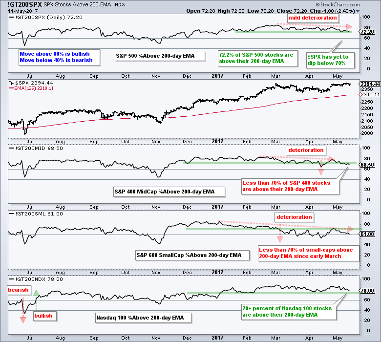
Deterioration in %Above 200-day Indicator
There is a correction underway when we look at the percentage of stocks above the 200-day EMA for the S&P MidCap 400 and the S&P Small-Cap 600. This indicator peaked in January for small-caps and fell to 61% on Thursday. It peaked in mid February for mid-caps and fell to 68.5% on Thursday. We can also see a slight deterioration in S&P 500 %Above 200-day EMA (!GT200SPX) over the last two months, but the indicator remains above 70%. Nasdaq %Above 200-day EMA (!GT200NDX) remains above 75%. Watch this indicator for the S&P 500 and Nasdaq 100. Moves below 70% would show further deterioration and signal the start of a broad market correction.
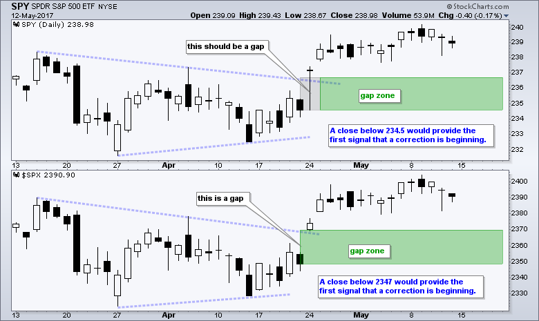
SPY Holds the Breakout and the Gaps
The market is not correcting until the 600 pound gorilla in the room says so and the S&P 500 is that gorilla. Technically, the S&P 500 SPDR (SPY) broke out with a gap-surge above 237.5 and these gaps are holding. In Charles Dow terminology, this breakout is bullish until proven other wise. The breakout zone is the first area to watch for signs of weakness that could lead to a summer correction. Thus, a close below 234.5 would fill the gaps and negate the breakout.
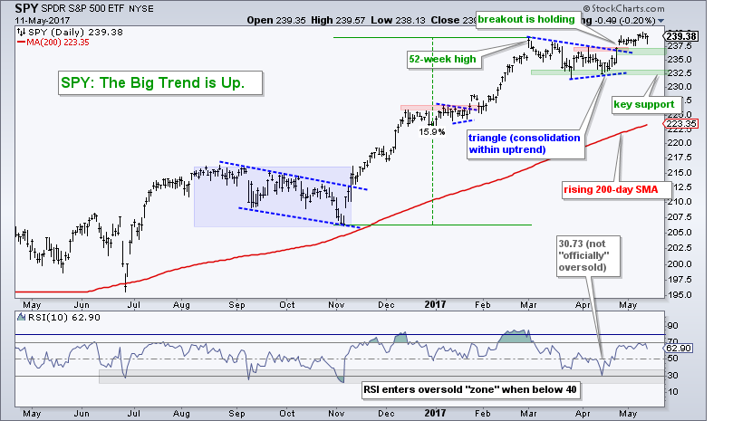
Why did I choose 234.5 and where is the second gap? The chart below shows SPY and the S&P 500 over the last two months. Notice that $SPX (bottom window) gapped above 2347 on April 24th, but SPY shows a candlestick with a low below 235 (no gap). This is not bad data from StockCharts because most other charting services show this same low. Instead, I would just consider it a spurious data point and act like there is a gap. This means a close below the 21-April close would fill the gap and totally negate the surge-breakout. This would be a negative development for the stock market.
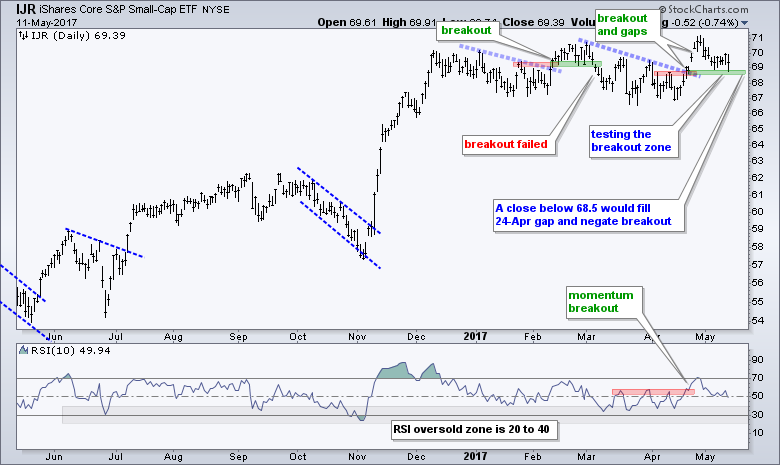
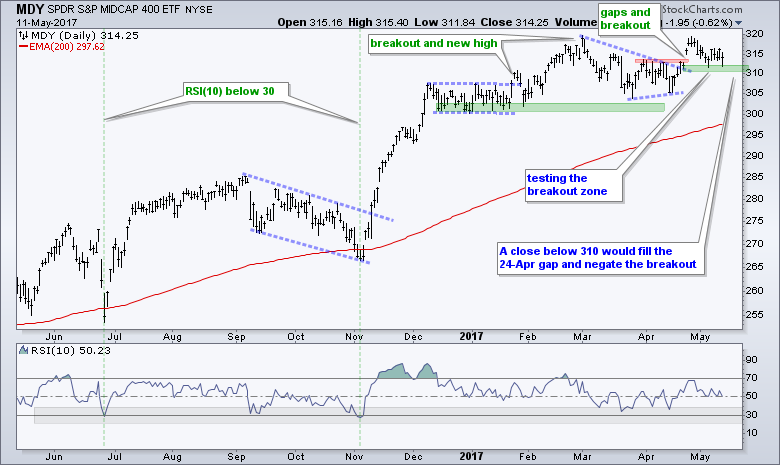
IJR and MDY Tests their Breakout Zones
The S&P SmallCap iShares (IJR) and the S&P MidCap SPDR (MDY) fell back last week and stalled near their breakouts this week. A close below 68.5 in IJR and 310 in MDY would fill the 24-Apr gaps and negate the breakouts.
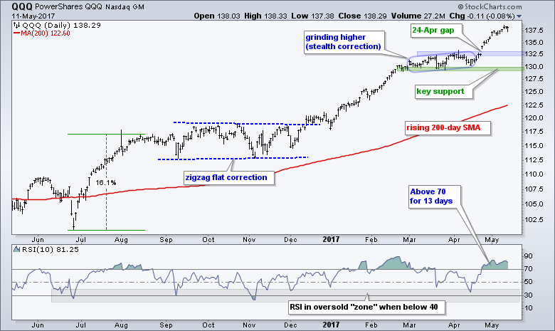
In contrast to SPY, MDY and IJR, the Nasdaq 100 ETF (QQQ) is nowhere near its 24-Apr gap. In fact, it is around 4.5% above the gap zone and near a 52-week high. The broken resistance zone and gap turn into the first support zone to watch on a pullback.
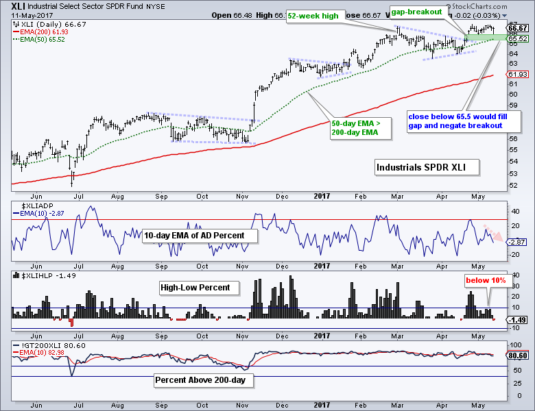
Mind the Gap-Breakouts in XLI and XLF
The Finance SPDR (XLF) and the Industrials SPDR (XLI) stalled over the last two weeks and I am watching these two sectors closely for clues on the broader market. Today I will show XLF and XLI with the three breadth indicators: the 10-day EMA of AD Percent Indicator, High Low Percent and %Above 200-day EMA. First, XLF sports a gap and wedge line breakout on 24-25 April. The two-week consolidation established resistance around 24 and a break above 24.10 would signal follow through to the wedge breakout. The 24-Apr gap is used to mark the green support zone. A close below 23 would fill the gap and clearly negate the breakout. Such a move would be quite negative for the finance sector.
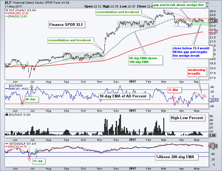
There is some concern with breadth because the 10-day EMA of XLF AD Percent ($XLFADP) is at -14.50%, which is the lowest of the nine sectors. This means XLF experienced the most selling pressure over the last ten days. I am also concerned with High-Low Percent because it has not been above 11% since early March.
The next chart shows XLI with the same breadth indicators. Again, I am focusing on the 24-Apr gap-breakout for the first clues. This gap-breakout is bullish right now and has yet to be proven otherwise. A close below 65.5 would fill the gap and negate the breakout. The indicator window shows the 10-day EMA of AD Percent moving to -2.87%, which was the fourth weakest of the sectors. Also notice that High-Low Percent actually turned negative. Breadth within the industrials sector is not outright bearish, but it shows deterioration.
Asset Correlations with the 20+ YR T-Bond ETF
I am going to jump to the bond market now because the stock-bond dynamic reflects the risk appetite in the financial markets. Bonds are likely to rise if they sense less strength in the economy and this in turn could affect stocks. The chart below shows the 20+ YR T-Bond ETF (TLT) with the 13-week Correlation Coefficient for 8 ETFs. I added a 13-week EMA for each. This EMA is red when correlation is mostly negative and green when mostly positive. First, notice that the Finance SPDR (XLF) and Regional Bank SPDR (KRE) are negatively correlated to TLT. Thia means they tend to move in opposite directions. A bounce in TLT, therefore, would be negative for XLF and KRE. Second, notice that the Correlation is largely positive for the Utilities SPDR (XLU), the REIT iShares (IYR) and the Consumer Staples SPDR (XLP). The first two are bond proxies and the third is a defensive sector.
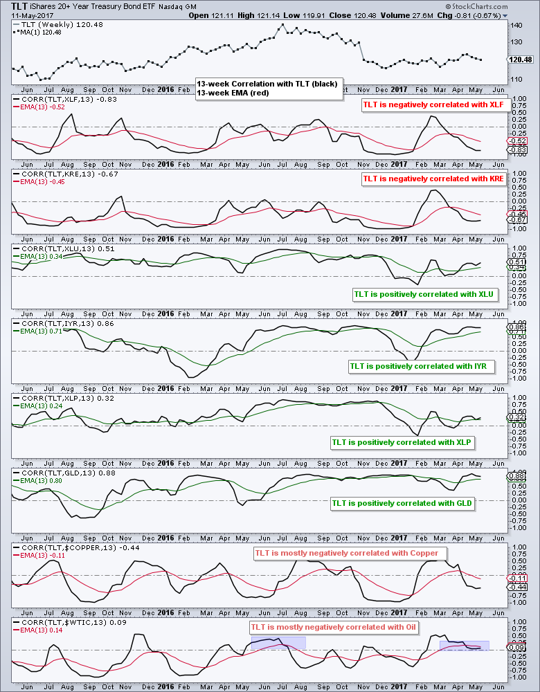
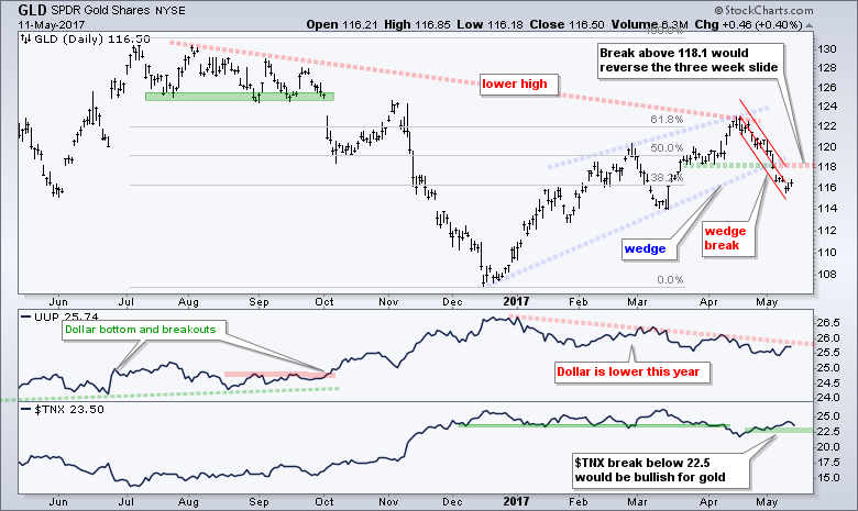
There is a positive correlation between TLT and the Gold SPDR (GLD). This means gold will likely rise if TLT rises. The last two windows show a largely negative correlation with Spot Copper ($COPPER) and Light Crude Continuous Contract ($WTIC). This makes sense because bonds loathe inflation and typically rise when inflationary pressures are low.
A Key Retracement and Wedge for TLT
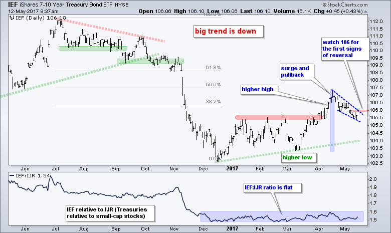
The first chart shows the 20+ YR T-Bond ETF (TLT) with a higher high in April and a wedge pullback the last three weeks. The pullback in TLT is positive for the finance sector and the stock market, but negative for utilities and gold. TLT is at an interesting juncture because the falling wedge retraced 50-61.8% of the prior advance. An interesting juncture is an area that may produce a reversal. The immediate trend, however, is clearly down as long as the wedge falls. Look for a break above 122 to reverse the fall and signal an upturn in Treasury bonds. The second chart shows the 7-10 YR T-Bond ETF (IEF) with first resistance marked at 106.
Gold Holds Wedge Break
The three week decline in TLT triggered a pretty violent decline in the Gold SPDR (GLD) as it fell over 5%. The ETF broke the wedge line and this signals a continuation of the prior decline (July to December). This three week decline is quite steep so I am using a Raff Regression Channel to define it. Broken support and the upper line of the Raff Regression Channel mark downswing resistance at 118.10. A breakout here would be quite positive, especially if TLT turns up and the 10-yr T-Yield breaks below 22.5 (2.25%).
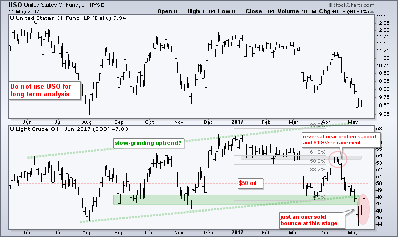
Oil Gets an Oversold Bounce
Oil got a nice bounce this past week, but this is just an oversold bounce after a sharp decline. June Crude (^CLM17) fell over 15% from mid April to early May and broke below a big support zone. Even though a move back above the broken support zone would seem positive, I would not take such a move seriously unless oil can get back above %50. In other words, I want to see more than just a dead-cat bounce.
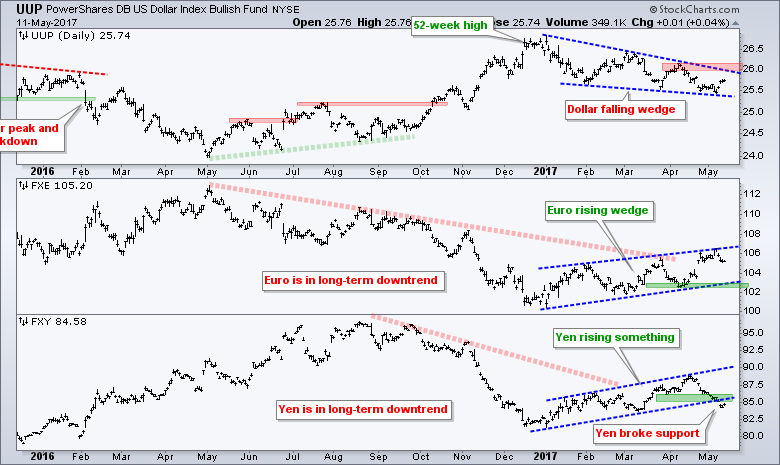
Dollar Bounces with Falling Wedge
The Euro fell back after the French election results and the Yen broke support. The combination produced a bounce in the greenback, but the US Dollar ETF (UUP) remains within the falling wedge. The Euro ETF (FXE) holds the key and a support break at 102 is likely needed to produce an upside breakout in the Dollar. A breakout at 26.1 would reverse the wedge in the Dollar and signal a continuation of the bigger uptrend.
******************************************************
ETF Master ChartPack - 300+ ETFs organized in a Master ChartList and in individual groups.
Follow me on Twitter @arthurhill - Keep up with my 140 character commentaries.
****************************************
Thanks for tuning in and have a good day!
--Arthur Hill CMT
Plan your Trade and Trade your Plan
*****************************************


