.... The Great Rate Debate
.... Correlations Do Not Reflect Magnitude
.... BB&T Takes Two Steps Forward and One Step Backward
.... Fifth Third, Huntington and PNC Financial
.... Three Steel Stocks on the Move ....
The Great Rate Debate
Are yields rising, falling or flat? This depends, as always, on your timeframe. Chartists looking since July 2016 would say rising, chartists looking since July 2011 would say flat and chartists looking since December would say falling. Technically, the 10-yr T-Yield has been falling the last six-seven months and the last seven years. The 7-year chart shows the yield working its way lower with a multi-year low in July 2016. Yields surged after the election, peaked in December and fell the last seven months. One could make the case for a flat trend over the last six years because the 10-yr yield has crossed the 2% level (blue line) over a dozen times. The red Raff Regression Channel defines the decline since December with resistance marked at 2.5%. A breakout here would signal a continuation of the July-December advance and target a move above 3%. I also highlighted two other Raff Regression Channels that did not pan out in the past.
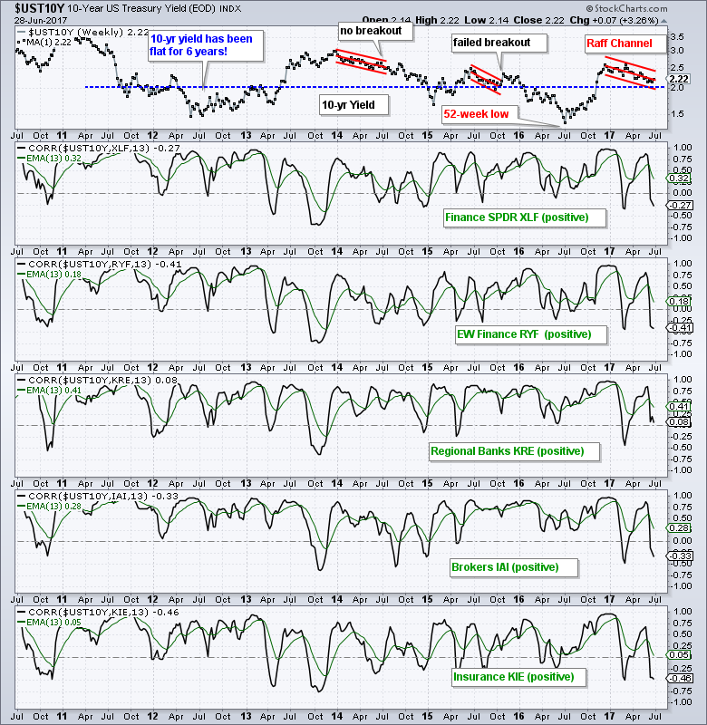 As the Correlation Coefficients in the other windows show, the direction of the 10-yr is important to the finance sector. These windows show the 13-week Correlation Coefficient with a 13-week EMA in green. This is not a timing indicator. It is simply to show us how two assets correlate. Notice that the green lines are mostly above zero and this means the 10-yr yield is positively correlated with the finance sector, which means they tend to move in the same direction. Thus, a breakout in the 10-yr yield would be bullish for banks, brokers and insurance stocks.
Correlations Do Not Reflect Magnitude
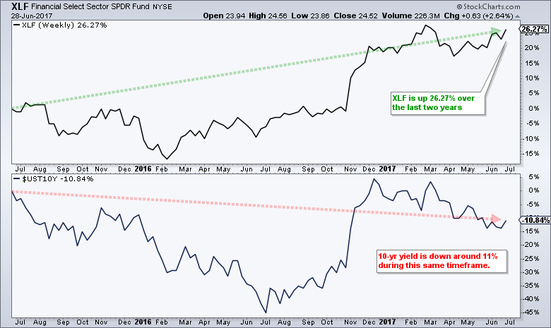
Even though the relationship between the finance and the 10-yr yield seems pretty clear, keep in mind that correlations do not reflect the magnitude of the move. This is why a comparison of the price charts does not always reflect the correlation. The Correlation Coefficient is based on the period's price change. Correlation is +1 when both advance or both decline, and -1 when one advances and the other declines. The magnitude of the advance or decline is immaterial. The performance SharpChart below shows the Finance SPDR (XLF), the 10-yr Yield ($UST10Y) and the Correlation Coefficient. Notice that XLF is up around 26% over this two-year period and the 10-yr yield is down 11%. Thus, one could make the case for negative correlation using two-year price bars!
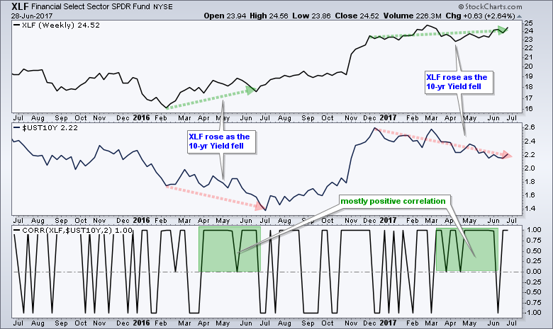
The next chart shows XLF, the 10-yr Yield and the 2-period Correlation Coefficient over the last two years. The 2-period Correlation Coefficient is +1 when both rise or both fall each day for two days, and -1 when one rises and the other falls each day for two days. It is zero when the two-day correlation is mixed (one day +1 and one day -1). This chart also shows two distinct periods when XLF rose and the 10-yr yield fell. Notice that the Correlation Coefficient was positive for a large part of these periods (green zone). This is because the Correlation Coefficient does not consider the magnitude of the moves, just the direction.
Despite magnitude issues, I still think the Correlation between the 10-yr yield and banks is mostly positive and rising yields are positive for banks. However, I would focus on the price chart for banks and the banking ETFs first, and look at the correlations second.
BB&T Takes Two Steps Forward and One Step Backward
I will cover the Regional Bank SPDR (KRE), Finance SPDR (XLF) and Insurance SPDR (KIE) in Friday's Weekly Market Review & Outlook. Today I would like to highlight some regional bank charts that appear to be ending long corrections. The chart below shows BB&T (BBT) advancing some 50% from July to March and then retracing around 50% of this advance with a decline back to the 41-42 area. This is a classic two steps forward and one step backward situation. The stock surged in early-mid June and broke above the May high. Also, notice that the 50-day EMA is above the 200-day EMA and the stock is staying above the 200-day EMA.
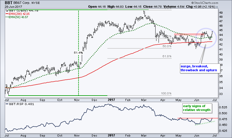
BBT fell back after the initial surge with a throwback, but held above the 200-day and surged the last three days. It looks like the correction from March to June is ending and the bigger uptrend is resuming, and this projects a move to new highs. The indicator window shows the price relative (BBT:RSP ratio) forming a higher low in June and starting to turn up.
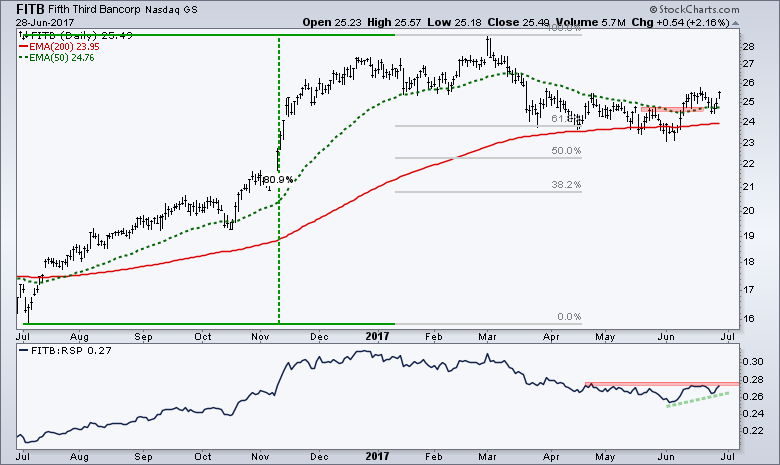
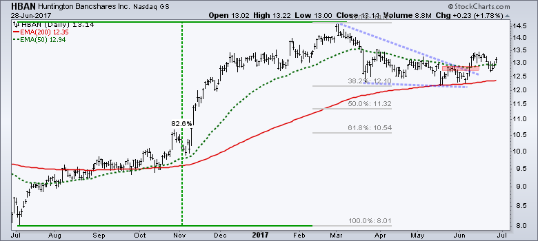
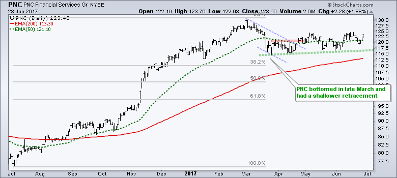
Fifth Third, Huntington and PNC Financial
The regional banks are a highly homogenous group and with high positive correlations. In other words, they pretty much all move up and down at the same time. Nevertheless, I am also seeing correction-ending breakouts in a number of regional banks and these charts are shown below.
Three Steel Stocks on the Move
The Commercial Metals (CMC) chart is a good example of an irregular correction. The stock surged in November-December and then corrected into early February with a 50% retracement. It looked like a normal correction at this point and the breakout in mid-February appeared to end this correction. The breakout, however, failed and the stock fell well below the 61.8% retracement mark in March.
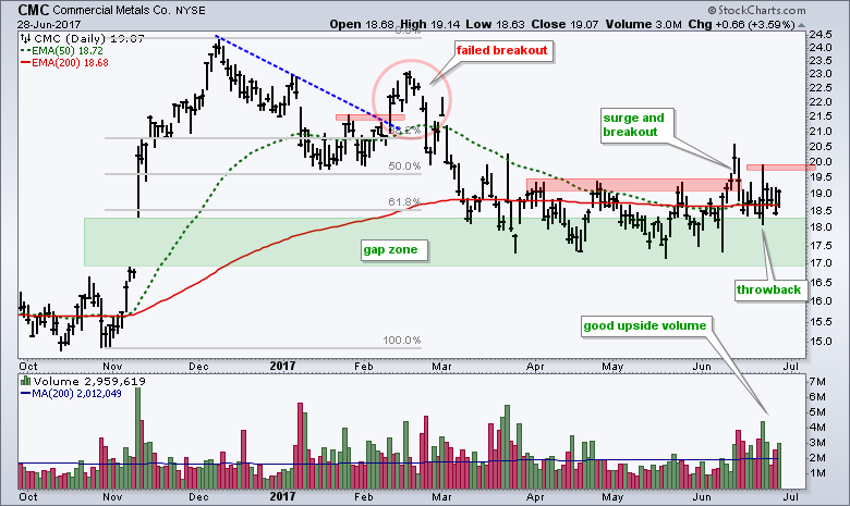
Even though CMC overshot the typical retracements, it is still above the October-November lows and in the gap zone. The stock firmed for several months and then broke out with a surge in mid-June. Even though CMC fell back after the breakout, I view the higher high as bullish and consider the dip back to the 18-18.5 area as a normal throwback. Watch for a second move above 20 to revive the breakout.
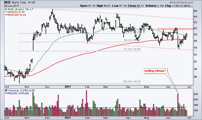
The second chart shows Nucor (NUE) with an extended correction that still looks normal (50-61.8% retracement and falling channel/wedge). The 50-day EMA is above the 200-day EMA and NUE is battling to hold the 200-day EMA. The high volume decline in mid-June looks like a selling climax of sorts. Notice that upside volume picked up immediately after this selling climax as the stock rebounded. A break above the mid-June high would be bullish.
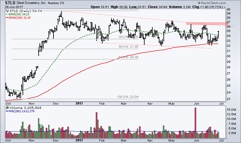
The third chart shows Steel Dynamics (STLD) with a long drawn-out correction from mid-December to June. The channel line and June highs mark resistance in the 36-37 area. Look for a breakout here to signal an end to the correction and resumption of the bigger uptrend.
******************************************************
ETF Master ChartPack - 300+ ETFs organized in a Master ChartList and in individual groups.
Follow me on Twitter @arthurhill - Keep up with my 140 character commentaries.
****************************************
Thanks for tuning in and have a good day!
--Arthur Hill CMT
Plan your Trade and Trade your Plan
*****************************************


