 |
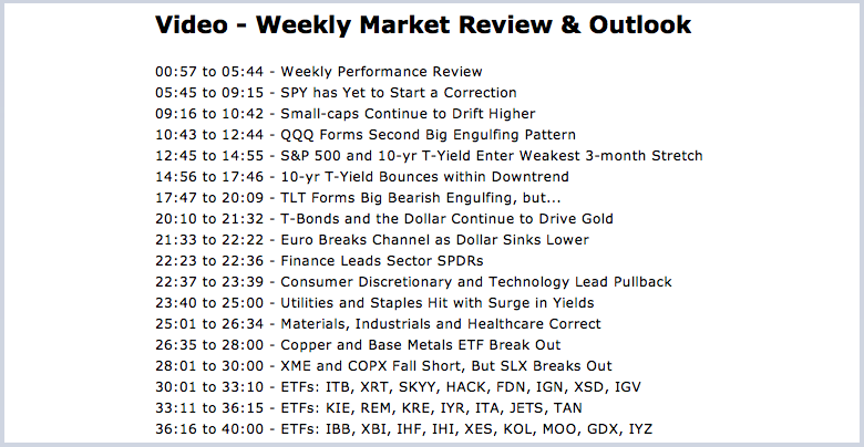
.... Weekly Market Review & Outlook |
----- Art's Charts ChartList (updated 30-June) -----
Big Moves Rock the Market, but not the Trends
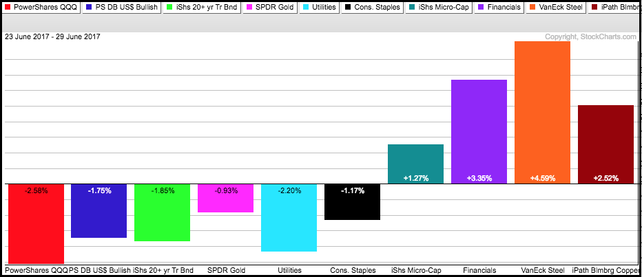
We saw some violent moves in the market this past week - and there is still one more trading day left in this pre-holiday week. The Nasdaq 100 ETF, US Dollar ETF, 20+ YR T-Bond ETF, the Gold SPDR, Utilities SPDR and Consumer Staples SPDR were the big losers. The Russell MicroCap iShares, the Finance SPDR, Steel ETF and the Copper ETN were the big winners. We can see that gold, utilities, staples, the Dollar and bonds are positively correlated, at least this week. The PerfChart below shows this week's gains and losses. Notice that this 1-week PerfChart looks similar to the 20-day PerfChart, which suggests that these are the short-term trends for the given ETFs.
I would not correlate any of these moves with recent weakness in tech stocks though. QQQ was quite extended and ripe for a correction, which seems to be underway now. Corrections are tricky because nobody knows how long they will last, how far they will extend and what path they will take. In addition, note that SPY has yet to even start a correction. Today I will look at some weekly charts to put recent price action into perspective. I will also take a look at the seasonal patterns for stocks and Treasury yields over the next three months. The correction has yet to actually start, but we should watch closely because of these seasonal patterns could embellish a correction should it take hold.
SPY has Yet to Start a Correction
First of all, there was no "rout" in the S&P 500 SPDR (SPY) because this broad market barometer fell less than 1% this week. Oh, and it hit an all time high last week. The chart shows SPY in a clear uptrend since the February breakout and March 2016 surge, which is when the PPO(10,40,0) turned positive. There have been three consolidations and three breakouts along the way with the most recent occurring in March-April this year. The advance stalled the last four weeks with the 240 level marking first support. A close below this level would argue for a correction of some sorts.
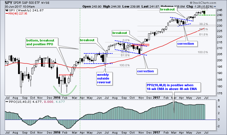
After a run from 205 to 245 (~19%) in 35 weeks, the market is entitled to a correction. That, however, does not mean we will get one. A normal correction (5-8%) could extend to the 230 area. A move to 230 would mark a 6% decline from the recent high and a 38.2% retracement of the November-June advance. It would also mark a return to the rising 40-week SMA (and 200-day SMA). Before leaving this chart, notice the PPO(10,40,0) setting. The last "0" is for the signal line and essentially removes the signal line from the PPO. This makes it a histogram that is positive when the 10-week EMA is above the 40-week EMA. Nifty, huh. Thanks TB!
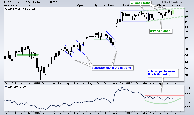
Small-caps Continue to Drift Higher
I will next turn to the S&P SmallCap iShares (IJR) chart because it is a broad based ETF with a heavy weighting in the finance sector (16.5%), which is the second largest sector. The other big sectors are: industrials (19%), Technology (14.7%), consumer discretionary (15.9%) and healthcare (12.8%). REITs weigh in at 6.5% and are separate from the finance sector. The chart shows IJR hitting new highs in February, April and June. The uptrend is more like a drift higher and I am sure lots of momentum oscillators are showing bearish divergences since February, but a drift higher is more bullish than a drift lower. I would re-evaluate this slow uptrend on a close below 68.
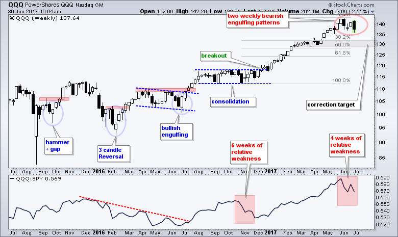
QQQ Forms Second Big Engulfing Pattern
The long-term trend for QQQ is clearly up, but two big bearish engulfing patterns show that a correction is underway. The ETF surged some 28% from the October low to the June high and is currently less than 5% from its all time high. The red oval shows the two bearish engulfing patterns. This week's open-close range engulfed the prior week's open-close range. I realize that this week's candlestick is incomplete, but it would take a 1.5% bounce on Friday to negate this bearish engulfing. In any case, a short-term downtrend emerged over the last four weeks and this means QQQ is correcting. A normal correction could retrace 38-50% of the prior advance and return to the February-March consolidation.
S&P 500 and 10-yr T-Yield Enter Weakest 3-month Stretch
I do not use seasonality very much because I think all the information we need is on the price chart and in the breadth indicators. The S&P 500 has yet to start a correction, but the Nasdaq 100 started a correction and the market lost an important leader. Seasonality becomes important when the trend and the seasonal patterns align. Thus, a short-term breakdown in SPY and a seasonally weak period could foreshadow the long awaited correction.
The chart below shows the seasonal tendency for the S&P 500 over the last twenty years (1998 to 2017). The number at the top of each bar shows the percentage of months the S&P 500 advanced for that particular month, while the number at the bottom shows the average gain/loss (percentage) for that month. For example, the S&P 500 rose 55% of the time in June and the average gain is actually a loss (-.5%).
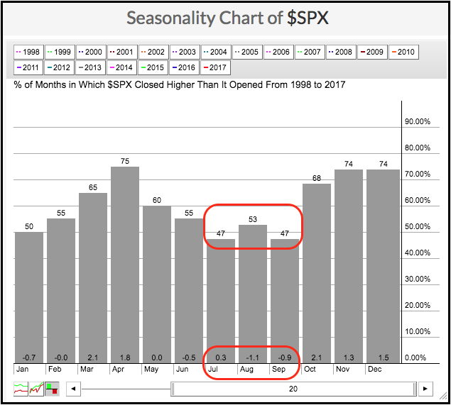
These numbers further reveal that the next three-month stretch was the weakest three-month stretch over the last 20 years. First, the S&P 500 advanced less than 50% of the time in July and September (47% each). These are the only two months below 50%. The S&P 500 advanced just 53% of the time in August, which is the fourth lowest reading. Taken together, the average of the last three months is 49% ((47+53+47)/3=49) and this is the lowest of any three-month stretch.
The average gain/loss at the bottom of the chart reinforces the negative bias for the next three months. The average loss for the S&P 500 is -1.1% in August and -.90% in September. These are the two biggest negative numbers on the histogram. Furthermore, the sum of the last three months is the lowest of any three-month period (+0.3% + -1.1% + -0.9% = -1.7%). History does not always repeat itself, but the historical tendency is clearly negative over the next three months. Might be a good time to go fishing!
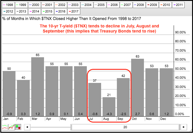
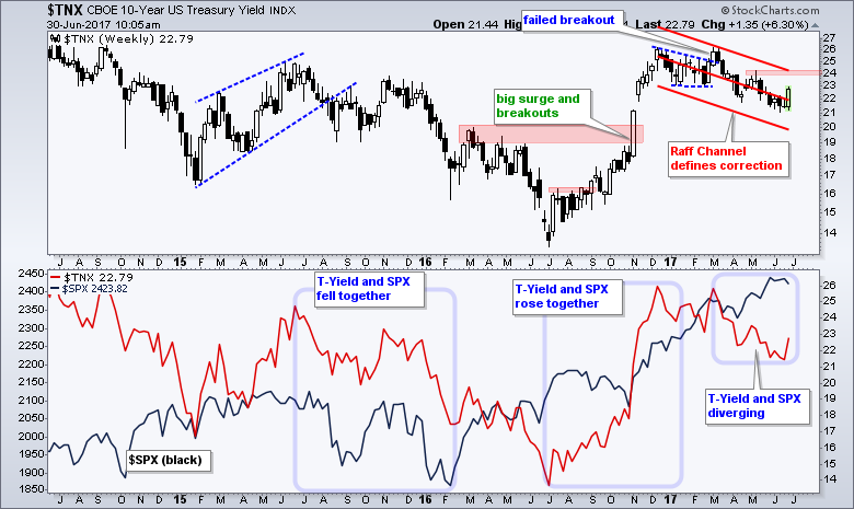
In a separate, but possibly related chart, notice that the seasonal patterns are bearish for the 10-yr T-Yield ($TNX) from July to September. In fact, these are the weakest three months for the 10-year yield. With T-yields and T-bonds moving in opposite directions, this implies that bonds tend to rise in the summer and into September. This jibes with the bearish seasonal patterns in the S&P 500, which suggests that stocks weaken from July to September and this money moves into the bond market. The 10-yr yield declines as Treasury bonds rise.
10-yr T-Yield Bounces within Downtrend
The 10-yr T-Yield ($TNX) surged this week with its biggest move since February, which triggered a breakout that failed. The trend this year is clearly down. This week's surge broke above the mid June highs to trigger a short-term breakout, but I am not ready to go ALL IN on a sustained upturn in the 10-yr yield. The Raff Regression Channel defines this downtrend and a follow through breakout at 24.1 is needed to fully reverse the six month downtrend.
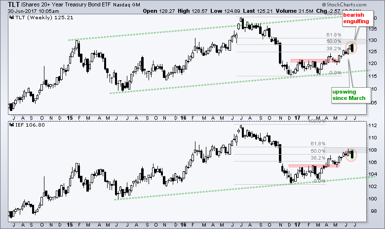
TLT Forms Big Bearish Engulfing, but...
Barring a big bounce on Friday, the 20+ YR T-Bond ETF (TLT) and the 7-10 YR T-Bond ETF (IEF) will form big bearish engulfing patterns this week. These patterns are also forming at potential reversal zones. Notice that the advance from March to June retraced 50-62% of the prior decline. Despite a bearish engulfing in a potential resistance zone, the trend since March is up and I am watching this trend for a breakdown.
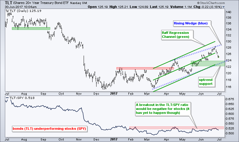
The next chart shows daily bars with a Raff Regression Channel and rising wedge defining the uptrend since March. TLT fell hard the last three days, but the overall trend is still up with support marked in the 122-124 area. A close below 122 would break this support zone and reverse the uptrend in TLT. The indicator window shows the TLT:SPY ratio trading flat this year. An upside breakout would show relative strength in TLT and a preference for safety over risk (SPY). This would be a negative development for stocks.
T-Bonds and the Dollar Continue to Drive Gold
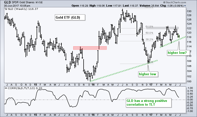
The Dollar and Treasury Bonds are the main drivers for gold. The uptrend in TLT is bullish for bullion and the downtrend in UUP is bullish for gold. On the price chart, GLD hit resistance in the 122 twice and fell back over the last three weeks. Notice that the 122 area coincides with a 61.8% retracement of the prior decline, which makes it a potential reversal zone. The decline of the last three weeks, however, is still considered a pullback within an uptrend, which became in December. Notice that TLT also began its uptrend in December. GLD is at a most interesting juncture because this is where it should bounce within the six month uptrend.
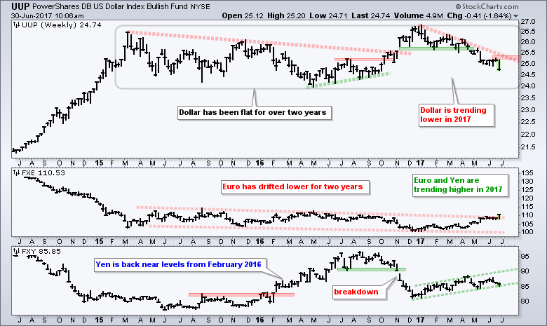
Euro Breaks Channel as Dollar Sinks Lower
The US Dollar ETF (UUP) fell sharply this week and extended its downtrend, which began in December. The new low allows me to lower resistance once again. UUP is in the bottom half of its two year range so perhaps we will see support in the 24 area. The middle window shows the Euro ETF (FXE) breaking out of a two year falling channel with a big surge. Keep in mind that the Euro accounts for 57% of UUP and is the main driver here.
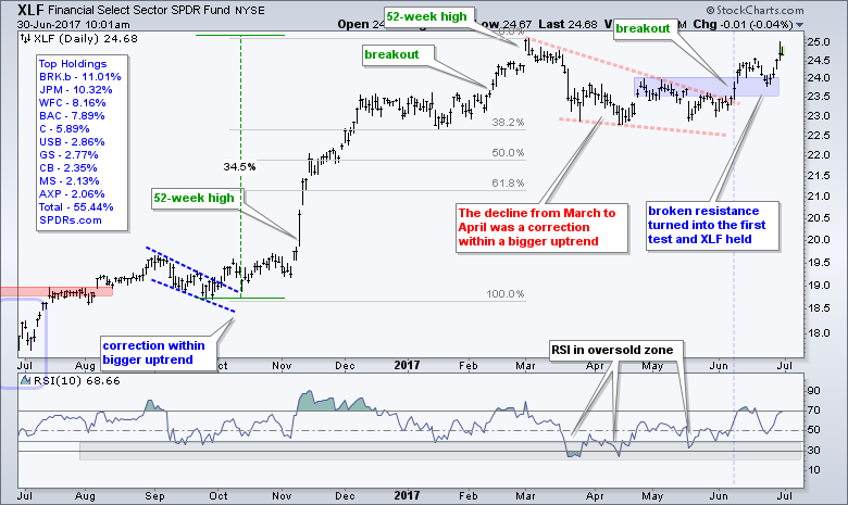
Finance Leads Sector SPDRs
The Finance SPDR (XLF) broke out with a big surge in mid June, fell back to the breakout zone last week and surged off this zone this week. This week's surge keeps the breakout alive and XLF is making a bid to become a leading sector. Note that the falling wedge is deemed a correction after the 52-week high and the breakout signals a continuation of the bigger uptrend.
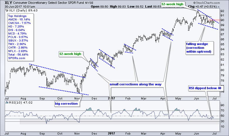
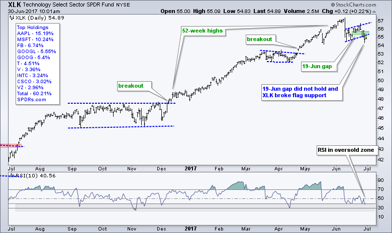
Consumer Discretionary and Technology Lead Pullback
The Consumer Discretionary SPDR (XLY) broke pennant support and moved lower the last four weeks. The blue lines show a falling wedge to define the current pullback. The Technology SPDR (XLK) broke flag support with a sharp decline and has also been moving lower the last four weeks.
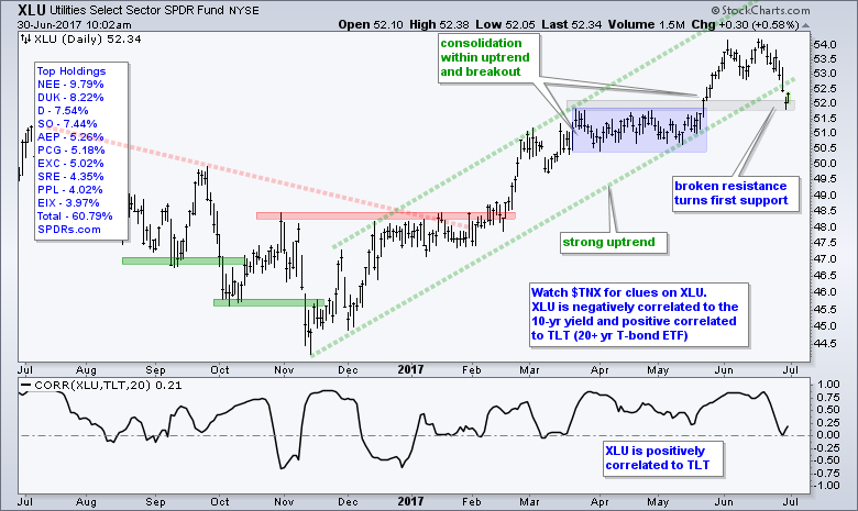
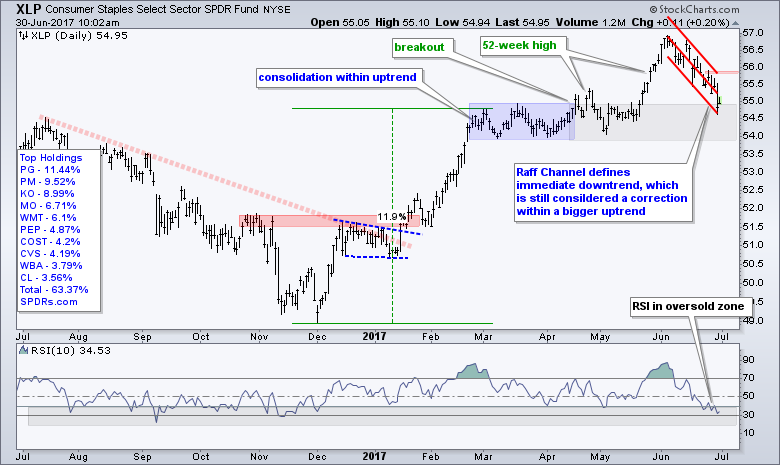
Utilities and Staples Hit with Surge in Yields
The Utilities SPDR (XLU) and the Consumer Staples SPDR (XLP) were hit pretty hard as the 20+ YR T-Bond ETF (TLT) fell. XLU finished near a support zone from broken resistance, while XLP fell back to the top of its prior consolidation (blue). Also notice that RSI(10) moved into the oversold zone for both ETFs. This puts both XLU and XLP at "interesting junctures" where we might see a bounce. Watch TLT because further weakness in Treasury bonds would be negative, while a rebound would be positive for these two ETFs.
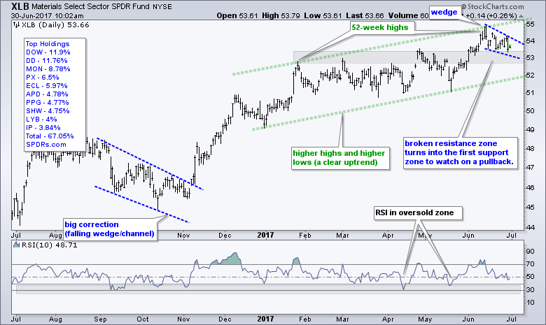
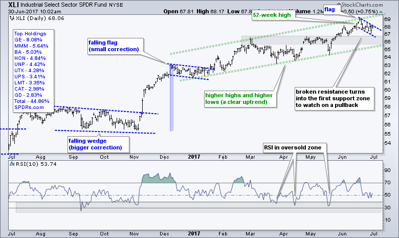
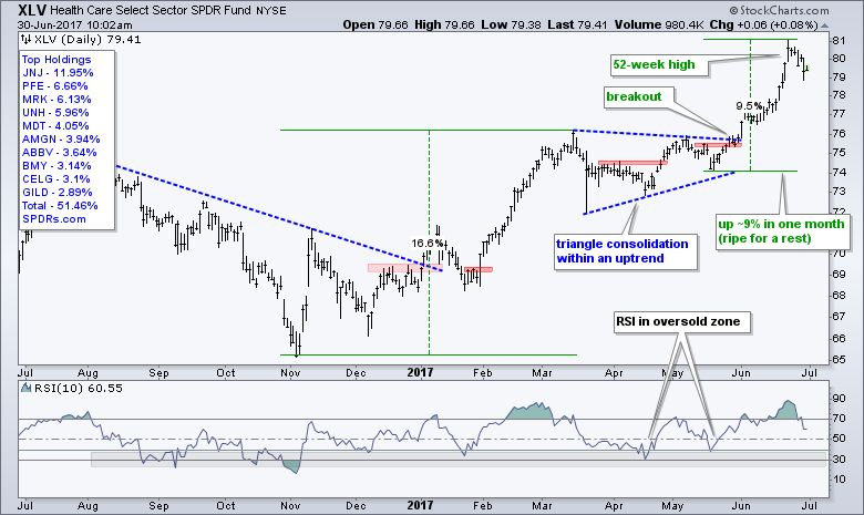
Materials, Industrials and Healthcare Correct
Elsewhere, the Materials SPDR (XLB), the Industrials SPDR (XLI) and the HealthCare SPDR (XLV) are correcting within uptrends. XLB and XLI sport slow and steady uptrends since December, and these two are correcting with 1-2 week pullbacks. XLV surged over 9% and is ripe for a correction or consolidation.
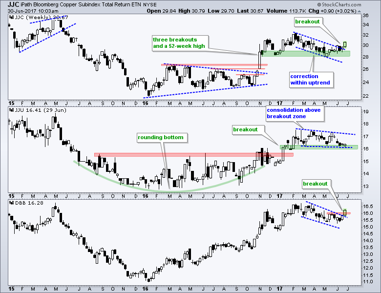
Copper and Base Metals ETF Break Out
It was a rough week for tech stocks, the Dollar and bonds, but not for the Copper ETN (JJC) and the Base Metals ETF (DBB). Led by copper and zinc, the lower window shows DBB correcting with a falling wedge/channel into June and breaking out with a surge the last two weeks. The top window shows JJC breaking out after a correction back to support. The Aluminum ETN (JJU) is lagging, but I will be watching closely as it tests support in the 16 area.
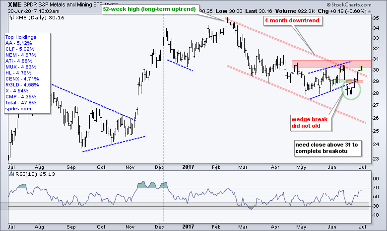
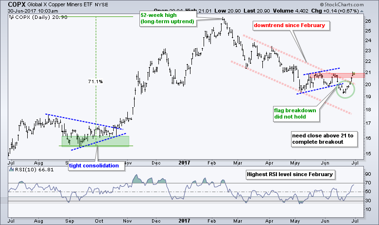
XME and COPX Fall Short, But SLX Breaks Out
The Metals & Mining SPDR (XME) and the Copper Miners ETF (COPX) bounced this week, but fell just short of closing above resistance. XME and COPX broke consolidation supports in mid June and then bounced back above these break zones to negate the signals. Such is life on a chart. The red zones mark resistance and a close above these zones is needed to complete the trend reversal.
The Steel ETF (SLX) did get a breakout with a close above resistance from the May-June highs. I suspect that US steel stocks are moving higher because of chatter regarding import duties. Regardless of the funny-mental reason, SLX shows support in the 35-37 area and a breakout at 38. This is enough to reverse the downtrend and suggest at the bigger uptrend is resuming.

******************************************************
ETF Master ChartPack - 300+ ETFs organized in a Master ChartList and in individual groups.
Follow me on Twitter @arthurhill - Keep up with my 140 character commentaries.
****************************************
Thanks for tuning in and have a good day!
--Arthur Hill CMT
Plan your Trade and Trade your Plan
*****************************************