 |
.... Those Noisy Small and Mid Caps .... Correction Signals versus Bear Market Signals .... High-Low and AD-Volume Lines Turn Down .... SPY and QQQ Have Yet to Break Down .... Non-confirmation between RSP and SPY .... Small-caps Extend Oversold Readings .... Utilities and Technology Leading .... Finance and Staples Still Holding Up .... Industrials-Healthcare-Materials Extend Corrections .... TLT Extends on Triangle Break .... Gold Near Top of Range .... Dollar Gets Oversold Bounce .... Oil Reverses Upswing .... |
----- Art's Charts ChartList (updated 18-August) -----
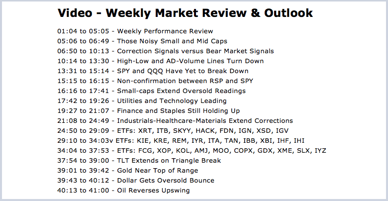
Those Noisy Small and Mid Caps
One of the biggest challenges in technical analysis is to distinguish between a mere correction and the start of a bigger downtrend. This is also true with broad market analysis. The selling pressure over the last four weeks was certainly intense, but is it enough to end the bull market? The chart below shows the S&P 500 SPDR (SPY), S&P MidCap SPDR (MDY) and S&P SmallCap iShares (IJR) as line charts with the 5% Zigzag. This indicator changes direction when there is a move greater than 5% (except for the most recent move).
 Notice that MDY declined more than 5% on three different occasions since April 2016 (red areas) and IJR did the same on five different occasions. SPY, on the other hand, only experienced one pullback that exceeded 5% (closing basis). Deeper pullbacks and choppier price action in small-caps and mid-caps have defined the current bull run before and after the election. As concerning as it is to see relative weakness in small-caps, I don't not think the bull market will end until the S&P 500 cries uncle.
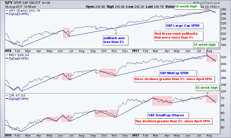
Correction Signals versus Bear Market Signals
According to my breadth indicators, the most recent leg of the current bull run began in March 2016. We have seen a few minor pullbacks along the way with the October-November correction marking the most significant pullback. Some breadth indicators are signaling a correction, but I have yet to get bearish signals that point to a bear market in stocks. First, I will review the bull/bear market breadth indicators and signals using three yardsticks for the S&P 1500. There are links at the end of this section to explain the indicators in detail.
The top window shows a classic moving average pair for the S&P 500. The 50-day EMA has been above the 200-day EMA since April 15th and this means the long-term trend is up. The second window shows the 10-day EMA of AD Percent, which is used to measure bullish and bearish breadth thrusts. This indicator is often the first to trigger and acts as the early warning. A surge above +30% is considered strong enough to signal the start of an extended advance (bull market). Conversely, a plunge below -30% is considered bearish. This indicator has been bullish since 3-March-2016.
The next two indicators are the "critical mass" indicators. A bull or bear market is clearly underway when these two signal. S&P 1500 High-Low Percent ($SUPHLP) turns bullish when it exceeds +10% and bearish when it exceeds -10%. A move above +10% (-10%) shows the critical mass needed in new highs to sustain an advance (decline). Even though High-Low Percent is the most negative since February 2016, it has yet to exceed -5% and yet to trigger a bearish signal. In other words, I do not see enough critical mass to suggest a bear market. The lower window shows the Percentage of Stocks above the 200-day EMA. This indicator turns bullish with a move above 60% and bearish with a move below 40%. This indicator triggered bullish on 31-March-2016 and has yet to dip below 50%. It was, however, hit rather hard the last four weeks and dipped to its lowest level since early November.
Bottom Line: The long-term trend for the S&P 500 remains up and the three breadth indicators have yet to trigger bearish signals. I will consider current market weakness as a correction within a bigger uptrend until two of these indicators trigger bearish signals. I have no idea if or when this may happen, or how long a signal will last.
Related Links: How to create a user-defined index (@GT200SUP).
Understanding the AD Percent Indicators, High Low Indicators and %Above 200-day EMA Indicators.
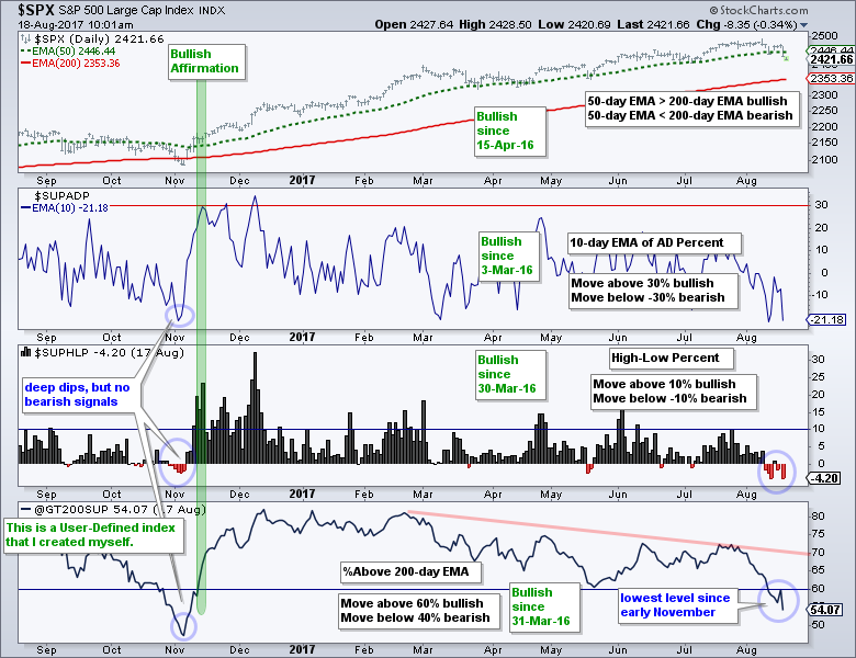
High-Low and AD-Volume Lines Turn Down
Even though the indicators above have yet to signal a possible bear market, we are seeing the most selling pressure since late October-early November. The next three breadth indicators show that a correction is clearly underway in the broader market. First, the chart below shows the Percentage of Stocks above the 50-day EMA for the S&P 1500, S&P 500, S&P Mid-Cap 400 and S&P Small-Cap 600. These indicators dipped to their lowest levels since early November (blue lines).
The second chart shows the High-Low Lines turning down for the S&P 1500, S&P Small-Cap 600 and S&P Mid-Cap 400. These High-Low Lines were above their 10-day EMAs from early November to early August. The downturn shows that new lows are increasing relative to new highs.
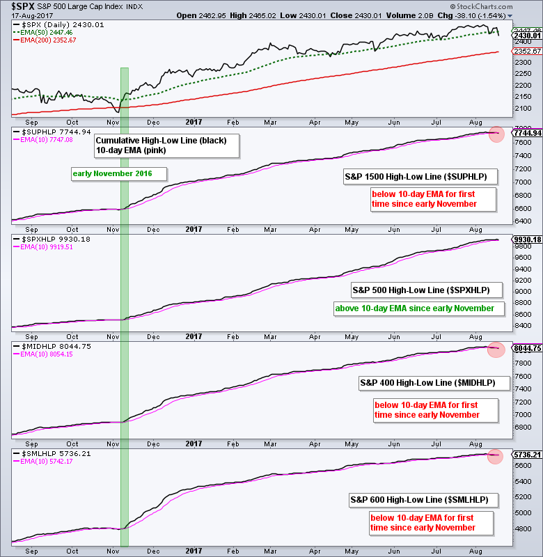
The third chart shows the S&P 1500 AD Volume Line breaking its June-July lows with a sharp decline on Thursday. The S&P 500 and S&P 500 AD Volume Line remain above their June-July lows and they are the last holdouts. The S&P Small-Cap 600 and S&P Mid-Cap 400 AD Volume Lines broke down last week.
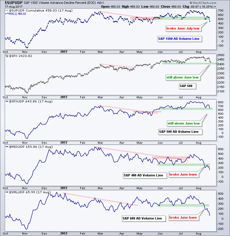
These three indicators point to selling pressure and confirm that the stock market is currently in a corrective phase. Large-caps and the S&P 500 are holding up the best, while small-caps and mid-caps are faring the worst.
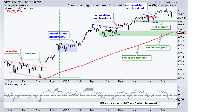
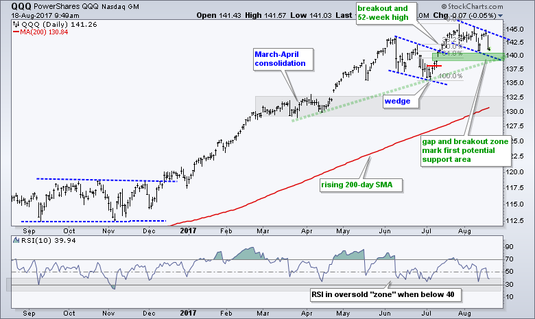
SPY and QQQ Have Yet to Break Down
The S&P 500 SPDR (SPY) and the Nasdaq 100 ETF (QQQ) are holding up the best because they have yet to break their June-July lows. These lows mark first support for SPY in the 240-241 area. The consolidation breakout in mid July was the third such breakout since January. SPY fell back after each breakout, but did not break the lows of the consolidation. A move below 240 would mark the first time the consolidation lows did not hold. The next support zone resides in the 230-235 area.
QQQ hit a new high on July 27th and then fell back over the last four weeks. The long-term trend is clearly up with the recent 52-week high and the wedge breakout is being tested with the pullback. The prior wedge breakout and gap in the 139-140 area turn into the first support zone to watch. The 50-61% retracement zone and March trend line confirm support in this area.
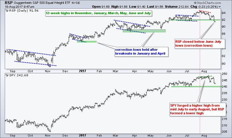
Non-confirmation between RSP and SPY
The trouble starts when we move down the market-cap ladder to equal-weights, mid-caps and small-caps. I will start with the EW S&P 500 ETF (RSP) to show the negative divergences with SPY. First, notice that RSP peaked on July 25th and SPY peaked on August 8th, two weeks later. RSP did not confirm the new high in SPY and now shows "chart" weakness. Second, notice that RSP broke below the June-July lows and SPY remains above these lows. RSP shows chart weakness with this lower low. After keeping pace with SPY on the price chart from November to July, RSP is starting to lead lower and this shows weakness for the average stocks in the S&P 500.
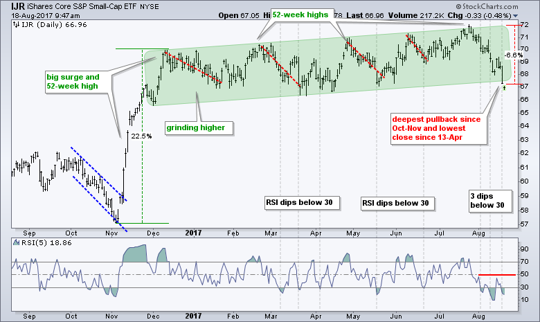
Small-caps Extend Oversold Readings
The S&P SmallCap iShares (IJR) led the major index ETFs lower over the last four weeks with a 6+ percent decline. The close at 67.29 is below the May low and the lowest closing level since April 13. IJR is down if you measure from the December high or year-to-date, but it is up when measuring from the November low or over the last twelve months. With the 52-week high just four weeks ago, I am not quite ready to call for a downtrend or break down. IJR is once again oversold as RSI fluctuates around the 30 area. Look for a surge above 50 to signal an upturn in short-term momentum.
Utilities and Technology Leading
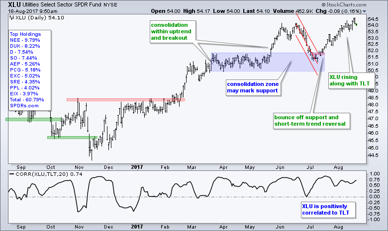
The Utilities SPDR (XLU) is the top performing sector because it hit a 52-week high on Thursday (intraday). The swing turned up with the gap and breakout in mid July. I do not see any new signals or setups on this chart. As a bond proxy, however, I would expect XLU to stay strong as long as the 20+ YR T-Bond ETF holds its uptrend.
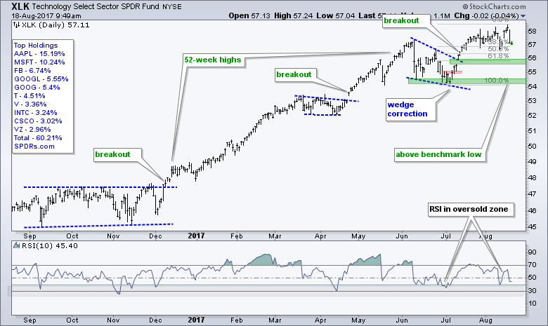
The Technology SPDR (XLK) fell sharply on Thursday, but hit a 52-week high on Wednesday and remains a top-performing sector. Technology is still the biggest sector in the S&P 500 (23%) and it is hard to get too bearish on this broad market benchmark with XLK near a new high. The wedge breakout and gap mark first support in the 56 area.
Finance and Staples Still Holding Up
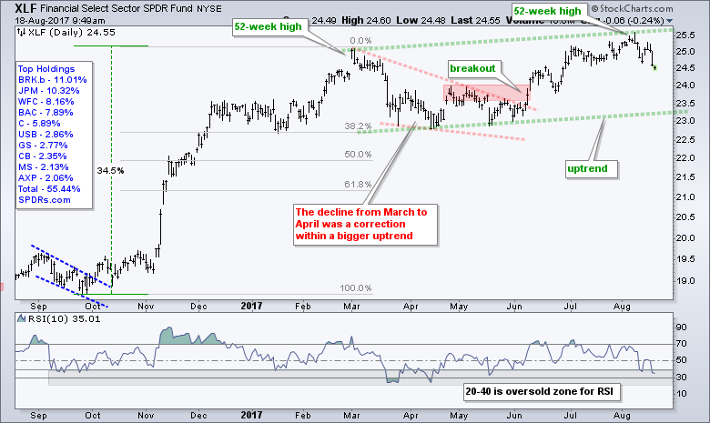
The Finance SPDR (XLF) hit a 52-week high two weeks ago and the fell back. The green dashed lines mark a rising channel of sorts. I could mark support with the July lows, but will refrain because I don't think a break below 24.5 would be that negative. It would just set up a short-term oversold condition within a bigger uptrend.
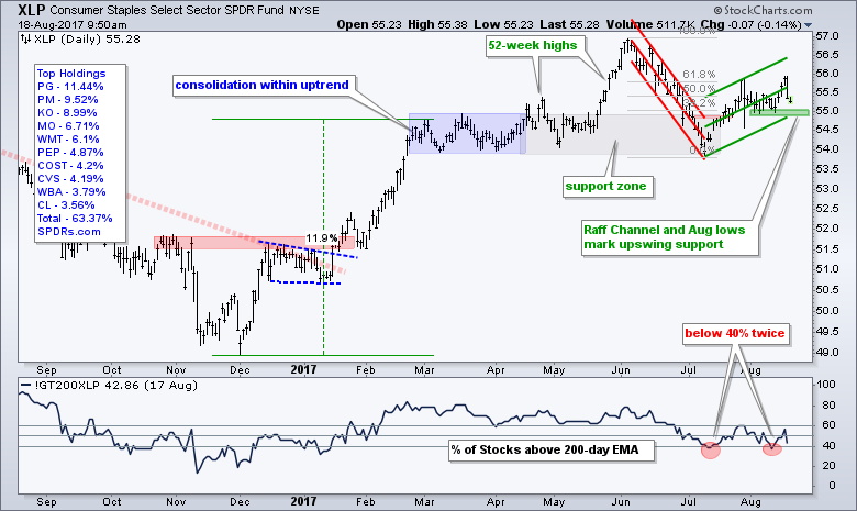
The Consumer Staples SPDR (XLP) is up over the past month and leading the market since mid July, but I still do not like the breadth or the pattern. I am now using a Raff Regression Channel to define the bounce that retraced around 62% of the prior decline. The lower line and early August lows mark support at 54.8 and a close below this level would reverse the upswing. The indicator window shows Staples %Above 200-day EMA (!GT200XLP) dipping below 40% twice in the last two months. There are a lot of weak stocks within this sector.
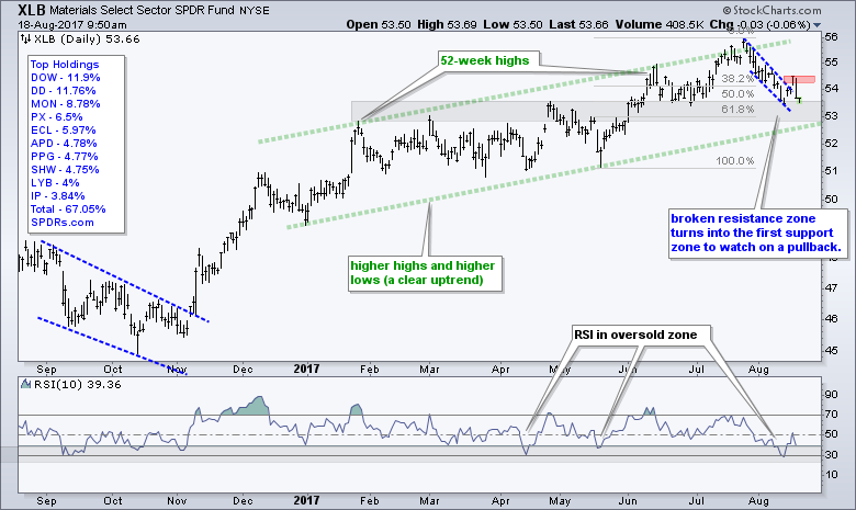
Industrials, Healthcare and Materials Extend Corrections
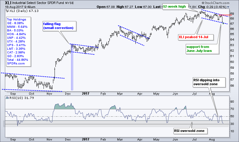
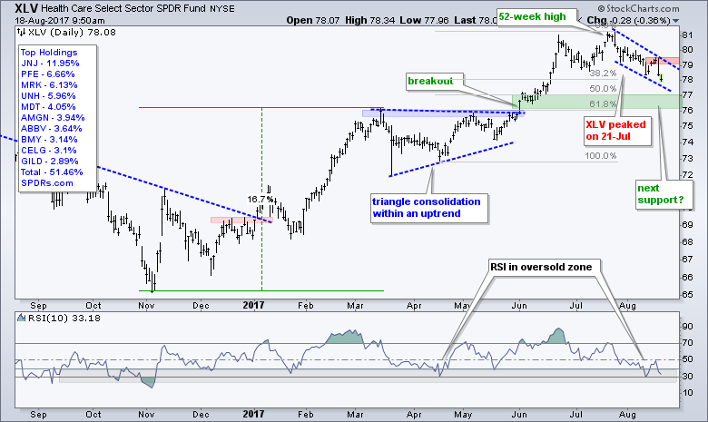
The long-term trends are up for the Industrials SPDR (XLI), HealthCare SPDR (XLV) and Materials SPDR (XLB), but these three pulled back over the last three to four weeks. A pullback within an uptrend is considered a correction so we should be on our toes. XLI has a falling flag working since mid July and RSI dipped into the oversold zone. A move above 69 would break flag resistance and end this correction.
The HealthCare SPDR (XLV) is in a similar boat with flag resistance marked at 79.50 for now.
The Materials SPDR (XLB) appeared to get a flag breakout with the gap-surge from Monday to Wednesday, but fell back sharply on Thursday. The ETF is still trading in a potential reversal zone marked by the gray support zone and the 50-62% retracements. Look for a move above 54.6 to revive the breakout.
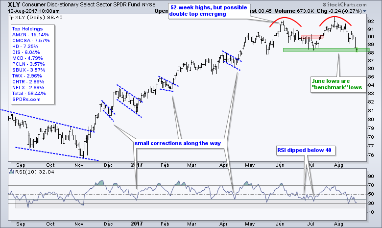
The Consumer Discretionary SPDR (XLY) has a potential double top working and the ETF is testing support from the intermittent low. A close below 88 would confirm the double top and reverse the uptrend that has been in place since the November breakout.
Be sure to check out the Art's Charts ChartList for correction setups in XLI, XLV, IBB, XBI and XME. The industry group ETFs associated with the tech sector remain strong with XSD hitting support, HACK in a retracement zone, FDN in pullback mode, IGV holding its little breakout and SKYY correcting. ----- Art's Charts ChartList (updated 18-August) ----- These setups are explained in the video at the top.
TLT Extends on Triangle Break
The 20+ YR T-Bond ETF (TLT) surged as the stock market fell on Thursday. This surge did not change the overall trend, which is up. The triangle breakout in early August was the most recent chart pattern signal and this breakout is holding. The July-August lows mark support at 122 and I would expect bonds to trade higher as long as this uptrend (support) holds.
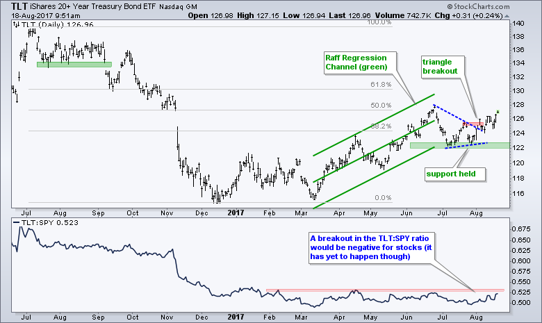
The indicator window shows the TLT:SPY ratio moving sideways most of the year. This means TLT is not outperforming SPY (or SPY is underperforming TLT). Instead, TLT is performing in line with SPY. As noted before, a breakout in this ratio would show relative strength in TLT and this would be negative for stocks.
Gold Nears Top of Range
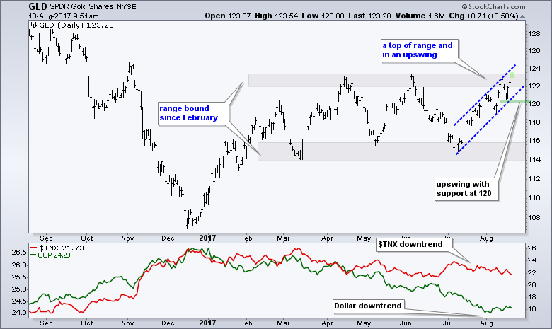
The Gold SPDR (GLD) also surged over the last two days and remains in an upswing since early July. The trend since February, however, is flat and GLD is near the resistance zone. I will take my cues from the six week upswing and consider gold bullish as long as support at 120 holds.
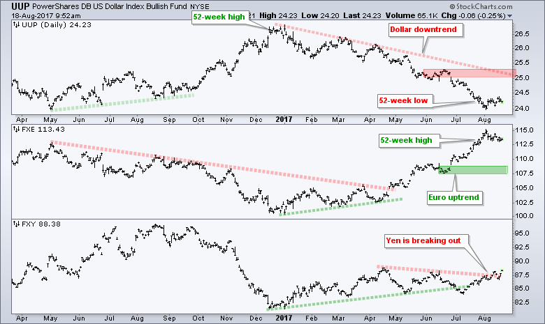
Dollar Gets Oversold Bounce
The US Dollar ETF (UUP) bounced over the last two weeks, but this is still considered an oversold bounce within a bigger downtrend. The June highs and January trend line mark the first major resistance zone in the 25-25.3 area.
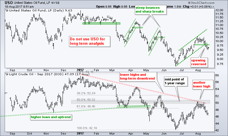
Oil Reverses Upswing
Oil is in a long-term downtrend and the short-term uptrend reversed with a decline the last four days. September Crude (^CLU17) sports a series of lower lows and lower highs since January. The most recent bounce fizzled around 50 and well below the prior high (May). The green dashed lines mark the short-term upswing on the USO chart. USO broke support with a close below 9.75 and this signals a continuation of the bigger downtrend.
******************************************************
ETF Master ChartPack - 300+ ETFs organized in a Master ChartList and in individual groups.
Follow me on Twitter @arthurhill - Keep up with my 140 character commentaries.
****************************************
Thanks for tuning in and have a good day!
--Arthur Hill CMT
Plan your Trade and Trade your Plan
*****************************************


