.... Nearing the Moment-of-truth for TLT and $TNX
.... How the 10-yr Yield Affects other Names
.... Gold, Silver and Gold Miners Reverse Near Key Retracement
.... Newmont Forms Bull Flag
.... Working with High-Low Percent Indicators
.... Finance, Industrials, Tech and Materials Lead New High List
.... New Highs Expand for XLK
.... Three Different Sector Views for Consumer Staples ....
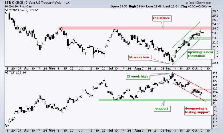
Nearing the Moment-of-truth for TLT and $TNX
The first chart shows the 10-yr T-Yield ($TNX) in the top window and the 20+ YR T-Bond ETF (TLT) in the bottom window. The 10-yr yield surged over the last four weeks and TLT fell towards its summer lows. The surge in the 10-yr yield lifted banking stocks, but weighed on gold, gold stocks, utilities and consumer staples. We should watch these two closely because $TNX and TLT because are at a moment-of-truth - short-term and long-term. $TNX surged to resistance from the spring-summer highs around 24 (2.4%) and TLT is trading just above the summer lows and these mark support. The green Raff Regression Channel defines the upswing in $TNX with the green zone marking support. The red lines define the downswing in TLT with the red zone marking resistance. Watch these levels for a short-term trend reversal.
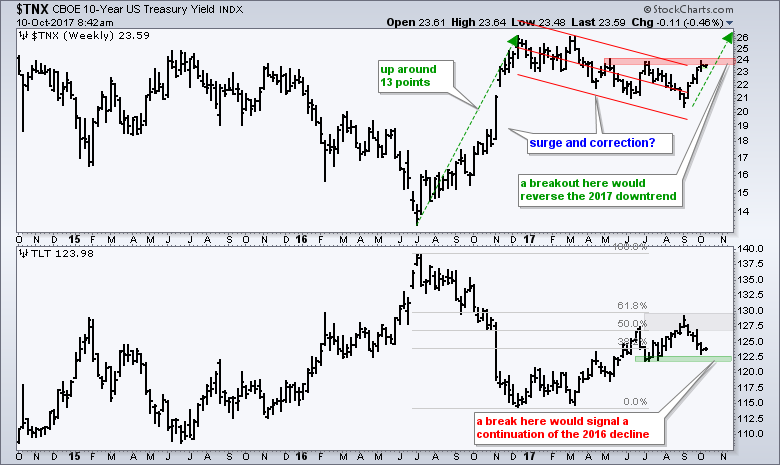
 We need a weekly chart to appreciate the importance of resistance for $TNX and support for TLT. The chart below shows $TNX surging in the second half of 2016, peaking in December and falling throughout 2017. Overall, it looks like a strong surge in 2016 and a correction in 2017. The four week advance carried $TNX to resistance and a breakout would signal a continuation of the 2016 advance. A weekly close above 24.25 would break resistance. Based on a measured move, the target would then be 33.3 (3.33%). The first advance is from 13.3 to 26.3 or 13 points. The low of 2017 is around 20.3 and a 13 point move from here would be to 33.3, which his 3.33% on the actual 10-yr yield. The bottom window shows TLT turning down at the 61.8% retracement and testing key support in the 122.5 area. A break here would be long-term bearish.
How the 10-yr Yield Affects other Names
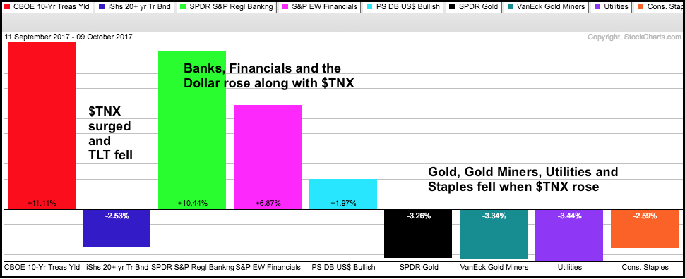
The PerfChart below shows the performance for the 10-yr T-Yield ($TNX), the 20+ YR T-Bond ETF (TLT) and seven other names over the last four weeks. $TNX is up sharply and TLT is down sharply. Notice that the Regional Bank SPDR (KRE), EW Finance ETF (RYF) and US Dollar ETF (UUP) rose along with the 10-yr T-Yield (positive correlation). In general, we can expect these three to move in the same direction as $TNX. Conversely, note that the Gold SPDR (GLD), Gold Miners ETF (GDX), Utilities SPDR (XLU) and Consumer Staples SPDR (XLP) fell when the 10-yr T-Yield rose (negative correlation). In general, we can expect these four to move opposite the 10-yr T-Yield.
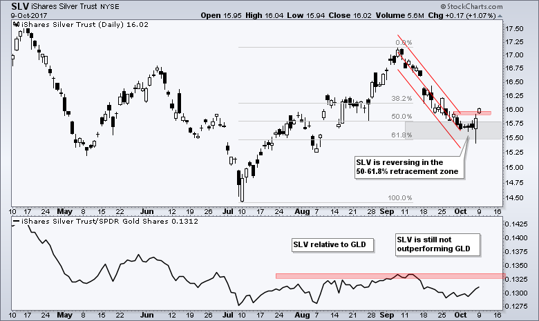
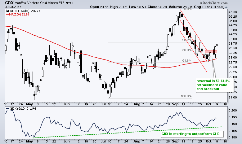
Gold, Silver and Gold Miners Reverse Near Key Retracement
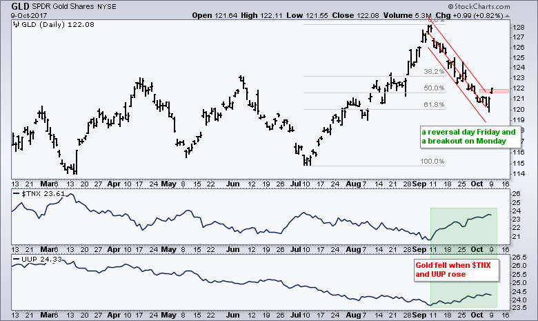
The next three charts show pretty much the same thing. The Gold SPDR (GLD), the Silver ETF (SLV) and the Gold Miners ETF (GDX) surged from July to early September and then fell back into early October. All three firmed in the 50-61.8% retracement zones, forged reversal days on Friday and popped on Monday. These pops triggered short-term breakouts and these are the early signals that the short-term downtrend reversed. Perhaps more importantly, these breakouts could signal a resumption of the July-September advances. Also of note, the SLV:GLD ratio remains flat and silver is not outperforming gold. The GDX:GLD ratio, however, has been working its way higher since May and the Gold Miners are starting to outperform gold.
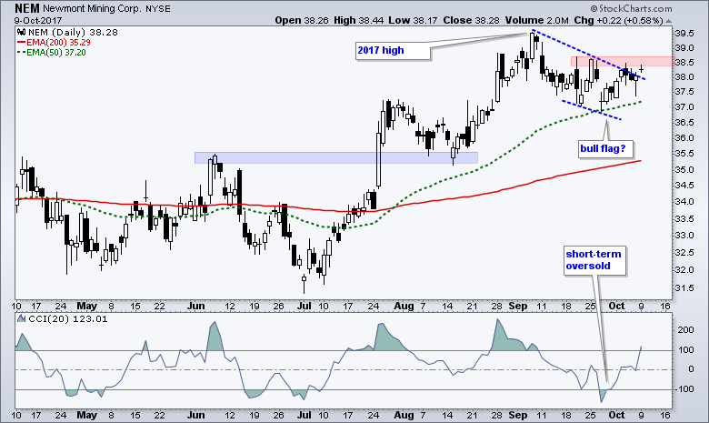
Newmont Forms Bull Flag
The next chart shows Newmont (NEM) hitting its highest level of 2017 and then falling back the last four weeks (blame the 10-yr Yield). A falling flag formed and this is typically a bullish continuation pattern. A breakout in the 38.5 area would signal a continuation higher.
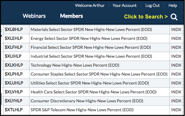
Working with High-Low Percent Indicators
Chartists looking for the sectors with the strongest stocks can focus on the High-Low Percent indicators. High-Low Percent equals new highs less new lows divided by total issues. StockCharts calculates and publishes these numbers for the nine sector SPDRs, some major indexes and a few other groups. Chartists looking for these symbols can click the search icon in the upper right hand corner of any web page and search for "high and low and percent" (without quotations). The image below shows the symbols for the sectors. They begin with a $ sign and the sector symbol, and end with HLP.
Finance, Industrials, Tech and Materials Lead New High List
I created a ChartList with these symbols and then ran a scan to rank by the 5-day SMA of High-Low Percent. Note that I will cover this and answer any other questions in MarketWatchers Live this Wednesday (12:00 to 1:30 PM ET). The image below shows the scan results with S&P 500 High-Low% ($SPXHLP) in the middle (blue lines). The financial sector is leading with the highest 5-day SMA (27.76%) and the technology sector is leading with the highest value on Monday (32.87%). In absolute terms, there were 20 new highs in the technology sector and 11 new highs in the finance sector (within the S&P 500). Elsewhere, the industrials and materials sector are also leading with the 5-day SMA of High-Low Percent at 24% and 20%, respectively.
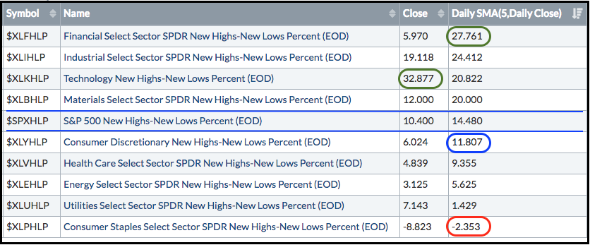
The sectors below the S&P 500 are lagging, but not all are weak. The 5-day SMAs for High-Low Percent for consumer discretionary and healthcare are in the 9 to 11 percent area. Energy and utilities have not produced many new highs this past week. Most energy stocks are still well below their 52-week highs and utility stocks fell over the last few weeks as the 10-yr T-Yield rose. The consumer staples sector is the weakest and the only one with negative High-Low Percent, which means there are more new lows than new highs.
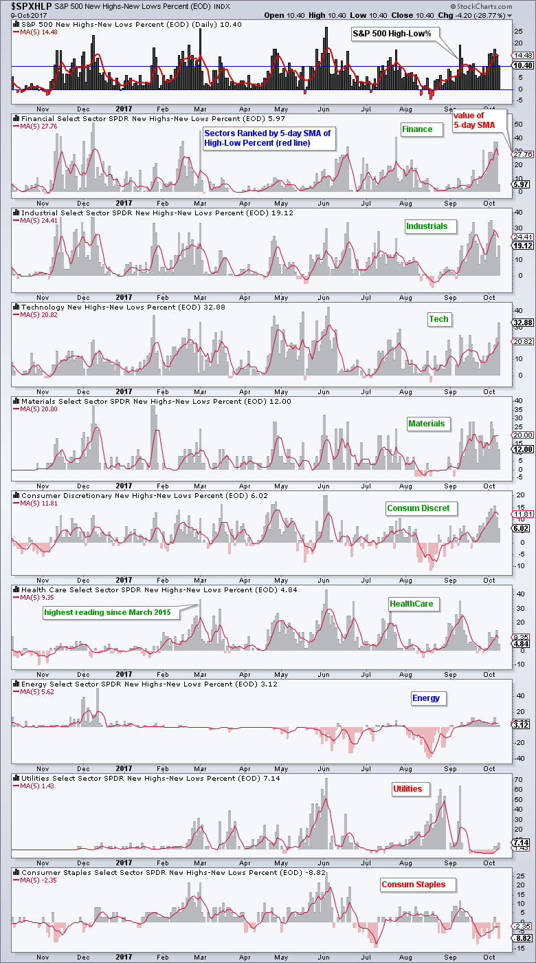
New Highs Expand for XLK
Members looking for a visual representation can always chart the High-Low Percent indicators as histograms. Note that you must be a PRO Member to chart more than 6 symbols (data sets) on one chart. The chart below shows the High-Low Percent indicators with the 5-day SMA in red and the sectors are sorted by the value of the 5-day SMA, which is the red number on the right. The fourth window from the top shows XLK High-Low% ($XLKHLP) hitting its highest level since early June as the number of new highs in this sector expanded on Monday.
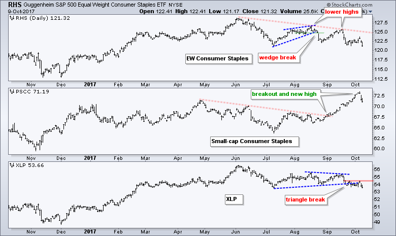
Three Different Sector Views for Consumer Staples
Chartists looking for a complete picture of sector performance can analyze the sector SPDR, the equal-weight sector ETF and the small-cap sector ETF. The sector SPDRs are weighted by market cap and capture the performance for large-caps in the sector. The equal-weight ETFs capture the performance for the "average" stock in the sector. The small-cap sector ETF captures the performance for small-caps. There is an interesting dynamic in the consumer staples sector with the SmallCap Consumer Staples ETF (PSCC) hitting a new high in early October. Meanwhile the EW Consumer Staples ETF (RHS) and Consumer Staples SPDR (XLP) formed lower highs in August-September and broke down. All three fell sharply over the last two days.
******************************************************
ETF Master ChartPack - 300+ ETFs organized in a Master ChartList and in individual groups.
Follow me on Twitter @arthurhill - Keep up with my 140 character commentaries.
****************************************
Thanks for tuning in and have a good day!
--Arthur Hill CMT
Plan your Trade and Trade your Plan
*****************************************


