.... Finance Sector Ignores Flattening Yield Curve
.... 2-yr Yield Hits New High
.... Yield Curve is not a Problem Until
.... Correlation between KRE and the 10-yr Yield
.... Correlation is Not Everything
.... Back to Chart Basics
.... Play the Pullback ....
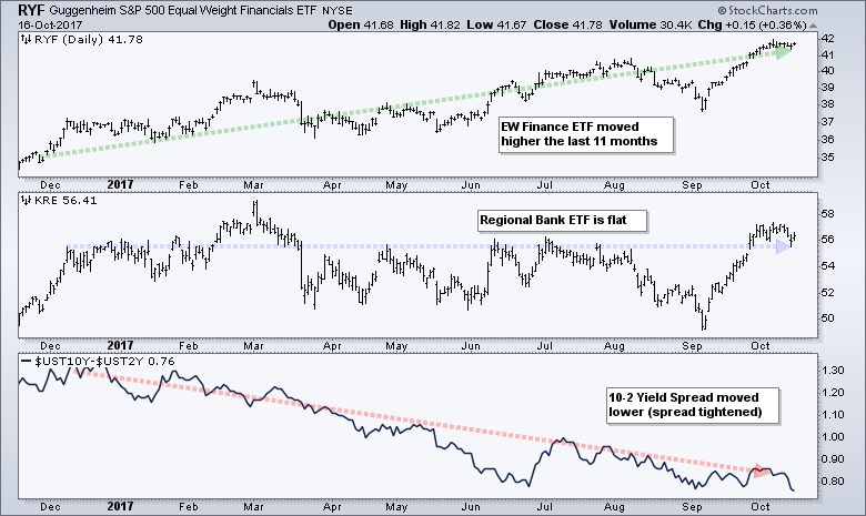
Finance Sector Ignores Flattening Yield Curve
What would happen to the EW Finance ETF (RYF) and the Regional Bank SPDR (KRE) if the yield curve flattened? Note that the yield curve is represented by the spread between the 10-yr Yield ($UST10Y) and the 2-yr Yield ($UST2Y). This spread hit a new low on Monday and most would consider this negative for the finance sector and the banks. The chart says otherwise. The chart below shows RYF in the top window, KRE in the middle window and the 10-2 Spread in the lower window. Notice that RYF hit a new high in October and KRE is within 5% of a new high. The 10-2 spread fell over the last eleven months and hit a 52-week low on Monday. Thus, the yield curve flattened considerably over the last 11 months, but EW Finance is trading near a new high and Regional Banks are holding its own.
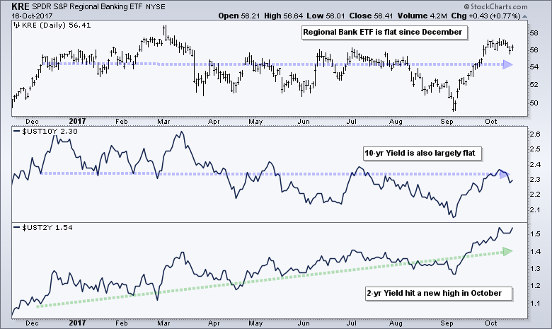
2-yr Yield Hits New High
The next chart shows KRE in the top window, the 10-yr yield in the middle and the 2-yr yield in the lower window. KRE and the 10-yr yield fell from March to September and then bounced to the middle of their ranges over the last six weeks. Overall, both are largely flat since December. The 2-yr yield, in contrast, consistently rose from December to October and hit a new high this month. This persistent rise in the 2-yr caused the yield curve to flatten because the 2-yr yield moved closer to the 10-yr yield.
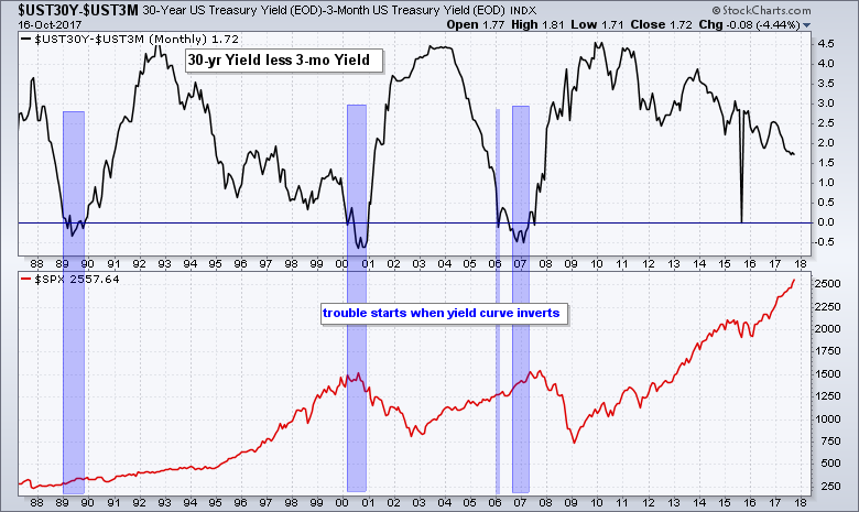
Yield Curve is not a Problem Until
The next chart shows the yield curve represented by the spread between the 30-year Yield ($UST30Y) and the 3-month yield. The 30-yr yield is the longest of the long yields, while the 3-month yield is the shortest of the short. The yield curve is normal when the 30-yr yield is higher than the 3-month yield and this spread is positive. The yield curve inverts when short-term yields move above long-term yields and this spread turns negative. The blue zones show when the yield curve inverted over the last 30 years. Clearly, the trouble starts with an extended inversion (1989, 2000 and 2007). The spread between the 30-yr Yield and 3-month yield fell over the last seven years, but remains far from an inversion and this supports the bull market in stocks.
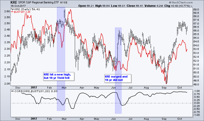
Correlation between KRE and the 10-yr Yield
There is clearly some positive correlation between the 10-yr Yield and Regional Banks. The next chart shows KRE with black bars, the 10-yr yield in red and the Correlation Coefficient ($UST10Y, KRE) in the lower window. The KRE bars and 10-yr yield match up pretty well and this is confirmed with the Correlation Coefficient, which remained largely positive the last 11 months. The blue areas show two periods when the Correlation Coefficient turned negative for a short time.
Correlation is Not Everything
I noted the relationship between KRE and the 10-yr yield several times this year, but the long-term chart suggests that correlation is not telling the entire story. In fact, the level of the 10-yr yield is not telling the entire story either. The next chart shows weekly data over the last six years. Even though the Correlation Coefficient ($UST10Y,KRE) has been largely positive the last six years, the chart shows some pretty big performance discrepancies. First, the 10-yr yield fell from 3% to 1.5%, but the Regional Bank SPDR traded flat during this timeframe. KRE lagged the broader market during this timeframe, but did not follow the 10-yr yield lower. Thus, the sharp decline in the 10-yr yield did not result in sharply lower prices for KRE.
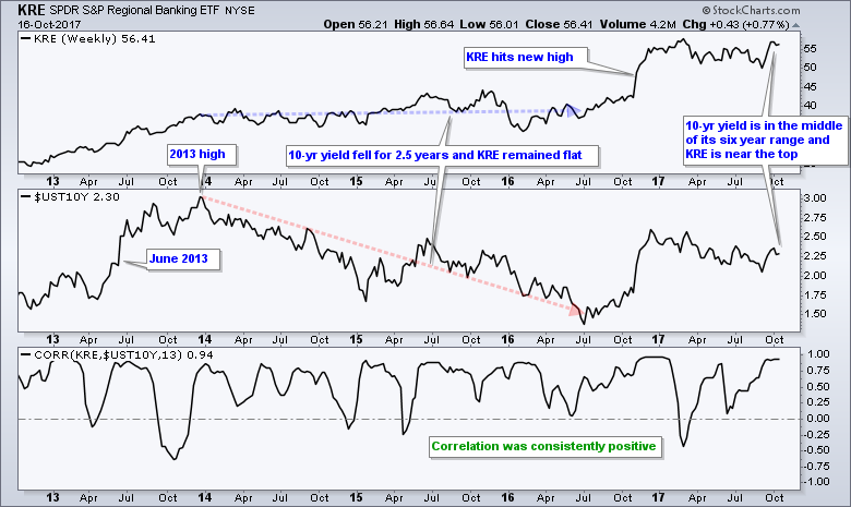
Second, the Regional Bank SPDR (black) hit a new high earlier this year, but the 10-yr yield (red) remains well below its 2013 high, which is around 3%. Thus, yields are down over the last four years, but KRE is up. Third, the 10-yr yield is near the middle of its six year range, but KRE is near the top of its six year range.
Overall, the 10-yr yield is flat over the last six years and the Correlation Coefficient ($UST10Y, KRE) is mostly positive. Even so, the KRE is up substantially during this timeframe and near a new high. There are two reasons for this discrepancy. First, the correlation coefficient does not consider the magnitude of the move. Correlation is +1 when both are up and +1 when both are down. The size of the moves does not matter. Thus, a big decline in the 10-yr yield and a fractional loss in KRE still results in a +1 correlation. Similarly, a big gain in KRE and a fractional gain in the 10-yr yield results in a +1 correlation. Second, the level of the 10-yr yield is just one input and there are other factors influencing the Regional Bank SPDR.
Back to Chart Basics
Treasury yields are part of the narrative for banks, but yields are not the only narrative at work. Don't worry, I am not going to start listing all the narratives at work. This is not necessary because we have a price chart that captures the positive and negative narratives, and then puts a value on the "net" narrative. On the KRE chart, I see a big advance (~70%) from June 2016 to February 2017, and then a long correction into September. This correction ended with a three week surge that broke the wedge line and summer highs. This breakout signals a continuation of the prior advance and new highs are expected in the coming weeks or months.
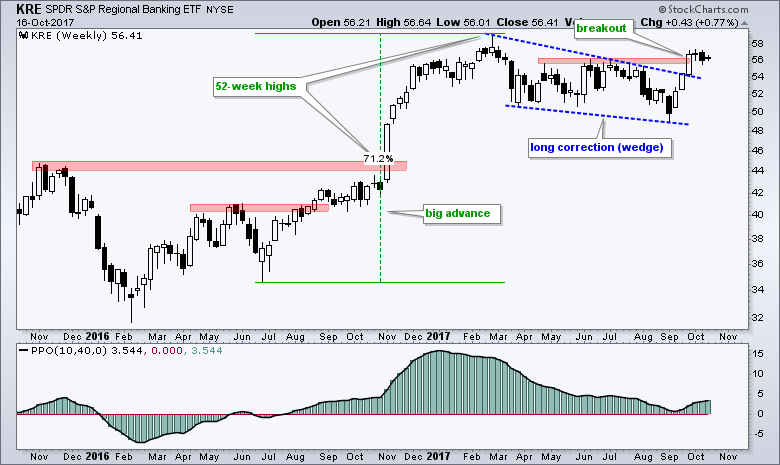
Play the Pullback
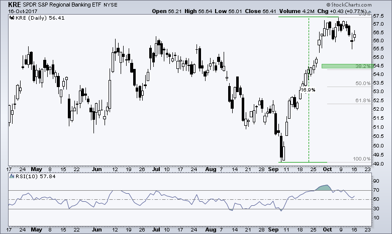
As far as trading KRE going forward, I think the long-term trend is up and this favors short-term mean-reversion setups. In other words, it is time to buy the dips because pullbacks are corrections within a bigger uptrend. As with all forecasting, timing a dip and predicting its depth is tricky. The 54.5 area marks a 38.2% retracement of the recent surge and the 20-40 area marks an oversold zone for RSI. A pullback into the 54.5-50 area and RSI dip below 40 would set up a possible mean-reversion opportunity.
******************************************************
ETF Master ChartPack - 300+ ETFs organized in a Master ChartList and in individual groups.
Follow me on Twitter @arthurhill - Keep up with my 140 character commentaries.
****************************************
Thanks for tuning in and have a good day!
--Arthur Hill CMT
Plan your Trade and Trade your Plan
*****************************************


