.... Is the Bond Market Sending a Message?
.... IJR Triggers Mean Reversion Signal
.... RSI Turns Up for the Health Care SPDR
.... When Ugly Charts Provide Opportunities
.... Biotech iShares Dip for the Third Time ....
I wrote about the unadjusted High-Yield Bond ETF (_HYG) on October 31st and junk bonds fell rather sharply the last six days. Even though the major stock indexes remain in long-term uptrends, the sharp decline in junk bonds could foreshadow the long-awaited correction in stocks. In contrast to small-caps, I think junk bonds represent the canaries in the economic coal mine because they are the first to suffer when the economy softens. I should also note that the 20+ YR T-Bond ETF (TLT) is up over 3% the last nine trading days and above the mid October high. Treasury bonds represent the ultimate safe-haven and this reflects some risk aversion in the markets. Moreover, the sharp rise in TLT and sharp decline in HYG could be sending a message to the stock market.
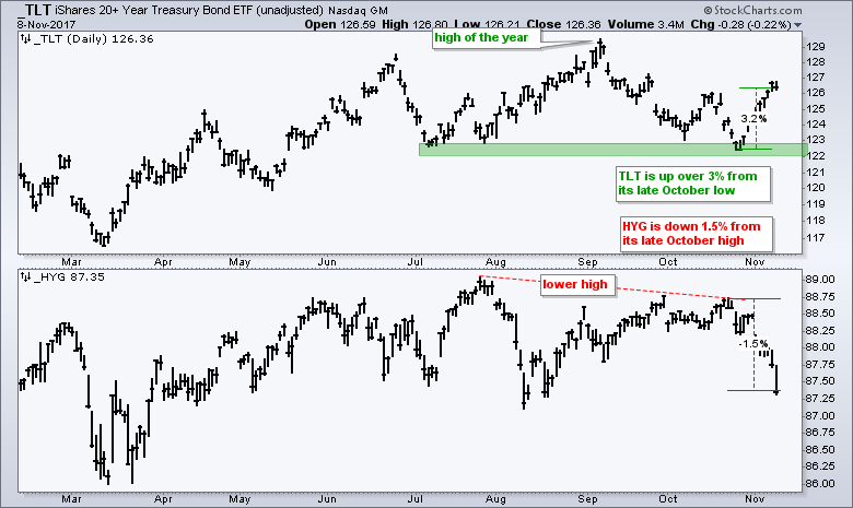
The chart above shows the unadjusted 20+ YR T-Bond ETF (_TLT) and the unadjusted High-Yield Bond ETF (_HYG) moving in opposite directions over the last two weeks. Chartists can place an underscore (_TLT) before the symbol to see a chart that is not adjusted for dividends or distributions. I am showing unadjusted charts because these reflect the capital gain or loss over time. In contrast, adding the dividends and distributions back to the prices creates a total return picture.
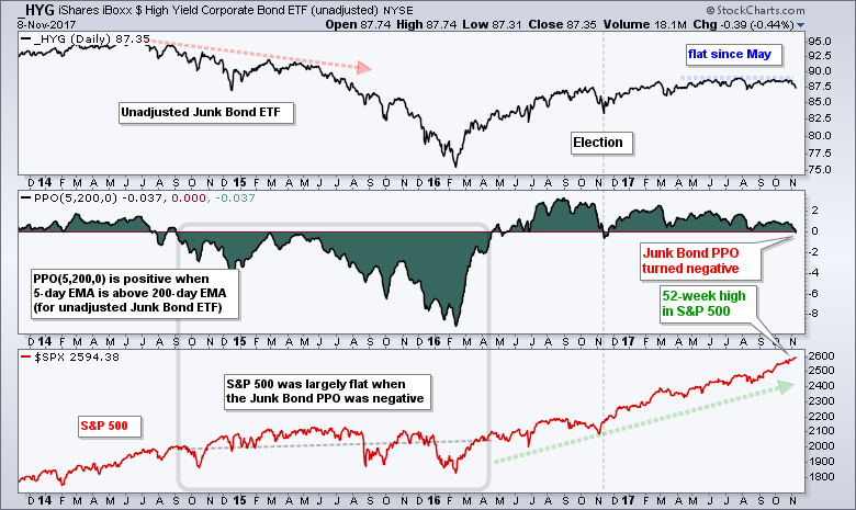
The next chart shows the unadjusted High-Yield Bond ETF (_HYG) trading flat since May and the PPO (5,200,0) turning negative. This means the 5-day EMA moved below the 200-day EMA and this is the first such occurrence since early November. Notice that the PPO was negative from September 2015 to April 2016 and the S&P 500 was largely flat during this time. It is hard to predict a correction when the S&P 500 is near a new high, but the sharp downturn in junk bonds and sharp rise in Treasury bonds could foreshadow a corrective period for stocks.
IJR Triggers Mean Reversion Signal
The rest of this commentary is devoted to the mean-reversion trade. Given the decline in junk bonds and rise in Treasury bonds, it may be time to hold off and watch price action as certain areas of the market become oversold. The short-term mean-reversion system using oversold levels in RSI triggered on Wednesday for the S&P SmallCap iShares (IJR). A bullish signal occurs when RSI(5) moves above 30, which means RSI became oversold (<30) prior to this signal. The system holds this position until a close below the Chandelier Exit (22,1), which is the red line. IJR is currently below the Chandelier Exit so a move above the Chandelier Exit is required before a sell signal is possible.
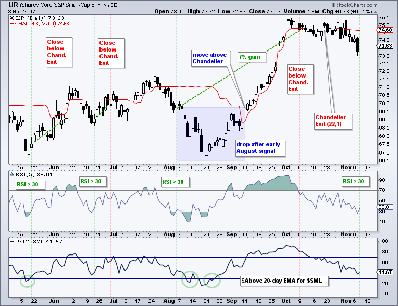
It is imperative that we fully understand an indicator and trading system before we actually trade them. Let's review the last trade for more insight. A bullish signal triggered on August 4th when RSI moved above 30 and IJR was trading around 70. IJR then fell below 67 over the next two weeks and bounced in the second half of August. The Chandelier Exit fell in early September because the 22-day high fell and IJR crossed above this exit on September 11th. Thus, a sell setup was not in place for over a month. Even though the trade got off to a rough start, it finished strong because IJR did not close below the Chandelier Exit until October 9th. The trade ended up with a 7% gain and this was the best trade of 2017. There is a full System Trader article on this mean-reversion system as well as ChartSchool articles on the Chandelier Exit and RSI.
RSI Turns Up for the Health Care SPDR
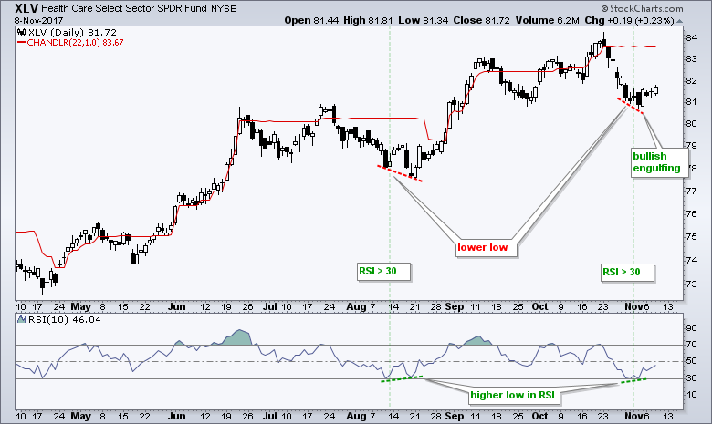
The next chart shows the Health Care SPDR (XLV) with RSI(10) becoming oversold on October 31st. I use RSI(5) for broad index ETFs and RSI(10) for sector/industry ETFs and stocks. Broad index ETFs are less volatile and this requires a more sensitive RSI setting. Sector ETFs, Industry ETFs and stocks are more volatile that broad index ETFs and I prefer a less sensitive RSI setting. It is a fielder's choice!
In addition to RSI becoming oversold for XLV, a very very small positive divergence formed from October 31st to November 2nd. Note that I only consider divergences when they are in harmony with the bigger trend, which is up for XLV. The ETF also formed a bullish engulfing on Friday and edged higher on Wednesday. Thus, it looks like a bounce could be in the making for the healthcare sector, which hit a 52-week high less than three weeks ago. That sure seems like a long time ago.
When Ugly Charts Provide Opportunities
Cesar Alvarez of AlvarezQuantTrading.com recently published a two part series on mean-reversion trading (The ABCs of Creating a Mean Reversion Strategy). It is a great series with an accompanying podcast from BetterSystemTrader.com. Cesar has helped me over the years with system development and I highly recommend his blog. One part of his post notes that is it "hard to pull the trigger on trades because the charts often look ugly". Mean-reversion and systematic trading really requires a different mindset than breakout trading.
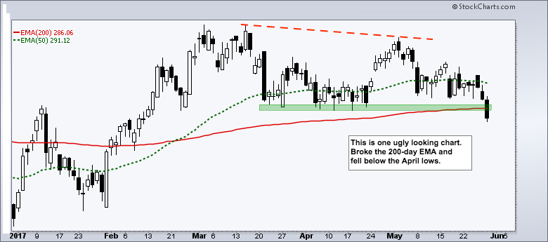
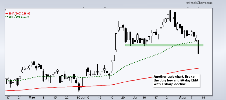
Taking a page from Cesar's note, the anonymous charts above show two sharp declines. The first shows a lower high in early May and then a break below the 200-day EMA and the April lows on May 30th. The second shows a 2.82% decline that broke support and the 50-day EMA on August 10th. Such declines certainly make the headlines and scare off traders, but they also present opportunities to buy the dip.
Biotech iShares Dip for the Third Time
By the way, the charts above are from the Biotech iShares (IBB). The chart below shows IBB with RSI dipping below 31.5 on May 30th and 29.64 on August 10th, which is when the ETF allegedly broke down on the price charts. Hindsight is 20/20, but the so-called support breaks clearly presented more of an opportunity than a threat. Currently, IBB broke the September lows and the 50-day EMA with a sharp decline in the second half of October. RSI also dipped to its lowest level of the year and became seriously oversold.
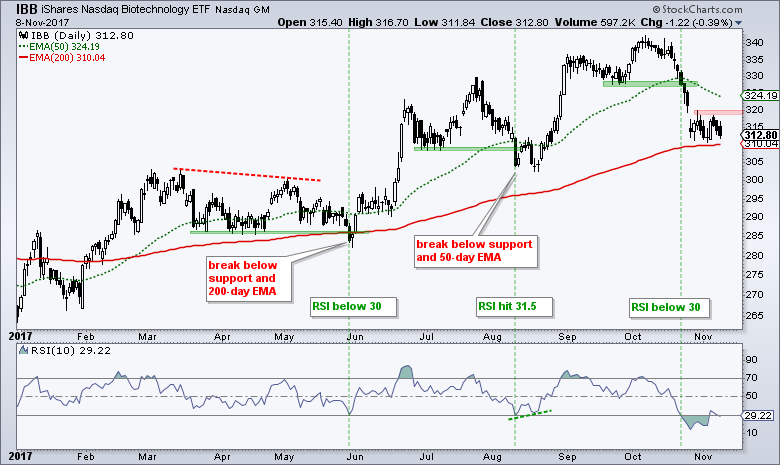
Ideally, RSI would dip below 30 and become "officially" oversold for signals, but we cannot count on the ideal situation. A move to the low 30s is close enough to oversold and this means we should be on alert for a bounce. RSI moved below 30 on October 23rd and IBB gapped down on October 30th. Thus, we can also see that RSI can become oversold and remain oversold. RSI moved above 30 last Friday and this is the first sign that a bounce is coming. The red zone shows short-term resistance and a breakout at 320 would be bullish for chart players!
******************************************************
ETF Master ChartPack - 300+ ETFs organized in a Master ChartList and in individual groups.
Follow me on Twitter @arthurhill - Keep up with my 140 character commentaries.
****************************************
Thanks for tuning in and have a good day!
--Arthur Hill CMT
Plan your Trade and Trade your Plan
*****************************************


