- VIX is a Teenager Again.
- $NDX and $SML AD Lines Lead.
- New Highs Still Dragging.
- Small-caps, Large-caps, Tails and Dogs.
- Six Leading Sectors (and Four Laggards).
- A Pop and Drop for Gold.
- Oil Forms Lower High.
- The Incredibly Shrinking Stock Market.
- Notes from the Art's Charts ChartList.
 VIX is a Teenager Again....
Once again, this market has something for everyone. The bulls are emboldened with new highs in two AD Lines, leadership from technology and finance, renewed vigor in small-caps, the dip below 20 in $VIX and a strong showing after the tariff tantrums.
The bears can point out relative weakness in large-caps, lower highs in eight of nine sector SPDRs, the low number of 52-week highs and the rising wedges taking shape on several charts. Note that rising wedges are technically uptrends and should not be considered bearish until they break.
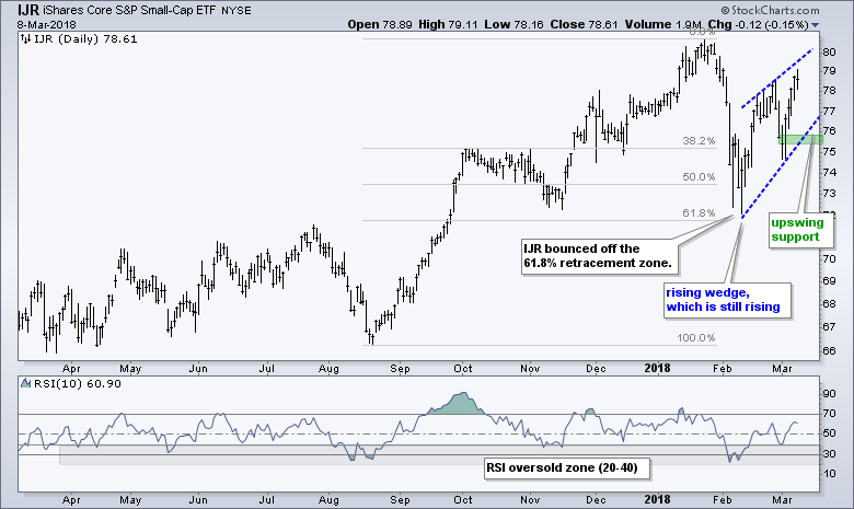
The chart below shows the S&P 500 edging back above its 50-day EMA this week, but still below its late February high. The S&P Small-Cap 600, in contrast, is above its late February high and this is why large-caps are lagging (or small-caps are leading). Take your pick.
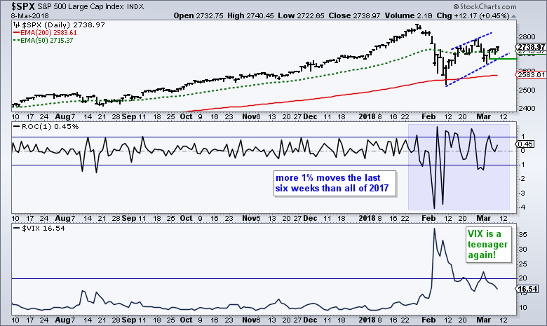
The S&P 500 Volatility Index ($VIX) is back in teenager land (16.5) and the S&P 500 seems to like this age, contrary to most parents. The S&P 500 gets upset when the VIX turns 21 and moves out of the house.
Even though the VIX is back to being a teen, notice that the S&P 500 continues with moves in excess of 1%. In fact, there have been more moves greater than 1% in the last six weeks than in all of 2017. This is not bearish or bullish. It just shows that volatililty is still here in a way.
As far as the S&P 500 is concerned, and the broader market by extension, I would respect the rising wedge as long as 2675 holds on a closing basis. This means the bulls get the benefit of the doubt right now. A close below 2675, which marks this week's low, would give back this week's bounce and break the wedge trend line.
$NDX and $SML AD Lines Lead
The next chart shows the AD Lines for the S&P 500, S&P Mid-Cap 400, S&P Small-Cap 600 and Nasdaq 100. First, note that the Nasdaq 100 AD Line hit new highs in late February and early March, and is leading the group. Second, notice that the S&P Small-Cap 600 AD Line hit a new high this week and is the second strongest.
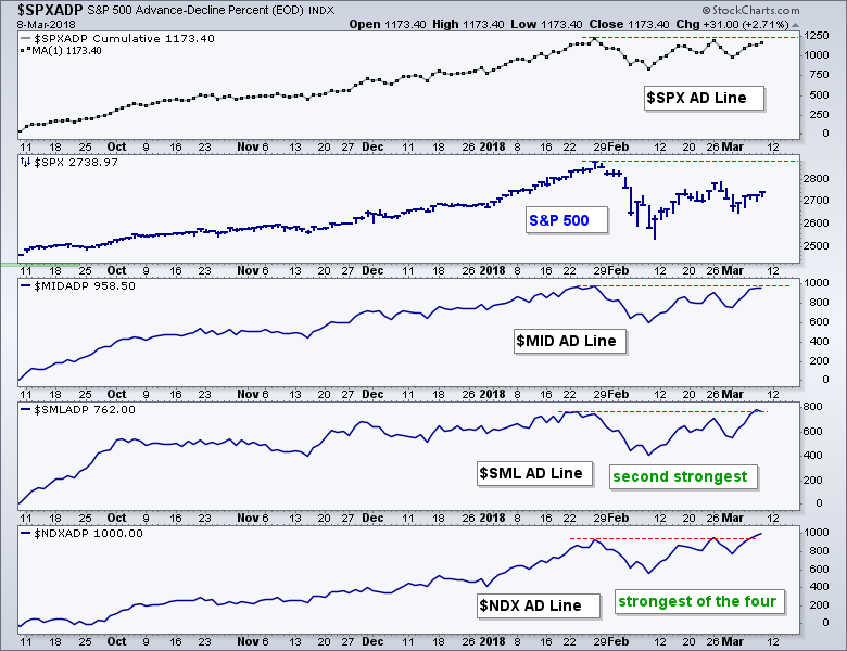
Even though the S&P Mid-Cap 400 and S&P 500 AD Lines, have yet to make new highs, they are not weak by any means and very close to making new highs. Another day or two of strength is all it would take.
The AD Line measures market breadth as a cumulative measure of net advances (advances less declines). Strength in the AD Line reflects underlying strength in the indexes and points to broad participation. These four AD Lines show broad strength coming from large-cap techs and small-caps.
New Highs Still Dragging
Four of the nine breath indicators are on bearish signals, which means five of the nine are still on bullish signals. Thus, these market indicators are still net bullish. You can read more on these from the 16-Feb commentary.
I continue to watch S&P 500 High-Low% ($SPXHLP) for signs that the correction is ending. The red zones mark periods when High-Low% remained below +10% for four weeks or longer. Currently, this indicator has been below +10% for 27 days, which is the longest streak since the August-November correction.
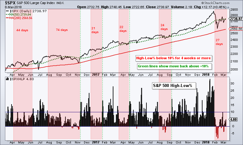
The inability to get back above +10% suggest that the market does not have enough leaders to lead it out of the correction. Stocks recording 52-week highs are leaders and in strong uptrends. The technology sector is supplying more than its fair share of leaders, but the other sectors are not and this is putting a drag on the S&P 500 as a whole.
Small-caps, Large-caps, Tails and Dogs
The S&P SmallCap iShares (IJR) led the S&P 500 SPDR (SPY) this week because it exceeded its late February high. Relative strength in IJR is good for small-caps, but this does not mean it will pull SPY higher. The performance chart below shows a steady performance line for SPY, and a move erratic line for IJR. Small-caps, however, are outperforming over the last two years.
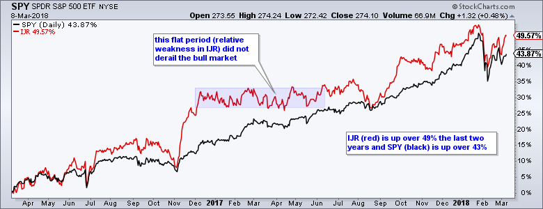
Small-caps account for less than 10% of the total US stock market. The S&P 500, on the other hand, accounts for some 80% of the US stock market. The S&P 500 is the dog and the S&P Small-Cap 600 is the tail, and the tail does not wag the dog.
Yes, I am aware that small-caps have higher betas and represent the risk-on side of the market, but the S&P 500 is the real driver here and the one we should watch the closest.
Six Leading Sectors (and Four Laggards)
Chartists can watch the six leading sectors to see if/when the S&P 500 can get out of corrective mode. The other four sectors are not leading because they are below their 200-day EMAs (XLE, XLU, XLP, XLRE).
XLK is by far the strongest because it hit a 52-week high in late February. XLY, XLF and XLI fell sharply last week and rebounded this week, but remain below last week's high. Taking a little liberty with the blue lines, we can see some symmetrical triangles taking shape. These are consolidations and they are forming after 52-week highs in January.
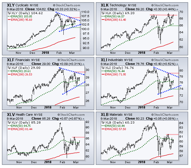
A consolidation after a 52-week high is normally a bullish continuation pattern and an upside breakout would be most positive for the broader market. The more breakouts, the more the merrier. The green lines mark the first support levels to watch and downside breaks would be negative.
I am not sure what to do with XLV and XLB, and will simply mark resistance at the late February high. Upside breakouts are needed to negate last week's sharp declines and put the bulls on track.
A Pop and Drop for Gold
The Gold SPDR (GLD) got a pop on Tuesday and gave most of it back on Wednesday and Thursday. The overall picture remains unchanged. GLD hit a new high in January, corrected into early March and formed a fat flag. Flags are corrective patterns and a break above the upper line would end the correction.
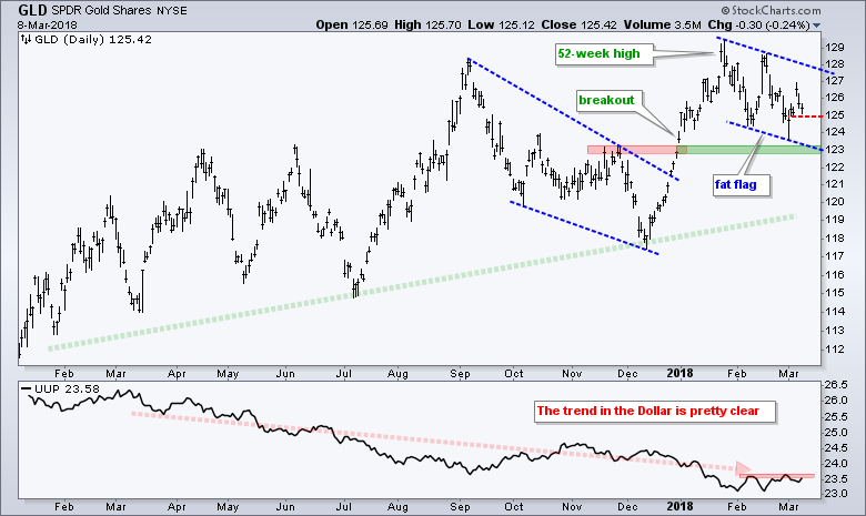
The surge on Tuesday provided the first sign of a reversal within the flag, but it did not hold. The inability to hold the bounce is negative and I would put gold back on the back burner, especially if the Dollar breaks short-term resistance. The red shading marks a resistance zone and a breakout would be short-term bullish for UUP, though not enough to reverse the long-term downtrend.
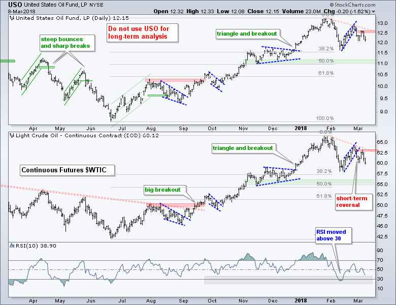
Oil Forms Lower High
Oil moved in lock-step with the stock market this year. Both rose in January, fell sharply into mid February, bounced into late February and fell back over the last eight days. I don't know how long this positive correlation will last and would not read too much into it.
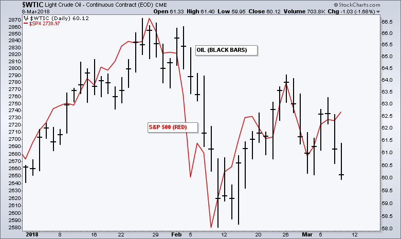
On the price chart, the Light Crude Continuous Contract ($WTIC) reversed the February upswing last week and formed a lower high from late January to late February (red dashed line).
The long-term trend is still up, but it looks like oil is correcting and could move towards the mid 50s. A break above $63 is needed to end this correction and put the uptrend back on track.
The Incredibly Shrinking Stock Market
We are familiar with supply and demand, and the effect on stock prices. An increase in demand pushes prices higher, while an increase in supply can weigh on prices. While my main focus is on the charts, I would also point out that the supply of stock is set to shrink in again 2018 and this could have bullish implications. According to estimates from JP Morgan, companies will authorize at least $800 billion in share buy backs in 2018. This mind-blowing number is a 51% increase over 2017. (CNBC article and video)
Here is a list of stocks making big buybacks in 2018 (Source: Kiplinger).
Notes from the Art's Charts ChartList
- The Home Construction iShares (ITB) remains one of the weakest ETFs due to the depth of the Jan-Feb decline and the absence of a recovery bounce the last few weeks.
- The Retail SPDR (XRT) is also showing weakness because its recovery bounce fizzled in mid February.
- The tech-related ETFs continue to lead. The Cloud Computing ETF (SKYY), Cyber Security ETF (HACK), Internet ETF (FDN), Networking iShares (IGN), the Semiconductor iShares (SOXX) and the Software iShares (IGV) all hit new highs.
- The Broker-Dealer iShares (IAI) and Regional Bank SPDR (KRE) are leading because both hit new highs this week.
- The iShares Aerospace & Defense ETF (ITA) has a possible cup-with-handle forming. The Solar Energy ETF (TAN) broke out of a small flag this week, but it is not in the leadership group because it remains well below its January high.
- The following ETFs are either in downtrends overall or show significant relative weakness. This means they are off the radar for long positions: XLE, XLU, XLRE, XLP, XES, XOP, FCG, AMJ, REM, IYR, IYZ. I could even consider adding ITB.
Plan Your Trade and Trade Your Plan.
- Arthur Hill, CMT
Senior Technical Analyst, StockCharts.com
Book: Define the Trend and Trade the Trend
Twitter: Follow @ArthurHill


