- Introduction and Overview.
- How Many Crosses in the Last 25 Years?
- Crunching the Numbers.
- Putting the Dow Industrials to the Test.
- SPY, SPX and Dividends.
- Slowing Down the Trigger.
- Reduce Risk and Get on the Right Side.
- Summarizing the Results.
- Consulting, Software and Data.
 The S&P 500 is trading just above its 200-day moving average so this is a good time to look at the historical evidence. This System Trader article will test the 200-day SMA with the S&P 500 and the Dow Industrials.
I will then show how we can reduce whipsaws and increase returns by adding a second moving average to further smooth the data. The final round of testing will use signals from the S&P 500 to trade the dividend-adjusted S&P 500 SPDR (SPY).
Moving averages smooth prices and filter out the noise. Note that there is no magical setting and there is not much difference between simple moving averages and exponential moving average. Sometimes longer period settings work better and other times shorter period settings work better. Sometimes EMAs work better and other times SMAs work better. Markets are dynamic and what worked in the past is not guaranteed to work in the future. I am, therefore, going to stick with some basic settings and avoid the impulse to curve fit.
I suspect that the 50-day and 200-day SMA work well for the S&P 500 for three reasons. First, these are the two most widely followed moving average settings. Second, the S&P 500 is by far the most widely followed index for the US stock market and some $7.8 trillion of institutional money is benchmarked to the index. Third, the S&P 500 accounts for over 80% of the entire US equity market. In short, the S&P 500 is "The Market".
This combination makes it almost a self-fulfilling prophecy. So many participants are focused on the S&P 500 and the 200-day SMA, and too a lesser extent the 50-day SMA. This suggests that many institutions act when the S&P 500 nears the 200-day moving average or breaks it (up or down).
How Many Crosses in the Last 25 Years?
Before reading any further, take a guess at how many times the S&P 500 crossed its 200-day SMA in the last 25 years (4/1/1993 to 4/1/2018). 50 times, 100 times, 150 times, 200 times, 250 times or 300 times? The answer is 170, which is around seven crosses per year.
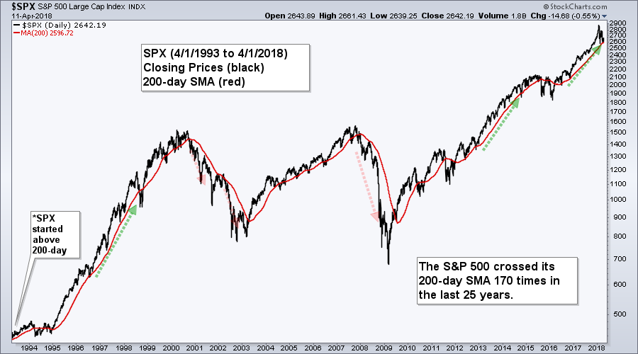
There were a few good trends in this period and also a lot of whipsaws. Most notably, the 200-day SMA would have gotten one out for the bear runs in 2000-2002 and 2008-2009. Simply adhering to the 200-day would have gotten one in during the bull runs of 1997, 2013 and 2017.
Crunching the Numbers
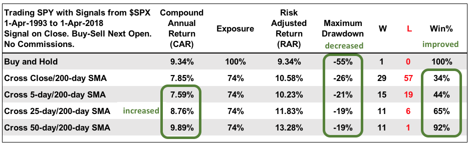
While we can get a “feel” for the 200-day SMA, we really don’t know how the 200-day SMA performs until we put it to the test with some real numbers. The table below shows buy-and-hold for the S&P 500 and Buy-Sell signals based on crosses of the 200-day SMA. Note that the first buy signal occurred on the first day because the S&P 500 was already above the 200-day SMA. I chose this 25 year period because SPY started trading in 1993 and we will be testing SPY later.
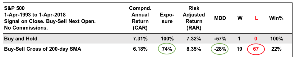
Buying and selling based on crosses of the 200-day did not produce a larger Compound Annual Return than buy-and-hold, but I think it still performed better than buy-and-hold. First, notice that exposure was just 74%. This means the system was in the market for 18.5 of the 25 years. Second, notice that the Maximum Drawdown is around half that of buy-and-hold. The downside is that there were lots of whipsaws and 67 losing trades.
Putting the Dow Industrials to the Test
In contrast to the S&P 500, the Dow Industrials crossed its 200-day moving average 228 times in the last 25 years, which is around nine per year. Right away we can see that there are more whipsaws with the Dow.
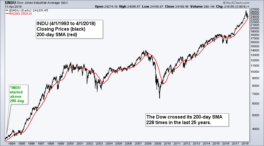
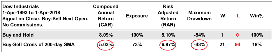
The table below shows buy-and-hold versus the 200-day SMA cross. Notice the 200-day cross had a lower Compound Annual Return, a lower Risk-adjusted Return, a higher Maximum Drawdown and a Win Percent below 20%. The S&P 500 is much better suited for the 200-day SMA than the Dow Industrials.
SPY, SPX and Dividends
Before looking at SPY, I would like to highlight the difference between the S&P 500 and the S&P 500 SPDR (SPY). The S&P 500 is an index that does not include dividends. StockCharts automatically adjusts stock and ETF data for dividends so the S&P 500 SPDR (SPY) includes dividends. Chartists looking for unadjusted data can precede the symbol with a hyphen (_SPY).
The chart below shows all three with the 200-day SMA in red. Notice that $SPX crossed the 200-day SMA in early April, dividend adjusted SPY did not cross and unadjusted SPY crossed twice. Dividend-adjusted SPY has a more positive bias than the S&P 500 because of the dividends were added back into the price. What is a poor chartist to do?!
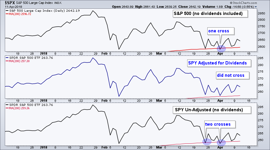
Personally, I am just going to use the S&P 500 for signals and ignore the rest. The rest of the market is going to follow the lead of the undisputed benchmark.
Slowing Down the Trigger
Even though a trading system based on a 200-day cross tests pretty well, there are too many whipsaws and the system can be improved by slowing down the trigger. I will stick with the 200-day SMA and replace the closing prices with another moving average.
The next charts show the S&P 500 with the 5-day, 25-day and 50-day moving averages. 5 days is a week, 25 days is a little more than a month and the 50-day SMA is one of the most popular moving averages. No real curve-fitting here.
The system will use signals from the S&P 500 and trades based on the dividend-adjusted S&P 500 SPDR (SPY). This total return ETF is more like the real world because we receive dividends when we are in a position.
The chart below shows the S&P 500 with the 5-day SMA in green and the 200-day SMA in red. The 5-day started above the 200-day and there were then 67 crosses. Chartists buying and selling the crosses would have earned a Compound Annual Return of 7.59% with a Maximum Drawdown of 20.61%.
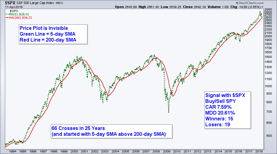
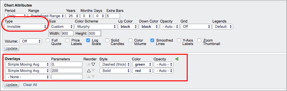
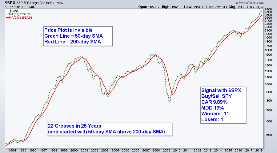
Charting note: the S&P 500 plot is invisible to make the chart easier to read. The image below the chart shows the settings used in SharpCharts.
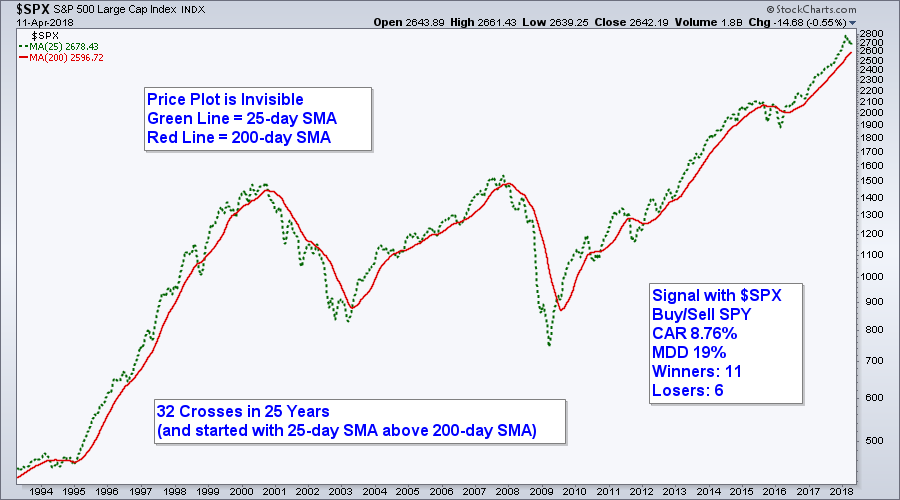
The next chart shows the 25-day SMA and the 200-day SMA generating just 32 crosses in the last 25 years. This is a little over one signal per year. The Compound Annual Return jumped to 8.76%, the Maximum Drawdown fell to 19% and there were almost twice as many winners as losers.
And now for the granddaddy of them all: the golden cross and the death cross. The next chart shows the 50-day SMA and the 200-day SMA. There were just 22 crosses in 25 years. The Compound Annual Return almost reached 10%, the Maximum Drawdown stayed at 19% and there was just one losing trade (Dec-2015 to Jan-2016).
Reduce Risk and Get on the Right Side
Long-term moving averages may not be great for trading and actual signals, but they can keep you on the right side of the market. The chart below shows monthly bars for the S&P 500 over the last 25 years. There were three big bull runs, two big bear markets and some other deep declines. A basic moving average strategy can tell you when to look for long positions, and, perhaps more importantly, when to stay out of the stock market.
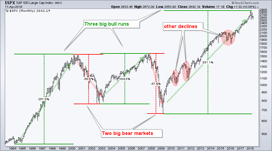
Note that these systems were only tested for long positions. Yes, I did test them with short positions based on bearish moving average crosses. The Compound Annual Return was lower in each test and the Maximum Drawdowns exceeded 30%.
Summarizing the Results
The table below summarizes the results. In general, I see better results with fewer signals and these are highlighted with the green areas. The Compound Annual Return increased as the moving average went from 5 to 25 to 50 days. The Maximum Drawdown decreased with each step and the winning percent improved significantly with fewer signals.
Consulting, Software and Data
Cesar Alvarez of AlvarezQuantTrading.com provides feedback my code and system development. Cesar has a great blog and provides consulting services for system development (click here). I used Amibroker to test the code and Premium Data from Norgate. Just like StockCharts, the data is adjusted for dividends to reflect the total return.
Plan Your Trade and Trade Your Plan.
- Arthur Hill, CMT
Senior Technical Analyst, StockCharts.com
Book: Define the Trend and Trade the Trend
Twitter: Follow @ArthurHill


