- Banks Lead on Multiple Timeframes.
- Regional Bank SPDR Extends Upturn.
- Big Banks are Mixed.
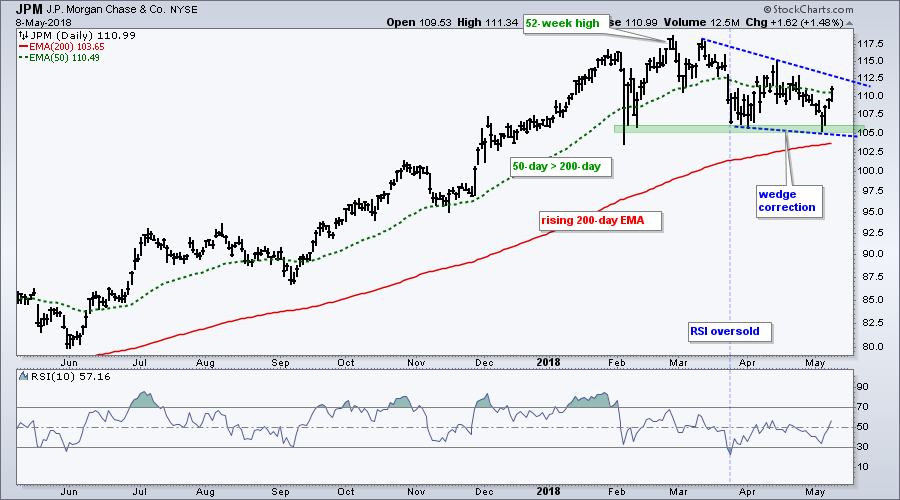
- Wedge Corrections for JPM and MS.
- Small-caps Get Dollar Tailwind.
- Energy ETFs Break Out of Consolidations.
- Bond Market Breakdown Holds.
- Utilities Look Poised to Continue Downtrend.
 Banks Lead on Multiple Timeframes...
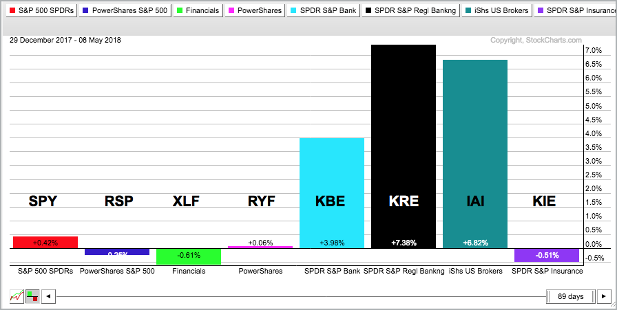
The PerfChart below shows the S&P 500 SPDR, EW S&P 500 ETF, Financials SPDR, EW Finance ETF, Bank SPDR, Regional Bank SPDR, Broker-Dealer iShares and Insurance SPDR. The first two symbols represent the broader market, while the others represent the finance-related ETFs. This is a great way to break down the finance sector and separate the leaders from the laggards.
I am showing year-to-date performance and we can see that the Bank SPDR (light blue), the Regional Bank SPDR (black) and the Broker-Dealer iShares (teal) are leading the pack with the biggest gains. These three are also leading on the one-month, three-month and six-month timeframes. Thus, these three have been consistent leaders since early November 2017.
Regional Bank SPDR Extends Upturn
The next chart shows the Regional Bank SPDR (KRE) in a long-term uptrend with a 52-week high in mid March and higher low in early April. The ETF plunged in late March and RSI dipped below 30, but the ETF held above the early February low and turned up.
Not all dips work out this well, but the dip is often
your friend when the the bigger trend is up.
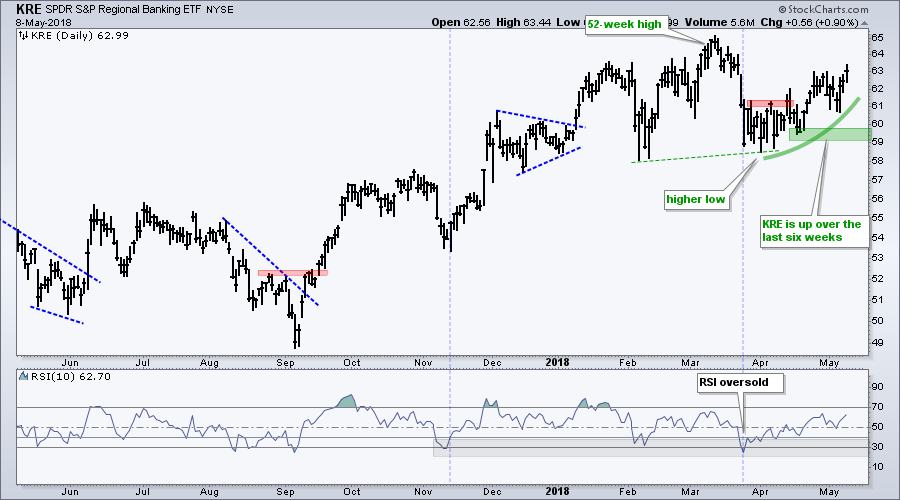
KRE is also outperforming XLF when comparing peaks and troughs on their charts. While the Financials SPDR (XLF) formed lower lows in early April and early May, the Regional Bank SPDR (KRE) held above its February low in early April and moved higher the last six weeks. Given the bigger uptrend and upside leadership, I would expect KRE to hit new highs soon.
Big Banks are Mixed
The next PerfChart shows year-to-date performance for five big banks and five regional banks. Big bank performance is quite mixed with three up and two down. Also note that Berkshire (BRK/B) is down year-to-date and weighing on the cap-weighted Financials SPDR. I did not put Berkshire on the list because it is not a bank and I want to keep the comparison tight.
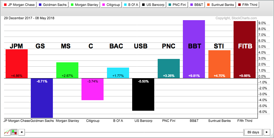
Regional bank performance is more bullish with four up and one down. Though not shown, also note that the discount brokers are performing well this year. See Monday's DITC article featuring Schwab (SCHW), TD Ameritrade (AMTD), Etrade (ETFC) and InteractiveBrokers (IBKR).
Note that Goldman Sachs (GS), Citigroup (C) and US Bancorp (USB) are down and this large-caps are weighing on the Financials SPDR. I am not interested in picking individual stocks in the regional banking group, but I will focus on JPM and MS today because they are showing relative strength.
Wedge Corrections for JPM and MS
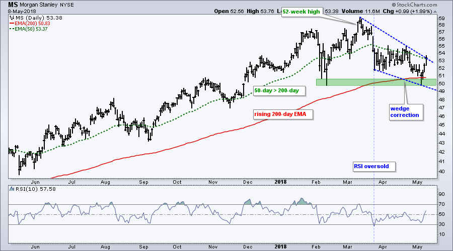
The next chart shows JPM with a long-term uptrend and a wedge correction. The long-term trend is up because of the recent 52-week high, the rising 200-day EMA and the 50-day is above the 200-day. The wedge represents a correction and the stock bounced off support the last three days. I would expect a breakout and move to new highs in the coming weeks. MS has a similar setup.
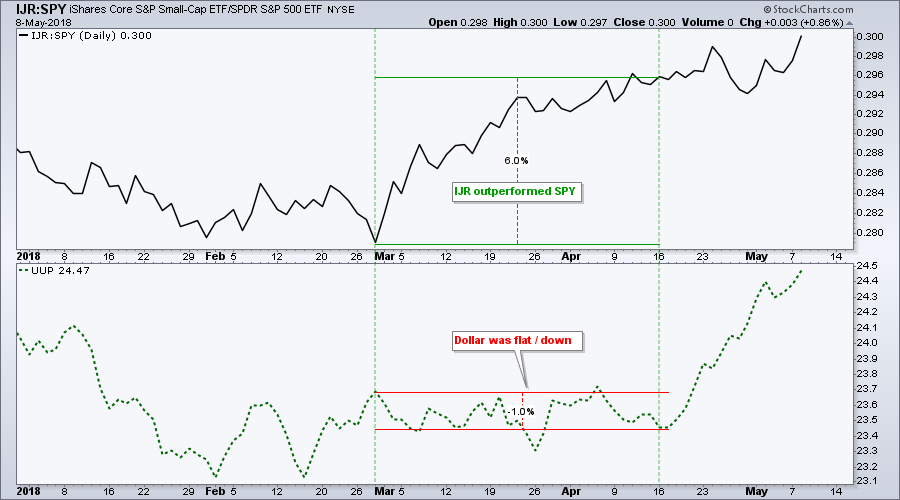
Small-caps Get Dollar Tailwind
My buddy Tom Bowley penned a great article on the relationship between the Dollar, large-caps and small-caps in ChartWatchers over the weekend. In general, I agree with the premise that a rising Dollar favors small-caps over large-caps. There could even be more at work here because small-caps started outperforming before the Dollar surge. Maybe small-caps were anticipating the Dollar surge!
The chart below shows the price relative (IJR:SPY ratio) in the top window and the US Dollar ETF (UUP) in the bottom window. Notice that IJR outperformed SPY from late February to mid April (+6%). The Dollar was flat or even down during this period. The Dollar has since surged and this creates a nice tailwind for small-caps.
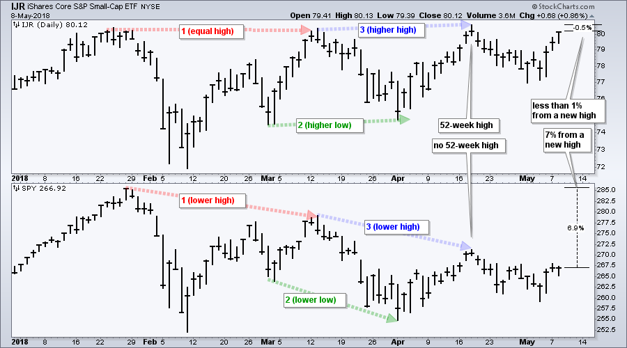
One of my favorite relative performance methods is to simply align two charts and compare corresponding peaks and troughs (highs and lows). The next chart shows four "chart" reasons IJR is outperforming SPY. First, IJR bounced back to its January high in mid March (SPY fell well short). Second, IJR formed a higher low from early March to early April (SPY formed a lower low). Third, IJR moved to a new high in mid April (SPY fell well short). Fourth, is less than 1% from a 52-week high and SPY is 7% from a 52-week high.
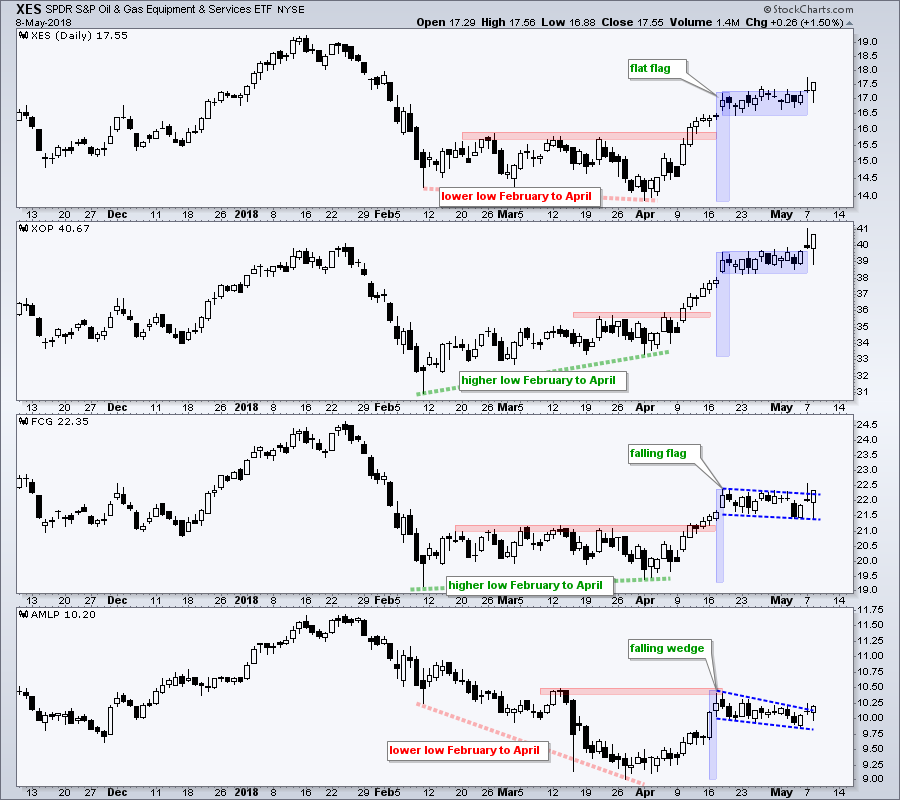
Energy ETFs Break Out of Consolidations
Oil remains in a long-term uptrend and this is positive for energy-related shares. The chart below was first shown in Art's Charts on April 26th. This commentary also included four telecom stocks and all four declined sharply a few days later. Yep, that's one I would like to forget about.
Anyhow, the chart below shows four energy-related ETFs breaking out of short-term consolidations. The Oil & Gas Equip & Services SPDR (XES) and Oil & Gas E&P SPDR (XOP) are breaking out of flat flags, while the FirstTrust Natural Gas ETF (FCG) is breaking out of a falling flag. The Alerian MLP ETF (ALMP) is breaking out of a falling wedge.
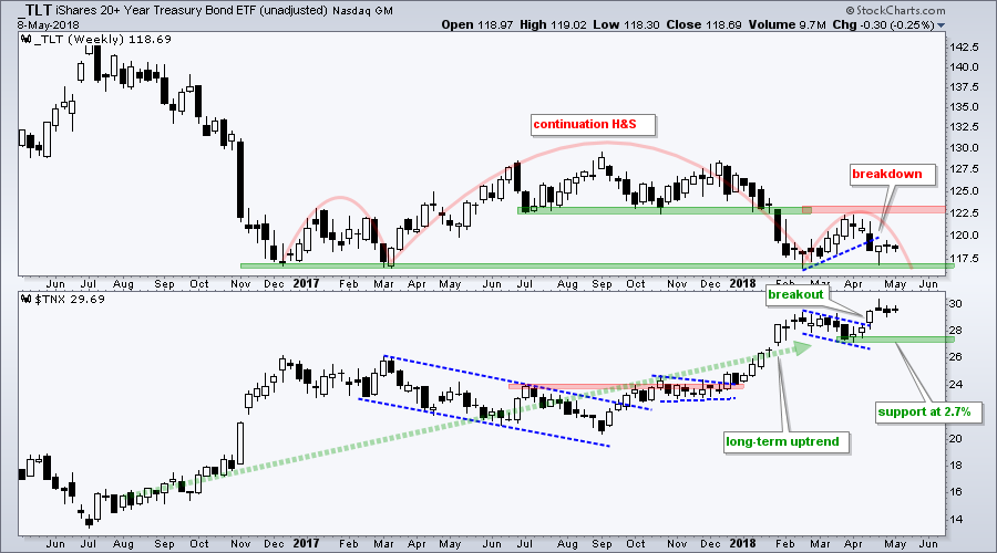
Bond Market Breakdown Holds
The next chart shows the unadjusted 20+ YR T-Bond ETF (_TLT) in the top window and the 10-yr T-Yield ($TNX) in the lower window. Unadjusted means the distributions were not added back into the price. Chartists can show unadjusted prices by preceding the symbol with an underscore (_TLT).
Unadjusted TLT is in a long-term downtrend with a massive head-and-shoulders pattern taking shape. Note that the head-and-shoulders can be a reversal or continuation pattern. In this case, the prior move was down and this head-and-shoulders represents a big consolidation within an even bigger downtrend. A break below neckline support would signal a continuation lower.
Utilities Look Poised to Continue Downtrend
The next chart shows total-return data for the Utilities SPDR (XLU) in the top window and unadjusted data in the lower window (_XLU). The debate between total return and unadjusted is similar to log scale versus arithmetic scale, simple moving average versus exponential moving average and green hot sauce versus red hot sauce. You get the idea. To each his or her own!
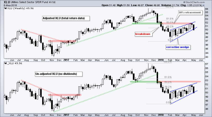
Regardless of the data type, XLU clearly broke down in December-January and rebounded from early February to early May. This rebound retraced around 50% of the prior decline and hit resistance near the support break. A rising wedge formed and XLU looks poised to reverse this upswing. I view the wedge as a corrective bounce within a bigger downtrend and expect a continuation lower.
Plan Your Trade and Trade Your Plan.
- Arthur Hill, CMT
Senior Technical Analyst, StockCharts.com
Book: Define the Trend and Trade the Trend
Twitter: Follow @ArthurHill


