- The Last Thing You Expect ....
- Another Ominous Wedge Takes Shape.
- $SPX-$SML Correlation is High.
- QQQ Shows Short-term Weakness.
- Regional Banks Outperform Big Banks.
- Highlights from On Trend.
 The Last Thing You Expect ....
... is probably what will happen. Even though I cannot quantify this expression, we have all experienced such a trade. The bullish setup is there, the breakout happens and everything looks hunky-dory. Then, right out of left field, the market turns and the "unexpected" happens. A few days or weeks later, we look at the charts and the "obvious" becomes clear using the good old hindsight indicator. In Homer Simpson language, this would be the "doh!" moment.
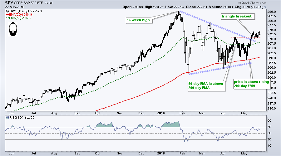
Let's start with SPY and the current expectations. The long-term trend is up because the ETF hit a 52-week high in January, the 50-day EMA is above the 200-day EMA and price is above the rising 200-day EMA. Medium-term, the ETF broke out of a triangle and exceeded the mid-April high. Sure looks good from this vantage point.
Another Ominous Wedge Takes Shape
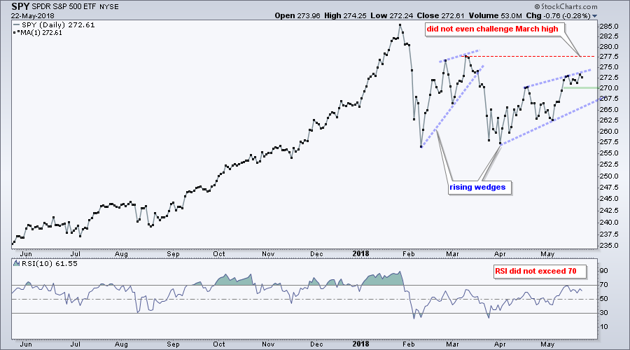
The next chart paints a less bullish picture, and may be preparing us for that "doh!" moment. SPY formed a lower high in March and did not even challenge the March high in May. The ETF also formed a rising wedge for the second time in four months. Note that rising wedges often form as counter-trend moves after sharp declines. Also notice that RSI did not exceed 70 in March or May (lackluster momentum). In contrast, RSI exceeded 70 several times from June to January.
 As noted in ChartWatchers this past weekend, the S&P 500 is underperforming on the price chart and with the breadth indicators. In particular, new highs in the S&P 500 have not exceeded 50 since mid March. There is clearly a lack of leadership in large-caps and this is a concern going forward. Turning back to SPY, a close below 270 would provide the first sign of weakness and a break below 265 would argue for yet another test of the 200-day.
Even though leadership in small-caps may seem encouraging, keep in mind that small-caps are really really small. Per the fact sheets at spindices.com, total market caps are: $SPX $23.6 trillion, $MID 1.8 trillion and $SML $813 billion. For reference, Apple $AAPL has a market cap of $934 billion and $SML market cap is just 3% of the S&P 500. Large-caps are the dog and small-caps are the tail, not the other way around.
As far as I am concerned, the S&P 500 is the main market barometer and its performance is less than inspiring. Even though the S&P Small-Cap 600 is leading and at new highs, I would be more concerned with lackluster performance in the S&P 500. Small-caps and mid-caps are going to follow the S&P 500, not the other way around.
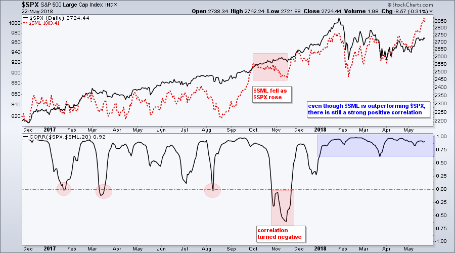
$SPX-$SML Correlation is High
The chart below shows $SML (red), $SPX and the Correlation Coefficient. Notice that the Correlation Coefficient dipped below zero a few times in 2017, but has not been below .60 in 2018. This shows a strong positive correlation between the two. In fact, correlations tend to rise during periods of uncertainty and this high correlation could be negative for the broader market.
QQQ Shows Short-term Weakness
While the S&P SmallCap iShares (IJR) hit a new high this week and SPY (barely) exceeded last week's high, the Nasdaq 100 ETF (QQQ) hardly bounced on Monday-Tuesday and remained below last week's high. This shows some short-term relative weakness.
On the price chart, QQQ gapped down last week and then stalled for six days with a contracting range (pennant). A move below 167 would break short-term support and are for a continuation of the gap down. Such a move would also raise the possibility of a lower high from March to May.

Regional Banks Outperform Big Banks
The difference between large-caps and small-caps can be captured by comparing the Financials SPDR (XLF) with the Regional Bank SPDR (KRE). KRE has been outperforming XLF on the price chart all year. My preferred technique is to compare highs and lows to determine relative strength and weakness.
The red and green lines show four corresponding pairs of highs and lows. The red lines show lower highs and lower lows in XLF, while the green lines show higher lows and higher highs in KRE.
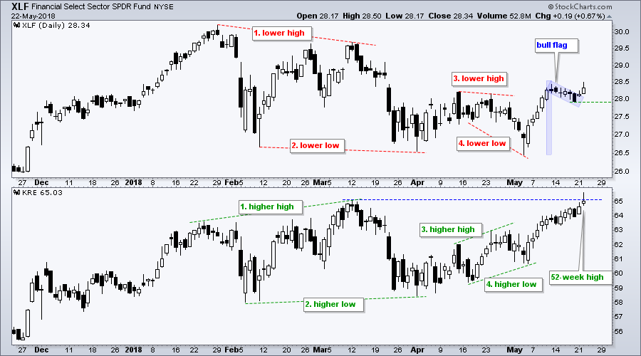 Most recently, XLF formed a lower low in early May, but KRE formed a higher low. This relative chart strength in KRE foreshadowed the move to new highs. KRE hit a new high this week, but XLF remains well below its January and February highs.
The chart also shows XLF with a flag breakout on Tuesday. The breakout is bullish and remains bullish until proven otherwise. A close below the flag low (green line) would negate the breakout and call for a reassessment. For rounding and a buffer, I would just use a close below 27.9.
Highlights from On Trend
Note that I highlighted a number of flags in Tuesday's show (On Trend). The principles applied to XLF can be applied to these flags. In particular, a close below the flag low would negate the breakout.
On Trend can be seen Tuesday's at 10:30 and 11:00 AM ET on StockChartsTV. The show repeats throughout the week and is also archived on our Youtube Channel. Here are the topics covered on May 22nd.
- Setting the Trend and Trading Bias
- Playing the Swings within a Pattern
- Charts: SPY, MOO, ABT
- Analyzing Flags, Pennants and Wedges
- Stocks: XLF, JPM, MS, AKAM, SOXX, MXIM
- Patterns versus Mean Reversion
- Drawing, Filling and Tilting Shapes
Plan Your Trade and Trade Your Plan.
- Arthur Hill, CMT
Senior Technical Analyst, StockCharts.com
Book: Define the Trend and Trade the Trend
Twitter: Follow @ArthurHill


