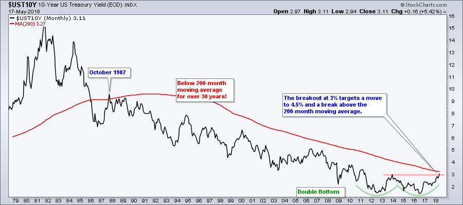
- The Mother of all Double Bottoms.
- The Shifting Relationship between Stocks and Bonds.
- S&P SmallCap iShares Hit New High.
- Small-caps Lead Breadth Indicators.
- S&P 500 Pauses Near Breakout Zone.
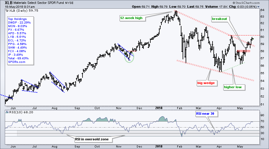
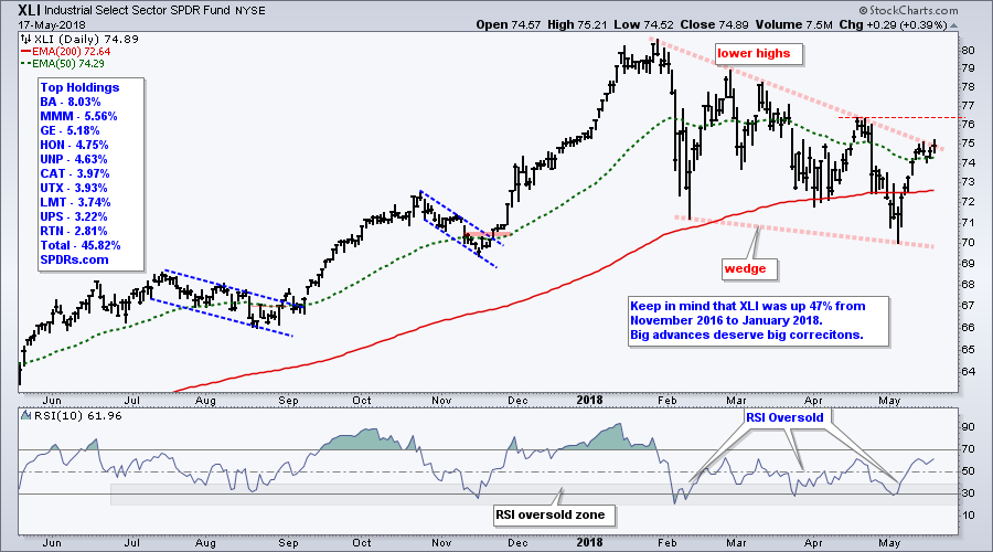
- Materials and Industrials Show Upside Leadership.
- XLI and XLB Bid to End 2018 Corrections.
- XLF Forms High and Tight Flag.
- Treasury Yields Hit New Highs.
- This Week in Art's Charts (IBB, XME, KRE).
- No Wonder Buffet Likes Apple.
- Notes from the Art's Charts ChartList.
 It was a big week for Treasury bonds and Treasury yields as the 10-yr T-Yield ($UST10Y) surged above 3% and hit its highest level since July 2011. With this move the 10-year yield confirmed a massive double bottom and fully reversed its long-term downtrend. Further upside in yields would be negative for bonds.
The chart below is an update from a January post in the Don't Ignore this Chart blog. This double bottom breakout projects a move to the 4.5% area and a break above the 200-month moving average. Even though 4.5% might seem high, keep in mind that it is still at the lower end of the 40 year range.
After years of excessively low yields, I would
view this as simply a return to normal.
The S&P 500 and the 10-yr T-Yield are positively correlated for the most part, but this has not always been the case, The chart below goes back 40 years with the 10-yr T-Yield in the top window, the 6-month Correlation Coefficient ($SPX) in the middle window and the S&P 500 in the lower window. The red line on the middle chart is a 52-period SMA (one year).
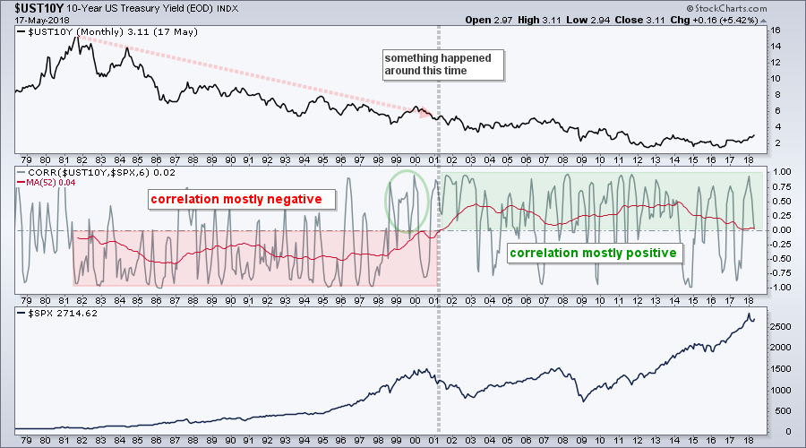 Notice that the 10-yr yield and S&P 500 were mostly negatively correlated from 1981 to 2000 and mostly positively correlated from 2001 until now. While it is hard to pinpoint exactly when, there was some sort of regime change at the turn of the century, perhaps starting in 1998 (green circle).
I do not know when/if we will see a regime change from positive to negative correlation. Stocks and yields are positively correlated right now and this means the rise in yields is positive for stocks (until it isn't). The 52-month SMA is close to the zero line, but it has yet to cross and I would not be concerned with rising yields until it does.
As far as the stock market is concerned, the 10-yr T-Yield is just another narrative that can distract us from what really matters. The price chart for the S&P 500 is what really matters when it comes to stocks and it remains bullish.
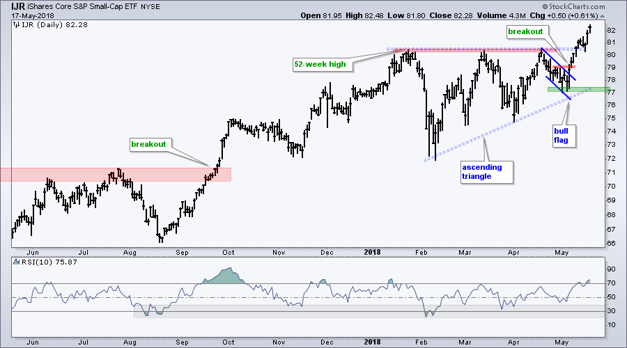
S&P SmallCap iShares Hit New High
The S&P SmallCap iShares (IJR) has been the leader the last few months and remains the leader because it is the only major index ETF to record a 52-week high in May. SPY, QQQ and MDY remain their 52-week highs, which were recorded earlier this year.
There is not any real change on the price chart. The falling flag breakout was the last reversal signal on May 7th and the ascending triangle was the last trend confirmation signal on May 10th. A reversal signal occurs after a pullback, while a trend confirmation signal occurs after a consolidation, which is the ascending triangle in this case. I will mark support in the 77-78 area for now.
Small-caps Lead Breadth Indicators
The S&P Small-Cap 600 is also leading the breadth indicators for the major stock indexes ($SPX, $MID, $SML, $NDX). Small-caps have the highest values in three categories. Small-Cap %Above 200-day EMA (!GT200SML) is 65.83%, the 10-day EMA of S&P SmallCap AD Percent ($SMLADP) is +25.3% and S&P 600 High-Low% ($SMLHLP) is 10.50%.
The chart below shows the High-Low pairs for these four indexes. The blue lines are set at +10% and -10%. This would be +50 and -50 for the S&P 500, and +60 and -60 for the S&P Small-Cap 600. Notice that new highs in $SML exceeded +60 twice in the last two weeks. This total is still short of the levels seen in early October and late November, but it is more bullish then bearish and small-caps are clearly leading.
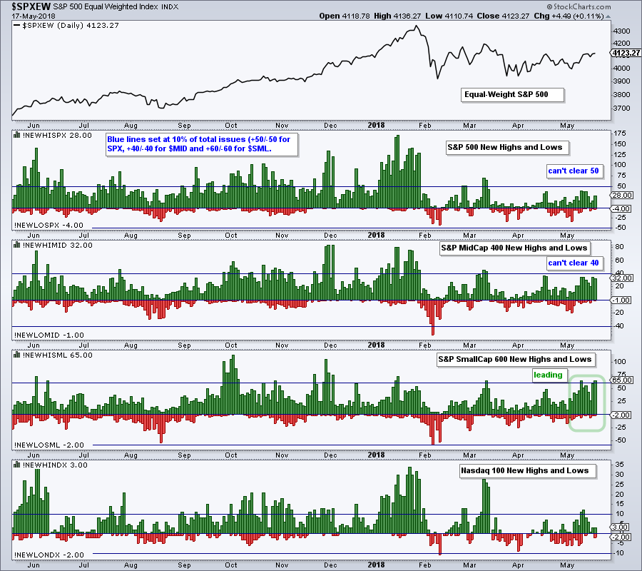
S&P 500 New Highs (!NEWHISPX) and S&P Mid-Cap 400 New Highs (!NEWHIMID) are having trouble clearing the 10% level (+50 for $SPX and +40 for $MID). An expansion here is needed to show a broadening in leadership and this would be positive for the broader market.
S&P 500 Pauses Near Breakout Zone
The S&P 500 broke above the triangle line and exceeded its mid April high last week. The index then fell back a little this week and stalled near the breakout zone. The breakout is there and remains bullish.
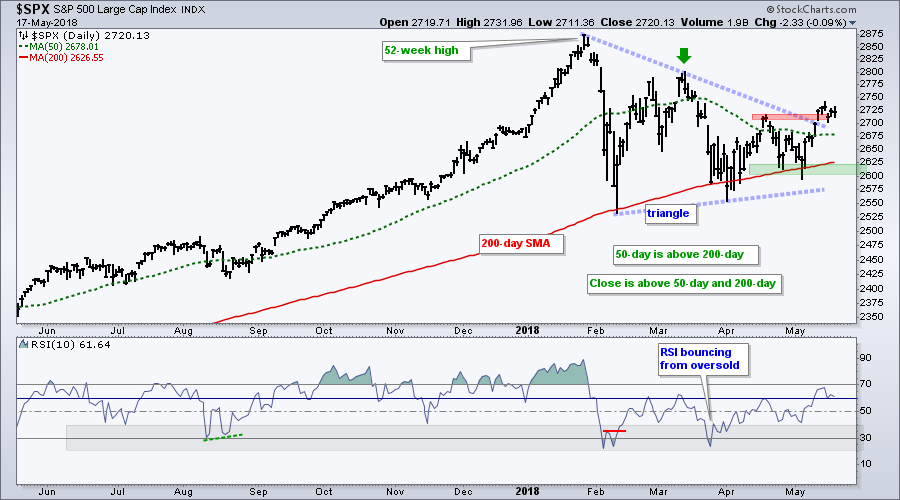
A decline back into the triangle zone would not be viewed as long-term bearish. The index did, after all, record a higher high in May by exceeding its April high. Also keep in mind that the index remains above the rising 200-day SMA and the 50-day SMA is above the 200-day SMA.
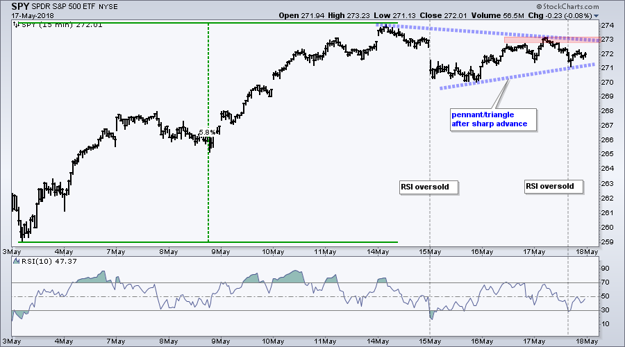
The pause over the last five trading days looks like a triangle on the 15 minute chart, which makes it a pennant on the daily chart. The chart below shows SPY surging almost 6% in seven days. The ETF was entitled to a rest after such a surge and this could be the pause that refreshes. A break above Thursday's high would signal a continuation higher.
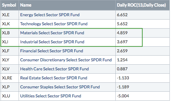
Materials and Industrials Show Upside Leadership
The Technology SPDR (XLK) has been leading all year and the Energy SPDR (XLE) led in April. The Materials SPDR (XLB) and the Industrials SPDR (XLI) were lagging at the end of April and then moved up the leader board with impressive runs in May.
The image below shows performance for the ten sector SPDRs this month. Notice that XLB is up 4.85% and XLI is up 3.7%, which puts them in 3rd and 4th place, respectively. For reference, SPY is up 2.84% this month and these two are up more than the broader market.
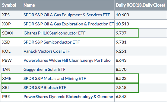
We are also seeing new leadership from XBI and XME in May. The image below shows the top ten performing industry group ETFs. They are ranked by the 13-day ROC, which is the month of May.
XLI and XLB Bid to End 2018 Corrections
XLI and XLB advanced over 40% from November 2016 to January 2018 and then declined with falling wedges. These wedges represent big corrections after even bigger advances. As noted with the S&P 500 in the ChartWatchers newsletter two weeks ago, big advances deserve big corrections.
The first chart shows XLB breaking the wedge line with a surge the last two weeks. The second chart shows XLI surging to the upper line of the falling wedge. The April highs (thin red lines) mark the next challenge for both. Breakouts here would forge higher highs and fully reverse the 2018 corrections.
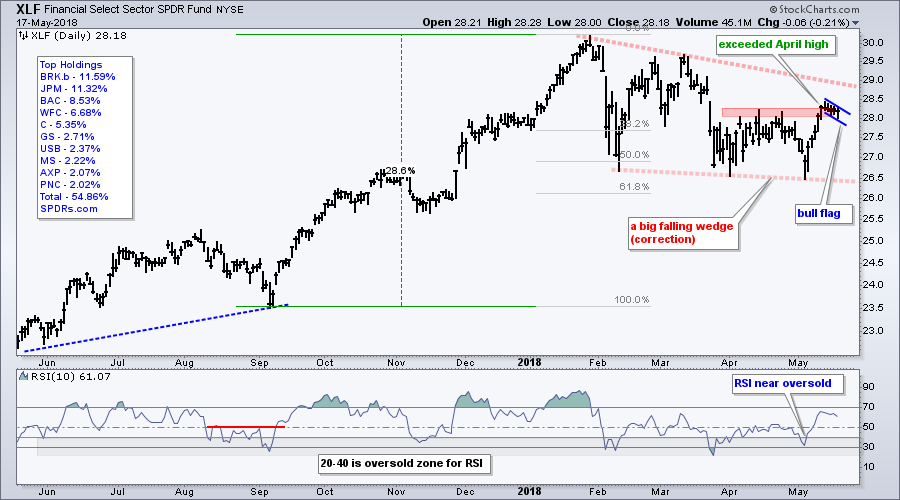
XLF Forms High and Tight Flag
The Financials SPDR (XLF) made a big move from May 4th to 10th with a 5% surge and break above the April high. As with SPY above, XLF was short-term extended at this point and needed a rest, which it got with a shallow pullback this week. This looks like a high and tight flag, which is a bullish continuation pattern. A break of the bull flag would argue for a continuation of the early May surge and we could then see a break above the wedge line. Note that banks and the finance sector were last featured in Art's Charts on May 9th.
Treasury Yields Hit New Highs
The next chart shows four different Treasury yields in the top window, the 10-2 yield spread and the spread between the 5-year yield and the 3-month yield. First, notice that all four Treasury yields hit new highs this month and the 2-year yield is leading the way. Note that the 2-year did not slow down in 2018 and hit new highs in January, February, March, April and May. We are clearly in a rising rate environment.
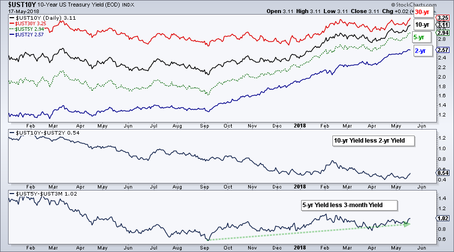
The 10-2 yield spread hit a new low in April and remains in a long-term downtrend. The yield curve may be flattening, but it is not even close to inversion because this spread remains firmly positive.
The difference between the 5-year yield and the 3-month yield bottomed in September and widened the last few months. This is another measure of the yield curve and its widening could be positive for banks.
This Week in Art's Charts
The Biotech iShares (IBB), Biotech SPDR (XBI) and Health Care SPDR (XLV) were covered on Monday (here). IBB bounced off support, XBI exceeded its April high and XLV challenged its April high.
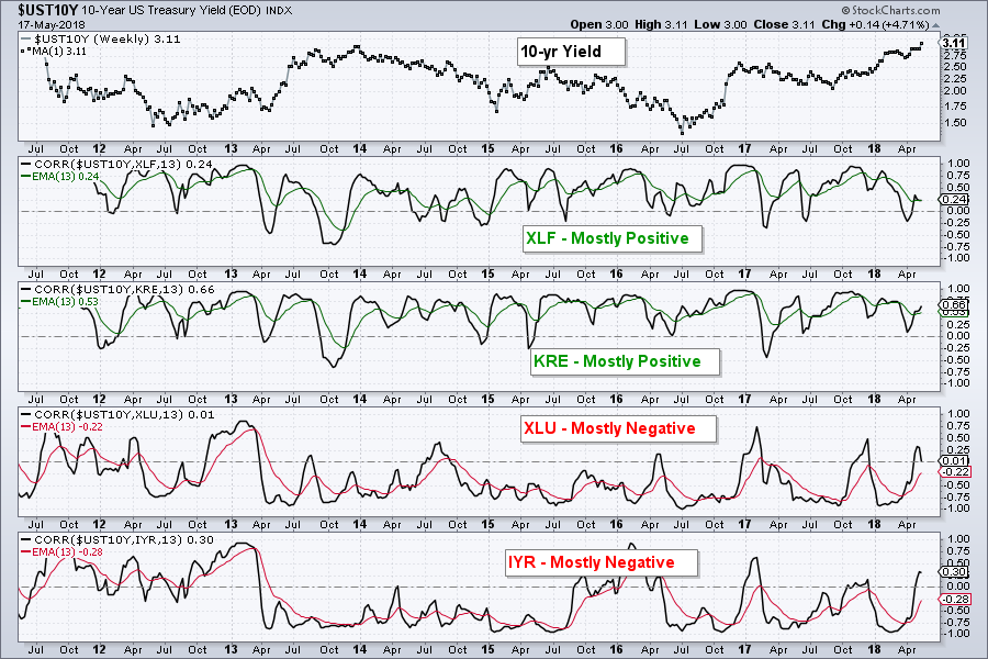
Tuesday's show, On Trend, covered the nine sector charts, the breakout in the 10-yr T-Yield ($TNX), the winners/losers in a rising rate environment and six stocks (TSLA, DHR, NKE, ROST, SYK, UHN). Note that XLF and KRE are positively correlated to the 10-yr yield, while XLU and IYR are negatively correlated.
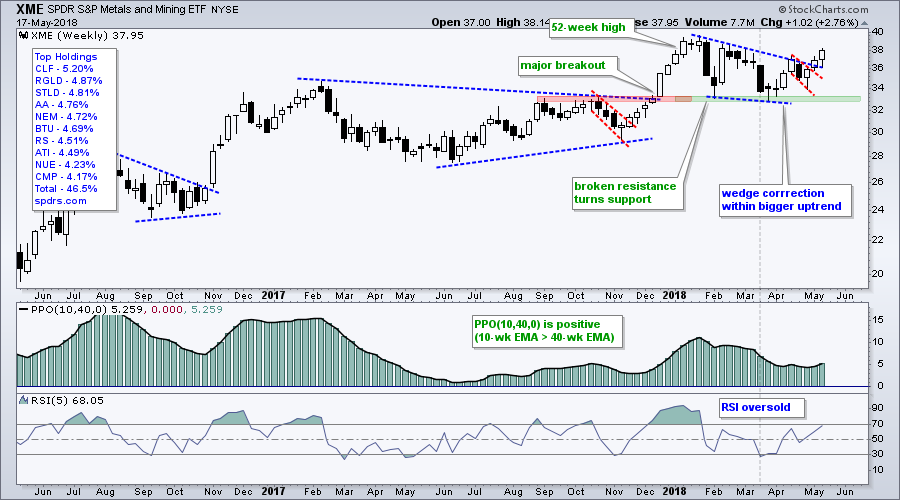
Thursday was all about the materials sector with the focus on breakouts the Metals & Mining SPDR (XME), Steel ETF (SLX) and Copper Miners ETF (COPX). I also covered copper, six steel stocks and four stock setups (ADSK, CA, HPE and HCA).
No Wonder Buffet Likes Apple
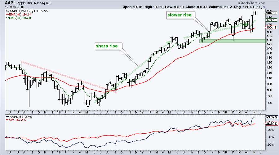
Warren Buffet made news last week because of Berkshire's annual meeting and an increase in its Apple holdings. The chart below shows Apple with a sharp breakout rise from May 2016 to April 2017 and then a slower rise since May 2017. The stock hit a 52-week high last week and is outperforming SPY on a three year timeframe (+53% vs +36%). Trend traders should have this stock on their radar for the strong uptrend, while mean-reversion traders should have this on their radar for dips.
Gene Munster of Loup Ventures offered his take on Apple with some very sound arguments, even if they were fundamental in nature. Munster note's that the iphone is a stable business (not a growth business), services will be 20% of gross revenues in a few years and the buy back will be bigger than most people think. CNBC Video Link (here).
Notes from the Art's Charts ChartList
- The Home Construction iShares (ITB) broke below its spring lows and remains one of the weakest industry-group ETFs.
- The Retail SPDR (XRT) led the market over the last seven days with a 5% surge and made good on the early April breakout.
- The Networking iShares (IGN) is lagging the tech sector overall with lower highs in April and May.
- The Broker-Dealer iShares (IAI) and Regional Bank SPDR (KRE) extended their breakouts and are closing in on new highs.
- The REIT iShares (IYR) reversed near the 61.8% retracement and fell sharply this week.
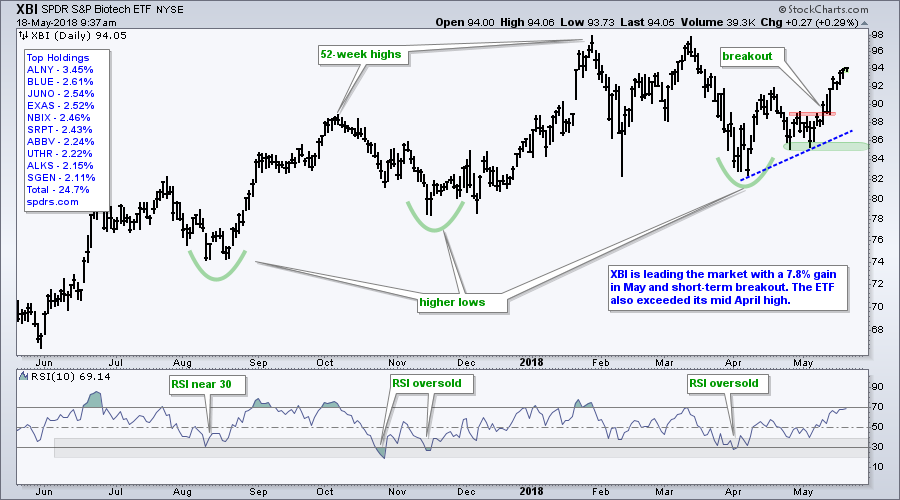
- The Biotech SPDR (XBI) is leading the market in May with a 7.82% gain this month.
- The HealthCare Providers ETF (IHF) broke out of a flag and the Medical Devices ETF (IHI) hit a new high to lead the healthcare sector this week.
- The Metals & Mining SPDR (XME) and Steel ETF (SLX) are leading in May with big gains and breakouts.
- Click here for the Art's Charts ChartList (updated May 18th)
Plan Your Trade and Trade Your Plan.
- Arthur Hill, CMT
Senior Technical Analyst, StockCharts.com
Book: Define the Trend and Trade the Trend
Twitter: Follow @ArthurHill


