- Correction Time?
- XLI and XLF Resume their Lagging Ways.
- Charting the Big Five Sectors.
- Watch the Risk-Off Assets.
- On Trend and Stocks to Watch.
... The Single Biggest Influence on Individual Stocks
There are several influences on the price of an individual stock, but one influence rises far above the others. Using the S&P 500 as the proxy for the stock market, price movements in the S&P 500 are the single largest influence on the price of an individual stock.
Let's start with the S&P SmallCap iShares (IJR) and compare it to the S&P 500 SPDR (SPY). We all know that small-caps are leading as IJR recorded 52-week highs throughout May and June. SPY lagged its little brother over the last few months, but the correlation between the two remained high.
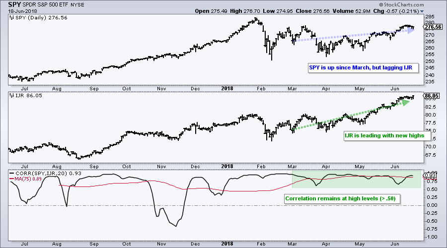
The chart above shows these two ETFs with the Correlation Coefficient (SPY,IJR) in the lower window. Notice that the Correlation Coefficient has been above .50 all year and this reflects a strong positive correlation. The red line is the 75 day SMA and it is currently near its highest levels in over a year (.89). This confirms the strong positive correlation between the two.
How can IJR be outperforming and hitting new highs when correlation remains positive? Correlation does not account for the magnitude of the move. For example, SPY could advance .10% and IJR could surge 1%, but the correlation would still be +1. The direction of the moves is the only thing that counts.
The key takeaway here is that we still need to key off the S&P 500 because it is the single biggest influence individual stocks. Small-caps, mid-caps, most sectors, most industry groups and most stocks will move in the same direction. Thus, if the S&P 500 corrects, IJR and most stocks will correct. The magnitude of the correction is another issue.
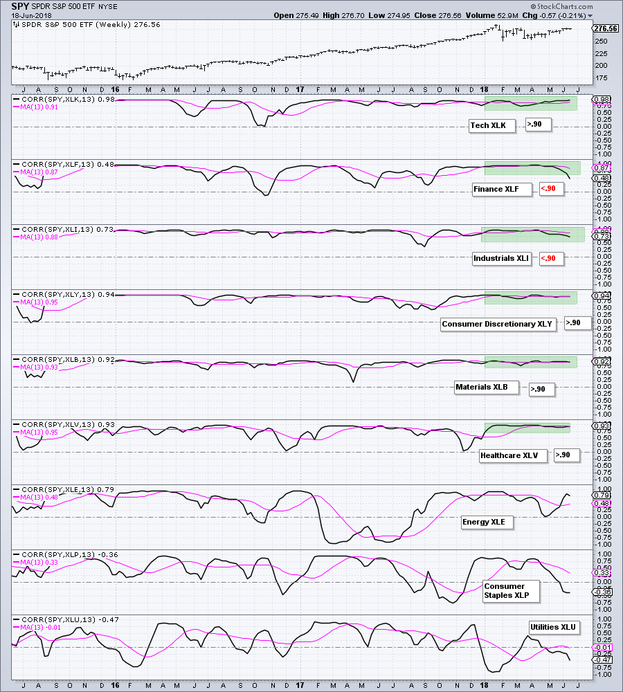
The next chart shows the 13-week Correlation Coefficient for nine sector SPDRs. The pink line is the 13-week SMA for smoothing. Notice that this EMA is above 90 for four of the nine sectors (XLK, XLY, XLV and XLB). This shows strong positive correlation with the S&P 500. The 13-week SMA dipped below .90 for XLF and XLI because these two are not keeping up with the broader market. Nevertheless, they still show a strong positive correlation. XLP, XLE and XLU are less influenced by the S&P 500.
Correction Time?
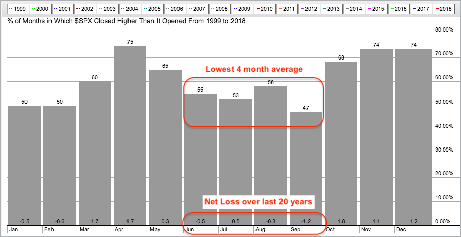
As noted on Friday, the seasonality chart for the S&P 500 shows that the index has been historically down from June to September over the last twenty years. June has a slight negative bias, July has a slight positive bias, August is slightly negative and September is decidedly negative. Overall, this period shows a net loss of 1.5% over the last twenty years.
Seasonality is not a very good timing tool so we should only pay attention when the charts confirm the seasonal patterns. This is also true with sentiment indicators, which are also not good for timing because sentiment can reach bullish extremes and remain at extremes during strong uptrends.
XLI and XLF Resume their Lagging Ways
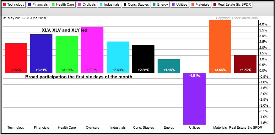
The S&P 500 could be in trouble because two key sectors started underperforming again over the last six days. The PerfChart below shows performance for the first six days of the month with nine of the ten sector SPDRs moving higher. XLF (blue), XLV (green) and XLY (pink) led the charge.
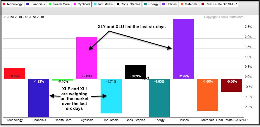
The second PerfChart shows performance over the last six days. Notice that XLF (blue) and XLI (turquoise) are leading the way lower. XLY (pink) is still strong, but XLU (purple) surged. Weakness in the Financials SPDR (XLF) and Industrials SPDR (XLI) is a big concern going forward. At best, these two are hampering a broad market advance (S&P 500). At worst, these two could drag down the S&P 500 and lead to a correction.
Charting the Big Five Sectors
The chart below shows the five biggest sectors in the S&P 500 and their weightings with each symbol. As a whole, these five account for 77.42% of the index. The first three are leading the market: XLK, XLY and XLV. XLK and XLY were up double digits from late April to early June and both are ripe for a rest. The blue zones mark the first support levels to watch on a pullback. XLV broke out in early June and the late May low marks support in the 81-82 area.
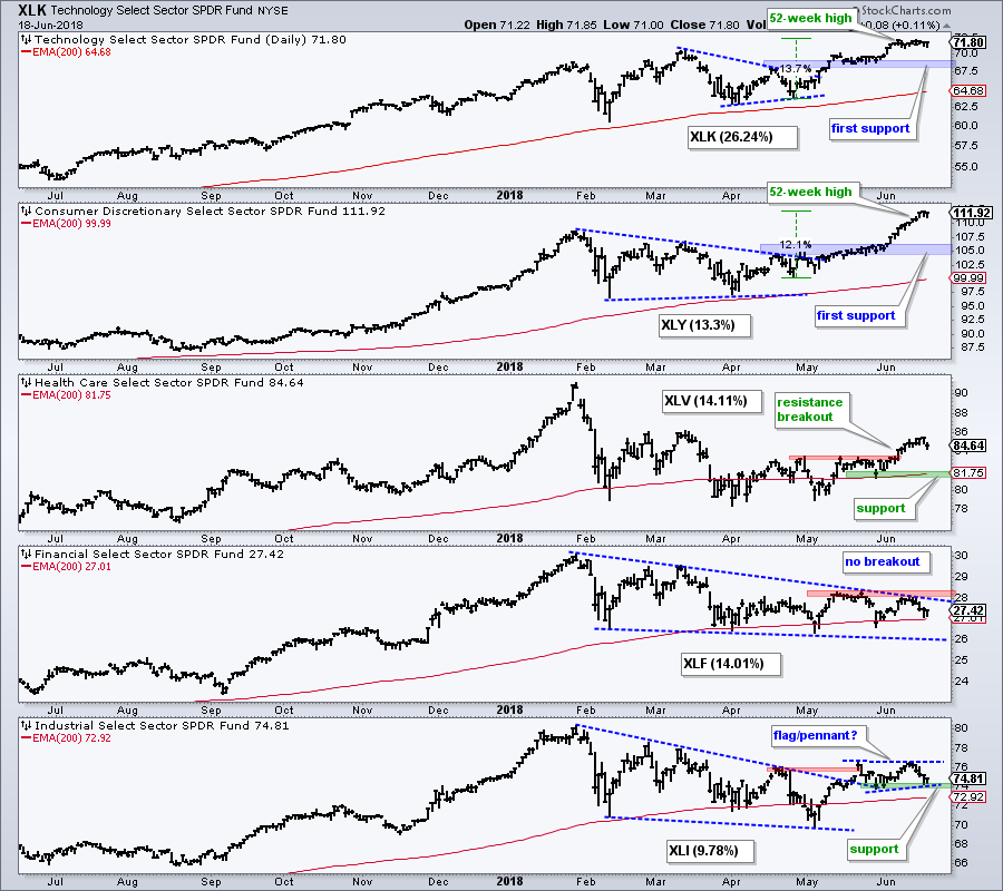
The trouble starts in the lower two fifths of the chart with XLF in a downtrend because we have yet to see a breakout. A break above the May highs is needed to reverse the downtrend. Until then, expect the third largest sector to weigh on the S&P 500. XLI broke out of a big falling wedge and then moved into a trading range. A close below 74 would negate this breakout and weigh on the S&P 500.
Overall, we have two big sectors looking extended and ripe for corrections (XLY, XLK). One sector (XLF) is lagging and already weighing negatively, while another sector (XLI) is on the verge of negating its breakout. All told, this is the recipe for a corrective period in the stock market, and it jibes with seasonality.
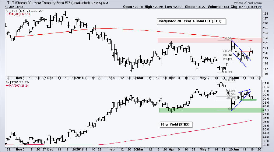
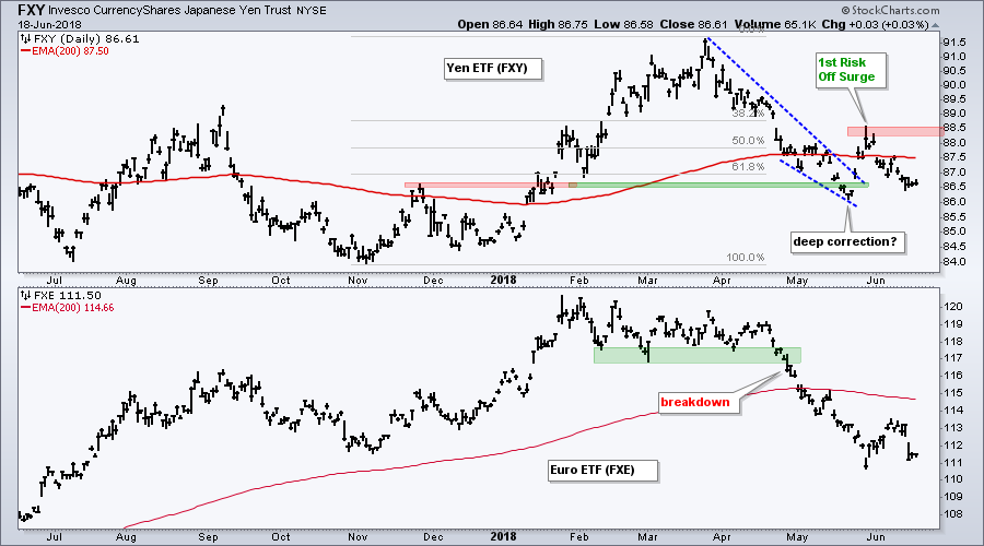
Watch the Risk-Off Assets
The Yen ETF (FXY) and the 20+ YR T-Bond ETF (TLT) are two risk-off assets that chartists can watch for clues. US Treasury bonds are the ultimate safe-haven alternative to stocks and the Yen is the safe-haven currency of choice. The first chart shows TLT surging above 122 during the last risk-off bout in late May and then retracing around 61.8% of this surge with a pullback into June. The ETF broke out of a falling flag last week and this targets a challenge to the spring highs (resistance). Further strength in TLT would show more risk-off and this could weigh on stocks.
The second chart shows the Yen ETF (FXY) with a deep correction into May and a sharp bounce during the first risk-off bout in late May. The Yen pulled back into June and may be poised to bounce off support from the May low. A break above the May high would fully reverse the downtrend in the Yen and reflect a strong move to risk-off.
On Trend and Stocks to Watch
Note that I will covered the charts above and more in On Trend, which is archived on our Youtube Channel. Should the stock market correct or churn over the next few weeks or even months, chartists should keep an eye on individual stocks to see how they hold up during the corrective period. Stocks that hold up the best tend to be the leaders when the correction ends. Often, these stocks start strengthening before the correction ends.
- HON and UTX Stall as CAT Breakout Fails
- Payment Processors (GPN, V, MA, PYPL, SQ)
- Tech Leaders (PFPT, ADSK, ACN, ADI)
- Exchange Leaders (NDAQ, CME, CBRE, ICE)
- Click here for the Youtube video
Questions, Comments or Feedback?
I cannot promise to response to all correspondence, but I will read it and take into under consideration. I greatly appreciate all feedback because it helps me improve the commentary and provides ideas for the future. Sorry, I do not take symbol requests.

Plan Your Trade and Trade Your Plan.
- Arthur Hill, CMT
Senior Technical Analyst, StockCharts.com
Book: Define the Trend and Trade the Trend
Twitter: Follow @ArthurHill
