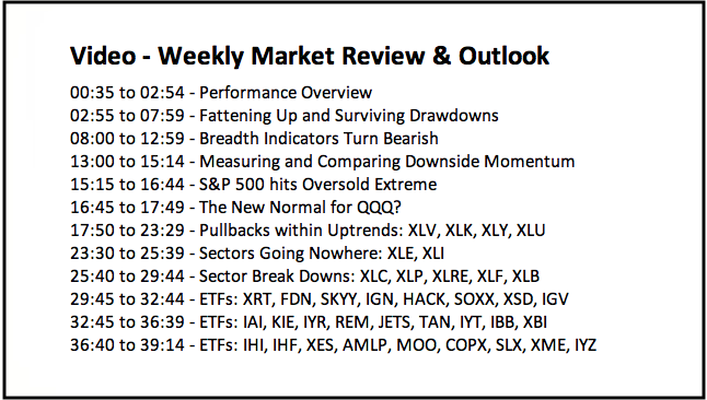
- Performance Overview.
- Fattening Up and Surviving Drawdowns.
- Breadth Indicators Turn Bearish.
- Measuring and Comparing Downside Momentum.
- S&P 500 hits Oversold Extreme.
- The New Normal for QQQ?
- Pullbacks within Uptrends: XLV, XLK, XLY, XLU.
- Charts Going Nowhere: XLE, XLI.
- Chart Break Downs: XLC, XLP, XLRE, XLF, XLB.
- Notes from the Art's Charts ChartList.
 ... Fattening Up and Surviving Drawdowns
... Autumn is the season when bears gorge on salmon and fatten up in preparation for their winter hibernation. Even though the term "bear" is not the best fit for a trader/investor, a bear's lifestyle reflects our equity curves.
Bears fatten up in good times so they can survive the bad times. Similarly, traders need to fatten up during bull markets and grow their capital. The salmon (uptrends) are plentiful during bull markets and this is the best time to make money.
The opposite happens in a bear market. The salmon are gone, winter is setting in and food supplies (uptrends) are scarce. Making money is difficult in bear markets and the winner is often the one who loses the least. Bear markets are a time to protect capital so we can have plenty of fodder for the next bull run.
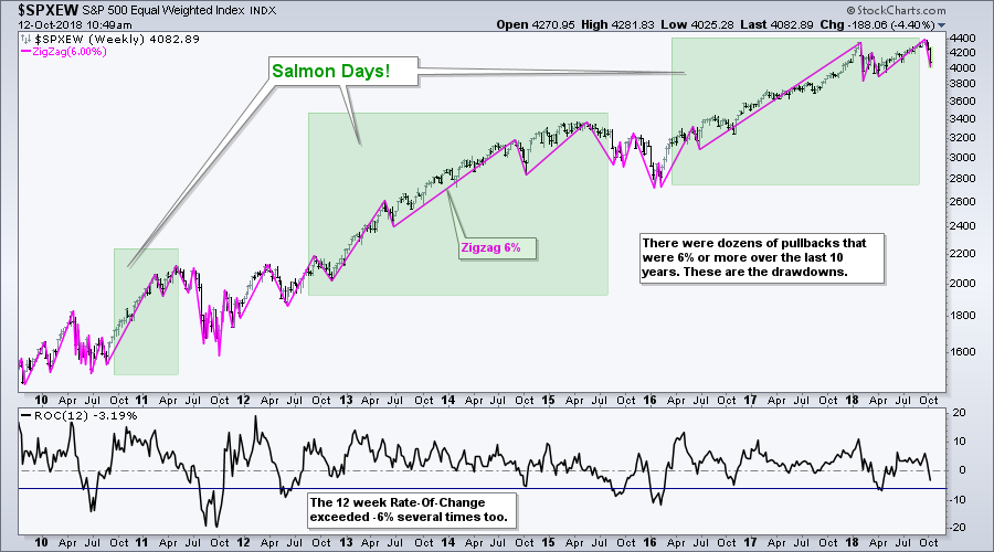
The broad market environment was bullish from March 2016 to September 2018 and the S&P 500 broke out of a triangle breakout in May and advanced into September. These were the times to fatten up and catch uptrends. The index fell sharply here in October and the evidence turned bearish this week. We are now in the midst of a drawdown because trends are reversing, stops are getting hit and losses are being incurred.
These losses (drawdowns) are part of the cycle and we need to have a plan or strategy in place to deal with them. Plan your trade and trade your plan.
Breadth Indicators Turn Bearish
I featured my key breadth indicators on Monday, when the weight of the evidence was still bullish. Broad selling on Wednesday pushed the AD Percent indicators to their lowest readings since April. Further weakness on Thursday pushed all nine breadth indicators into bear mode. This is the first time the majority of breadth indicators have been bearish since March 2016.
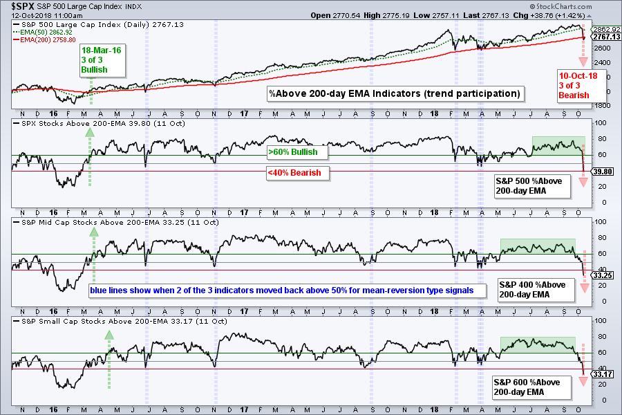
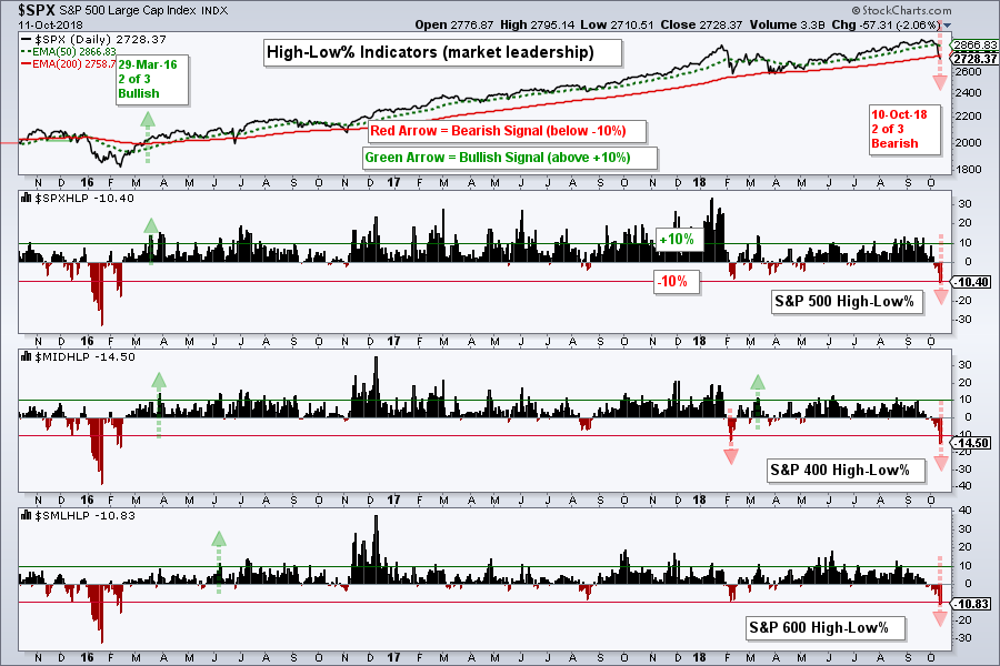
The first chart shows the %Above 200-day EMA indicators for the S&P 500, S&P Mid-Cap 400 and S&P Small-Cap 600. All three moved below 40% this week. These indicators were between 41% and 85% since March 2016. With all below 40%, this means that more than 60% of stocks in the S&P 1500 are below their 200-day EMAs.
 The second chart shows the 10-day EMA for AD Percent plunging below -30% for the third time this year. There were bearish breadth thrusts in early February, late March and now early October. These moves reflect broad participation on the downside.
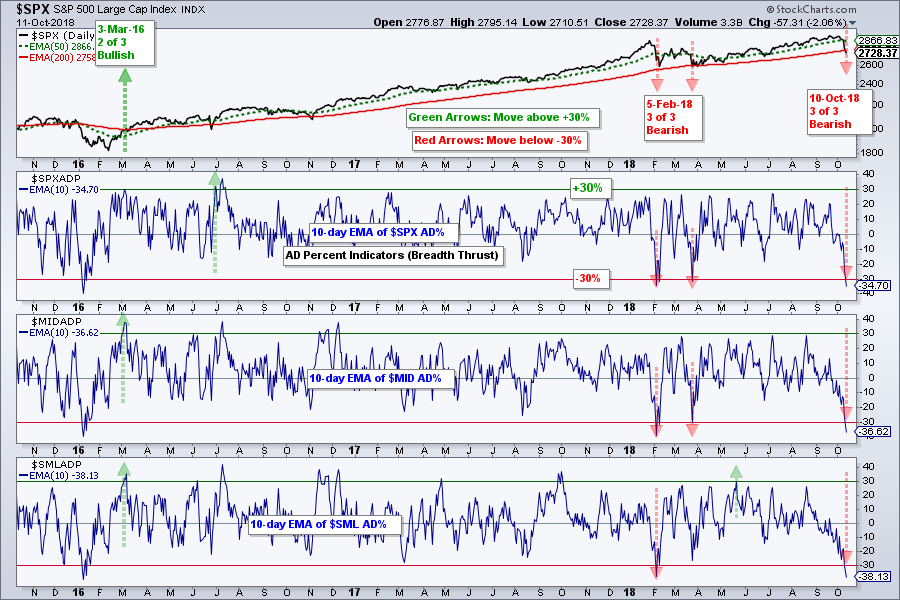 The third chart shows the High-Low Percent indicators for the S&P 500, S&P Mid-Cap 400 and S&P Small-Cap 600 plunging below -10%. This shows a serious expansion of new lows and stocks making new lows are in strong downtrends.
Measuring and Comparing Downside Momentum
Chartists can measure the intensity of buying or selling pressure by comparing RSI levels over time. The chart below shows the S&P 500 with 14-day RSI over the last ten years. This is just the third time that RSI moved below 20. Even though such levels represent an extremely oversold condition, the move below 20 occurs because of strong downward momentum. This is quite negative because a recovery period is often needed after such a sharp decline.
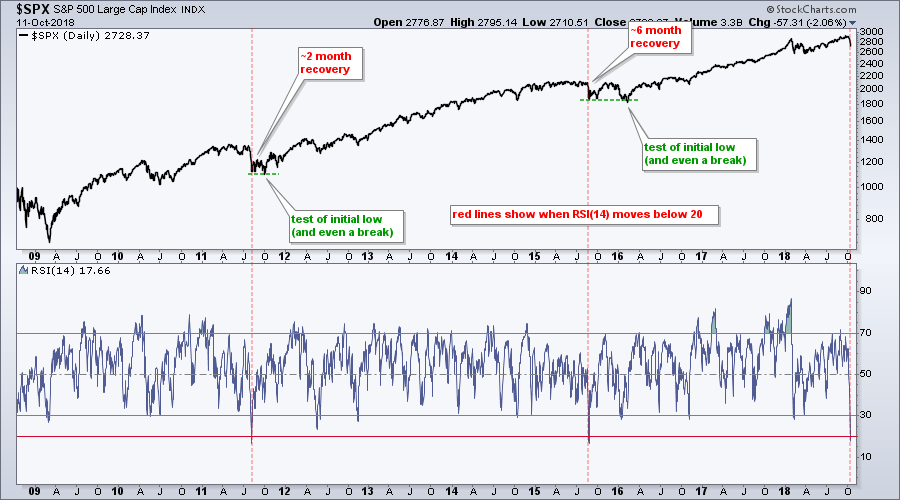 The S&P 500 took around two months to recover after the first plunge (early August 2011) and over six months after the second plunge (late August 2015). Also notice that there was a bounce after the initial plunge and then a retest of the low. The index even broke below the prior low on both occasions.
S&P 500 hits Oversold Extreme
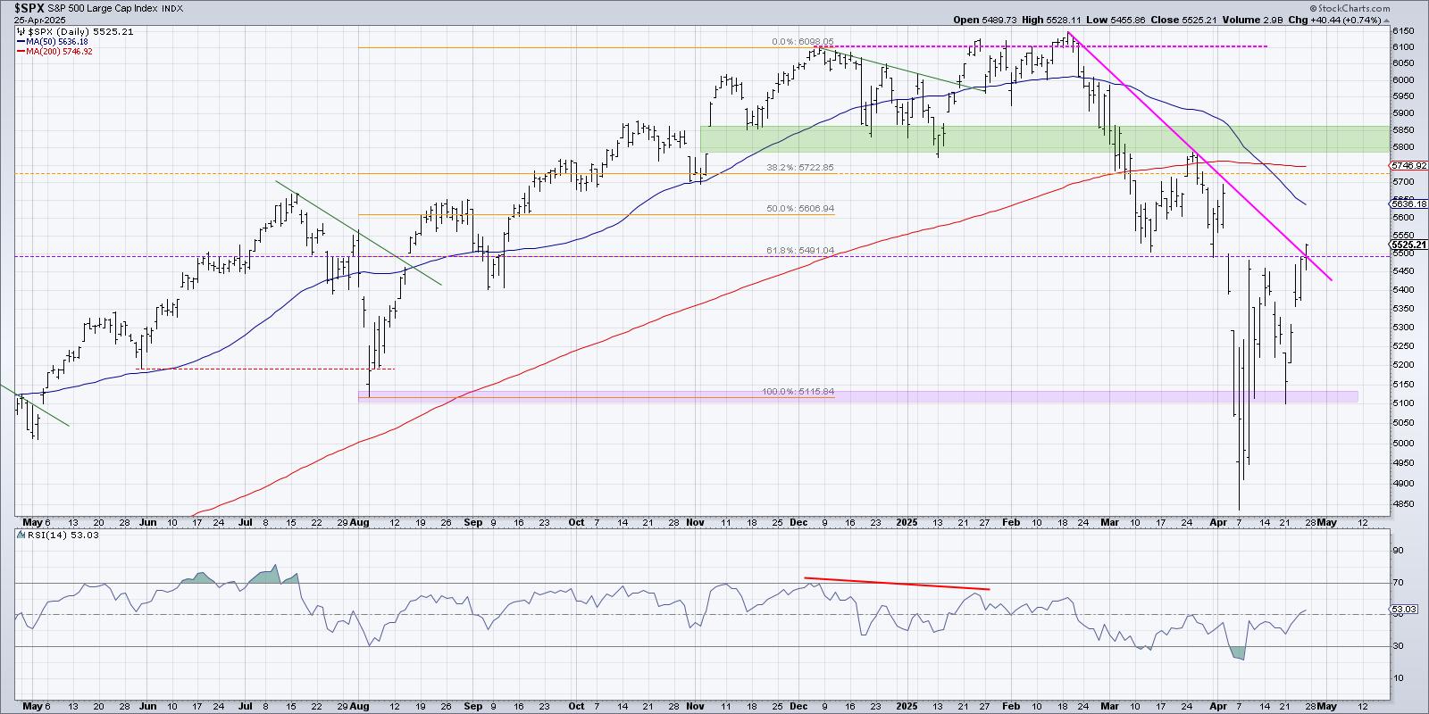
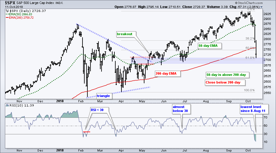
The next chart shows the S&P 500 with 10-day RSI, which hit its lowest level since August 8th, 2011. RSI is severely oversold and this could give way to a bounce in the next week or two. Also notice that Thursday's low is near the 61.8% retracement level and a support zone. The breakout area and May-June lows mark potential support here.
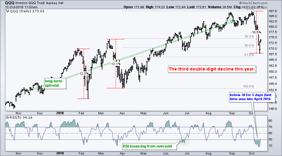
The New Normal for QQQ?
The next chart shows QQQ with its third double digit decline this year, which may be the new normal. QQQ is still up 9.5% year-to-date and I dare say that the bigger trend remains up. As with the S&P 500, Thursday's low is near the 61.8% retracement and the ETF is extremely oversold. This could give way to a bounce in the next week or two.
Ranking the Sectors
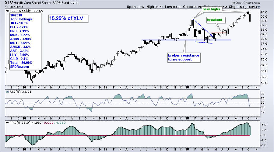
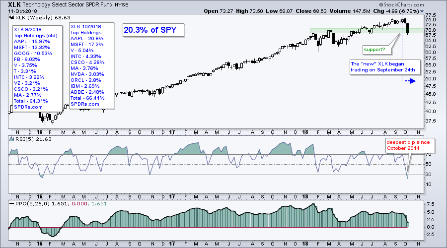
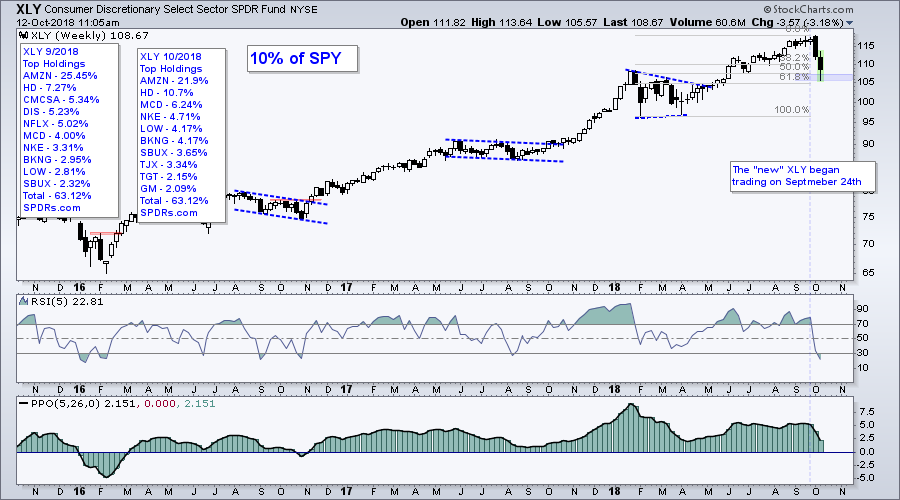
The next charts show the sector SPDRs with weekly candlesticks, 5-week RSI and the PPO(5,26,0). The PPO is positive when the 5-week EMA is above the 26-week EMA and negative otherwise. This is basically the direction of the six month trend. Currently, the PPO is positive for XLK, XLY, XLI, XLV, XLE, XLU, XLP and XLRE. It is negative for XLF and XLB. I would also assume it is negative for XLC because the ETF is down around 13% from its summer high. The next sections show the sector SPDRs grouped by strength. Four are currently experiencing pullbacks within bigger uptrends, two are trading sideways and five show chart break downs. Yep, it is a pretty mixed bag for the large-caps sectors.
Pullbacks within Uptrends: XLV, XLK, XLY, XLU
The Health Care SPDR (XLV) hit a new high in early October and fell back hard this week. I still think the long-term trend is up and would be watching this one for a mean-reversion setup if RSI moves below 30.
 The Technology SPDR (XLK) is still the biggest sector within the new sector alignment, which has been active since September 24th (three weeks). XLK is also in an uptrend still and near a support zone marked by broken resistance and the June low. RSI is also oversold for the first time since January 2016.
 The Consumer Discretionary SPDR (XLY) is also in a long-term uptrend, even after the sharp two-week decline. This decline returned to the breakout zone and retraced around 61.8% of the prior advance. RSI is also oversold and I would watch this one for a bounce.
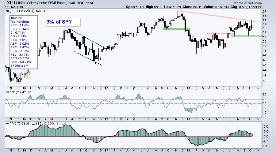
 The unadjusted Utilities SPDR (_XLU) also gets a vote for an uptrend because the summer breakout is holding for the most part. The lows from July to September mark support at 51, a break of which would reverse the uptrend. Note that I use unadjusted charts for XLU and XLRE because their yields are so high. Unadjusted price charts do not include the dividend adjustments.
Charts Going Nowhere: XLE, XLI
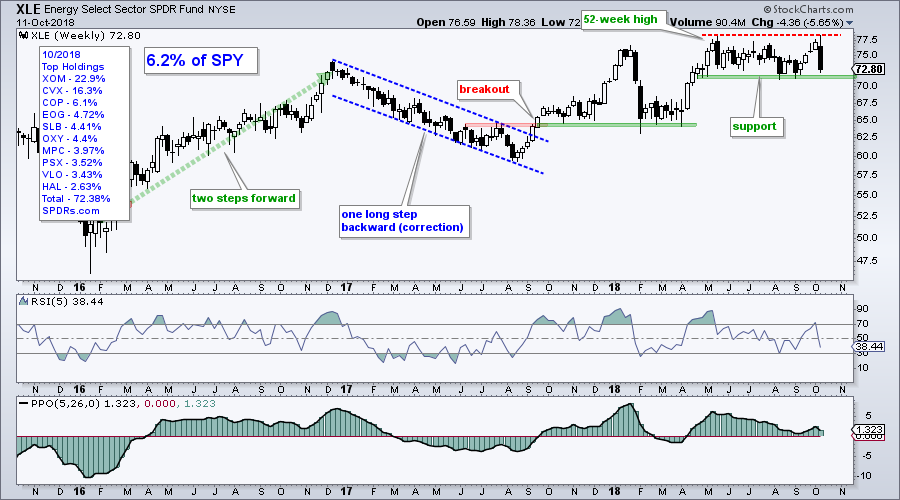
The Energy SPDR (XLE) is technically still in an uptrend, but the ETF has gone nowhere since March. After hitting a 52-week high, XLE traded flat with support in the 71-72 area and resistance in the 78 area. Watch these levels for the next directional clue.
 The Industrials SPDR (XLI) held out last week and got clobbered this week with a 7% decline the last four days. This decline reversed the upswing over the last three months and a double top is now possible.
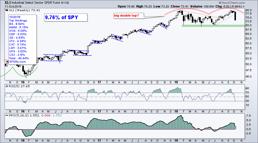
Chart Break Downs: XLC, XLP, XLRE, XLF, XLB
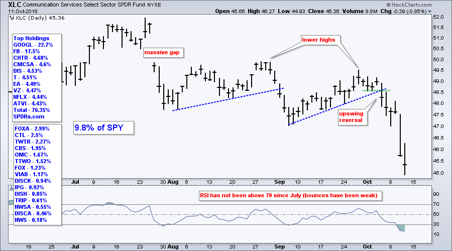
The Communication Services SPDR (XLC) began trading in June and peaked in late July. The ETF fell around 13% from its July high to the recent low and is one of the weakest sectors in the market right now.
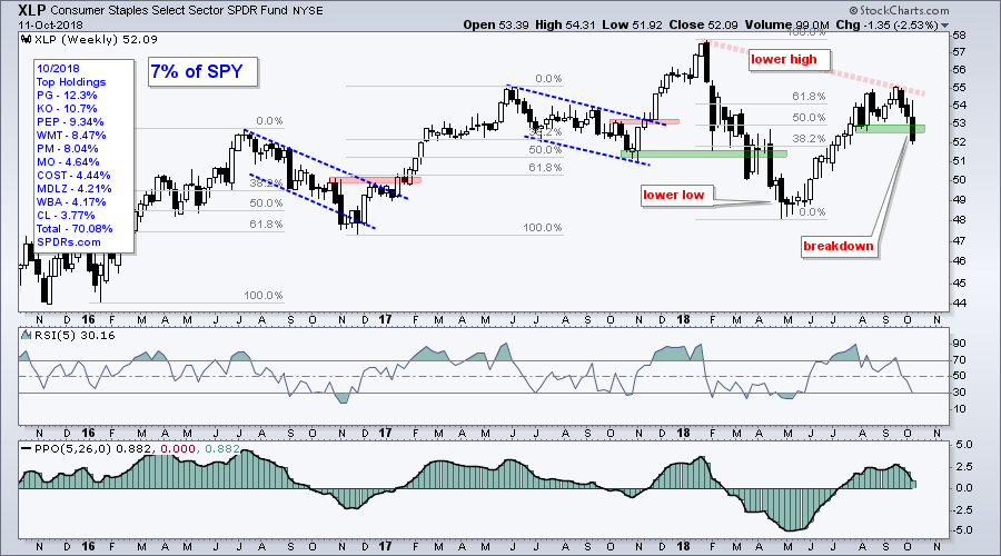
 The Consumer Staples SPDR (XLP) fell sharply the last three weeks and broke support this week. Notice that a lower high formed from January to September. Paired with the lower low in April, it looks like a downtrend for XLP.
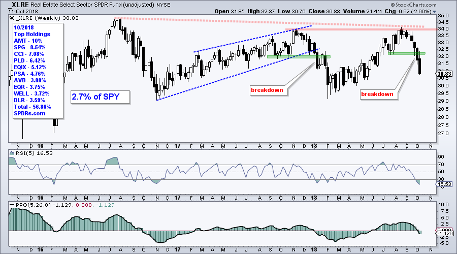
 The unadjusted Real Estate SPDR (_XLRE) led the market from February to August, but reversed near its 2017 high and broke support with a sharp decline the last four weeks. The PPO also turned negative and this sector is bearish.
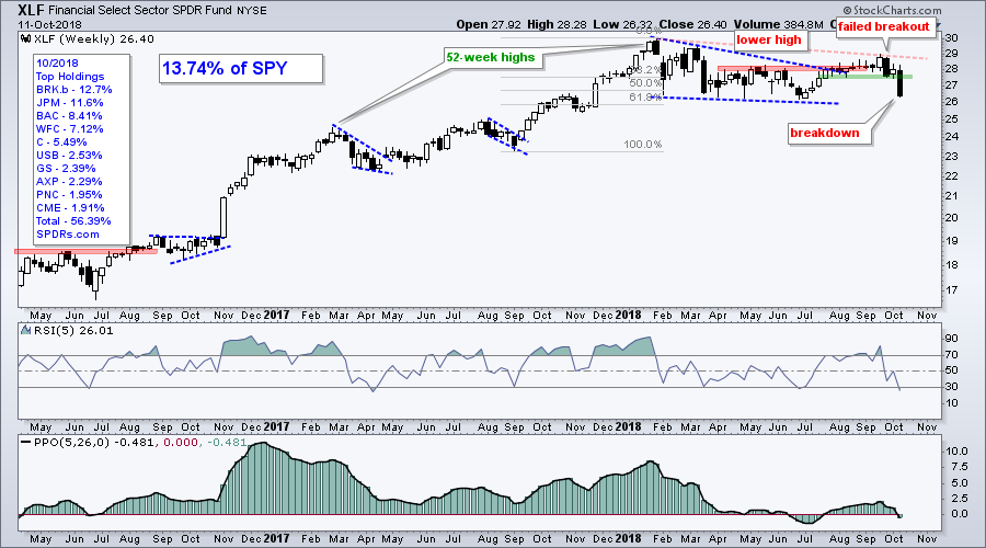
 The Financials SPDR (XLF) started the week above support and broke with a sharp decline the last two days. The ETF formed a lower high from January to September and broke down with a sharp decline this week. The PPO is also negative and this sector is bearish.
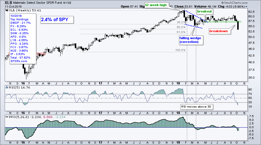
 The Materials SPDR (XLB) looks a bit like XLF above with a lower high from January to September and a break down this week. The PPO is negative, the ETF hit a new low and this is the weakest of the lot.
Notes from the Art's Charts ChartList
- Chart Leaders: IGV, KIE, ITA, IHF, IHI, MOO, IYZ
- Chart Laggards: ITB, KRE, IAI, IYR, TAN, KOL, COPX, XME,
- Uptrend&Oversold: IGV, KIE, ITA, IYT, IBB, IHI, MOO, IYZ
- Attempting a Reversal: GDX, AMJ
- The Retail SPDR (XRT) broke its summer lows.
- Six of the seven tech-related ETFs broke their summer lows (SKYY, FDN, HACK, IGN, XSD, SOXX).
- The Software iShares (IGV) is the only tech-related ETF that remains above its late June low.
- The Insurance SPDR (KIE) broke support with a sharp decline, but remains well above its summer lows.
- The Regional Bank SPDR (KRE) hit a new low for 2018, but not quite a 52-week low.
- The Gold Miners ETF (GDX) surged on Thursday and broke resistance (GLD also broke out at 115).
Questions, Comments or Feedback?
I do not take symbol request and I cannot promise to response to all correspondence, but I will read it and take into under consideration. I greatly appreciate all feedback because it helps me improve the commentary and provides ideas for the future.

Plan Your Trade and Trade Your Plan.
- Arthur Hill, CMT
Senior Technical Analyst, StockCharts.com
Book: Define the Trend and Trade the Trend
Twitter: Follow @ArthurHill