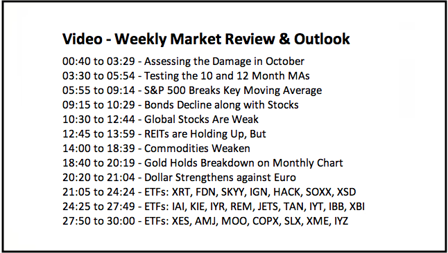
- Assessing the Damage in October.
- Testing the 10 and 12 Month MAs.
- S&P 500 Breaks Key Moving Average.
- Bonds Decline along with Stocks.
- Global Stocks Are Weak.
- REITs are Holding Up, But.
- Commodities Weaken.
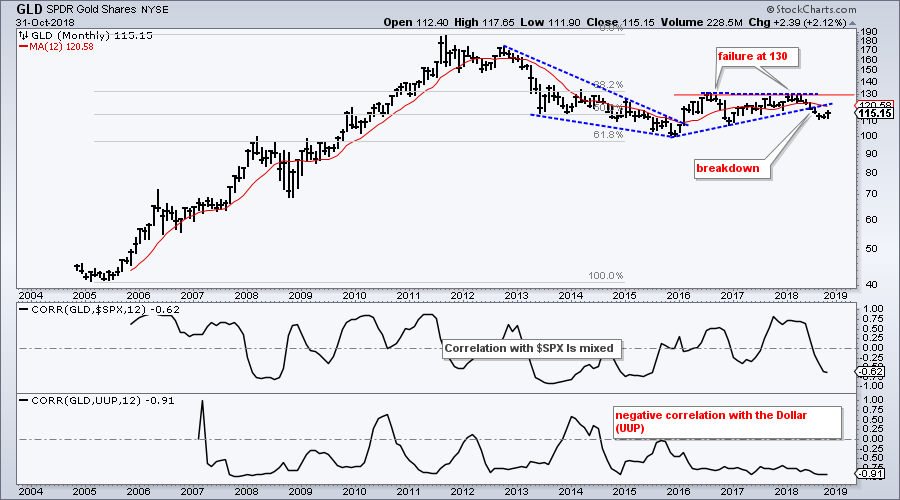
- Gold Holds Breakdown on Monthly Chart.
- Dollar Strengthens against Euro.
- Note from the Art's Charts ChartList.
 ... Assessing the Damage in October
... October was a pretty eventful month in the markets, or at least the stock market. The bulk of the evidence shifted from bullish to bearish in the middle of October and the S&P 500 closed below its 12-month SMA for the first time since March 2016. It was a good run and now it has ended. I will run through the numbers a little later with some backtesting.
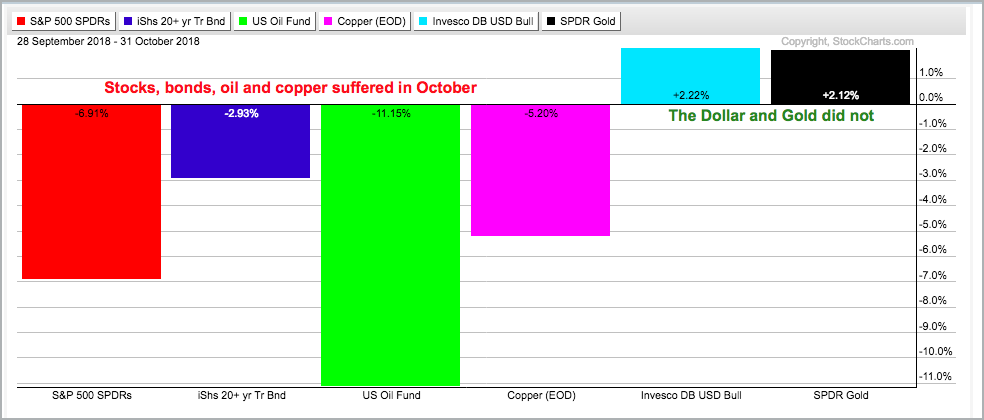
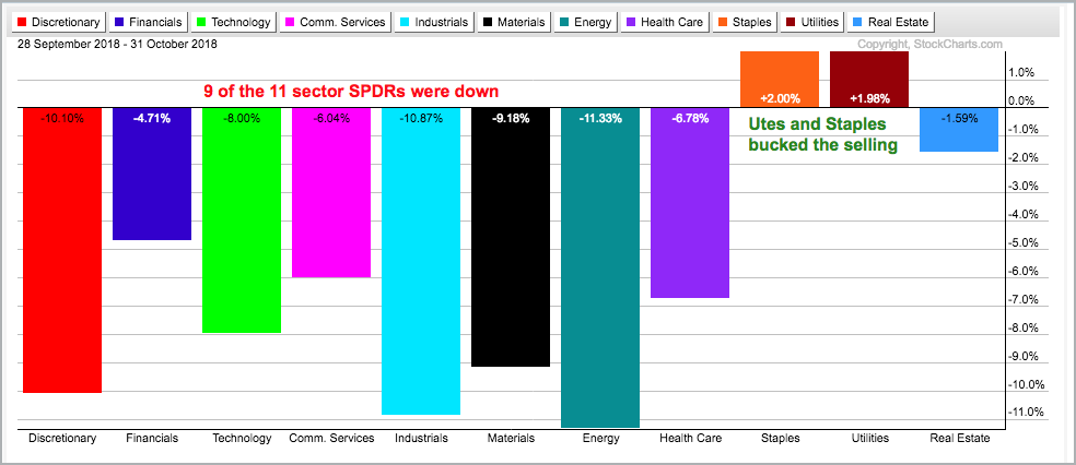
Nine of the eleven sectors were down in October with only the Utilities SPDR (XLU) and Consumer Staples SPDR (XLP) bucking the trend. The 20+ YR T-Bond ETF (TLT) also fell as even safe-haven bonds failed to attract money. Oil and copper also fell. Oil may be reversing a long-term uptrend, while copper is simply continuing a long-term downtrend. The Dollar and gold both rose, which is unusual because these two are negatively correlated.
Stocks bounced over the last two days, but I do not view this as any sort of bottom. My mid October bearish stance was reinforced with further weakness the second half of the month. Stocks were severely oversold after a sharp four week decline and a bounce is certainly normal. Barring the mother of all oversold bounces, the technical damage was already done.
While I do not know if the current decline will play out like 2008, 2011 or 2015, it will take more than a two day bounce to repair this technical damage. The stock market is clearly unsettled and more time is needed for settling.
Programming Note: This Weekly Market Review & Outlook is coming to you a day early because I am taking a vacation day tomorrow.
Testing the 10 and 12 Month MAs
I do not usually feature monthly charts, but October was one heck of a month and now is a good time for some perspective. The S&P 500 closed below its 10-month SMA and 12-month SMA, and these signals are generating a lot of buzz. Before looking at the charts, note that I backtested these signals and there is not much difference between the 10 or 12 month moving average, or between exponential moving averages and simple moving averages. I also tested with a 3-month EMA and 12-month EMA.
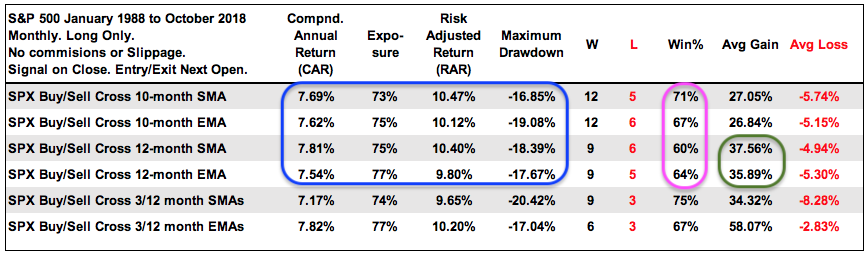
The Compound Annual Returns range from 7.17% to 7.82%, exposure is in the 75% area and the Maximum Drawdowns range from 17.04% to 20.42% (blue). These results are pretty similar. The 10-month SMA and 10-month EMA had higher Winning Percentages (pink), but notice that the Average Gains are much higher for the 12-month SMA and 12-month EMA (green). Clearly, there are some trade off. We get more signals and higher Win% with the 10-month MAs, but longer signals with the 12-month MAs.
Bottom Line: There is not enough difference to favor one moving average over the other. However, note that the S&P 500 closed below its 10-month and 12-month SMAs and EMAs. This is unambiguous and this is the main takeaway.
S&P 500 Closes below Key MAs
The chart below shows the S&P 500 with the 12-month SMA in red and the PPO(1,12,0) in the indicator window. The index closed below the 12-month SMA this month and the PPO turned negative for the first time since March 2016. The SMA signals over the last 20 years are shown. As you can see, these signals would have preserved capital and sanity in 2001-2002 and 2008-2009, but resulted in whipsaws in 2010 and 2015. Can't have it all!
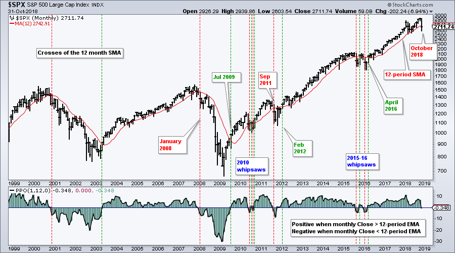
I never know which signal will result in a whipsaw or which will result in an extended decline. Sure, I can speculate, but this defeats the purpose of a systematic approach. Systematic traders/investors are agnostic and take the signals as they come. No arguments, no ifs and no buts.
Checking in on Asset Classes
Mebane Faber wrote a paper in 2006 on tactical asset allocation and this paper was updated few years later. Basically, Faber shows an asset allocation strategy based on the 10-month MA. Buy when above the 10-month SMA and sell when below. The paper uses US stocks, foreign developed stocks, 10-year government bonds, commodities and REITs as the five main asset classes. There will be lots of whipsaws, but this systematic approach is designed to outperform on the way up and preserve capital on the way down.
Personally, I only think we need to consider other asset classes when stocks are not under consideration. When the broad market environment is bullish for stocks, I think stocks are pretty much the only game in town. When the broad market environment is bearish for stocks, we need to either move to cash or look for alternatives. Let's look at some monthly charts for other asset classes with the 12-month SMA.
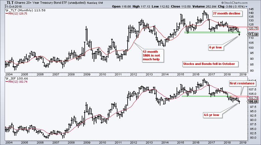
Bonds Decline along with Stocks
Bonds are the obvious alternative to stocks, but the 20+ YR T-Bond ETF (TLT) and the 7-10 YR T-Bond ETF (IEF) were down in October. Thus, money moved out of both asset classes. SPY was down 6.91% this month and TLT fell 2.93%. TLT may show relative strength in October, but this is not an issue because the long-term trend is down. The chart below shows unadjusted TLT, which does not include the monthly distributions. Price has been trending lower for over two years and broke below the 2015 and 2017 lows. Perhaps this decline will evolve into a wedge, but I would not consider this possibility unless TLT can break above the summer highs (123).
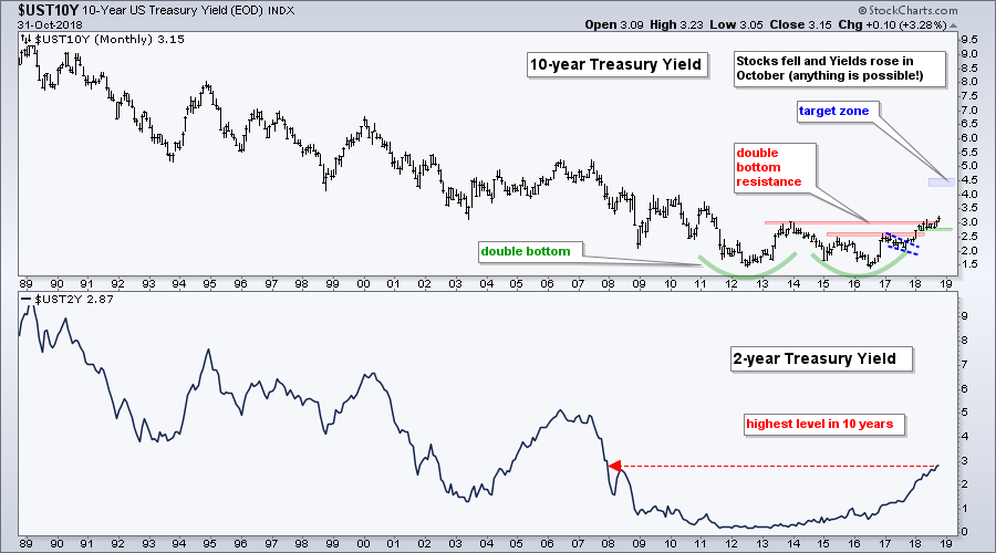
The next chart shows the 10-yr T-Yield ($UST10Y) hitting a seven year high as it breaks resistance from a massive double bottom. Forget about the stock market, forget about the Fed and focus on the chart. This chart points to higher treasury yields as long as the breakout holds. A close below the summer lows (2.8%) would call for a re-evaluation of the long-term uptrend.
Global Stocks Are Weak
The next chart shows the MSCI World (Ex-USA) Index ($MSWORLD) breaking below its 12-month EMA in June, four months ahead of the S&P 500. One could make the case for a longer-term uptrend since 2009 with a channel since 2010, but the index has been falling for nine months and this is long term enough for me.
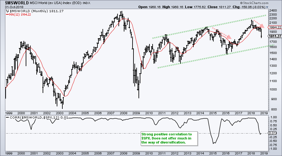
The indicator window shows the 12-month Correlation Coefficient ($SPX). Positive correlation means the asset moves in the same direction as stocks and offers little in the way of diversification. Negative correlation means the asset moves opposite of stocks and may offer an alternative. Despite two negative dips, $MSWORLD shows a strong positive correlation with the S&P 500 and does not offer any real diversification. As an aside, I am not a fan of these conglomerate indexes or ETFs (all world etc). They are simply too broad for my taste and I prefer to break it down into country indexes.
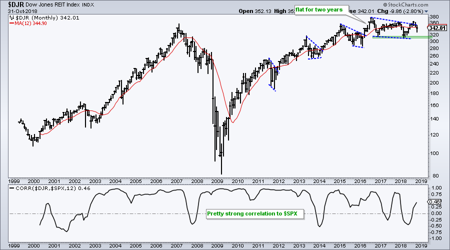
REITs are Holding Up, But
The next chart shows the Dow Jones REIT Index ($DJR) with a new high in mid 2016 and a trading range the last two years. The blue lines show corrections within the long-term uptrend. Perhaps the decline into 2018 was a wedge correction. The 2016-2018 lows mark the key levels to watch going forward. A break below these lows would usher in lower lows and clearly reverse the uptrend. The 12-month Correlation Coefficient ($SPX) is also mostly positive and this means REITs do not offer as much diversification as one might think.
Commodities Weaken
The next chart shows the Bloomberg Commodity Index ($BCOM) in a long-term downtrend and with a recent break down. The index broke down in 2008, bounced into 2011 and then fell into 2015. The advance into summer 2018 formed a rising wedge and the index broke the wedge line over the last few months. It looks like new lows are in store for this index. The indicator window shows the Correlation Coefficient ($SPX) moving above and below the zero line. Correlation with the S&P 500 is mixed.
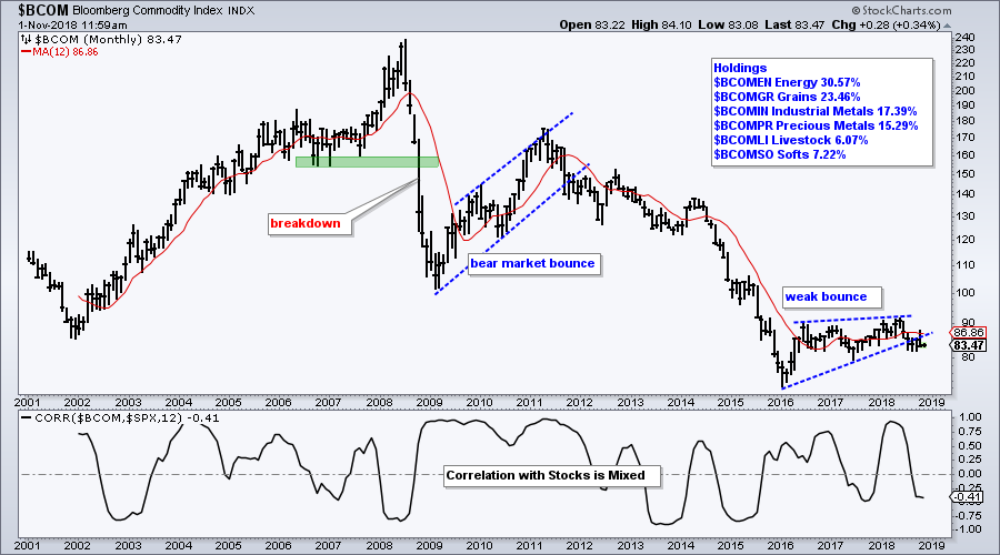
You can read more about the Bloomberg Commodity Indices here. Scroll all the way down to the bottom of the page for links on index documentation. I like this Bloomberg index because you can break it down into the sub-indices, which are shown on the chart. In addition, energy only accounts for 30.57% of the index. In contrast, energy accounts for 39% of the CRB Index ($CRB).
Gold Holds Breakdown on Monthly Chart
The Gold SPDR (GLD) bounced in October and there is a breakout on the daily chart, but the monthly chart still looks bearish. GLD surged from 2005 to 2011 and then fell into early 2016. A falling wedge formed and the ETF bounced near the 61.8% retracement in the first half of 2016. That was it for the bounce as resistance in the 130 area held and GLD broke down in this summer. Long-term, this breakdown is the dominant chart feature. A move above 121 is needed to negate it, while a break above 130 is needed to turn long-term bullish on bullion.
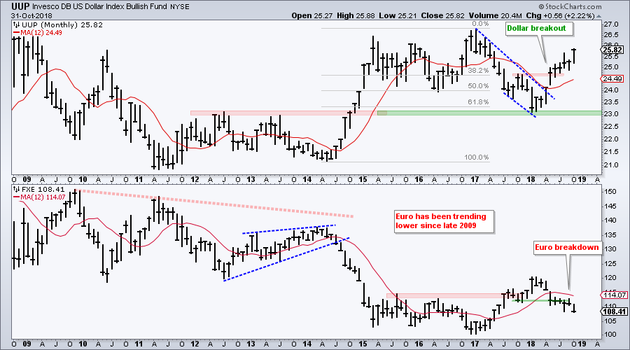
Dollar Strengthens against Euro
It is hard to get too excited about gold because the Dollar is in a strong uptrend and gold has a strong negative correlation with the greenback. The chart below shows the US Dollar ETF (UUP) bouncing off the 61.8% retracement area and broken resistance in early 2018. UUP broke out of the falling wedge and broke resistance. The bottom window shows the Euro ETF (FXE) breaking down over the last few months and the Euro accounts for some 57% of the Dollar ETF.
Note from the Art's Charts ChartList
The Medical Devices ETF (IHI) and HealthCare Providers ETF (IHF) are the only two industry group ETFs with declines that I would consider as corrections within a bigger uptrend. The other ETFs broke their summer lows and/or hit new lows for 2018 (or even 52-week lows). This is the only note from the Art's Charts ChartList.
Questions, Comments or Feedback?
I do not take symbol request and I cannot promise to response to all correspondence, but I will read it and take into under consideration. I greatly appreciate all feedback because it helps me improve the commentary and provides ideas for the future.

Plan Your Trade and Trade Your Plan.
- Arthur Hill, CMT
Senior Technical Analyst, StockCharts.com
Book: Define the Trend and Trade the Trend
Twitter: Follow @ArthurHill


