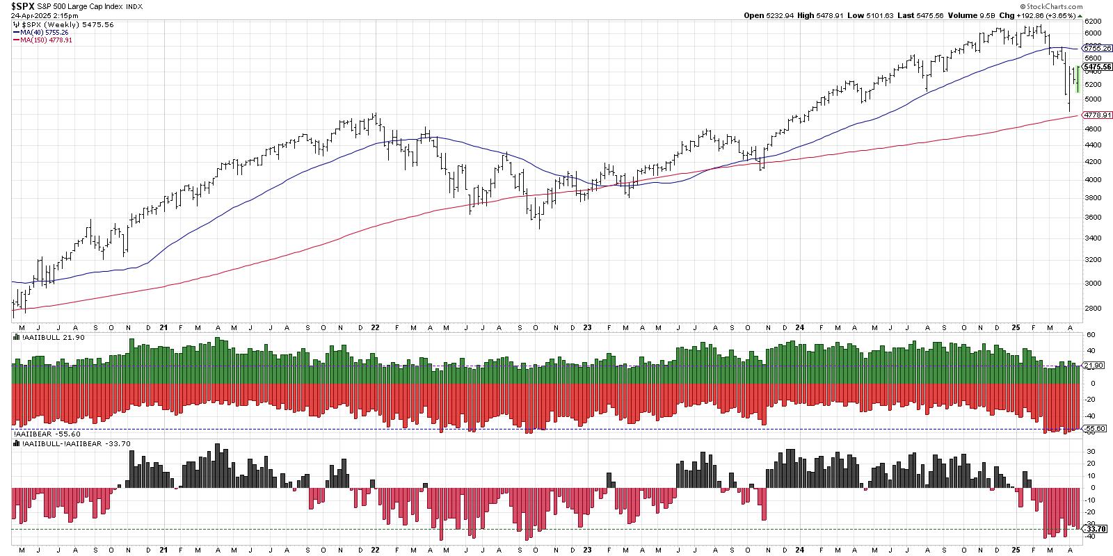
- Putting January Into Perspective.
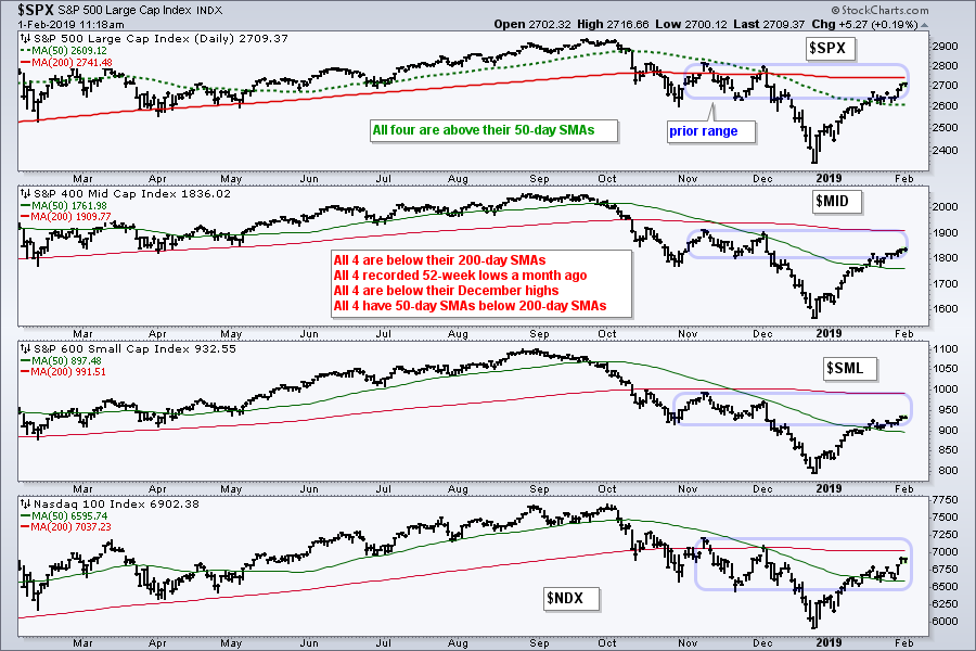
- Still Below December High.
- Another Reversal Zone Appears.
- SPY and the Pennant Breakout.
- Participation begins the Wane.
- REITs, Utes and Healthcare Lead New Highs.
- XLU Extends on Breakout.
- Charts that Make me Throw my Hands Up.
- Choosing Another Timeframe.
- The Powell Put Comes to Life.
- Homebuilders Take the Lead.
- Watching Support in the Retail SPDR.
- Regional Bank SPDR Weakens
- Biotech ETF forms Bullish Pennant.
 ... Putting January Into Perspective
... One's outlook often depends on one's timeframe. This outlook can also be influenced by recent price action or a recency bias. Stocks surged in January with the biggest advance in years (+1 for the bulls). This surge, however, was preceded by an even deeper decline (+1.2 for the bears). Taking the two months together, the bears still have a scoring edge.
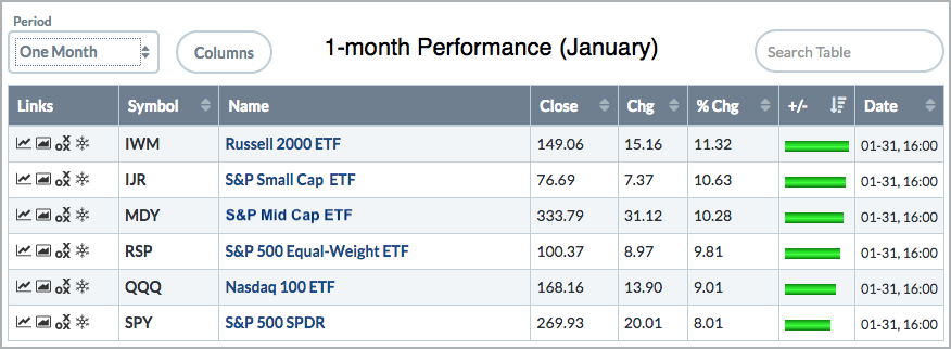
The S&P 500 had its best January since 1987 with a 7.87% gain and the S&P 500 SPDR surged 8%. All boats rose with the Russell 2000 iShares leading the charge (+11.32%). All sector SPDRs were up with the Communication Services SPDR up a leading 11.75% and the Utilities SPDR up a lagging 3.48%.
These gains are clearly impressive by themselves, but the picture dims when we step back three to six months. SPY is essentially flat over the last three months (+.32%) and down 3.05% over the last six months. Taking a bigger step back, SPY is up 3.57% over the last nine months, but down 2.43% over the last twelve months. Thus, the one year picture is mixed, at best.
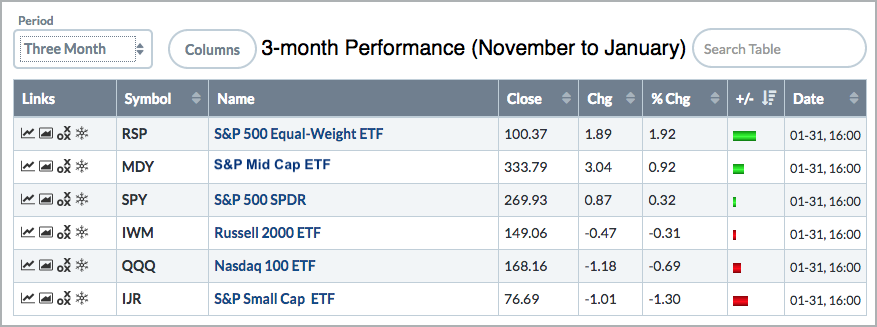
The sector picture is mixed over the last three months with seven up and four down. The Real Estate SPDR (XLRE) is leading with an 8.24% gain, while the Financials SPDR is down .68% and the Technology SPDR is down 4%. The picture flips when we look at six month performance. The four defensive sectors are positive over the last six months (XLRE, XLU, XLV and XLP), while the other seven sectors are down between 4 and 16%.
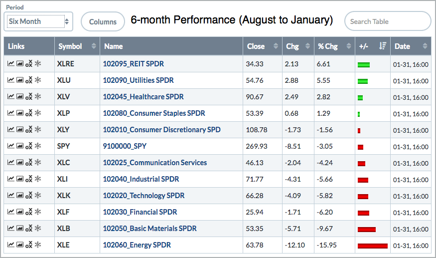
Note that the chart links in the first three charts are to PerfCharts. These images are screenshots created by viewing a ChartList in Summary mode and then changing the period setting (1-month, 3-month, 6-month).
Still Below December High
At the risk of sounding like a broken record, the surge off the late December low is extraordinary, but it is still overshadowed by the prior decline, which was from early December to late December. In other words, the S&P 500, S&P Mid-Cap 400, S&P Small-Cap 600 and Nasdaq 100 are still below their last peak and have yet to record a higher high. They are below their 200-day SMAs and their 50-day SMAs are below their 200-day SMAs.
Another Reversal Zone Appears
The short-term uptrend extended as stocks moved higher again this week. As noted last week, the turn-on-the-month has a bullish bias. This period includes the last four days of the current month and the first four days of the next month. We are starting the first four days of February today and this bullish bias could extend into early next week.
The S&P 500 chart shows the index trading in the prior consolidation zone (November to early December). There are plenty of "classical" reasons to expect a short-term reversal or pullback in February. The flat 200-day SMA at 2741, the consolidation zone and the 50-61.8% retracement zone mark an area that could lead to a short-term reversal. In addition, the index is also getting extended after a 15% advance in five weeks.
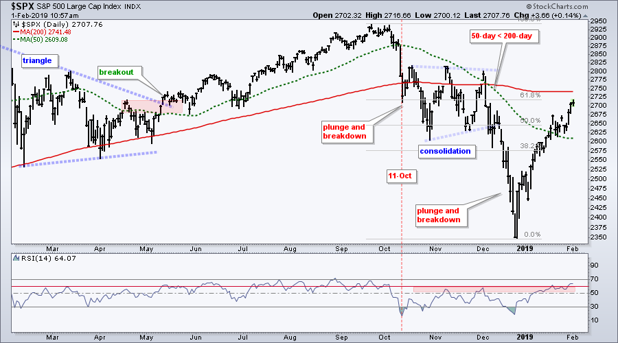
There were also plenty of "classical" reasons to expect a short-term reversal around January 10th when the index was in the 2600 area (broken support, another 50-61.8% retracement zone, overbought, 50-day SMA, bearish wedge). These reasons did not pan out as the short-term trend never actually reversed. And therein lies the key. Broken support zones, prior highs, moving averages, overbought conditions and retracements make it easy to argue for "potential" resistance or a reversal zone, but the immediate trend is the ultimate arbiter.
SPY and the Pennant Breakout
The chart below shows SPY breaking out of a pennant with a gap up on Wednesday and surge the last two days. This signals a continuation of the prior leg up and projects a move to (gulp) the 285 area. Projections are like potential resistance zones. They are hit and miss so we need to focus on immediate price action.
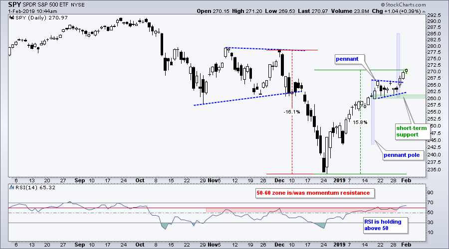
The pennant breakout is bullish until proven otherwise with the pennant lows marking a clear support zone in the 260-261 area. A break below this support zone and an RSI break below 50 would be short-term bearish and signal the start of the dreaded pullback.
Participation begins the Wane
Even the pennant breakout is bullish, participation narrowed over the past week and this could foreshadow weakness ahead. The S&P 500, S&P Mid-Cap 400 and S&P Small-Cap 600 moved to their highest level since December 7th on Thursday, but their AD Percent values were not that strong ($SPX +35%, $MID +24%, $SML +36%). In fact, the AD Percent values have not been above +70% since January 18th. There is, thus, less upside participation than before and this adds another argument in favor of a February pullback.
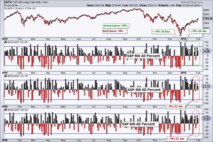
I also use thrust levels for short-term clues (above +70% or below -70%). S&P 500 AD Percent is still green because the last signal was a bullish thrust above +70% (January 18th). The last signals for S&P MidCap AD Percent and S&P SmallCap AD Percent were bearish breadth thrusts below -70% (January 22nd). This shows strong participation on the downside and it has yet to be countered with a bullish thrust.
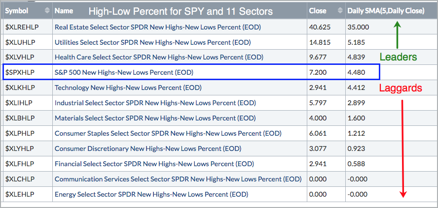
REITs, Utes and Healthcare Lead New Highs
The table below comes from a scan for High-Low Percent, which is new highs less new lows divided by total issues. The "close" column shows the High-Low Percent values and the last column is the 5-day SMA of High-Low Percent. First and foremost, notice that S&P 500 High-Low% has yet to exceed +10% and turn bullish. Second, the vast majority of new highs come from the Real Estate SPDR, Utilities SPDR and Health Care SPDR. Third, notice that the 5-day SMA for High-Low Percent for the other eight sectors is below that of the S&P 500. We need to see more new highs from the offensive sectors to support a bull market.
XLU Extends on Breakout
The Utilities SPDR (XLU) chart looks fine with a pretty decent uptrend at work after the late January breakout. Notice how XLU found support near the September low, firmed for a few weeks and broke out last week. The ETF surged over 2% on Thursday and appears headed for a new high.

Charts that Make me Throw my Hands Up
I cannot make heads or tails of the daily charts for the Health Care SPDR (XLV), Consumer Staples SPDR (XLP) and Real Estate SPDR (XLRE) because they each sport three to four 10+ percent moves in the last five months. There are literally thousands of charts out there and these three fall into the "huh?" category. I am sure that I could think of something to say here, but these are not nice steady uptrends so I will just pass.
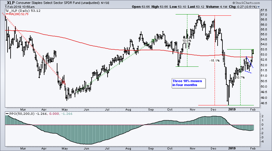
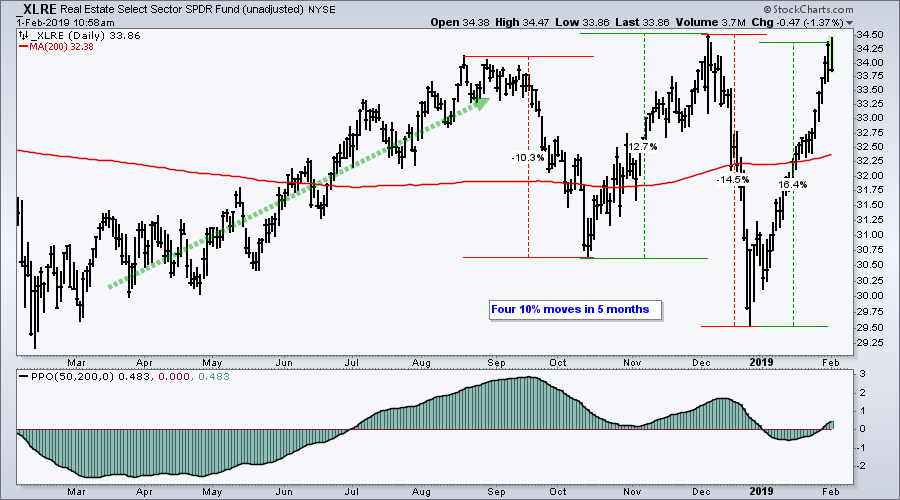
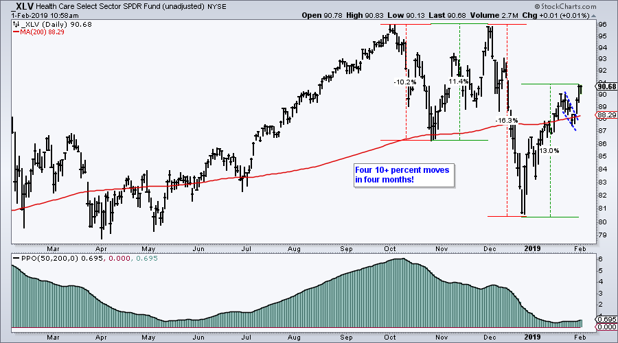
Keep in mind that we have a choice when looking at charts. We can either pass and move on to the next chart or select the chart for further study. Overall, I am finding ETF charts more and more challenging to analyze. This could be due to a bifurcated market with lower correlations among stocks. Lower correlations create cross currents within indexes and ETFs, and make for inconsistent trends. Such an environment also favors stock pickers.
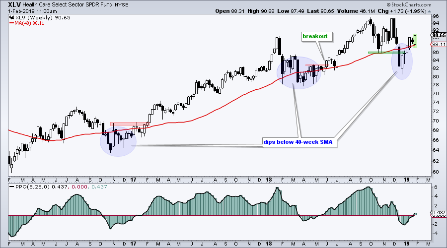
Choosing Another Timeframe
Chartists can also deal with noisy charts by choosing a longer timeframe. The next chart shows weekly candlesticks for XLV over the last three years. The trend on this chart appears to be up with three big hiccups along the way. The blue ovals show when XLV moved below the 40-week SMA and the PPO(5,26,0) turned negative. The dips did not last too long as XLV turned back up and the PPO crossed back into positive territory. Thus, this chart looks bullish from a longer-term perspective. A close below 86 would argue for a reassessment.
IEF Consolidates above Breakout
It was a wild week for the 7-10 YR T-Bond ETF (IEF) with a big surge on Wednesday-Thursday and a plunge on Friday. As a result, we need to look at a weekly chart to filter out the noise. Unadjusted IEF (_IEF) broke out in December and is stalling above the breakout. Thus, the breakout is holding and IEF remains bullish overall. A move below 103 would negate the breakout and call for a reassessment. The indicator window shows the 10-yr T-Yield ($TNX) stalling below its break zone. A move above 28 (2.8%) would call for a reassessment.

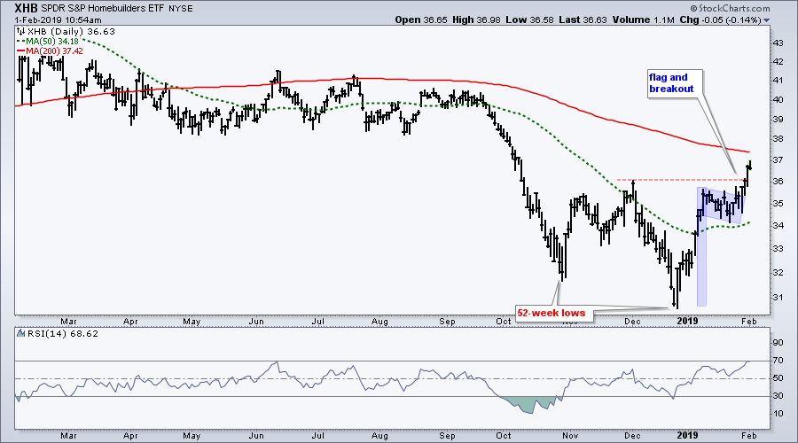
Homebuilders Take the Lead
I featured the Home Construction iShares (ITB) and Home Builders SPDR (XHB) with bull flags last Friday and highlighted several related stocks in On Trend on Thursday. ITB and XHB led the market on Thursday with big moves. Even though both are still in long-term downtrends, ITB showed upside leadership in early January by exceeding its early December highs. Both are now above their rising 50-day SMAs and closing in on their falling 200-day SMAs. Also notice that RSI exceeded 70 for ITB and this shows the strongest upside momentum in more than an year.

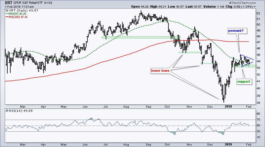
Watching Support in the Retail SPDR
Stocks continued higher this week with SPY moving above its mid January high, but the Retail SPDR (XRT) moved lower and did not partake. The ETF has traded flat the last three weeks and I am watching for the next directional break. A pennant could be forming and a break above 44.5 would be bullish. On the flip side, the ETF is not keeping pace with SPY and a break below 43 would be bearish. Such a break would weigh on the consumer discretionary sector.
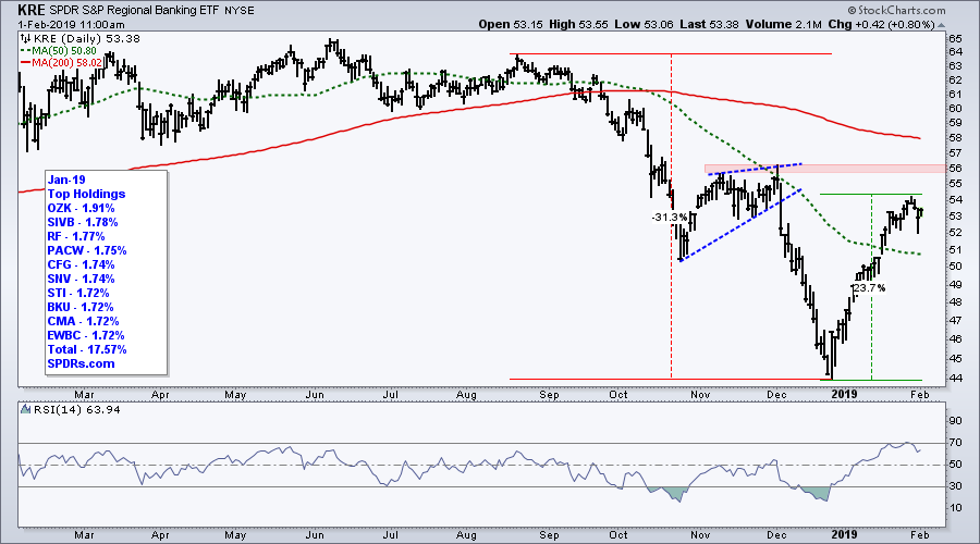
Regional Bank SPDR Weakens
The Regional Bank SPDR (KRE) led the market down from September to December (-31%) and led the market higher over the last five weeks (+24%). Is this a consistent uptrend? No. Is it a chart I want to study further? Not really. In any case, KRE showed some strong upside momentum on this move as RSI moved above 70. It is worth putting on a watchlist for a playable pullback. Perhaps a dip to the 49-50 area and RSI dip to around 50.
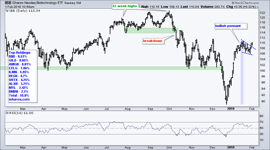
Biotech ETF forms Bullish Pennant
The Biotech iShares (IBB) fell from 110 to 90 and then surged back to 110, all within six weeks. The ETF then edged lower the last two weeks with a falling wedge or pennant of sorts. This looks like a bullish continuation pattern and the ETF broke out with a surge on Thursday. Keep in mind that this is a short-term setup on a noisy chart! A close below 106 would argue for a re-evaluation.
Art's Charts ChartList
This week's ChartList contains the key breadth charts with the nine indicators as well as the commodity ETFs, international ETFs and growth stocks I am following. Note that I added RSX to the international ETFs. In addition, I added FTNT, PFPT and QLYS to the growth stocks.
Questions, Comments or Feedback?
I do not take symbol request and I cannot promise to response to all correspondence, but I will read it and take into under consideration. I greatly appreciate all feedback because it helps me improve the commentary and provides ideas for the future.

Plan Your Trade and Trade Your Plan.
- Arthur Hill, CMT
Senior Technical Analyst, StockCharts.com
Book: Define the Trend and Trade the Trend
Twitter: Follow @ArthurHill