- Defensive Sectors Have Strongest Charts.
- Offensive Sectors Have Yet to Break Down.
- S&P 500 Gets a Bounce.
- A Bearish Failure Swing for the Russell 2000.
- Large-caps Lead New High List.
- Discretionary and Communication Sectors Take Hits.
- Housing versus Retail.
- Software versus Semis.
- Treasury Bonds Extend on Breakouts.
- Measuring Risk with Bond Ratios.
- Yield Spread Ticks Higher.
- Art's Charts ChartList Update.
 ... Defensive Sectors Have Strongest Charts
After a massive advance from late December to late April, the S&P 500 gave some back with a pullback in May. This large-cap index remains above the 200-day SMA and in bull mode. Small-caps, however, continue to fare worse as the Russell 2000 could not hold above its February high and fell back below the 200-day SMA. Despite some sizable pockets of weakness in the broader market, the weight of the evidence remains bullish.
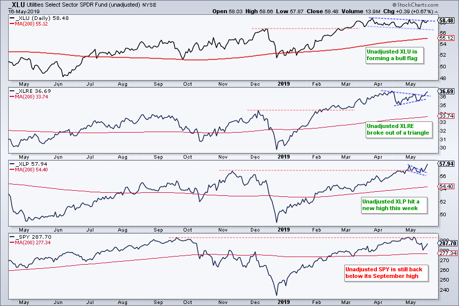
Even though the weight of the evidence is not bearish, risk-aversion is certainly in the air. The first chart shows unadjusted prices for the Utilities SPDR (_XLU), Real Estate SPDR (_XLRE), Consumer Staples SPDR (_XLP) and S&P 500 SPDR (_SPY). Precede the symbol with an underscore for unadjusted prices, which exclude dividends.
Two features stand out on the price charts. First, notice that SPY is back below its September high. In contrast, XLU, XLP and XLRE are above the 2018 highs. Second, XLP hit a new high this week, XLRE broke out of a triangle and XLU has a bull flag taking shape. These three have the strongest price charts of the eleven sector SPDRs.
Offensive Sectors Have Yet to Break Down
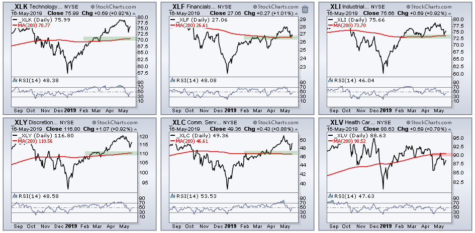
I am not going to extrapolate a bear market from strength in the defensive sectors. Bear markets come about when the offensive sectors start breaking down. The Technology SPDR (XLK), Consumer Discretionary SPDR (XLY), Financials SPDR (XLF), Industrials SPDR (XLI) and Communication Services SPDR (XLC) are above their 200-day SMAs. All five bounced this week. The trouble starts when/if the majority of these offensive sectors start breaking their 200-day SMAs. The Health Care SPDR (XLV), which is not an offensive sector, is the third biggest sector and below its 200-day. It is underperforming and the weakest of the big six sectors.
S&P 500 Gets a Bounce
The S&P 500 chart remains bullish overall. First and foremost, the index hit a new high in early May, it remains above the rising 200-day SMA and the 20-day is above the 200-day. $SPX bounced off the support zone after retracing around 25% of the prior advance (late December to early May).
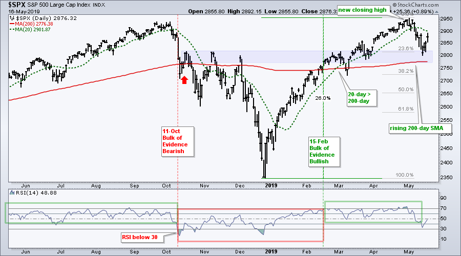
I am a bit concerned that this week's bounce could be similar to the mid October bounce (red arrow). The index fell sharply in early October and then bounced with a three-day move back above the 200-day SMA. This bounce did not last long as the second shoe dropped.
The index is currently in better shape than in mid October because it held above its 200-day SMA here in May and the breadth indicators remained net bullish. Nevertheless, I would be concerned that the second shoe may drop if the index closes below 2850.
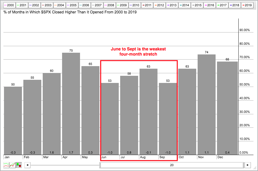
Keep in mind that the S&P 500 was up 26% in 86 days and the pullback was 5% in just 9 days. That's a pretty short correction. The weakest four month period of the year starts in June and I would not be surprised to see the market meander with some sort of consolidation. Corrections can involve both price and time.
A Bearish Failure Swing for the Russell 2000
The bearish failure swing is a bearish RSI signal from Welles Wilder, creator of RSI. Note that this signal is NOT the same as a bearish divergence, even though a bearish divergence also occurred.
A bearish failure swing has four parts: RSI moves above 70 (1), RSI falls back below 70 (2), RSI rises and fails to exceed 70 (3), RSI falls below the intermittent low (4). The failure occurs when RSI fails to exceed 70 on the bounce. Signal confirmation occurs when RSI breaks its prior low. The failure below 70 shows waning upside momentum, while the break below the prior low shows an increase in downside momentum.
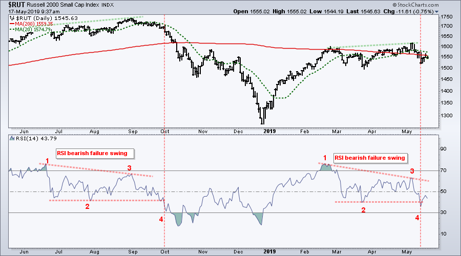
The chart above shows the Russell 2000 trading well below its September high and seriously lagging the S&P 500. The small-cap index is also back below its falling 200-day SMA. The indicator window shows RSI with two bearish failure swings in the last nine months. The first occurred in early October and foreshadowed a sizable decline. The second signal triggered this week when RSI broke below its March low.
Astute chartists will also notice that the Russell 2000 formed higher highs during each failure swing. Higher highs in the index and lower highs in RSI amount to a bearish divergence. Personally, I do not use bullish or bearish divergences in my analysis. Divergences are so 1990s! In addition, I am not sure if they add any value to this signal. As far as I am concerned, the falling 200-day SMA, underperformance and RSI break down point to weakness in the Russell 2000 and this is enough reason to avoid small-caps.
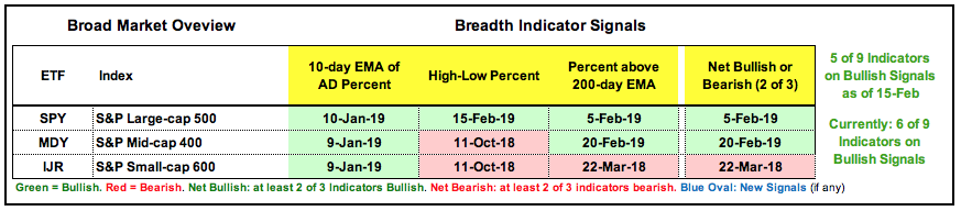
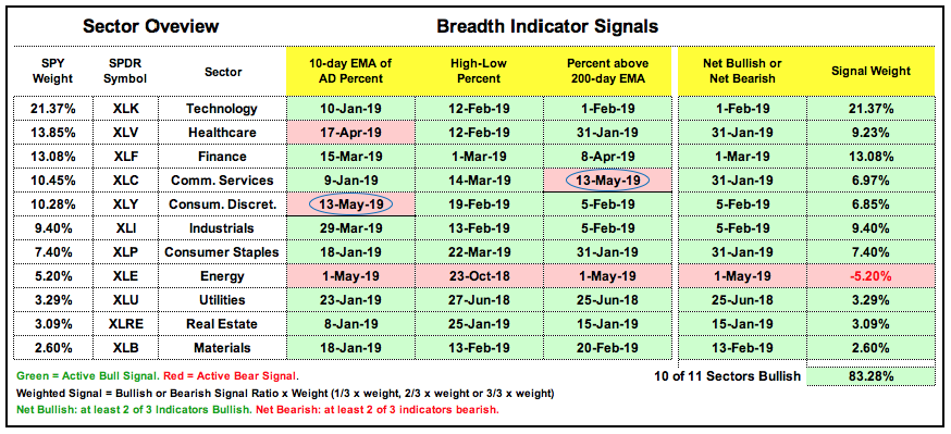
Large-caps Lead New High List
The index breadth table remains net bullish with six of the nine indicators on active bullish signals. S&P 500 High-Low% ($SPXHLP) exceeded 10% this week as staples, REITs and utilities led the new high list. Small-caps remain a drag with the Small-Cap %Above 200-day EMA (!GT200SML) below 50% (44.33%). This is also one of the three indicators with an active bearish signal.
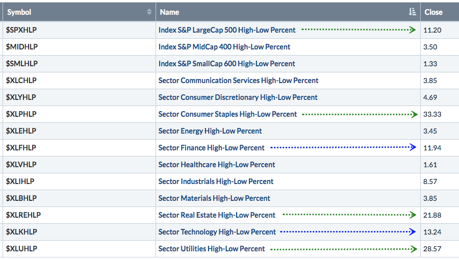
Discretionary and Communication Sectors Take Hits
The Consumer Discretionary SPDR (XLY) and Communication Services SPDR (XLC) led the May pullback with two bearish signals on Monday (17-May). The 10-day EMA of XLY AD Percent ($XLYADP) dipped below -30% and XLC High-Low% ($XLCHLP) exceeded -10%. All told, 6 of 33 possible signals are bearish and the Energy SPDR (XLE) is the only sector that is net bearish. The weight of the evidence is still bullish, but the weighted total fell to +83.28%. Keep in mind that these indicators only measure the large-caps sectors.
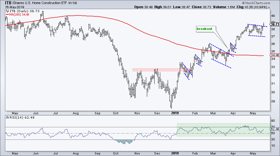
Housing versus Retail
Even though the index table is net bullish, 3 of 9 indicators (1/3) are bearish and this points to a sizable pocket of weakness within the market. We can see this split on the charts by looking within the consumer discretionary. The Home Construction iShares (ITB) remains strong and with another consolidation breakout this week. RSI has remained in the 40-80 zone all year.
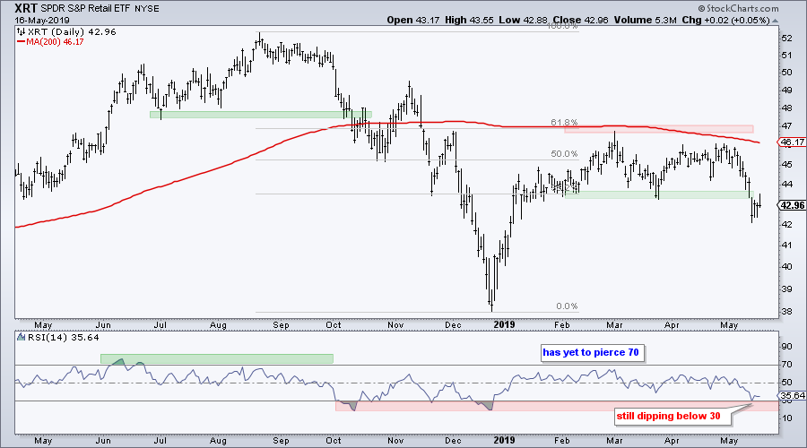
In contrast to ITB, the Retail SPDR (XRT) failed at the falling 200-day SMA and 50-61.8% retracement zone. The ETF broke down this week with a move below the March low and RSI dipped below 30 for the fifth time since October.
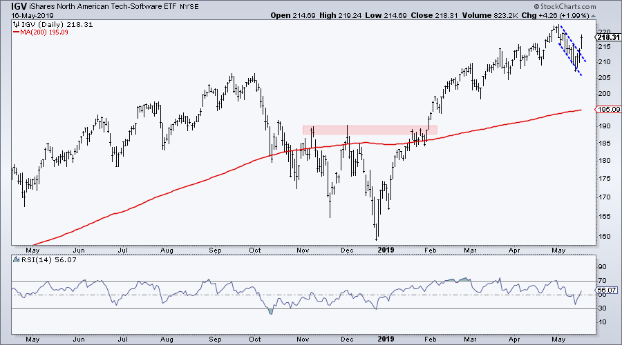
Software versus Semis
The next chart shows the Software iShares (IGV) surging over the last three days and breaking out of falling flag. This is one of the strong ETFs in the stock market right now. It hit a new high in early May and remains well above its rising 200-day SMA.
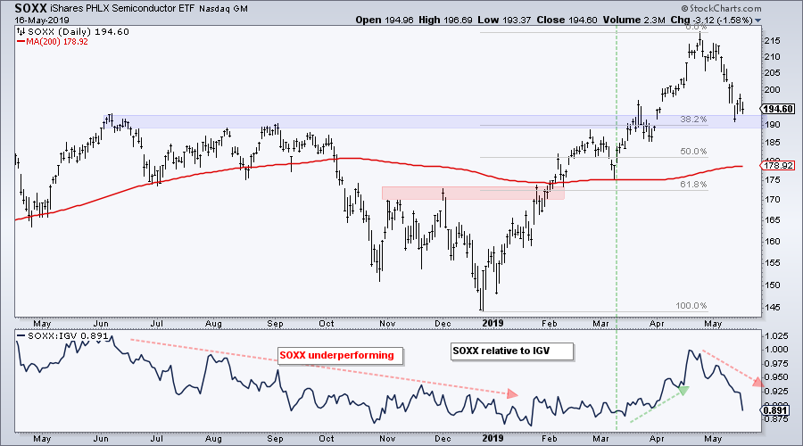
The Semiconductor iShares (SOXX) bounced on Tuesday-Wednesday, but fell back on Thursday and remains near Monday's low. Even though the big trend is up and the May decline is viewed as a correction, SOXX is lagging IGV since late April. SOXX could hold the key to the success or failure of this week's bounce. A bounce off support here would be positive for stocks, while a break below 190 would be negative. The indicator window shows the price relative falling from June to January, turning up in March-April and then falling sharply in May.
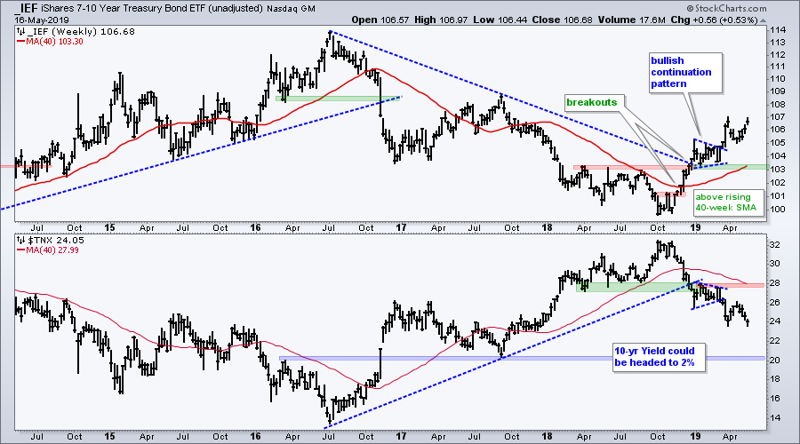
Treasury Bonds Extend on Breakouts
The 7-10 YR T-Bond ETF (IEF) and 20+ YR T-Bond ETF (TLT) are leading ETFs since October. Both surged in November, broke resistance levels in December, consolidated into January-February and turned up in March. They are currently well above their 2018 peaks and also well above their rising 40-week SMAs. Thus, the move this week is simply a continuation of a pre-existing uptrend. The indicator window in the chart below shows the 10-yr T-Yield ($TNX) on a path to 2%.
Measuring Risk with Bond Ratios
I do not want to draw conclusions on the stock market based on price action in the bond market, but there are some concerning charts in the fixed income area. Note that I would not turn bearish on stocks unless the breadth tables flipped and the S&P 500 broke down. Having said that, the next chart shows the S&P 500 with three ratio charts using bond ETFs. A ratio chart measures relative performance. The ratio rises when the numerator (riskier asset) appreciates faster than the denominator (safer asset). The first shows the ratio of stocks to bonds using the SPY:IEF ratio. Notice that stocks have been outperforming since late December, but this ratio remains well below the October peak. The ratio turned down in May and a break below the March lows would suggest that stocks are again underperforming bonds. This stock-bond pair is the ultimate risk on-off pair and a break below the March low would suggest risk aversion in the market.
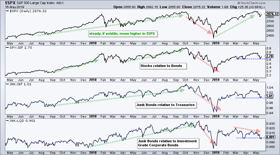
The next ratio shows the High Yield Bond SPDR (JNK) relative to the 7-10 YR T-Bond ETF (IEF). Junk bonds act like stocks so it is no surprise to see parallels with the SPY:IEF ratio. Again, a break below the March low would suggest risk-aversion in the bond market. The last window shows the High Yield Bond SPDR relative to the Investment Grade Bond ETF (LQD). Notice that this ratio formed a lower high in April and moved below its March low in May.
Yield Spread Ticks Higher
The yield spread moved above 4 this week and is near the March high. The higher low in the yield spread from October to April shows less confidence in the credit markets over the last nine months. Further strength above the March high would suggest more tightening in the credit markets and this would be negative for stocks.
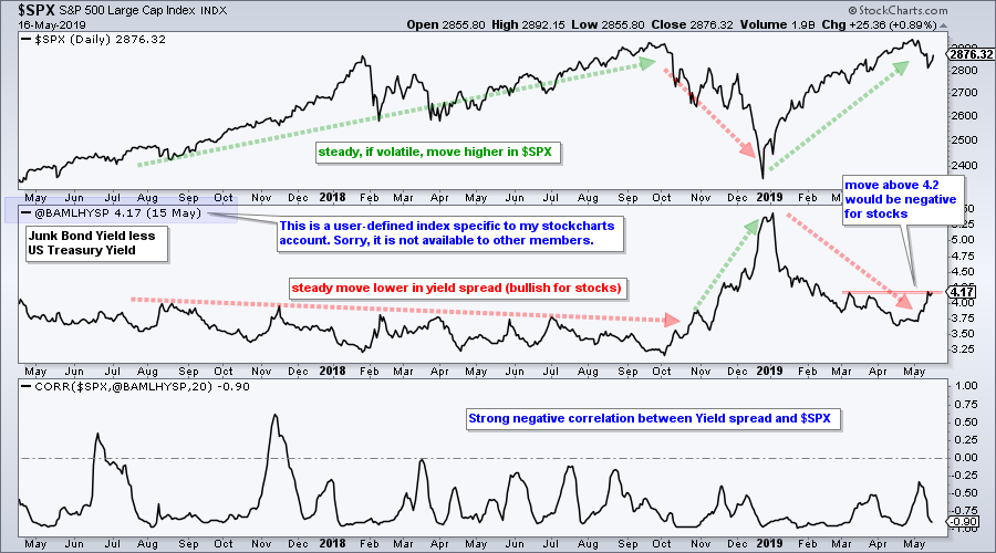
The symbol @BAMLHYSP is a user-defined index based on a data series from the St. Louis Fed database (FRED). StocksCharts members can chart user-defined indexes that they created, but these cannot be shared with other members (sorry). You can learn more about user-defined indexes in this support article and more about the data series at the St. Louis Fed site.
Art's Charts ChartList Update
The Art's Charts ChartList has been updated. There are only six active charts on this list currently. BERY and SMTC closed below their re-evaluation levels and will be removed. Note that this ChartList will change in the coming weeks and be based on a more systematic approach to picking stocks. The picks will be based on a scan and I will share the scan code, as well as the general strategy. Click here for the Art's Charts ChartList
Questions, Comments or Feedback?
I do not take symbol request and I cannot promise to response to all correspondence, but I will read it and take into under consideration. I greatly appreciate all feedback because it helps me improve the commentary and provides ideas for the future.

Plan your trade and trade your plan.
Arthur Hill, CMT
Senior Technical Analyst, StockCharts.com
Author, Define the Trend and Trade the Trend
Want to stay up to date with Arthur's latest market insights?
– Follow @ArthurHill on Twitter
– Subscribe to Art's Charts
– Watch On Trend on StockCharts TV (Tuesdays / Thursdays at 10:30am ET)


