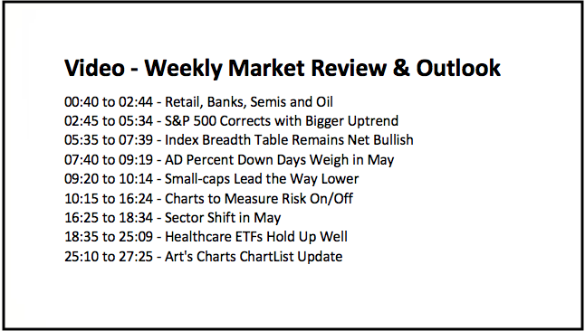
- Retail, Banks, Semis and Oil.
- S&P 500 Corrects with Bigger Uptrend.
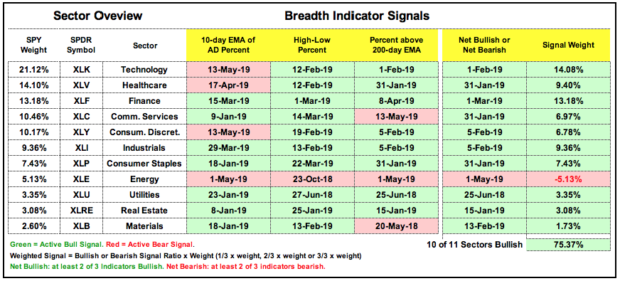
- Index Breadth Table Remains Net Bullish.
- AD Percent Down Days Weigh in May.
- Small-caps Lead the Way Lower.
- Charts to Measure Risk On/Off.
- Sector Shift in May.
- Sector Breadth Table Remains Bullish.
- Healthcare ETFs Hold Up Well.
- Art's Charts ChartList Update.
 ... Retail, Banks, Semis and Oil
... The stock market is quite mixed with large-caps holding up, small-caps breaking down and mid-caps somewhere in the middle. Even though large-caps are holding up, signs of risk aversion and pockets of weakness within the stock market are cause for concern going forward.
The Retail SPDR (XRT) did not come close to its September highs this year and broke down in May. The Regional Bank SPDR (KRE) also fell well short of its summer highs and did not even exceed its February high. The Semiconductor iShares (SOXX) led the market lower in May with a double digit decline. Light Crude Continuous Contract ($WTIC) formed a lower high from October to April and broke below its 200-day.
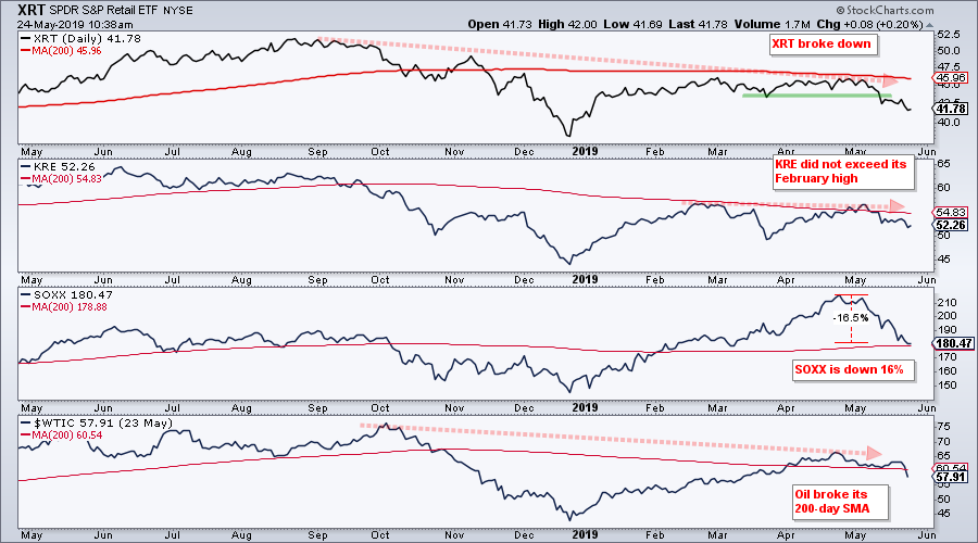
Even though there are pockets of strength within the technology sector (software) and finance sector (insurance), the pockets of weakness seem to be expanding, as is risk aversion. Also notice that the worst four month period begins in June and the Russell 2000 iShares has an active bearish failure swing in RSI. At best, this points to a choppy period ahead for stocks. At worst, it points to a deeper correction or perhaps even a regime switch from bullish to bearish.
S&P 500 Corrects within Bigger Uptrend
The S&P 500 hit a new high in early May and then fell back towards its flattening 200-day SMA. The long-term trend remains up, but the short-term trend is clearly down and this means the index is in corrective mode. The extent of this correction and the next "support" level are anyone's guess. As of Thursday's close, the index is down a whopping 4.2% the last 17 days. I will take my cues from the breadth indicators, the 200-day SMA and the 20/200 cross. Right now, price is above the 200-day, the 20-day is above the 200-day and all three breadth indicators are on bull signals.
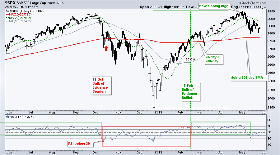
Even though the breadth indicators are still bullish, the index has clearly lost some upside momentum as RSI broke below 40 and to its lowest level since late December. The RSI bull range extends from 40 to 80, and the bear range from 20 to 60. An RSI move back above 60 is needed for the index to get its mojo back. The gray line shows the 50-day SMA. I do not normally use this moving average, but it is widely followed and the index failed at this moving average this week. A move back above 2880 would fill Thursday's gap and retake the 50-day.
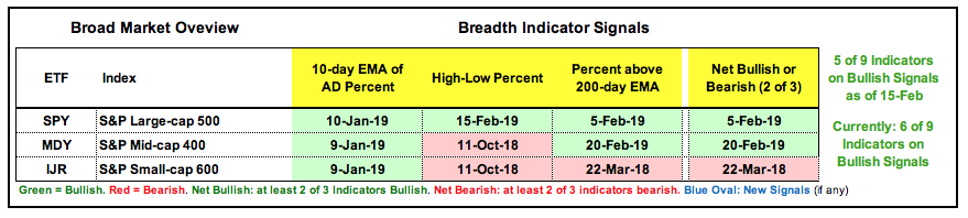
Index Breadth Table Remains Net Bullish
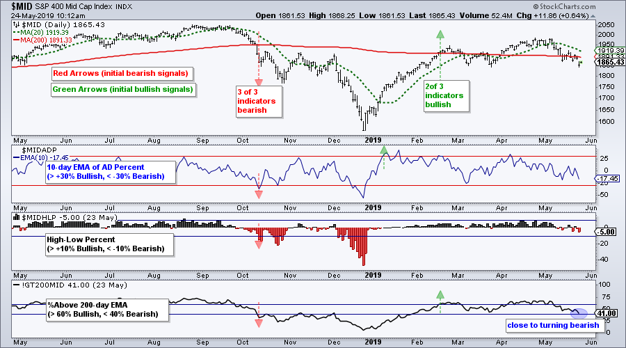
There is no change in the index breadth table, but Mid-Cap %Above 200-day EMA (!GT200MID) is close to flipping. A move below 40% would flip this indicator and reduce the bullish signals from 6 to 5 (of 9). Either way, this is a pretty split market when looking at the S&P 1500 as a whole (large-caps, mid-caps and small-caps). Some say it is a stock pickers paradise, but picking winning stocks in such a mixed environment is a tough.
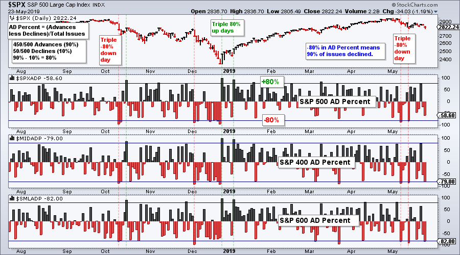
AD Percent Down Days Weigh in May
Speaking of mojo, the breadth indicators lost their mojo in May with two triple 80% down days in AD Percent. An 80% down day in AD Percent means 90% of issues in the index declined. A triple 80% down day occurs when AD Percent for the S&P 500, S&P Mid-Cap 400 and S&P Small-Cap 600 exceeded -80%. This occurred on May 7th and 13th. AD Percent for the S&P 500 and S&P Mid-Cap 400 surged to +79% on Tuesday, but S&P SmallCap AD Percent ($SMLADP) fell well short. Chartists looking for a bullish catalyst can watch for another triple +80% up day. At the very least, we should see two of the three exceed +80% and the other come close.
Small-caps Lead the Way Lower
The S&P Small-Cap 600 started underperforming in early May because it failed to take out its late February high, which the S&P 500 did. The index moved back below its 200-day in mid May and below the March low this week. Thus, we have a lower high from late August to late February and now a lower low over the last few months. The move back to the 1000 area looks like a counter-trend bounce and this week's breakdown signals a continuation of the August-December decline.
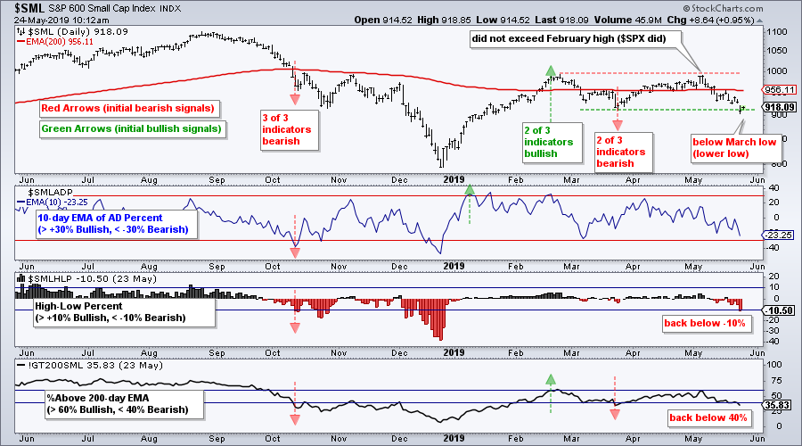
The breadth indicators turned net bearish in late March when the Small-Cap %Above 200-day EMA (!GT200SML) moved below 40%. S&P 600 High-Low% ($SMLHLP) was still on a bearish signal from October and this March signal put two of the three on active bearish signals. High-Low Percent is back below -10% and %Above 200-day is back below 40% as small-caps lead the way lower.
Charts to Measure Risk On/Off
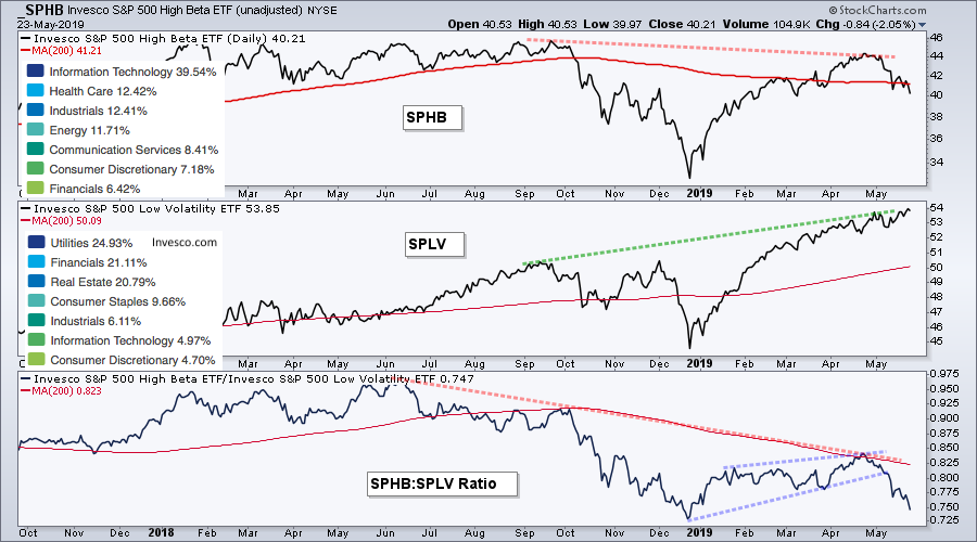
In addition to weakness in small-caps, there are more signs of risk aversion brewing in the markets. The first chart shows the S&P 500 High Beta ETF (SPHB), the S&P 500 Low Volatility ETF (SPLV) and relative performance (SPHB:SPLV). The top sector holdings are also shown on the chart. First, note that SPHB is heavy on the technology sector (~40%), while SPLV is heavy on utilities and REITs (~45%). Second, notice that SPHB formed a lower high from September to April as SPLV formed a higher high. High beta (risk) stocks were lagging low volatility (risk) stocks on the price chart. The lower window shows the SPHB:SPLV ratio forming lower highs since late summer and breaking down in May. These charts show that stock market clearly prefers low risk stocks over high risk stocks.
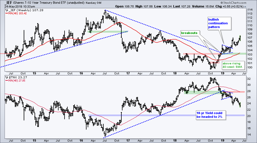
Bonds were strong again this week as the 7-10 YR T-Bond ETF (IEF) surged to another new high this year. The next chart shows stocks relative to bonds (IEF:SPY ratio) and junk bonds relative to Treasuries (JNK:IEF). Stocks outperformed bonds and junk bonds outperformed Treasuries as these ratios rose the first four months of the year (risk-on), but the tables flipped in May (risk-off). A breach of the spring lows in these ratios would show further risk-aversion in the credit markets and this could be negative for stocks.
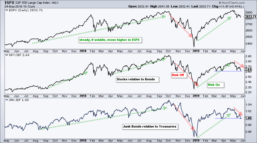
The yield spread backed off its March highs and fell back to 4.03 this week. The higher low in the yield spread from October to April shows less confidence in the credit markets over the last nine months (risk aversion). Further strength above the March high would suggest more tightening in the credit markets and this would be negative for stocks.
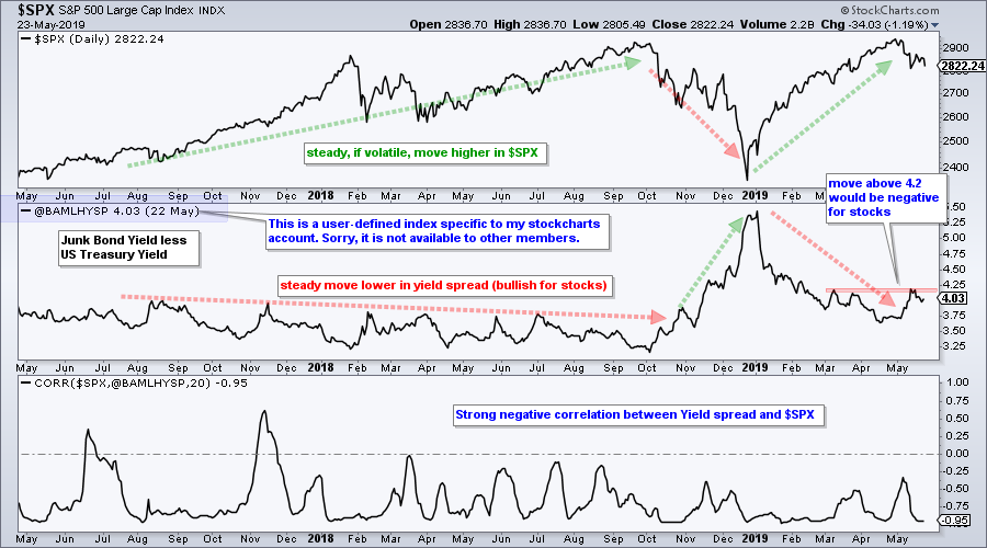
The symbol @BAMLHYSP is a user-defined index based on a data series from the St. Louis Fed database (FRED). StocksCharts members can chart user-defined indexes that they created, but these cannot be shared with other members (sorry). You can learn more about user-defined indexes in this support article and more about the data series at the St. Louis Fed site.
Sector Shift in May
The next chart shows performance for the 11 sector SPDRs and SPY over the first four months (bottom half) and the current month (top half). Notice that tech, consumer discretionary, communication services and industrials were leading the first four months. Tech is now the second worst performing sector in May, while consumer discretionary, finance and industrials are down more than SPY (leading lower). The offensive sectors are leading this decline.
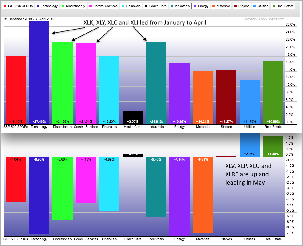
Healthcare, staples, utilities and REITs are the only sectors that gained in both periods (January to April and May). These are the true leaders in the market right now. XLU and XLRE are up around 2% in May and following the bond market higher because they are bond proxies.
Sector Breadth Table Remains Bullish
Despite the sector shift, the sector breadth table remains net bullish and this reflects strength in large-caps overall (S&P 500). Energy is the only sector that is net bearish. Tech, healthcare, communication services, materials and consumer discretionary each have one bearish indicator. All told, some 75.4% of the sector weightings are bullish and this is enough to hold up the S&P 500.
Healthcare ETFs Hold Up Well
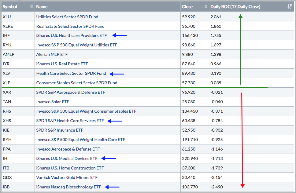
The S&P 500 hit a new closing high on April 30th and then fell 4.2% over the last seventeen days (closing basis). Stocks and ETFs showing gains during this period are holding up well, while stocks and ETFs with smaller losses are showing relative strength (less weakness). The table below shows some sector and industry group ETFs with the 17-day Rate-of-Change. Six of these ETFs are healthcare related and this is an area to consider going forward. Yes, I see the Gold Miners ETF (GDX) on the list, but I am not taking the bait with a strong Dollar!
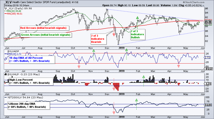
The first chart shows the Health Care SPDR (XLV) with two of the three breadth indicators turning bullish on January 31st. Even though the 10-day EMA of HealthCare AD Percent ($XLVADP) triggered bearish on April 17th, the other two remain on bullish signals. Thus, the sector is still net bullish. On the price chart, XLV formed a large triangle consolidation. A break above the triangle line, 200-day and early May high would be bullish.
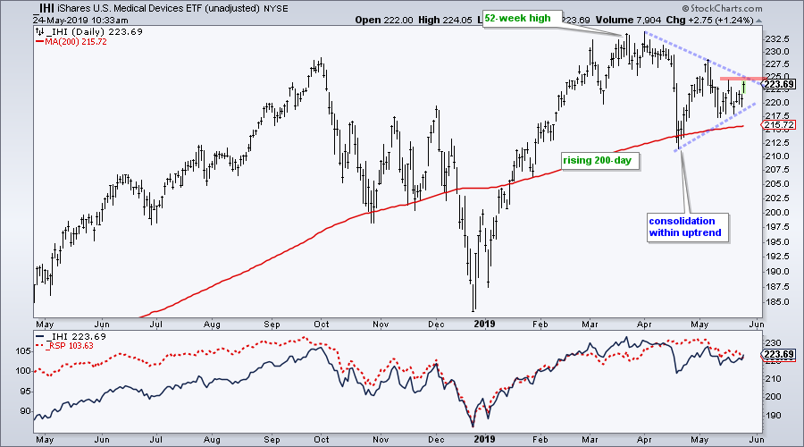
The Medical Devices ETF (IHI) is stronger than XLV because it is above its rising 200-day SMA. In addition, the ETF hit a new high in late March and remains in an uptrend overall. Healthcare stocks were hit hard in mid April with a political scare and have since largely consolidated. IHI formed a triangle over the last several weeks and a breakout at 225 would be bullish.
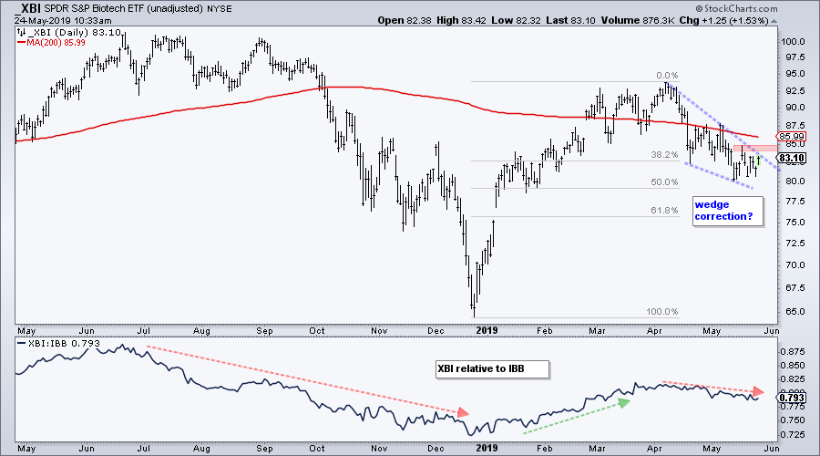
The next chart shows the Biotech SPDR (XBI), which is below its falling 200-day SMA. Despite an overall downtrend, XBI is at an interesting juncture and represents an alternative to XLK. After a big surge from late December to mid April, the ETF retrace around 50% with a falling wedge to the low 80s. The pattern and the retracement are typical for corrections after big moves. Watch for a move above 85 for a breakout.
Art's Charts ChartList Update
The Art's Charts ChartList has been updated. There are only four active charts on this list currently. Note that this ChartList will change in the coming weeks and be based on a more systematic approach to picking stocks. The picks will be based on a scan and I will share the scan code, as well as the general strategy.
Click here for the Art's Charts ChartList
Questions, Comments or Feedback?
I do not take symbol request and I cannot promise to response to all correspondence, but I will read it and take into under consideration. I greatly appreciate all feedback because it helps me improve the commentary and provides ideas for the future.

Plan your trade and trade your plan.
Arthur Hill, CMT
Senior Technical Analyst, StockCharts.com
Author, Define the Trend and Trade the Trend
Want to stay up to date with Arthur's latest market insights?
– Follow @ArthurHill on Twitter
– Subscribe to Art's Charts
– Watch On Trend on StockCharts TV (Tuesdays / Thursdays at 10:30am ET)