- Small-caps and 3 Sectors Weigh.
- Everywhere and Nowhere.
- Immediate Trend is Still Up.
- Another Possible Support Zone.
- Index Breadth Table Survives 90% Down Days.
- Yield Spread Remains Positive for Stocks.
- Mean-Reversion Setup Brewing.
- Art's Charts ChartList Update.
 ... Small-caps and 3 Sectors Weigh
Stocks came under broad pressure in May, but the bulk of the evidence remains bullish for the stock market. Note that the S&P 500 and the Nasdaq 100 are still well above their rising 200-day SMAs. Both were up substantially from late December to April and could correct back towards these moving averages. Pockets of weakness surface as we move down the market cap scale. The S&P Mid-Cap 400 and Russell 2000 are barely above their 200-day SMAs, but the S&P Small-Cap 600 fell back below its 200-day this week.
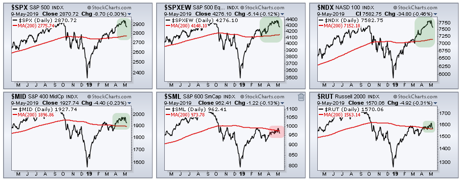
Eight of the eleven sector SPDRs are above their 200-day SMAs. The Materials SPDR, Energy SPDR and Health Care SPDR are below their 200-day SMAs and are the lagging sectors according to this metric. Nevertheless, the majority of sectors are above their 200-day SMAs and this supports a bullish environment for the stock market as a whole. The real trouble starts if/when the big sectors start breaking below their 200-day SMAs.
Everywhere and Nowhere
Let's start with a weekly chart for some perspective over the last eighteen months. Basically, the S&P 500 has been everywhere and nowhere since January 2018. There were higher highs and lower lows as the swings in the index progressively widened from 12% to 26%. The index recorded another new high in early May and then fell this week. Even with this week's decline, the S&P 500 is still less than 5% from an all time high. That is not much of a downtrend.
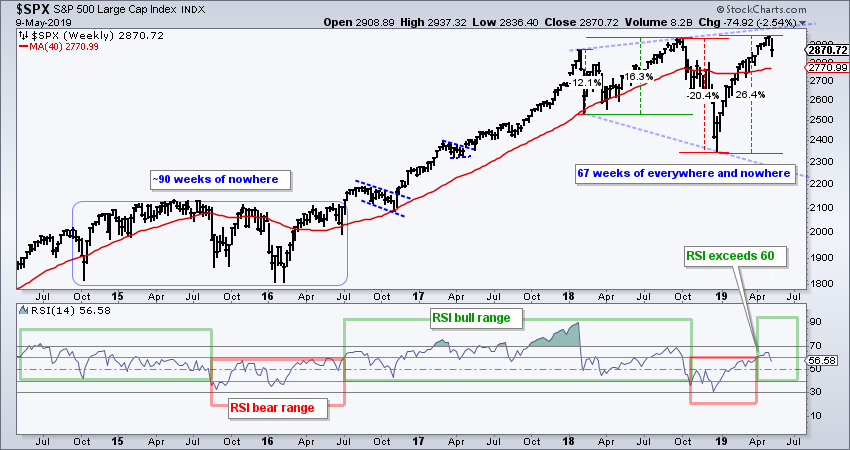
Trading and investing was relatively easy from July 2016 until January 2018 as the index climbed in a methodical manner with relatively low volatility. We do not need the VIX to understand that the volatility regime has shifted higher since January 2018. The widening swings, higher highs and lower lows show a roller coaster market that is somewhat out of control.
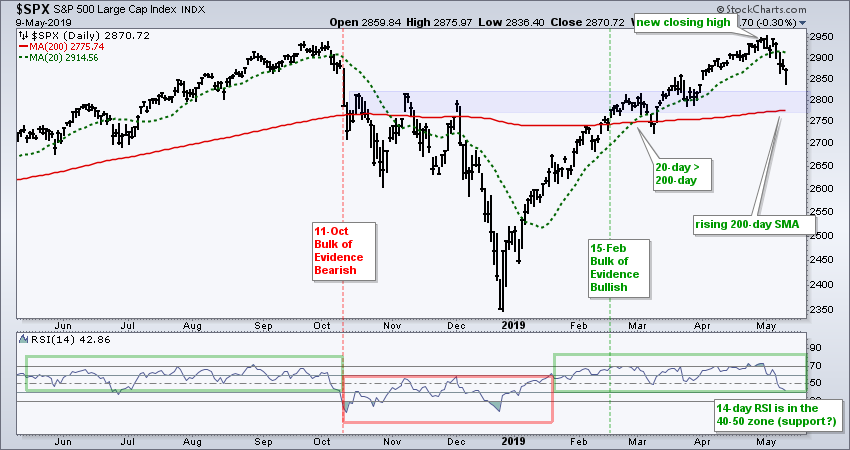
Immediate Trend is Still Up
Despite a roller-coaster since January 2018, the current swing remains up and the breadth tables remain net bullish. The S&P 500 is above its rising 200-day SMA and the 20-day SMA is above the 200-day SMA. The blue zone marks a possible support zone based on broken resistance and the 200-day SMA. Support zones are just that: zones that mark an area for potential buyers to step in.
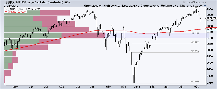
Another Possible Support Zone
I have railed on the concept of support and resistance for indexes and ETFs before and will do it again. The science for support and resistance levels is very imprecise (subjective), especially for an index that has over one hundred moving parts (stocks). As an aside, note that the top 50 stocks in the S&P 500 account for 52% of its market cap, while the bottom 450 account for 48% (hat tip to Carter Worth and CNBC).
The chart below shows another possible support zone based on Volume-by-Price and the Fibonacci Retracements Tool. This zone is below the 200-day SMA and near the early March low. Basically, the index could find support anywhere between 2700 and 2850, as long as the bulk of the evidence remains bullish. I will abandon the thought of finding support if/when the bulk of the evidence turns bearish.
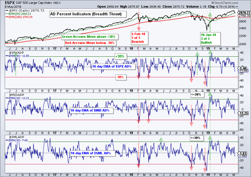
Index Breadth Table Survives 90% Down Days
There were no changes to the index and sector breadth tables. As noted on Wednesday, AD Percent for the S&P 500, S&P Mid-Cap 400 and S&P Small-Cap 600 exceeded -80% on Wednesday, which means more than 90% of issues decline. This shows broad selling pressure. These triple 90% down days also occurred on October 10th and December 4th, and further weakness ensued.
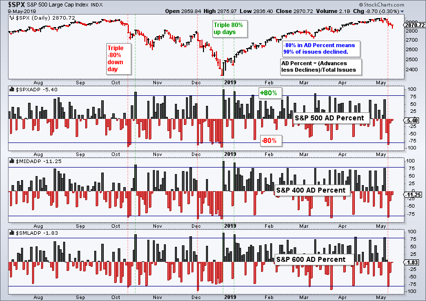
While the 90% down day is short-term negative, the 10-day EMAs of AD Percent have yet to trigger bearish signals with moves below -30%. Thus, the bullish signals from early January remain in play. Further weakness and downside follow through are needed to trigger bigger bearish signals. Then, and only then, will I consider turning medium/long term bearish.
Yield Spread Remains Positive for Stocks
The chart below shows the S&P 500 in the top window, the yield spread in the middle window and the Correlation Coefficient (yield spread, S&P 500) in the lower window. The yield spread is the yield on junk bonds less the yield on Treasury bonds. A high or rising yield spread signals stress in the credit markets and this can be negative for stocks. Right now, the yield spread is below 4%. It is low and falling, which is positive for stocks. A move above 4.2% would suggest tightening in the credit markets and this would be negative for stocks.
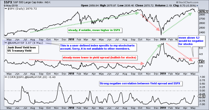
The symbol @BAMLHYSP is a user-defined index based on a data series from the St. Louis Fed database (FRED). StocksCharts members can chart user-defined indexes that they created, but these cannot be shared with other members (sorry). You can learn more about user-defined indexes in this support article and more about the data series at the St. Louis Fed site.
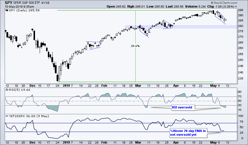
Mean-Reversion Setup Brewing
At this point, I view the May decline as a short-term pullback within a bigger uptrend because the bulk of the evidence remains bullish. If we remove China trade tariffs, the Fed, earnings, and the Kardashians from our brains, and just focus on price, a short-term mean-reversion setup is in the making. For those unfamiliar with my mean-reversion strategy, here is a System Trader article using RSI(5) and the Chandelier Exit. There is also video explaining the strategy in detail.
The chart below shows SPY with RSI(5) becoming short-term oversold (<30) and the S&P 500 %Above 20-day EMA (!GT20SPX) just above an oversold reading (<30%). The science of oversold is like the science of support (a bit imprecise). An RSI move back above 30 would provide the first sign that prices are turning up, as would a break above the wedge line on the price chart. With mean-reversion systems, it is important to plan your exit BEFORE entering the trade. Mean-reversion trades are short-term (a few days to a few weeks) and exits usually trigger on the first bounce, which could occur now or off the 280 area.
Art's Charts ChartList Update
The Art's Charts ChartList has been updated. There are only eight charts on this list currently. I would like to add more, but I cannot annotate and comment on 20 to 30 charts per week. This ChartList will change next week and be based on a more systematic approach to picking stocks. The picks will be based on a scan and I will share the scan code, as well as the general strategy.
Questions, Comments or Feedback?
I do not take symbol request and I cannot promise to response to all correspondence, but I will read it and take into under consideration. I greatly appreciate all feedback because it helps me improve the commentary and provides ideas for the future.

Plan your trade and trade your plan.
Arthur Hill, CMT
Senior Technical Analyst, StockCharts.com
Author, Define the Trend and Trade the Trend
Want to stay up to date with Arthur's latest market insights?
– Follow @ArthurHill on Twitter
– Subscribe to Art's Charts
– Watch On Trend on StockCharts TV (Tuesdays / Thursdays at 10:30am ET)


