- Small-caps Still Lagging.
- S&P 500 Establishes Clear Support Zone.
- Breadth Falls Short and Fades.
- $SPX Close + 200-day SMA = NOISE!
- A Mixed, but Bullish, Indicator Table.
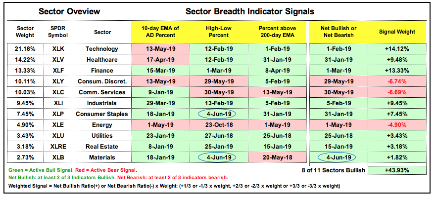
- Sector Table Remains Firmly Bullish.
- New Highs Surge within S&P 500.
- New Highs in Finance Sector.
- Medical Devices, Defense and Solar Lead.
- Art's Charts ChartList Update.
 ... Small-caps Divide the Market
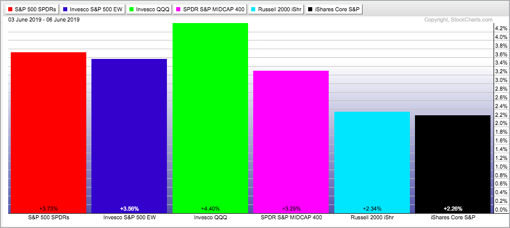
May belonged to the bears and June is starting out in favor of the bulls. However, not all bulls are created equally and small-caps continue to lag. The S&P 500 SPDR and EW S&P 500 ETF gained 3.73% and 3.56% over the last three days, but the Russell 2000 iShares and S&P SmallCap iShares were up 2.34% and 2.26%, respectively. The S&P 500 is within 5% of a 52-week high, which was in early May. The Russell 2000 is more than 10% from its 52-week high, which was on August 31st.
The market is clearly bifurcated with large-caps holding up, small-caps dragging and mid-caps somewhere in the middle. The S&P 500 accounts for some 80% of the total market cap for the US equity market and remains the 800-pound gorilla in the room. Despite the negatives out there, the S&P 500 has yet to break down and the weight of the evidence is still bullish for this benchmark index.
Despite a bullish environment overall, there are plenty of negatives out there and June marks the start of the weakest four month stretch for stocks. The S&P 500 was up some 25% from late December to late April (four months) and entitled to a corrective period. On a closing basis, the index fell around 7% in May and this is still normal for a correction within a bigger uptrend. Looking into the crystal ball, I would not be surprised if we see choppy/corrective trading in the coming weeks or months.
S&P 500 Establishes Clear Support Zone
The S&P 500 broke its 200-day moving average last week and reversed the break with a three day surge this week. Long-term, the 20-day is currently above the 200-day and there are two strong bounces off the 2720-2750 area (March and June). This area marks a clear support zone going forward and a close below 2720 would be quite negative, especially if the 20-day crosses below the 200-day.
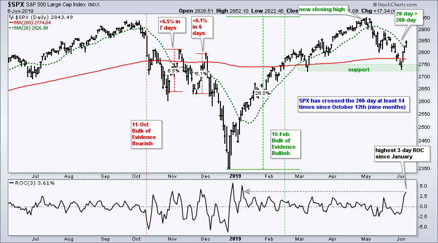
The indicator window shows the 3-day Rate-of-Change hitting 3.61% and its highest level since the January breadth thrust. Even though I am not bearish on the S&P 500 right now, short-sharp advances are often associated with bear market bounces. Notice the 6+ percent advances in October-November, which also occurred near the 200-day SMA.
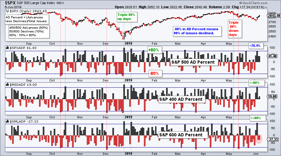
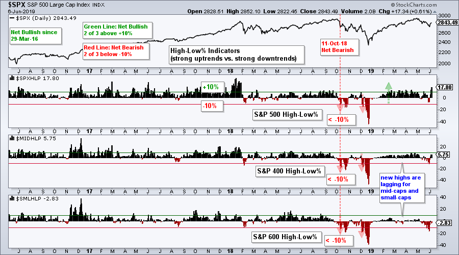
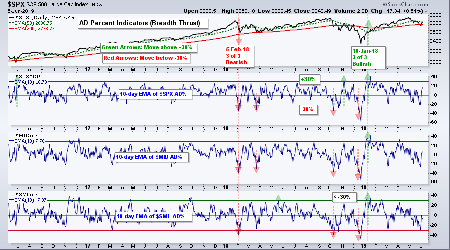
Breadth Falls Short and Fades
Uninspiring breadth is the reason I am throwing a little cold water on the three day surge. The next chart shows AD Percent for the S&P 500, S&P Mid-Cap 400 and S&P 500. $SPX AD Percent did not exceed +80% on Tuesday and did not exceed +50% on Wednesday-Thursday. AD Percent did exceed +80% for $MID and $SML and this is a bullish breadth thrust. However, $SML AD Percent turned negative the last two days (red oval)! Overall, we did not get a triple 80% up day on Tuesday and follow through on Wednesday-Thursday was mixed. This makes the three day surge a little suspect.
In a separate, but possibly related note, the early June bounce could also be part of the bullish bias at the turn of the month. This System Trader study showed a strong positive bias extending from the last four days of one month to the first four days of the next month. The fourth day of the next month ended on Thursday.
$SPX Close + 200-day SMA = NOISE!
There is always a lot of noise around the 200-day SMA as the index crossed this "key" level 157 times over the last twenty years. Most of these crosses resulted whipsaws and only a few foreshadowed meaningful trend reversals. Chartists can greatly improve performance by using a 20-day SMA instead of the close. In contrast to the close/200-day cross, the 20-day SMA has crossed the 200-day SMA just 29 times over the last twenty years. There were also several whipsaws with this cross, but far fewer and overall performance is much better. Buy and hold is the only way to eliminate whipsaws!
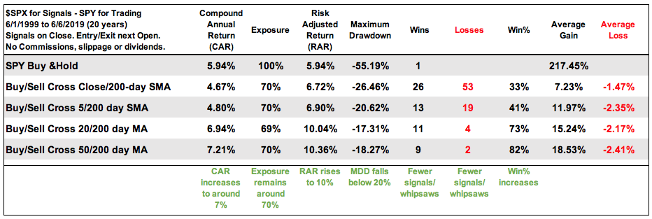
The table shows performance when trading SPY based on moving average signals in the S&P 500. I use the S&P 500 for signals because it is the most widely follow benchmark and there are no dividends, which can affect the signals. The green notes at the bottom show the highlights. In a nutshell, performance improves as we move from the Close/200-day cross to the 50/200-day cross. Return increases, drawdowns decrease and winning percent increases.
The 20-day/200-day SMA cross is my preferred combination for the S&P 500 and I will continue to watch this pair closely.
Note that I discussed various moving average signals for the S&P 500, S&P Mid-Cap 400, S&P Small-Cap 600 and Nasdaq 100 in On Trend this past Thursday. The 200-day does not work well with the small-cap and mid-cap indexes, but performance can be improved by cueing off the S&P 500 for signals. And finally, we will find out if directional changes in the 200-day have any predictive power. Hint: they do not. Click here to watch.
A Mixed, but Bullish, Indicator Table
There is a discrepancy with the index indicator table and this discrepancy reflects the split nature of the broader market. Let me explain....There are three indicator groups: the 10-day EMA of AD Percent, High-Low Percent and %Above 200-day EMA. There are three indexes: S&P 500, S&P Mid-Cap 400 and S&P Small-Cap 600. Technically, the indicator group turns bullish/bearish when at least two of the three are on active bullish/bearish signals.
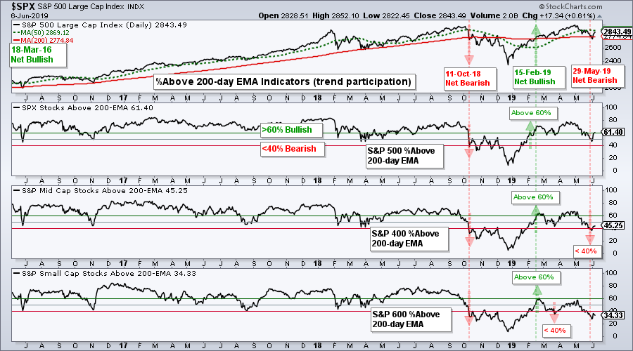
Two of the three signals are bearish for High-Low Percent (since October 11th) and %Above 200-day EMA (since May 29th). Blame small-caps and mid-caps. This means these two indicator groups are net bearish.
The 10-day EMAs of AD Percent triggered bullish with breadth thrusts on January 10th and have yet to reverse these signals bearish. Thus, two indicator groups are net bearish and one is net bullish.
With three indicators and three indexes, there are nine possible signals. Currently, five signals are bullish (green) and four are bearish (red). The S&P 500 has three active bullish signals, while the S&P Mid-Cap 400 and S&P Small-Cap 600 have one active bullish signal each. Thus, the majority of signals are bullish and this gives the stock market a slight bullish edge. IMHO.
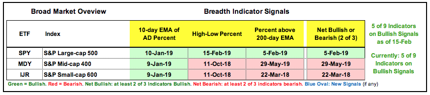
Keep in mind that technical analysis is part art and part science. There is some science (rational) behind these signals, but there is also some art involved in the interpretation.
Sector Table Remains Firmly Bullish
The bulk of the evidence remains bullish on the sector breadth table and there were two new bullish signals. The XLP High-Low% ($XLPHLP) surged above +10% on Wednesday and reached +33.33% on Thursday. Lots of new highs in consumer staples. The XLB High-Low% ($XLBHLP) also surged above +10% on Tuesday and reached 19.23% on Thursday. Ecolab (ECL), Ball Corp (BLL), Linde (LIN) and Vulcan Materials (VMC) hit new highs. Overall, the weight of the evidence is bullish with 8 of 11 sectors net bullish, 23 of 33 signals bullish and the signal weight at +44% (range is from -100 to +100).
New Highs Surge within S&P 500
It is hard to get too bearish on the S&P 500 when the index manages 93 new highs on a three day advance. That means 18.6% of stocks in the S&P 500 recorded new highs on Thursday and this is also the most new highs since January 2018! That ain't chicken scratch. There were 32 new highs (8%) in the S&P Mid-Cap 400 and 18 new highs in the S&P Small-Cap 600 (3%). Even though 3% is chicken scratch, there are at least 143 stocks within the S&P 1500 in strong uptrends. Such numbers are usually not found in a bear market environment.
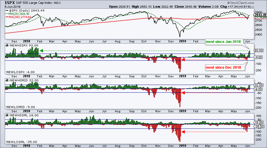
The new highs prove that there are uptrends out there and good stock picking can be rewarded. Also note that the S&P 500 went from the most new lows in six months to the most new highs in 17 months in the space of a week. This abrupt switch simply affirms that we are in volatile times. Also notice that new lows reached 100 in the S&P Small-Cap 600 last week and there is still a lot of weakness within the small-cap universe.
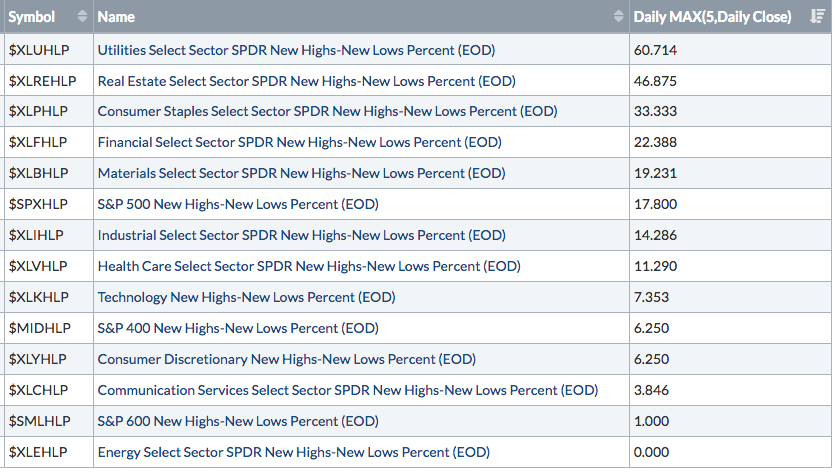
New Highs in Finance Sector
Last week I ran a scan to measure the lowest low value of High-Low Percent for the 11 sectors and 3 major indexes. Today I am running the opposite scan by looking for the highest high value of High-Low Percent this week. What a difference a week makes! Utilities, REITs and Staples are the leading sectors for new highs. Finance is in fourth place as XLF got a nice bounce the last three days. The S&P Small-Cap 600 barely turned positive this week and there were no new highs in the Energy sector.
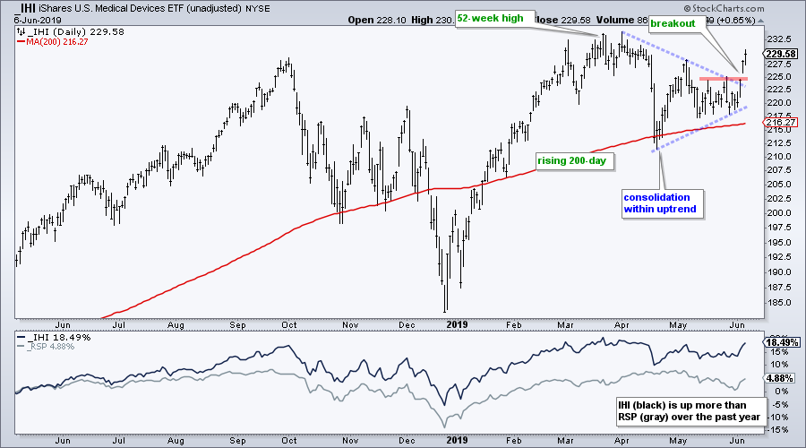
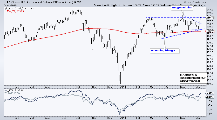
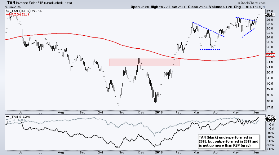
Medical Devices, Defense and Solar Lead
The Medical Devices ETF (IHI) turned red hot this week with a break above the triangle line and late May highs. The ETF is also in a bigger uptrend with a 52-week high in late March and price is above its 200-day SMA. The indicator window shows IHI (black) outperforming the EW S&P 500 ETF (RSP).
The Aerospace & Defense iShares (ITA) surged off the 200-day SMA this week and has an ascending triangle working. Within this pattern, the ETF broke out of a falling wedge. An ascending triangle breakout would signal a continuation of the prior advance and target a move to new highs.
The Solar Energy ETF (TAN) held up very well in May by forming a triangle consolidation. The ETF broke out of this triangle this week and is very close to a new high. This is one of the strongest ETFs since March and a clear leader.
Art's Charts ChartList Update
The Art's Charts ChartList will change next week. I am putting the final touches on a scan and running some tests. This scan will find stocks in strong uptrends and I will make additions to the ChartList based on this scan. Stay tuned....
Click here for the Art's Charts ChartList
Questions, Comments or Feedback?
I do not take symbol request and I cannot promise to response to all correspondence, but I will read it and take into under consideration. I greatly appreciate all feedback because it helps me improve the commentary and provides ideas for the future.

Plan your trade and trade your plan.
Arthur Hill, CMT
Senior Technical Analyst, StockCharts.com
Author, Define the Trend and Trade the Trend
Want to stay up to date with Arthur's latest market insights?
– Follow @ArthurHill on Twitter
– Subscribe to Art's Charts
– Watch On Trend on StockCharts TV (Tuesdays / Thursdays at 10:30am ET)


