- The Long and Rocky Road.
- S&P 500 Maintains Bullish Bias.
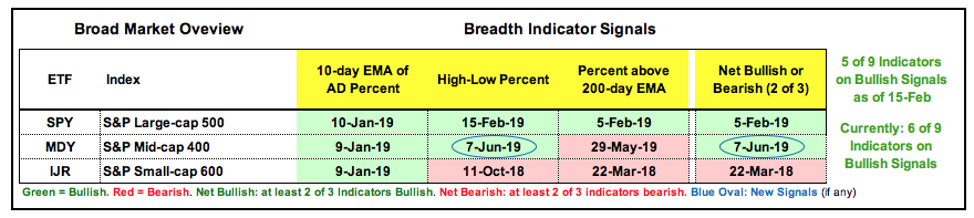
- Index Breadth Table Improves.
- MDY and IWM Break Out of Wedges.
- Sector Breadth Table Gets Four New Signals.
- Healthcare Perking Up.
- Big Six Sectors Trigger Breakouts.
- Utes, REITs and Staples Remain Strong.
- Art's Charts ChartList Update.
 ... It has been a difficult market on most timeframes since October 2018, which is when the S&P 500 Equal-Weight Index ($SPXEW) moved deep below its 40-week SMA. Note that I am using the equal-weight index because it reflects performance for the "average" stock in the S&P 500. The index has since recovered from last year's plunge, but the various Rate-of-Change indicators remain mixed. First, note the wonder months from November 2016 to February 2018 when the 13, 26, 39 and 52 week Rate-of-Change indicators (ROCs) were positive. These periods correspond to 3, 6, 9 and 12 month Rate-of-Change.
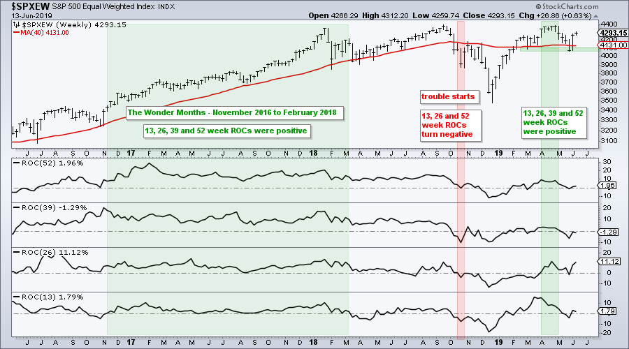
Three of the four ROCs turned negative in October when the index plunged below its 40-week SMA. The market recovered in 2019 and all four ROCs were even positive in April. The May decline ruined the party as all four dipped into negative territory, but the June surge pushed three of the four back positive, for a fleeting moment.
Even though the 26-week ROC is at an impressive 11.12% now, the 52-week ROC is at +2% and the 39-week ROC is at -1.29%. These varying ROC indicators suggest that the long-term trend is quite flat right now and the chart confirms because the index peaked just below 4400 three times in the last 18 months (January 2018, September 2018 and April 2019).
S&P 500 Maintains Bullish Bias
Despite a flat trend over the last nine to eighteen months, the cup remains half full for the S&P 500 because the 20-day SMA is above the 200-day SMA and price is within 2% of an all time high. After surging some 26% in 17 weeks, the index retraced around 1/3 of the advance with a 7.6% decline over a five week period. Given the size of the prior advance, a 7.6% decline is pretty normal for a correction. The index forged a reaction low with the surge back towards 2900 and this affirms support in the 2720-2750 area. This is the area to watch going forward.
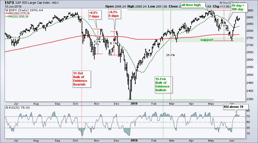
Note that I am NOT marking resistance in the 2950 area because the bigger trend is up and the bulk of the evidence is bullish. Higher highs are expected in an uptrend and this means resistance are just noise. Support levels, on the other hand, are expected to hold and warrant our attention.
Index Breadth Table Improves
The index breadth table improved this week as S&P 400 High-Low% ($MIDHLP) exceeded +10% last Friday and finally reversed its bearish signal from October. This means that six of the nine indicators are on active bullish signals.
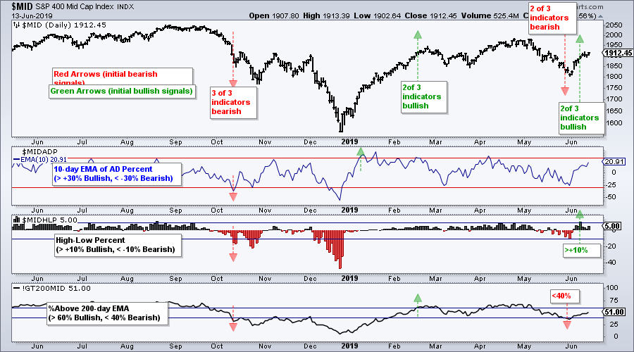
The chart below shows S&P 400 High-Low% ($MIDHLP) moving above +10%. This shows new highs expanding and this is positive for mid-caps. The 10-day EMA of S&P MidCap AD Percent ($MIDADP) was already on a bullish signal and this means two of the three signals are bullish. The Mid-Cap %Above 200-day EMA (!GT200MID) remains on an active bearish signal since the dip below 40% on May 29th.
MDY and IWM Break Out of Wedges
The next charts show the S&P MidCap SPDR (MDY) and the Russell 2000 iShares (IWM) with three continuation patterns. Continuation patterns form after an advance or decline and represent the pause that refreshes. The pattern's bias depends on the direction of the prior move. As with all patterns and signals, continuation patterns are certainly not fool proof and have their fair share of bad signals.
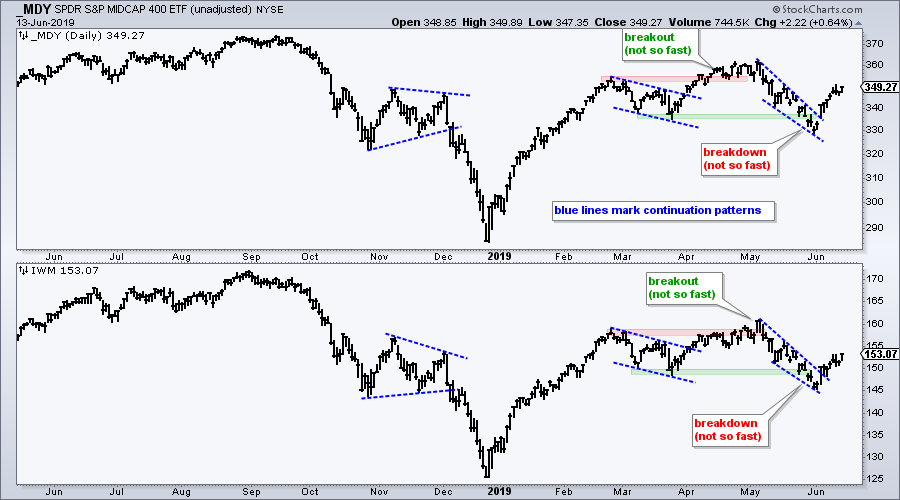
Continuation triangles with a bearish bias formed in November-December, while falling channels with a bullish bias formed in March-April. Even though both ETFs appeared to break support in May, falling wedges took shape and these are bullish continuation patterns. Both ETFs broke out with big surges last week and these breakouts are holding.
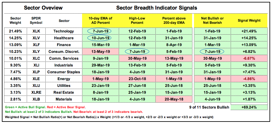
Sector Breadth Table Gets Four New Signals
The sector table improved this week and remains firmly bullish. There were three new signals on the sector breadth table and one sector flip. The 10-day EMA of AD Percent triggered bullish for the Technology SPDR (XLK) and Health Care SPDR (XLV). This means we saw a bullish breadth thrust in these two sectors, which are the biggest sectors in the S&P 500. XLY High-Low% ($XLYHLP) flipped from bearish to bullish with a move above +10%. The sector also flipped from bearish to bullish because two of the three indicators are on bull signals now. All told, nine of the eleven sectors are net bullish and the total signal weight increased to +69%.
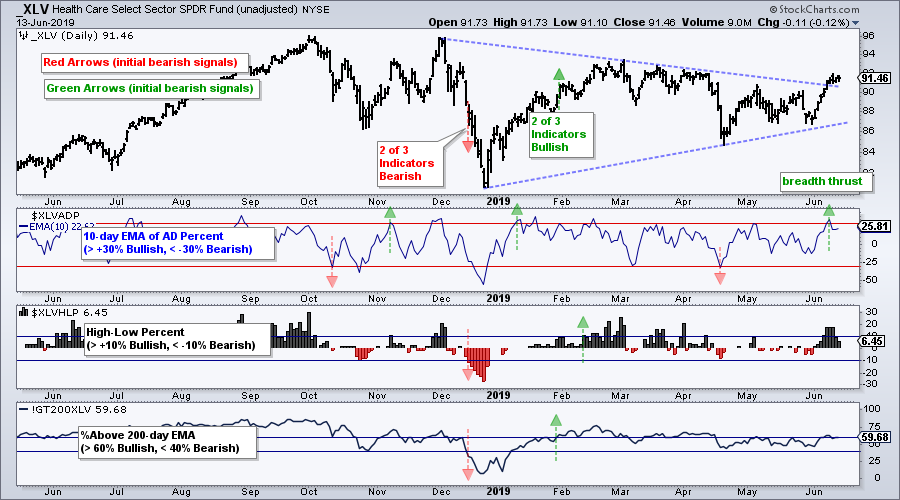
Healthcare Perking Up
The next chart shows the Health Care SPDR (XLV) with the breadth indicators. In addition to the breadth thrust, XLV broke out of a large triangle consolidation. I am not sure if this is a big bullish continuation pattern or not, but the range clearly narrowed over the last few months and XLV clearly exceeded its May highs. Thus, we have a breakout that is confirmed with a breadth thrust. Within healthcare, the Medical Devices ETF (IHI) is the runaway leader and I highlighted the biotech ETFs in Thursday's commentary.
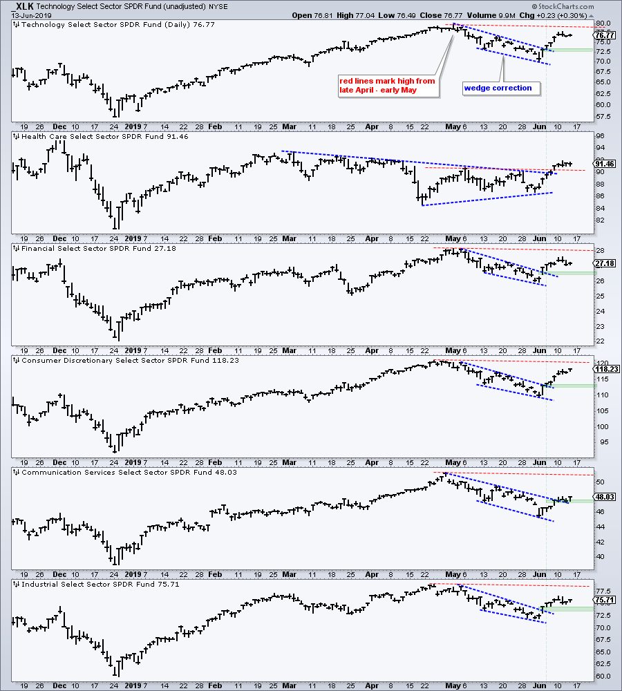
Big Six Sectors Trigger Breakouts
The next chart shows the top six sector SPDRs and these six sectors account for around 78% of the S&P 500. The red lines mark the high from late April or early May for each sector. First, notice that XLV is the only one to clear this high and this shows relative chart strength. Second, notice that the other five broke out of wedge patterns with the surge over the last eight days. These breakouts are bullish and the big six are participating. The green shading marks the breakout zones and it is important that most of these zones hold. A move back below the breakout zone would signal a failed breakout and this would be negative.
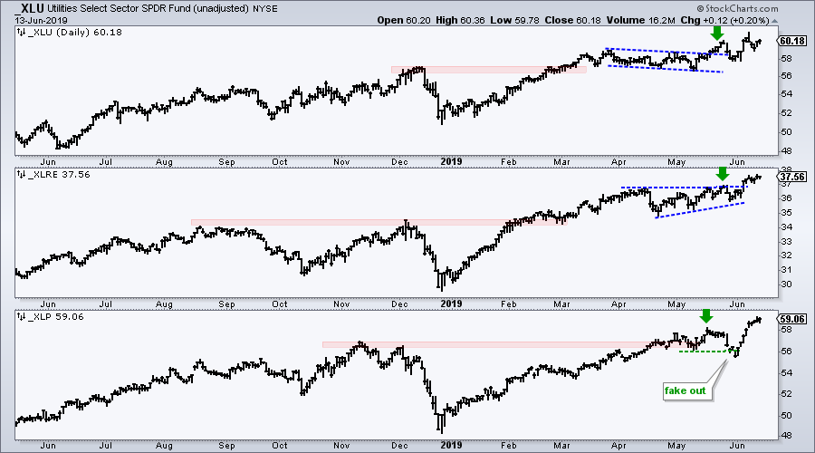
Utes, REITs and Staples Remain Strong
The Utilities SPDR (_XLU), Real Estate SPDR (_XLRE) and the Consumer Staples SPDR (_XLP) remain the strongest sectors overall because all three recorded 52-week highs in May (green arrows) and again in June. XLU broke out of a falling flag in late May, XLRE broke out of an ascending triangle in early June and XLP went from a failed support break to a new high in two weeks. Note that I am using unadjusted data (sans dividends) for these charts (_XLU, _XLRE, _XLP).
Art's Charts ChartList Update
The Art's Charts ChartList was updated on Wednesday. This list features 30 stocks in long-term uptrends, as defined by a scan using 65-day RSI and 65-day Aroon Up/Down. The scan yielded a few hundred stocks and I made selections for the ChartList. I will post a System Trader article next week with scan code and backtest results.
Click here for the Art's Charts ChartList
Questions, Comments or Feedback?
I do not take symbol request and I cannot promise to response to all correspondence, but I will read it and take into under consideration. I greatly appreciate all feedback because it helps me improve the commentary and provides ideas for the future.

Plan your trade and trade your plan.
Arthur Hill, CMT
Senior Technical Analyst, StockCharts.com
Author, Define the Trend and Trade the Trend
Want to stay up to date with Arthur's latest market insights?
– Follow @ArthurHill on Twitter
– Subscribe to Art's Charts
– Watch On Trend on StockCharts TV (Tuesdays / Thursdays at 10:30am ET)


