Living in the city where BRE-X was born, I have seen the stock soar, scored, scarred, scared and scuttled. Therefore my enthusiasm for the metal is always muted. My broker sent out BRE-X shares for Christmas after they went bust. So my concern is always where is my exit. So I start with a healthy dose of not wanting to own gold but maybe I need to. Let's go see.
So let's break the Gold trade down into parts.
1) $GOLD - gold (end of day) data only.
2) GLD - The ETF that tracks $GOLD intraday
3) GDX - The US version of the Gold Index
4) $BPGDM - The Bullish Percent Gold miners index.
$USD - US Dollar Chart
FXE - Euro Chart
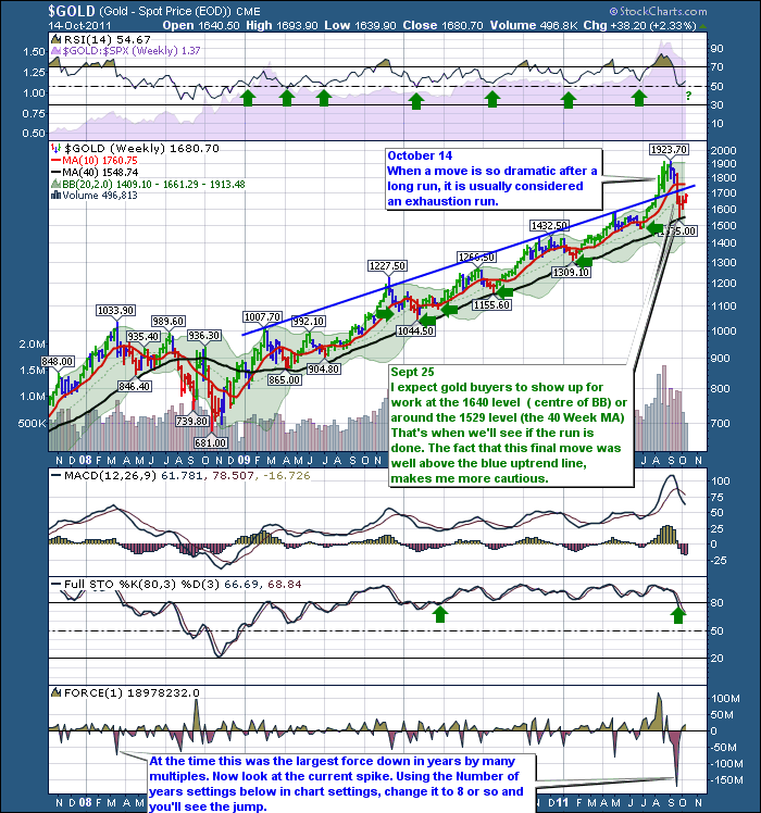
Here was my weekly gold chart last authored on October 14th.
So far that has worked out. What makes the charts so critical today? I actually saw this two nights ago working through the charts, so the behaviour Wednesday is interesting but my thoughts for the gold blog today was the Good Old Fibonacci levels.
As a footnote: I wanted to go see the statue of Fibonacci when I was in Pisa, Italy, but the family voted for the leaning tower instead.
For those of you not familiar with Fibonacci, may I point you to 8 pages of great information in the Chartschool, found here on this link - Fibonacci.
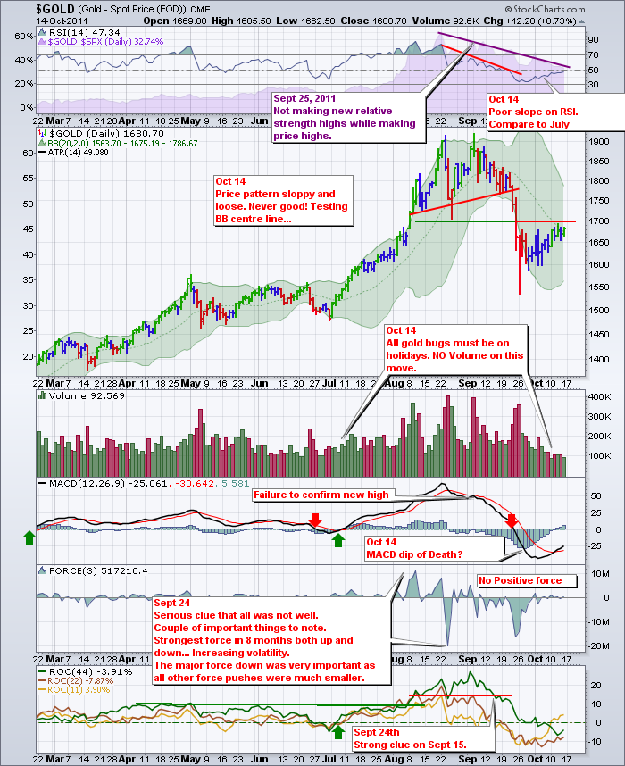
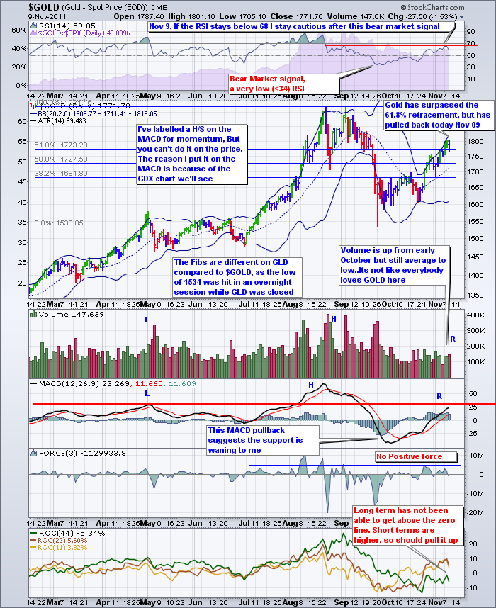
Lets go into $Gold daily and look at the Fib (onacci) levels.First here is a detailed chart I last annotated on October 14. Following it is a chart with the fib levels.
Keeping in mind the data on the chart above, here is my new labelling.
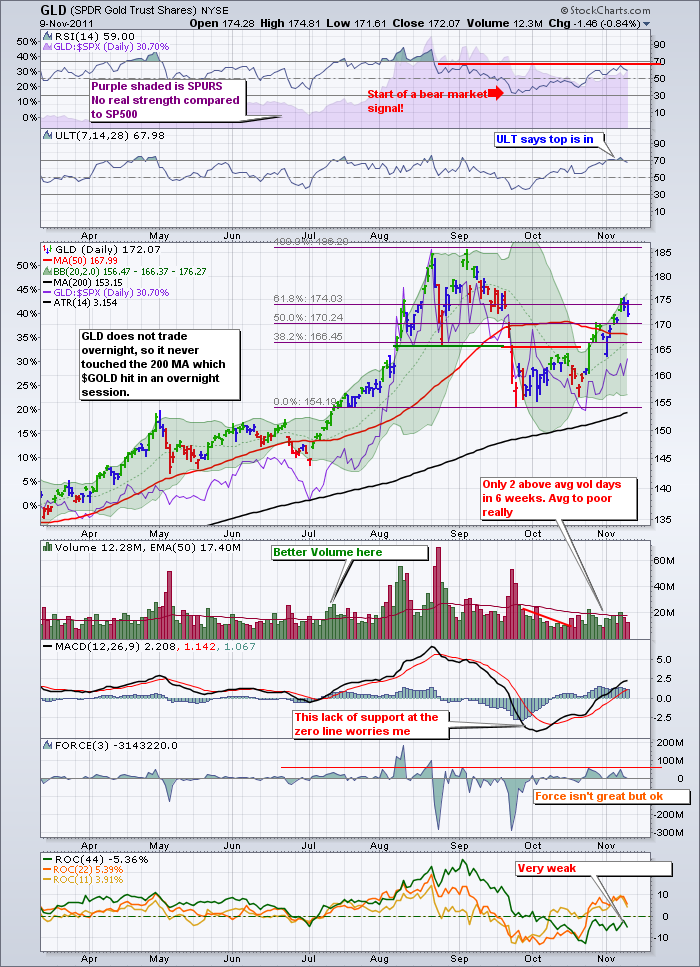
Lets check GLD. I am not smitten by the bull run here. Look how orderly the move was from July 1 to Mid august. All candles about the same height. Compare the candle behaviour to the current run. Gaps, spurts, starts, not real smooth. The RSI is much slower on this run. I would say 'not impulsive' compared to July so that would make it corrective compared to the impulsive move down off the peak. The RSI in JULY was almost straight up and soared into overbought. We have not been able to jump into overbought on GLD after 6 weeks and a 61.8% retracement...
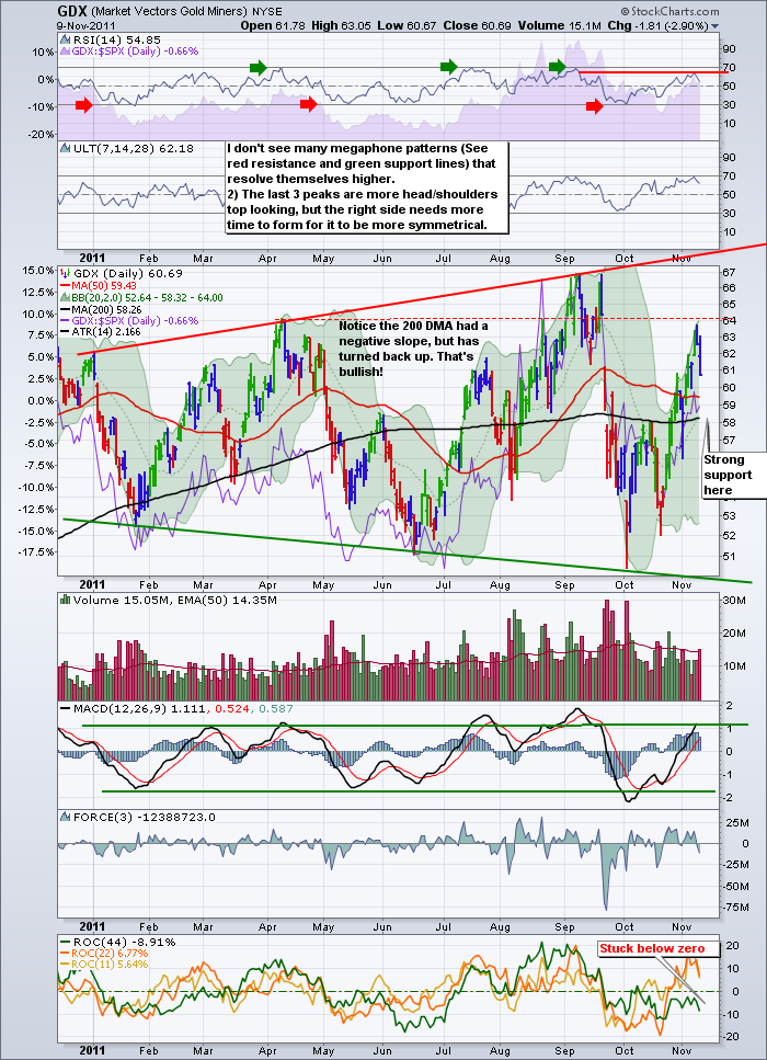
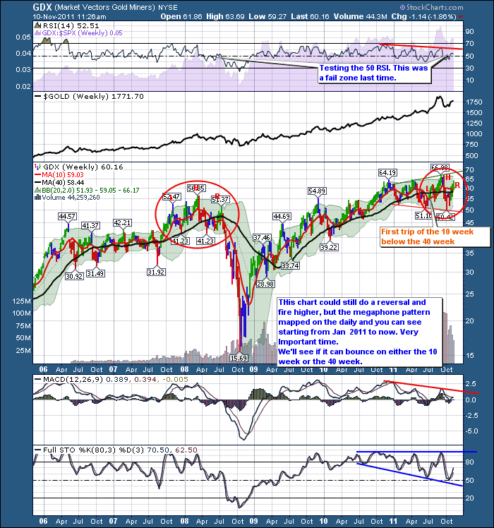
Lets go check GDX. What I like on this chart is that it currently has rising tops. What I don't like is the current peak on the right is exactly at the top from what could be a left shoulder, the highest peak and Wednesday we started a descent from the recent peak. I would also expect the Green ROC line to be in positive territory. That is particularly worrying. The RSI has bounced from 30 - 70 three times now. That is particularly unsettling. The price oscillations are getting higher and lower, and the RSI is banging 70 on the peaks every rally. So far not this rally. But one day does not make a correction.
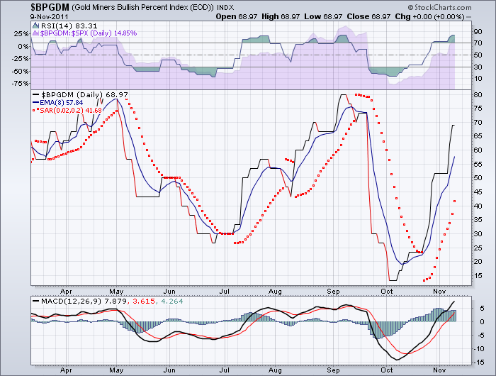
$BPGDM - always a valuable chart. This chart measures what % of the gold miners are on a buy signal on a PnF chart. The higher the better. Well, it doesn't look like this is in danger of being stopped out on the Parabolic SAR or just a simple EMA crossover.
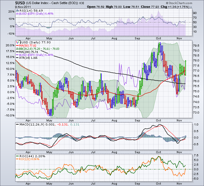
This $USd chart does not need a lot of annotation. THe ROC (44) is in bullish territory and didn't go negative on the pullback. The price action itself surged higher, pulled back and got support around the 200 DMA. From there it has surged. I would expect the surge in the $USD to push down the prices of commodities. Gold included.
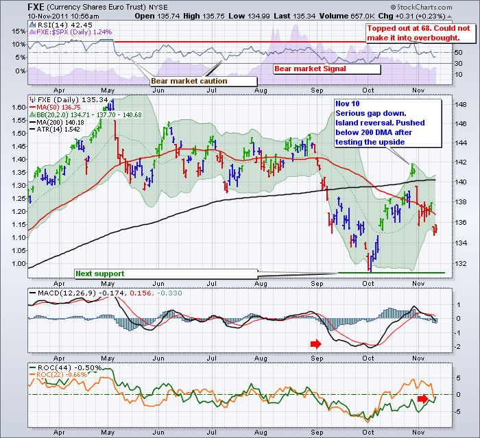
Here is the FXE which is the Euro chart. What I notice the most on this chart is the fail at the 200 DMA, as well as the price following the 50 DMA for the most part. Currently that is pointed down. The next level of support for the currency is the bottom of the chart.
Check out how the GDX index behaved at 2008.THe RSI failed at 50 and then it let go. The $400 move back then is dwarfed now by these high prices, but its a big deal when the commodity drops 40%.
In Summary, I am bearish Gold here.
The main reason is the currency direction. This won't be smooth. Notice the ATR of 1.5 cents/day on the FXE and 1.1 on the $USD !
The second reason is the megaphone pattern on the GDX. The most recent peak formed 2 days ago, appears to mark a head shoulders pattern. I am not impressed by the stark negative divergence on the MACD and the RSI compared to price on the weekly. This level of divergence on the weekly is very bearish.
PS. Some of the charts won't reflect todays trade, as I wrote most of this last night.
Inverse etf's that track gold or the gold miners would be a method to execute this trade.
Examples include HBD.TO or HGD.TO Its a volatile world out there.
To subscribe to this blog, follow the link and click the top right.
Good Trading,
Greg Schnell, CMT

