The work of cycles is fabulously interesting. It just seems hard to bet on any particular turn.
George Lindsay used time spans to find places on the chart where a chart was likely to turn. He was looking for the inflection points in the market. His work has been brought back to life by Ed Carlson of Seattle Technical Advisors.
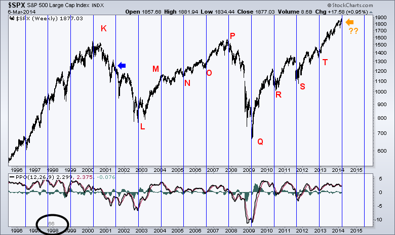
What has made the recent market cycles (last 15 years) so interesting, has been the difference in time spans. From the 2000 high to the 2002 low was a period of two 66 weeks time spans. From the 2007 top to the 2009 lows was 1 time span of roughly 66 weeks. Why 66 weeks? Well, it is only through the manipulation and experimentation of the cycle tool in Stockcharts that I was able to find a time span that worked for all the market turns. While multiples of 66 weeks like 132,198 and 264 work well, they all missed one of the turns. It was only the lowest common denominator that worked. This is trial and error, best fitting with the historical models.
So here is the chart.
You can see it worked pretty well on most cycle lines. It missed in 2001 at the blue arrow. What is most important, is the right edge of the chart. It is telling us that we are near one of those potential reversal points that George Lindsay talked about. Only the history books will tell us how it works out, but it is worth noting in a timely manner.
The Black circle at the bottom annotates the number 66 in gray. That is the number of weeks between the lines.
Good trading,
Greg Schnell, CMT


