Well, the first two chapters had provocative charts that look set up for major moves. The Canadian Dollar ($CDW) looks ready to move as well. Once again, starting with the long term weekly chart, Lets study the RSI.
The RSI has been in bear mode for the last 3 years since the 2011 commodity top. We can see it recently broke above the blue down trend but is still below the red line marking a bear market range. The Canadian Dollar does not respect the typical bear market ranges for RSI as nice as the Japanese Yen as an example, but we can still see the bull and bear market areas generally. The bottom line on the RSI is we are trapped in the bear market mode and approaching resistance at $95 on price. Notice the downtrend channel that the Loonie has set up since the 2011 top. Switching to the pink uptrend line, it is very steep. Some more moderate trend was definitely possible. After the 2009 correction, the pink trend line became resistance. This is typical of trend line work. What was support becomes resistance. Gaan also talked about the slope of the trend lines and how a chart will move through different slopes. The Canadian Dollar bounced off the huge support level at 89 in 2014. Notice how the 2000 - 2009 lows trend line also formed a supportive trend for the $CDW that coincided with the 89 level.
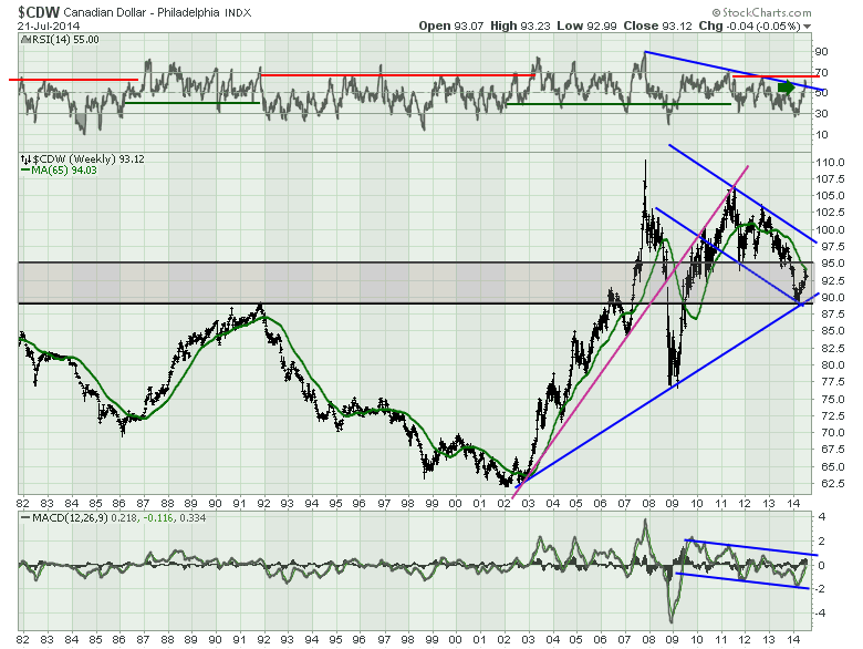
The MACD is gently trending down over the last 4 years, but the real question is what happens now as it returns to the zero line from below.
Lets move on to the shorter weekly view and zoom in on the recent price action. I have been covering off the major topping structure in the Canadian Dollar for at least a year. The 2009 low was clearly a bear market on any scale. Notice the spire top in 2007. Moving almost 6 cents up and back in 3 weeks. It moved up 17.5 cents in 3 months. That is a classic spire top. So where to draw the bull/bear market lines on the RSI? After that colossal move and a spike or climax high, it was probably ok to recognize the best was in. While you are never sure in a bull market, these final grand runs are usually on a few charts at the end. We can see the pink uptrend line and how the price action changed after the 2009 low. The L-L-H-H-R-R topping pattern is listed in some of the old price pattern books in my office. These are usually very significant long term tops, especially when they form on the weekly and take years to build. Once again the brown line runs through the gap like the chart for the Australian Dollar. The Brown line was support for the entire head/shoulders topping structure and this current bounce back up looks like a classic retest of the support. Having the 65 week MA right around this level and down sloping only confirms it could be a place for a major slide to start in the Canuck buck.
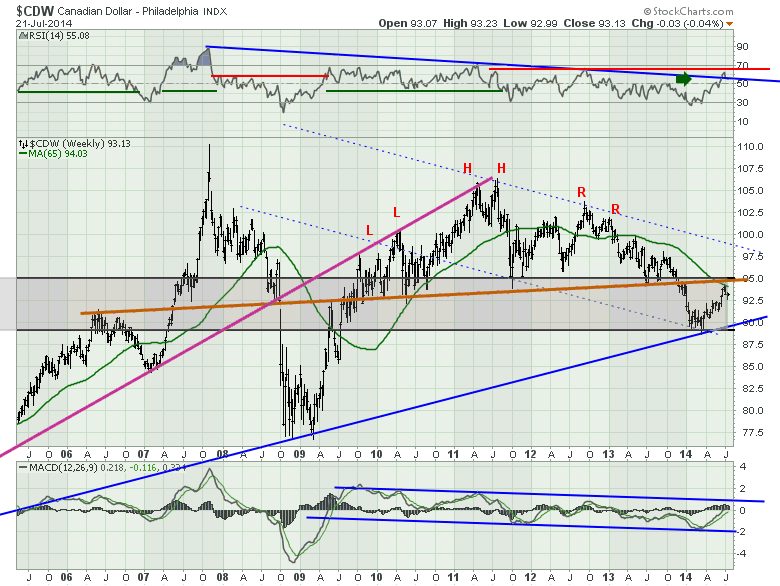
This is really the charts last line of offence. If it can not break out here and demonstrate serious power, I would want to be very aware of the potential move in the $CDW to the downside. The fact that this was the same levels that the Canadian dollar fell apart at back in 2008 before the major L-H-R topping structure almost confirms that the spike high and the subsequent failure to retake it confirms this top is in place for a while.
Onto the daily in Chart 3. This looks much more bullish but it is very short term. Having the price stall above the 200 DMA and below the 300 DMA is not bad by itself. A significant breakout above would be very powerful and probably convert my pessimistic views from the weekly. But the blue up sloping trend line must hold. A breakdown on this line would put the price back below the main moving averages at 92.5 and really mark a top based on the weekly.
.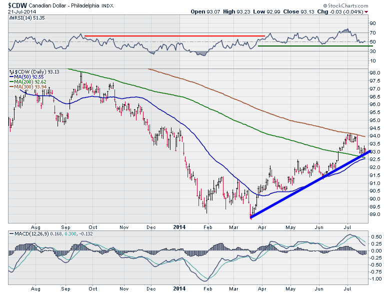
Lastly, the MACD has been pushing higher. It still looks bullish. If it rolls over and goes below the zero line with some pace, It would confirm a lot of my broad suspicions.
So once again, another currency at a critical place on the charts. The back test of the neckline for the major rounded top or double L-H-R top. I am watching the Aussie and the Canadian as a pair. This has been a good bear market rally, but my weekly charts tell me it is just that, especially in the context of the European charts which we will cover next.
Just a shout out to John Murphy who does a lot of currency analysis in his regular Market Message for subscribers of StockCharts.com. John was instrumental in helping me see the power of analyzing the currencies as part of the broader market. John Murphy will be a primary speaker at StockCharts.com Chartcon 2014 in 2 weeks. His insights are powerful. I remember being in New York October 2012 at the SCU 101 class we were teaching, looking at the Japanese Yen head/shoulders top with him. John just said "Wow- that's a massive top, what is it?" He saw the pattern, didn't know what the symbol was, and then we talked about the implications. We got some time to discuss the implication with John's extensive inter-market work over the next few minutes and it really stuck with me. If you are looking for that kind of quality time with some of the nicest, publishing technicians in the business, I would encourage you to come to Seattle for August 9-10. Not only will you get a broad sample of what a group of technicians are thinking all in a timely two day summit, but you will get a chance to really hear the why of their thinking from some of the best technicians like John, Richard Arms and Alexander Elder about the same market at the same time. Typically that price is a mastercard commercial - priceless-. To get more information, Chartcon 2014 is the link you need to click!
The Commodity Currency charts are still in bear market mode on the weekly. That is the primary trend. Until its broken, we expect it to continue. This would appear to be the upside limit of the bear market rally. A breakout to 70 on the RSI's in both currencies would be very bullish. At this point, I don't expect it but that's why we have charts. To help identify when the trend is changing and when we are wrong. If you missed the blogs on the Yen and the Aussie Dollar, the links are here. The Japanese Yen The Australian Dollar.
Lastly, to subscribe to most of the blogs, they are available by email or RSS Feed found in the top right of the page. For the Canadian Technician, it looks like this. Feel free to click on the link and connect to the page.
Enter your email and you are good to go! Feel free to forward any of the work when you find it compelling!
Good Trading,
Greg Schnell, CMT


