I could have written a specific article on the price of oil going ballistic in 2007 and 2008, but I will try to correlate that 'oil' story with the 2014 fall in oil. 2011 will be remembered as the commodity top and that is what we will cover in this article. Many of the world's commodities topped in 2011, with the most obvious being Gold and Silver.
This is the third article in a series of modern day Manias.
Part 1 can be found here. The Year 2000.
Part 2 can be found here. The Year 2007.
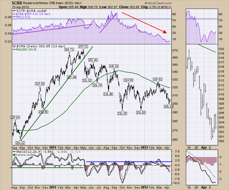
For consistency, I'll work through the same charts we had in the previous articles. The commodity top in Silver happened in March. It was central to the actual top with a number of ballistic moves in commodities from 2010 into the spring of 2011. Notice how there were 3 peaks on this commodity index. The trend line snap was pretty important. Notice the change in the MACD and some trend lines under the purple SPURS would have been valuable. The breaking of purple trend lines were indicative of a potential top. . Once the Relative Strength (SPURS) started to trend down, the commodity top was complete.
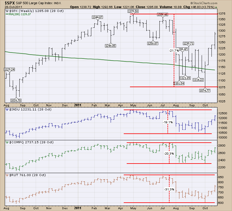
The $SPX dropped a little over 20% and on the morning of October 4, 2011 as it entered bear market territory (a 20% drop is considered a bear market) came a fierce rally to fire it up off the lows. The Russell 2000 topped with everything else in April. However, it suffered a fall that was 50% larger than the other indexes. The big drop in the markets occurred in July when the Greece situation flared up and concerns over the ability of the Eurozone to hold together was put into question. However, it was the dramatic topping structure in all the commodities that identified problems in the growth model worldwide. The US Federal Reserve implemented another round of stimulus to pull the markets forward.
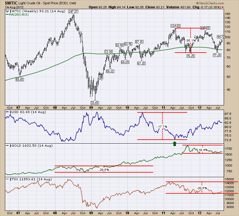
The crude chart was a whole lot different. I have included the 2008 pullback (Asteroid style descent) for reference purposes. The pullback in oil in 2011 had a couple of things going on. Notice how close the 2011 $WTIC oil top was to the low in the $USD. Immediately under the $USD chart, you'll notice that $GOLD topped as the $USD broke out. The $TSX topped in March compared to the US Markets in April. The main reason was the start of the commodity topping process. The stocks in the index were pulling back while oil was still rising. Classic divergence. Gold pulled back and rallied briefly with the broad market rally but went on to make lower lows by December 2011. The power of the $USD to affect commodity prices over the long term is very important.
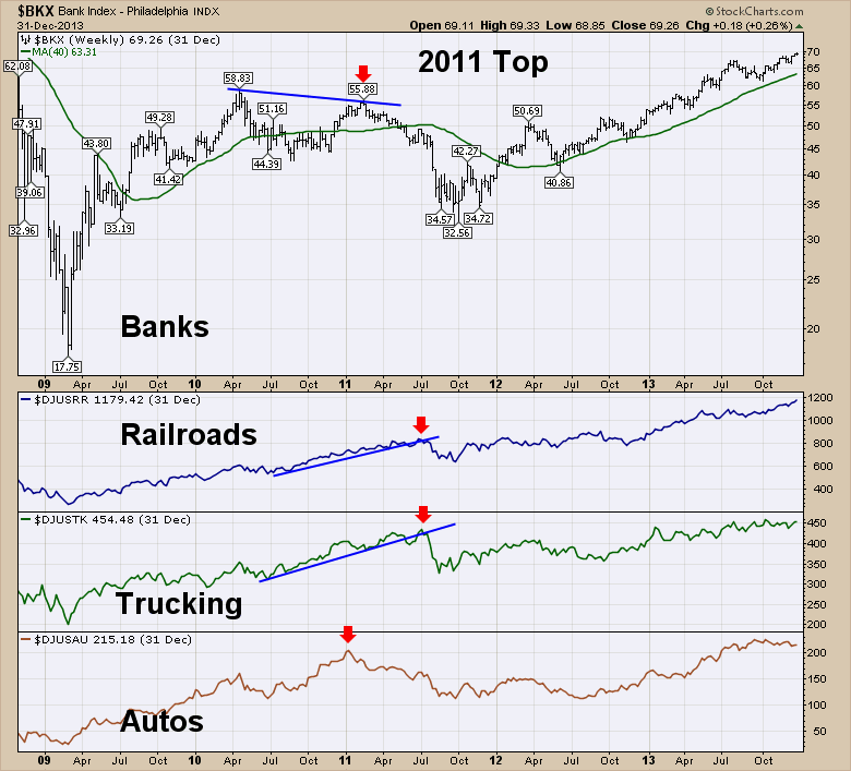
Now let's look at the other indicators like Banks, Transports and Autos. The US Banks were unable to take out the 2010 highs and they rolled over in February 2011. The Railroad and Trucking indicators rolled over well after the equity markets topped. They were unaware of anything untoward until the July top when everything was unwinding. Lastly, the Auto Industry Group was one of the timely indicators of market weakness. It had made its top in January 2011 and drifted lower through the year.
The housing stocks are interesting in this case. They are usually considered a leading indicator. Let's look at them in 2011. While none of them had made it above the 2010 highs, they all topped early in the year 2011 and drifted lower. What was more informative, was how sharply they bounced at the end of 2011. Two of them returned to the 2009 lows and one of them made dramatically lower lows. Every one had major downtrends in place and all of them broke red line support. Toll Brothers took out every stop on the October 4th lows. DR Horton broke the up sloping trend line as well as a horizontal line that was almost 2 years long under the late 2009 lows and the 2010 lows just above the dotted line (Not drawn because of space concerns). The DR Horton stock spent September going sideways and broke lower into the October 4th low. Hovnanian broke through all the support levels except the 2009 lows. The final stock, Pulte, had plunged below 2009 lows in August 2011, and made final lows on October 4, 2011. The most interesting part in hindsight, is how they all made major bottoms on the same day. Commodities had been breaking down for months and astute investors were buying plummeting homebuilder charts in the face of weak economic demand. Who knew? Not one of those charts would have been on the buy button for me that fateful October 4, 2011 bombing of the lows. Yet three downsloping trend lines had been broken above by November 2011 and courageous investors in Toll brothers might have had some courage by getting back above the up sloping support line in red. Mentally, I can't imagine why that group would have rallied so much, but we'll cover that off in a little bit technically.
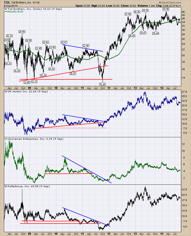
Within the next year, all of these stocks had rallied at least 180% if we continue to analyze the chart above. Pulte and Hovnanian rallied 7 fold from lows of $3.22 and $0.89 respectively! An interesting study in this case is when the stocks finally bottomed. In most cases they had broken final support lows by a little bit and then turned and shot higher. But these had been trending down since the highs of 2005! - OUCH! - over 6 years before they would be the best buy possible. In this example a few of them had lower entries near the 2009 lows, but for the most part, the stocks round tripped and two years of bull market gains would have been missed while you held 'dormant' stocks. For me, I really want to have a method for finding that final sense of selling after a massive bear market. I remember that morning well. When the market is down by 20%, and my good friend JC will disagree with me, I would fully expect the big players to be bargain hunting on the lows. Now whether it's 20% or 21%, the market falls in steps. I covered off in Part 2 how the volatility increased as lower lows were made. The first bounce was at a particular level. When the market couldn't hold that, it accelerated down to a deeper discount. A larger 'bear market' rally up was in store, but the previous highs become major barriers. It they can't break out and hold, it is a big problem. So when can we buy? Well, when support has broken and most stops are hit, it is important to watch the price action closely. If it can bounce from that level, there are major gains to be made. For people only buying strong stocks, this is not for you. For bottom fishers, close out specialists, shopping the 70% off sale rack, we need to identify buy points. Usually this includes getting back above a broken support line. It is also nice if peer group stocks are reversing higher as well. 3 of 4 of these stocks made lows and broke out to the upside above the blue down trend lines together. It would make sense that the best buy point is right there. In November, all four of these stocks had broken above blue down trend lines together. I will suggest that the Toll Brothers is much harder if you didn't buy on the bounce off support of the 2009 low. Do you buy at $17, $19, or $21? The bottom line is that eventually all industry groups come back to life. This one came back on the back of low commodity prices, and enough time to heal the resale market for homes.
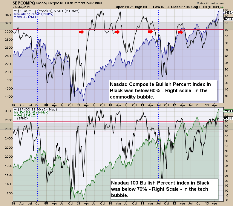
Here are the Bullish Percent Indexes ($BPIs) for the Nasdaq Composite ($BPCOMPQ) and the Nasdaq 100 ($BPNDX). The red line areas are typically bullish above, bearish below and the area in between is important to watch for stalling either direction. I like to use 60% on the $BPCOMPQ and 70% on the $BPNDX. When they are below there, I am concerned. While the commodities topped through the early months of the year 2011, the Bullish Percent indexes remained very high. The$BPCOMPQ didn't fall below the support levels until May. However, the $BPNDX had fallen earlier in the year and couldn't get back above 72%. That is the stalling I am referring to.
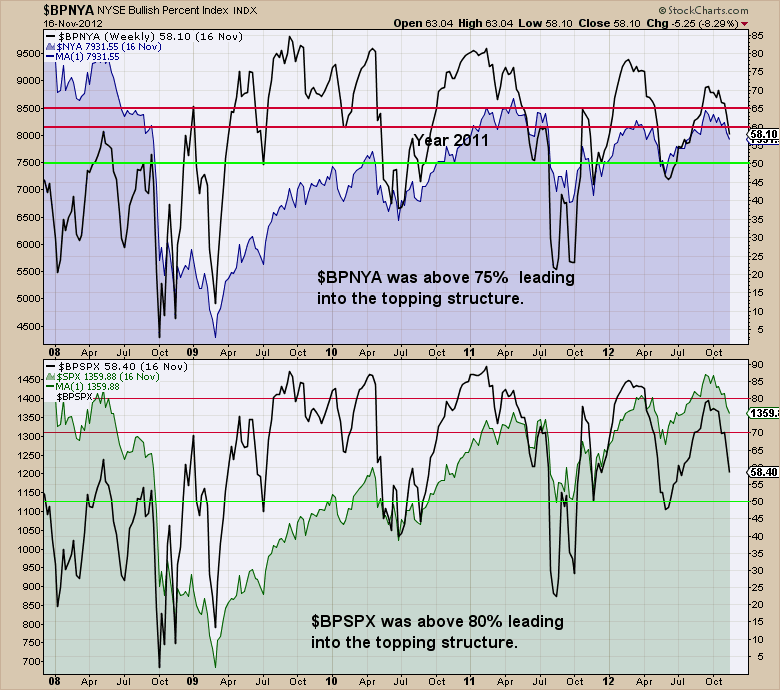
Here are the Bullish Percent Indexes ($BPIs) for the New York Stock Exchange Composite ($BPNYA) and the S&P 500 ($BPSPX). The red line areas are typically bullish above, bearish below and the area in between is important to watch for stalling either direction. I like to use 60% on the $BPNYA and 70% on the $BPSPX. When they are below there, I am concerned. Both the $BPNYA and $BPSPX stayed above until May 2011.
Now it is time to specifically talk about the start of the commodities melt down. If we learn one thing about major commodity markets, the bear market rallies are there to draw you in and then they plummet again. How do you know when it's over? I think the study of the homebuilders may help us. But first let's talk about the commodities. This 2011 top was a slaughter for most commodity investors. Global markets were bouncing everywhere and commodities had been in a big bull market before the financial crisis. Now they were just starting to reaccelerate. Everyone wanted on the train to huge profits in the markets that had been the best before the last crash! So it should be obvious to me now, that tech stocks were not the place to be after the 2003 low. They rallied, but commodities were the best place to be in general. After the housing roof collapsed, the best thing to buy on the 2009 lows was not housing stocks. It was tech, biotech and healthcare. The bank stocks haven't been great places to be after their decimation because of the regulatory, legal, write-offs etc. There was some love there because of the Fed supporting their balance sheet during the restructuring, but Citigroup was at $50 a share in 2010 and still is as an example. BAC was at $18 in 2010, and still is. GS was at $177 in 2009 and is at $180 today. JPM, WFC, USB have done better, but 50% gains since 2010 isn't exactly heroic achievements. After $WTIC surged to the big highs in 2008, the rapid rebound was excellent, but it was not the best place to invest. XOM bought EOG. Suncor bought PetroCanada, Talisman crashed, Encana plummeted. Cenovus couldn't get any love. Some of these companies ended up overpaying for assets based on where oil was in 2007. So there might be a trade on the original flush, but be wary of loving it too long and expecting too much. So one of the things I am thinking about is the long term reentry into a decimated sector. It becomes all about the base.
This article is long enough now. Part 4 will cover the different commodities, the freight train that the commodities created, and signs that suggested a series of bear market rallies. Let's roll through the commodity charts in Part 4 and look for some of the signs that the top was in for the long term.
I try to cover off some of this information in the webinar series I host every Thursday at 4:30 EST. The registration link can be found on the What's New section of the homepage and at this point in time, it is open to everyone, not just subscribers. Click here to Register for Thursday January 29th, 2015. In the next article, we'll cover the Individual Commodity bubble of 2011.
Good trading,
Greg Schnell.
